Dataset
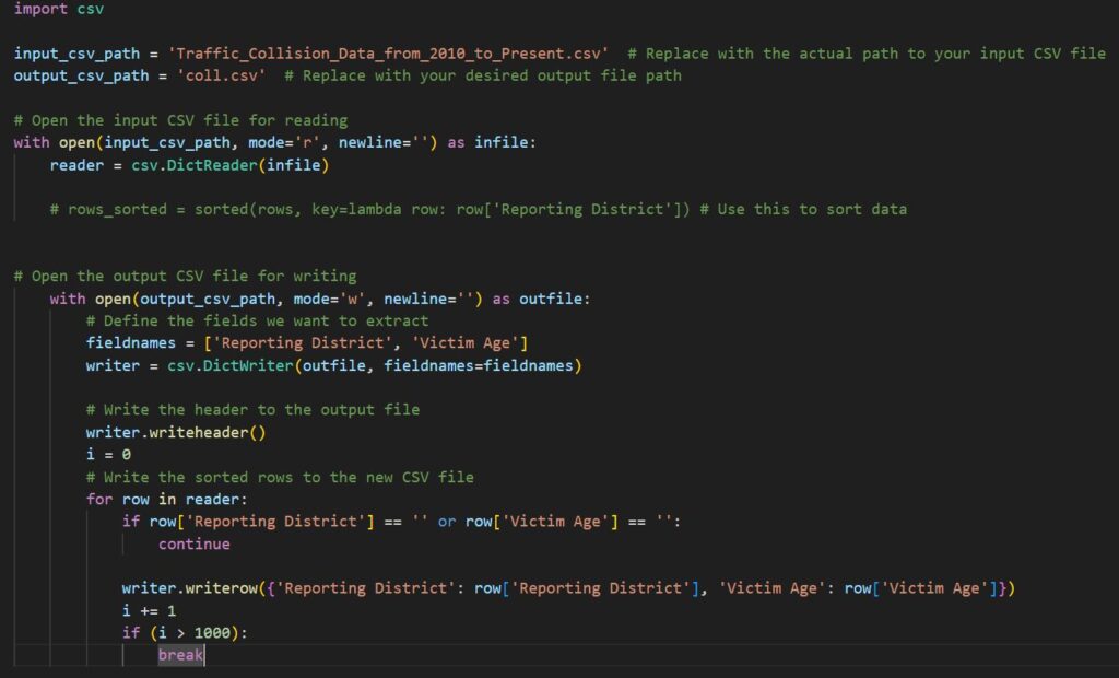
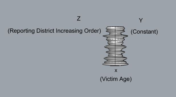
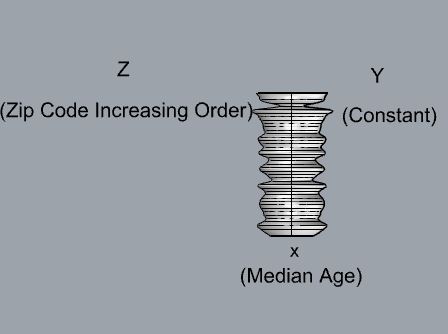
There was two data sets that interest me and they were the traffic collisions and census data for Los Angeles. This is due to the fact I’m originally from Los Angeles and because of that, your kind of isolated from the world. Since moving to Albuquerque it has opened my eyes on what you can find on the outside. So to get a better understanding how on densely populated Los Angeles is and I always hated the traffic in LA, so seeing the amount of collisions makes it understandable on why travel times were so large. The data set for traffic collision is massive since its collected data from 2018 to 2024. So I only selected the column for Reporting district so we know the location of the accident and the Victim Age to see who gets affected. For the second data set it was much smaller but had reporting information for each zip code in LA. Thankfully the data set was already sorted but if it wasn’t it wouldn’t matter since I have a script that will sort it based on what variable I want to check against. For this dataset I wanted to create multiple figures so for one of them I used the Total population and the Average Household Size since it would give a good visualization on how the total is distributed. Then for the final object I used Total population and and median age. Depending on how large the data set was I only chunks of the data since fitting 500,000 rows could be challenging for grasshopper to process.
Design Process
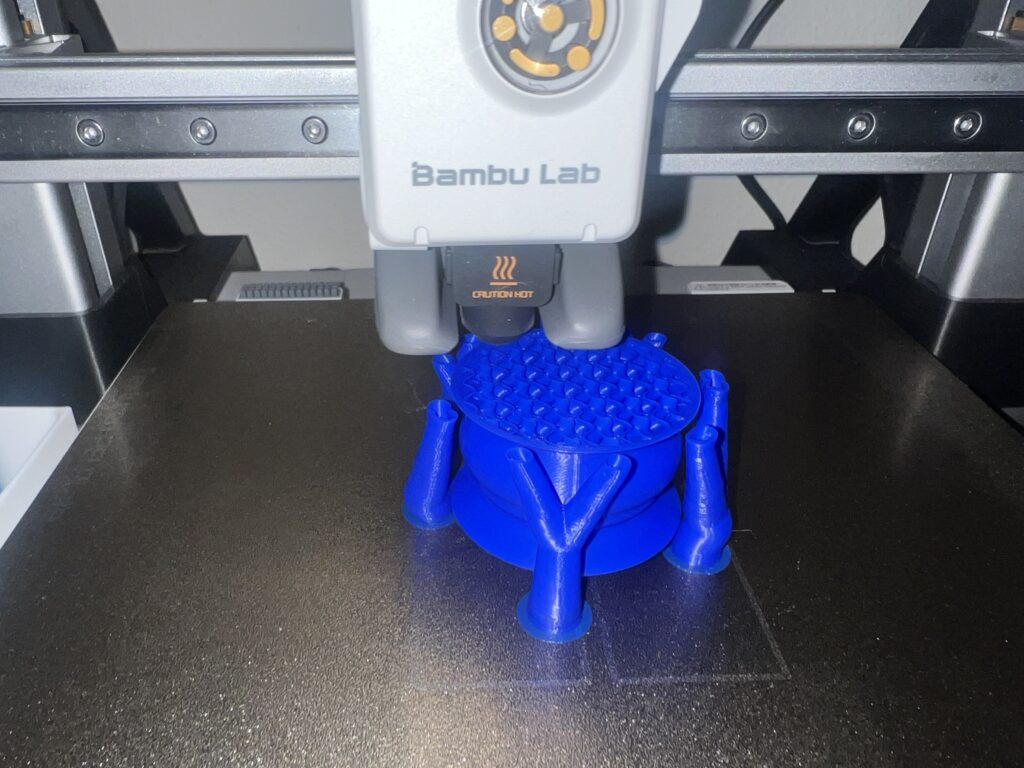
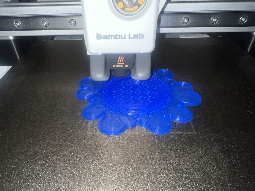
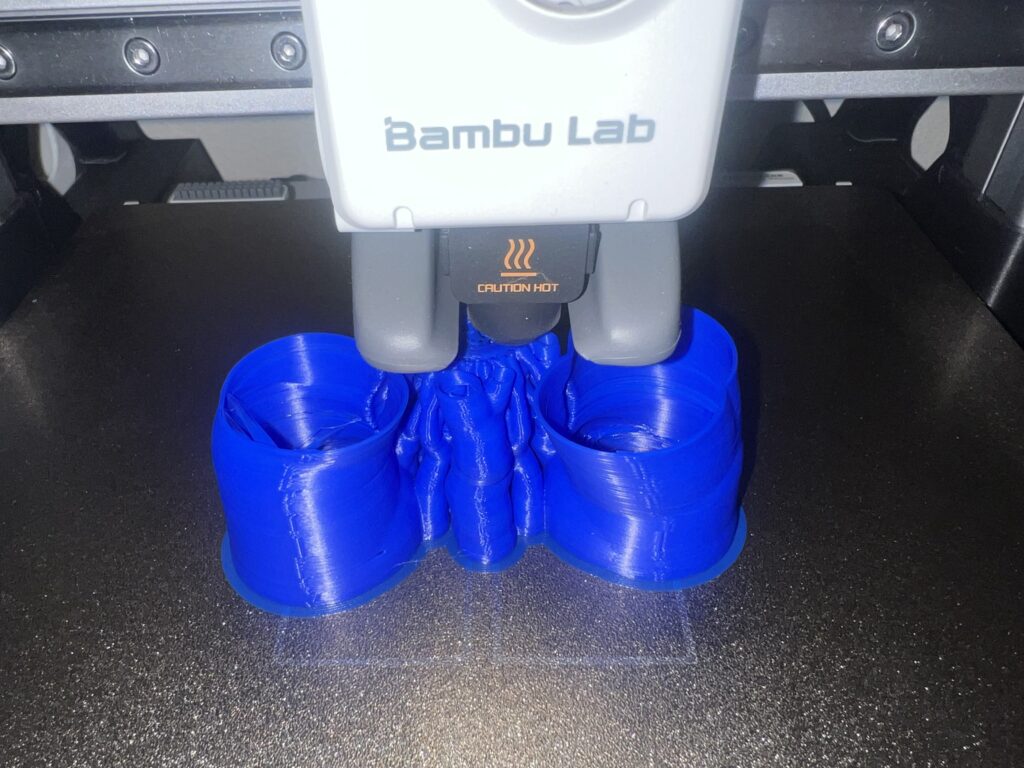
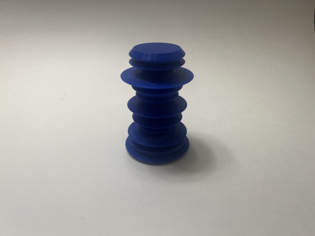
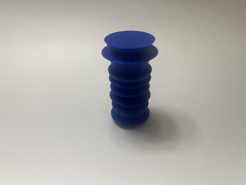
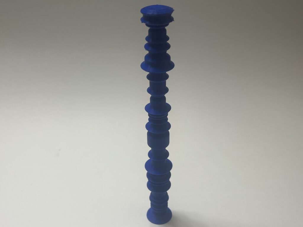
I wanted the data to be the model where just by looking at the model you know what it represents. Meaning if I were to give you what the axis represent you will be able to collect data from the visualization. Almost like a 3D graph or chart where the curvature depicts that more people live in this sector because of how much it sticks out. In order to achieve this I had to mess around with what column should belong to which axis in order for it to make sense. For me it made the most sense to put the location of the data on the Z axis because as you move up you will be at a new location. Then the actual data will be on the x since the width will give a nice visual effect. Since LA is such a large area the data can get random which creates sharp edges. So sharp in fact that overhang becomes a concern and trying to print the model in that state will require supports. A solution I used was to take the modulus of the data points so I can skip every so points depending how aggressive the overhangs are in order to create smooth transitions. The third model needed additional filtering since there were some values that were zero which wasn’t an issue until it came to printing it. This is because at the zero points it would create weak points causing it to snap during the process.
Printing Process and Final Images
Reflection
Designing models with data was interesting and challenging. This is because you had to find a data set that can be translated in a model. Then parsing through that data for any irregularities, too large of values, and garage data. Once the data is clean I have to figure out what had to go to which axis. As you can see from the result you get some interesting figures. I also didn’t want to make the figures too complex to the point where you can’t understand what the figure is suppose to be. Some of the data sets for Los Angeles are so large and compact you can get aggressive waves to the point you don’t know what to make out of it. My final models do a good job of illustrating the diverse and large scale of Los Angeles.
3D objects can help people understand data because sometimes datasets can be so large it can be difficult to comprehend its meaning. So by creating a model representation of that data makes it more tangible. It also makes it more visually intuitive and easier to see patterns. By using data you are able to create models that tell a story. Each layer of the model has a meaning and that meaning is determined by the individual that creates it. For example, for my 3rd model as you go through the zip codes of Los Angels you see what the average household size. The curvature tells you that some areas have bigger families and where they are the same. Finally each object will be unique since it would be difficult to get the same data set. This assignment was the most challenging for me due to the amount failed prints I had. Supports were all over the place and had multiple prints snap during the printing process. Trying to figure out solutions without alternating the data set was challenging but rewarding to see the type models could come out of it.
Hi Ricardo,
I’m glad you were able to overcome the challenges and create these prints! I like how they turned out. Using modulus to make your designs more printable is a nifty solution. I wonder, did you run into difficulties getting the tree supports off of the household size print? I tried using supports but found them difficult to get off (plus my print had failed underneath the supports). It’s really cool that you learned more about your hometown (home-metropolis?) from this project. You definitely nailed showing the scale and diversity of LA.
Hi Liz,
Yea getting the supports was definitely challenging without damaging the print since it was engulfed by them. The easiest way I found is to use a pair of needle nose pilers and then wiggle the supports until they come off. It’s best to do this right after the print has finished printing since the plastic hasn’t hardened yet. Thank you for the compliments! Hopefully I can do the same with ABQ’s dataset.
Ricardo,
Glad you persevered, your prints look very clean! I also had to use supports for one of my prints, which slowed down the process tremendously for me. Los Angeles traffic sounds terrible, I like that you chose a dataset that had slightly more meaning to you. The models are definitely more visually intuitive like you had said. I think the only attribute that our physical models lack and where a computerized graph/data may have an advantage over are the labels. It can be hard to differentiate the data if we don’t have those rendered images of our models to reference.
Hi Desiree,
Yea supports add so much time to the print. I believe for one of my prints was only 4 hours, but my slicer told me I needed supports so then I resliced it and the print time went to 9 hours. I wish I can say I can avoid supports entirely but they are needed at times. Yea having labels will definitely help with differentiation I almost feel like engraving each level with the information would help. However, readability sounds like a concern, maybe an external label graph sounds like it would help with this.
Hi Ricardo,
Sorry to hear about the troubles you had with printing I also had about 6 failed prints which caused a big delay. I always think about bigger cities traffic when I am complaining about traffic here in Albuquerque. I enjoyed how each of your data sets analyses different components of the data set you chose. I also had a harder time trying to make sure my figures would show changes in the data, I contemplated putting a little engraving on my figures for an explanation.
Hi Andrea,
Yea I feel your pain when it comes to the failed prints especially when it failed when you’re already a couple hours in. Plus the amount of filament you waste can also be a concern. Yea traffic in Albuquerque is a dream compared to big cities and even when there is traffic at least it flows or you can find ways around it. Engravings sound great but I feel like they have to be ranges since labeling each level can create overlapping I think.