Dataset
I chose my dataset from the CDC Website in regards to Covid19. I did not necessarily wanted to be focused on death, but that was the first dataset I came across and so I stuck with it. It had very interesting data. Not only based on Covid19, but also on pneumonia and other illnesses.
It can be found HERE (https://data.cdc.gov/NCHS/Provisional-COVID-19-Deaths-by-Sex-and-Age/9bhg-hcku). I thought it was interesting that CDC kept the number of views (at 4.04 Million) and number of downloads (436K).
Design Process
I really enjoyed playing around with the different data and sorting it on different criteria. I had trouble figuring out how to make the shape, because I did not realize that there were empty fields (the data had more than 13K rows), so I ended up selecting much smaller scale (not individual states by age, but all ages all together).
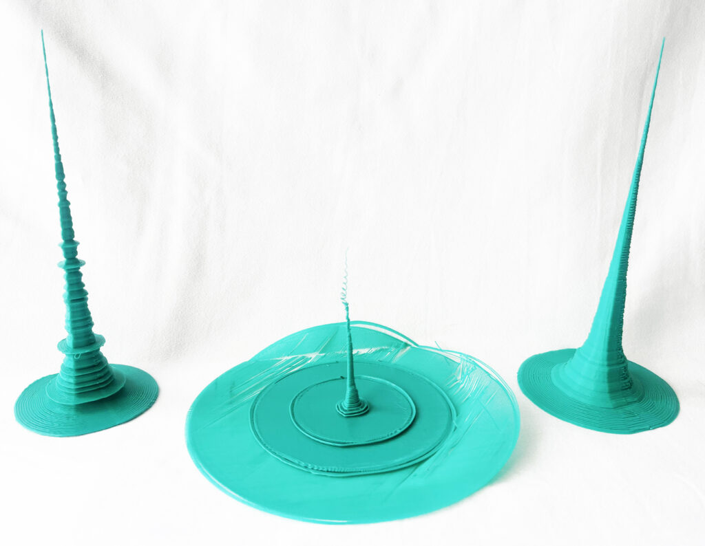
I played around with the different fields and finally settled on 3 different criteria:
– Total Deaths of Covid19
– Total Deaths all together
– Total Deaths of Pneumonia
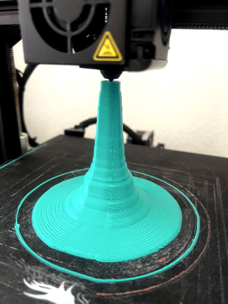
It was neat to see how different criteria produced different objects. Although, quite similar in outline shape, the final 3D prints were interesting to see and quite unique to look at.
Issues
I came across quite a few issues during my process on not only on the computational side. At first I had to figure out that the data was so large that I had to divide the entire set by 600 – 1200.
Then I had several issues with my printer. As I am not home most of the time, I would set my printer to print and when I came back the prints were disastrous. My printer got stuck on one spot two different times and created a little crater. I am quite glad it did not set my house on fire. Not sure if it could. I sure hope not.
I had to reset my bed leveling a few times, because for some reason, my magnetic top has warped somewhat and was causing me weird prints with missing parts.
Finally, I had to switch my data completely, because my dataset had such large inequalities, that the print itself would collapse on itself and when I tried to do support beams, it just covered the entire thing…. so in the end I switched my Total set by State to the Set on Pneumonia deaths instead. The results were not quite as beautiful, but unfortunately I run out of time.
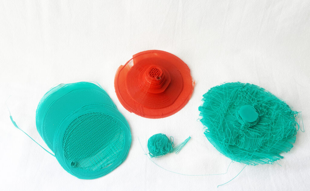
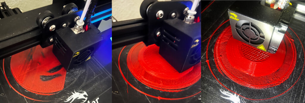
And it happened more than once:
Final Thoughts
I enjoyed this project, and it was very interesting to see the physicalization of the data. I wish I could have made more dramatic shapes, but I stuck with simpler design for the time-constraint purposes.
In the future I wish to make the map of mountains for my friends in Colorado, who live in the wilderness and I bet they would enjoy it as a Christmas gift. Thanks for the idea!
Files
My Grasshopper File can be found HERE
(https://handandmachine.org/classes/computational_fabrication/wp-content/uploads/2023/10/MichaelaUrichLA3.gh)
Hi Michaela, I liked how unique the prints turned out. I’m sorry they didn’t turn out the way you planned. It’s interesting how one can visualize Covid data and Covid deaths in a physical format.
Hi Raneem, thank you for commenting and your positive message. I couldn’t really think what data to focus on, so Covid being such a big part the past few years, I knew there must be a lot of data, so it was an easy choice. However, sorting through the heaps of data, not so much … hahahah .
Hi Michaela,
I know you said you had issues representing/printing the data, but I quite like how extreme the shapes ended up being. The dataset you are working with is very impactful, considering it is rate of death. The fragility of the first layers seem powerful in its implications – your figures bring the numbers to life and make them understandable in a tangible way.
Hi Jaime, thank you for commenting and your kind words. I thought it was interesting how the numbers varied to largely. It was quite challenging to sort through it all, but in the end it was quite interesting to see different states’ statistics.