by Daniel Morales-Garcia
Dataset Selection:
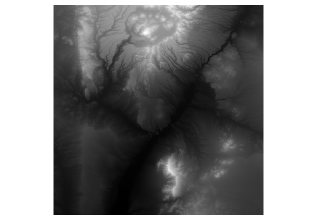
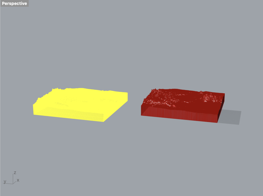
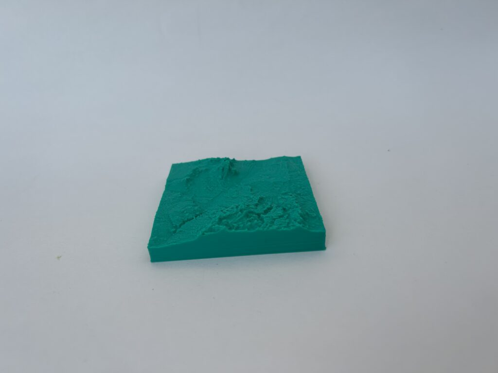
GeoTiff of Sandia/Jemez Mountains: This dataset provides an intricate terrain data map, suitable for fabricating a detailed 3D model that symbolizes the various elevations of both Sandia and a portion of the Jemez mountains.
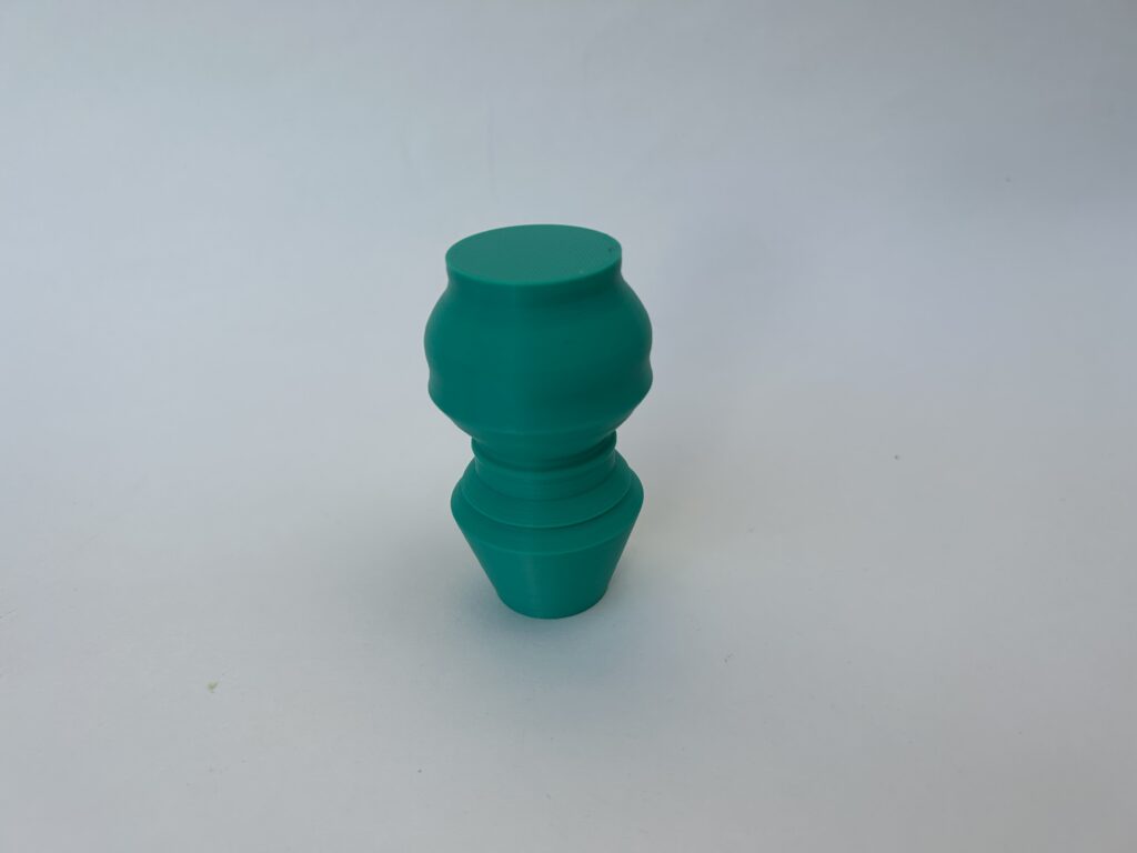
Heart Rate of student during an exam: This dataset gives insight into the physiological responses of students under examination stress. It serves as a potential tool to visually and tangibly capture the intense experiences students undergo during tests.

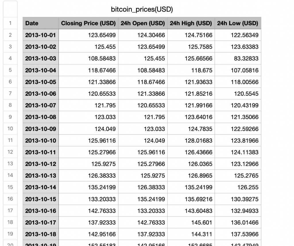
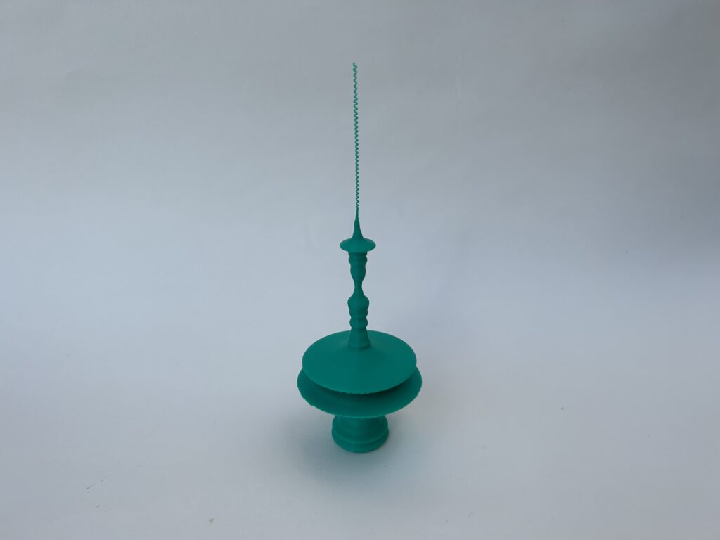
Price of Bitcoin from its inception until today: The dataset provides a chronological overview of Bitcoin’s value, enabling a visual representation of its notorious volatility.
How and Why:
How:
- GeoTiff of Sandia/Jemez Mountains: Sourced from The National Map Downloader.
- Heartbeats of students: Acquired from PhysioNet’s Wearable Exam Stress dataset.
- Bitcoin Prices: Retrieved from Kaggle’s Bitcoin Price Data (USD) dataset.
Why:
- GeoTiff of Sandia/Jemez Mountains: This dataset resonated with personal experiences, having driven up the Sandias and camped in Jemez. It offers a tangible connection to personal memories.
- Heartbeats of students: A reflection of personal experiences with pre-test anxiety, the dataset provides a deeper understanding of what students go through during exams.
- Bitcoin Prices: This dataset was chosen to provide a tangible representation of the cryptocurrency’s tumultuous journey over the years.
Data Cleaning and Filtering:
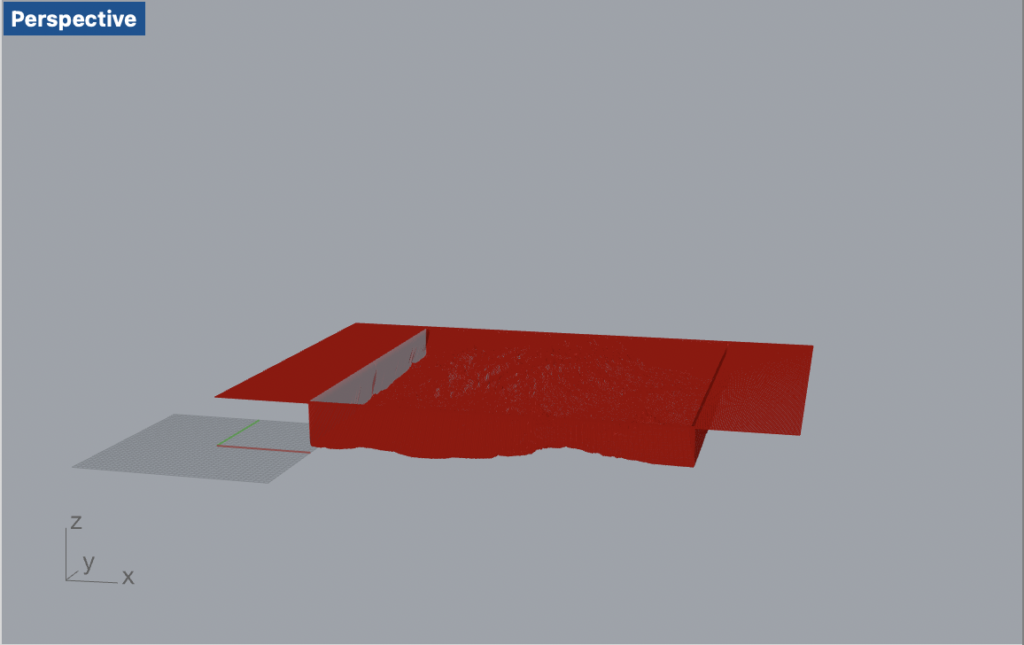
- GeoTiff of Sandia/Jemez Mountains: After procuring a square GeoTiff of both Sandia and a section of Jemez mountains, it was converted into a PNG format. A subsequent attempt to transform the PNG into a bitmap using an online converter introduced an unintended white margin to the bitmap’s side. This anomaly, when processed in Rhino Grasshopper, created a visual that resembled an inverted mountain.
- Heartbeats of students: The data, provided in a CSV format, was rather extensive. To manage its volume and maintain relevance, only the initial 500 rows from the CSV file were utilized.
- Bitcoin Prices: From the “Bitcoin Price Data (USD)💰” dataset, only the column representing the closing price for each day was considered. For ease of representation and to ensure stability in the 3D printed model, the data was refined to include prices at the commencement of each month. Additionally, any value falling below $800 was reset to $800 to guarantee stability in the 3D print.
By integrating these datasets into physical artifacts, the goal is to offer a tangible experience that goes beyond the conventional methods of data visualization, ensuring a more profound connection and understanding of the datasets’ essence.
Design Process:
Sandia/Jemez Mountains Design:
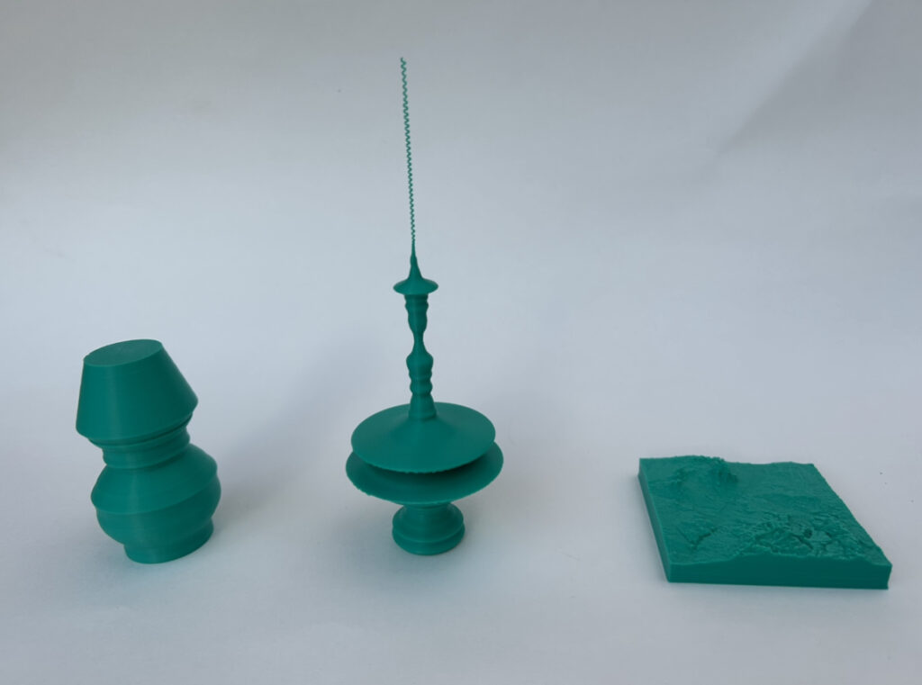
For the Sandia/Jemez Mountains dataset, I began by utilizing the 2D array input, where each element was tied to a pixel’s brightness, an indirect representation of the elevation for that specific terrain point. My approach was to convert these brightness values into a series of points in the 3D space. For every row in this array, a vertical (Z-axis) profile was generated using the brightness value as the height determinant. This not only mapped the terrain’s elevations but also formed a series of curves, thereby creating a topographic visual of the mountains. To enhance printability and the visual appeal, I ensured the inclusion of a base by leveraging the bitmap edges.
Heart Rate of Student During an Exam Design:
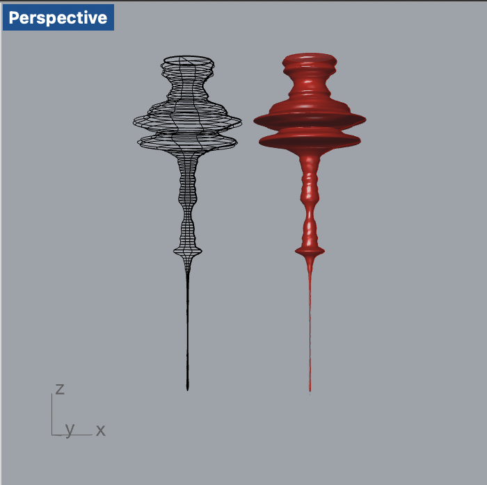
Diving into the heart rate dataset, I started by extracting this physiological data from a CSV. Given the extensive range of possible heart rate values, I opted to filter and utilize only those BPMs that were realistically feasible, falling within the 30 to 220 BPM bracket. With the intent of creating a tangible base for my 3D model, I initiated my design with 200 points set at a consistent heartbeat of 70 BPM, signifying an average resting heart rate for an individual in their 20s. Post this base, each successive point was mapped to the students’ heart rate data, offering a visual progression of their stress and experiences during the exam.
Bitcoin Prices Design
For the visualization of Bitcoin prices, I sourced the data from a CSV file which cataloged Bitcoin’s closing prices. To streamline the data and maintain focus, I chose to represent only the start-of-the-month prices. Keeping the 3D printing constraints in mind, I imposed a floor value for the Bitcoin price: any value that fell below $800 was adjusted to be $800. This was crucial to maintain the stability of the final printed artifact. The Bitcoin prices were then plotted against time, with the height (on the Z-axis) representing the chronological progression and the X-axis depicting the price fluctuation. This design effectively captured the volatile journey of Bitcoin over the years in a tangible manner.
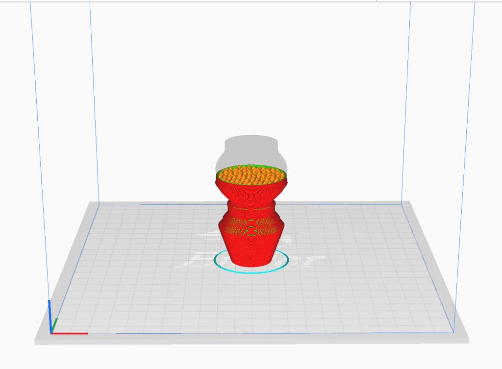
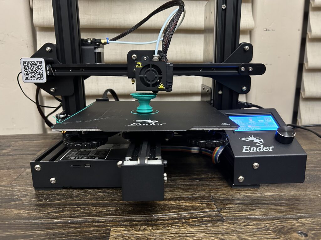
Printing vessels
Luckily, I had no issues during the printing process of my vessels!
Results:
Reflection:
As I delved into this project, I found myself on an journey that bridged the realm between raw data and physical design. With each dataset, I was driven by personal resonance and a curiosity to give form to intangible numbers.
Working with the GeoTiff of the Sandia/Jemez Mountains brought to life a terrain I’ve personally traversed. By converting pixel brightness into tactile topography, I could feel the mountains highs and lows in my hands, connecting with them on a more profound level than merely reminiscing about drives and camps.
Similarly, the heartbeat data was a deeply personal exploration. Having experienced pre-test anxiety myself, visualizing the palpitations of students during an exam was an evocative experience. It wasn’t just about physicalizing the data, but also about understanding and empathizing with those frantic rhythms, reliving moments of personal anxiety.
Lastly, the Bitcoin dataset was an enthralling ride through the cryptocurrency’s volatile history. By setting a base price and capturing the monthly fluctuations, the resulting model wasn’t just a depiction of financial ebbs and flows, but also a testament to the unpredictable nature of investments and aspirations.
This endeavor of physicalizing data has made me appreciate the immense potential hidden within numbers and patterns. It’s one thing to see a data chart; it’s entirely another to touch a 3D representation of the same information. Such objects dont just inform but tell stories, evoke emotions, and serve as tangible reminders of experiences, trends, and phenomena. Through this assignment, I’ve come to realize that while data provides knowledge, its 3D physicalization brings forth understanding and connection.
Code:
Hello Daniel,
I am impressed by your “Bitcoin Prices Design”. Its prices really changed a lot. It’s a tragic if a person buy on the highest point and sold during the lowest point….
Jingbo
Thanks Jingbo! I absolutely agree, the fluctuating nature of Bitcoin prices can be both exciting and nerve wracking. The 3D form really highlights those highs, lows and unpredictability.
Hey Daniel,
I really enjoyed your forms, in particular your heartbeat and bitcoin forms. I also found that same dataset in my initial search actually, and couldn’t quite get a grasp on what I would do with the data cleaning, so kudos to you for making a very interesting and revealing form using it! The bitcoin form is one of the better forms I’ve seen at visualizing some raw data. I know that I’ve certainly seen some graphs that do help visualize, but with the additional dimension I feel like it demonstrates things even better, as well as being much better art! Nice job with these!
Thanks Christopher. It’s interesting to hear that you came across the same dataset; data cleaning can indeed be challenging. Your feedback on the heartbeat and bitcoin forms is much appreciated. I’m glad to hear that you found it effective and artistic. It means a lot!
Hi Daniel,
I liked your Bitcoin data form. I’m a crypto investor myself and it’s cool to see the times where I wish I bought when it was low vs when it was at it’s high. I liked the way it printed when it was low, it gave like a spring appearance and feel. Great work!
Thanks Nathaniel! I’m glad you resonated with the Bitcoin data form. The spring-like appearance during the lows was an unintended but pleasant outcome, and I’m glad you appreciated it.