Data and Explanation
I was inspired by a podcast in which the interviewee explained how much art has positively impacted her mental health journey, in particular the Japanese art form that connects broken pieces of ceramic with gold. The art form Kintsugi creates a new vessel that is only possible with broken pieces. Depression can make you feel broken, and this is a topic that is personally important to me.
I chose a data set on depression that looked at adults responses form Patient Depression Questionnaires (PHQ9) over the span of a year from 2013 to 2014. This a tool frequently used to diagnose depression. It asks the patient to indicate how frequently they suffer from depression symptoms. There are nine symptoms with the following possible responses: ‘nearly every day’, ‘more than half the days’, ‘several days’, or ‘not at all’. I chose to sort the columns of responses by the symptoms that had the highest value for the people who responded with several days. This pattern was shared across all responses, except for the ‘everyday response’ in which the top two symptoms for that response were inverted compared to the other responses. Sleep problems and low energy were the two most common symptoms. The data set is from Our World in Data, a scientific publication. More specifically this data set was gathered form a study put out by 2013-2014 National Health and Nutrition Examination Survey in the United States (NHANES). Here is a link to that original study: https://link.springer.com/article/10.1186/s12888-018-1696-9. I chose the data from Our World in Data because a lot of the of the cleaning I would have done to the data was already completed. Here is the link to the data I used: https://ourworldindata.org/grapher/depressive-symptoms-across-us-population?tab=table
Design Process


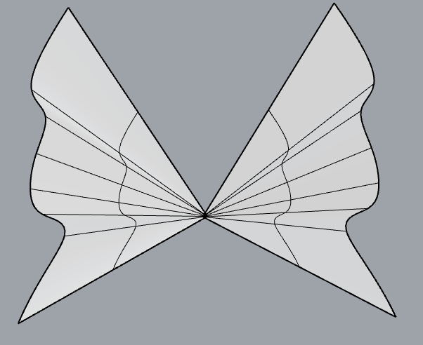
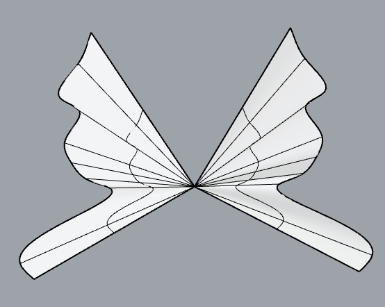
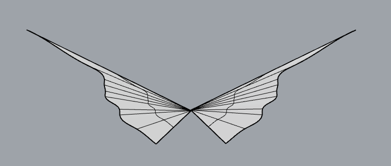
I really struggled with this assignment. I panicked and tried switch data sets. In the end I started by working through the class examples with my chosen data set. Then it finally hit me that I could make a butterfly taxidermy. The data defines the wing shape of each butterfly, which is a different response category. Each point of data I connect a line to the origin. The more frequent a symptom occurred the further the endpoint was from the origin. To add a little interest I added a random z value that gave the form a subtle wave. I then lofted the wing.
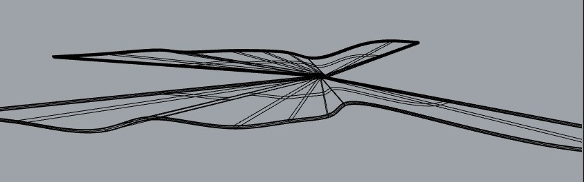
Trying to make a thin and beautiful artifact is where I spent most of my time. I love that there is an inherent connection between metamorphosis and butterflies since coping and thriving with a mental illness is a transformative process. I was additionally pleased that the only response category that did not make a compelling butterfly wing was the ‘not at all response’ which ties back to my original inspiration. To be clear I in no way think that people that responded within the other categories are in any way broken. I think that the discovery that there needs to be depression symptoms present to make my object was nice parallel to the need for broken vessels in Kintsugi.
Printing Heartaches
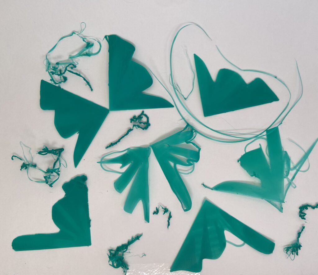
I struggled a lot with my printing. I leveled repeatedly and had my printer running nearly nonstop. I want to reprint my butterfly wings but change some problematic geometries. I also want to keep playing with the wing thickness. I also found that changing the printing speed and bed temp really helped my wings to print. Bellow are more failed prints.


Final Products


Reflection
I am so intrigued by data physicalization. I want to do more within this area of computational fabrication. Data is important because it educates us. It can be hard to make someone feel something about a piece data. Having something that people can physically connect with is an incredibly powerful tool. I love that data allows us to tell a lot of different stories. This is also the element of data physicalization I find the most challenging. It is far too easy to fit the data to what I want to convey. It is a fun puzzle trying to figure out how not to compromise the integrity of the data in an effort to make a compelling form. The fact that I could make forms that told the same story as one of the main findings in the original study is a form of communication I have never considered.
Hey Erin,
Turning depression data into butterfly designs inspired by Kintsugi is a very cool concept. Love how you connected transformation and healing. Can’t wait to see your future projects!
Best,
Daniel
Hello, Erin:
It is so cool to transform the depression data into butterfly shapes! I believe if you make the product a little bit thicker, it would be easier to print them out. I would love to see the final products on Tuesday!
Hi Erin,
The butterflies are a beautiful representation of your data. I hope that you are able to get the wings printed how you want! You mention the art of Kintsugi at the start of your post, do you think it would be possible to repair the broken wings in the same way?
This would be a fun thing to do with 3D printing pens (it’s a handheld extruder essentially)!
As someone who has struggled a lot (a lot a lot) with their mental health with over the last *vaguely gestures backwards* this is such a lovely idea and concept. The use of butterflies as a metaphor for transformation and healing is an excellent way to use the data, and I would love to see you explore this further.