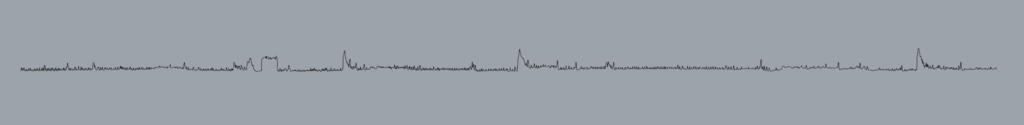
I chose to explore heart rate data that I collected last year. A few years ago my partner was diagnosed with epilepsy. While we were figuring out his medication, he would have small seizures during the night while sleeping. I started recording his heart rate with a smart watch during the night, so that I could tell when he would have a seizure. I could tell when he had a seizure because his heart rate would spike about 120 beats per minute (bpm). I downloaded one week of data from January of 2022, when my partner was having seizures almost every night. I was missing one day, January 20th, because we did not turn the watch on that night. I used data from midnight to 6:30 AM. I organized all the data in one spreadsheet. For some of the days, we went to sleep after 12:00 AM, or woke up before 6:30. On these days, I replaced the blank cells with zeros because my Python code did not work with blank cells. Below is a graph of one night of heart rate data.
Heart rate data for Jan 16-21, 2022
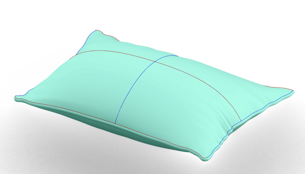
Since all the seizures happened at night, I thought it would be good to make a form that had to do with sleep. I started with a pillow form. I modeled it in Rhino by drawing three horizontal curves (red) and two vertical curves( blue) that defined the form of half a pillow. The middle horizontal curve was curved up to give the pillow three dimensions. I used the NetworkSurface node in Grasshopper to make a surface that formed half the pillow. I then mirrored the half pillow to get the full form.
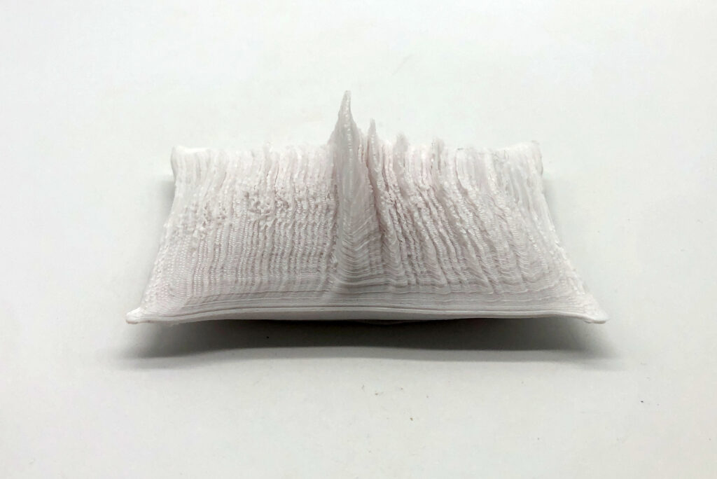
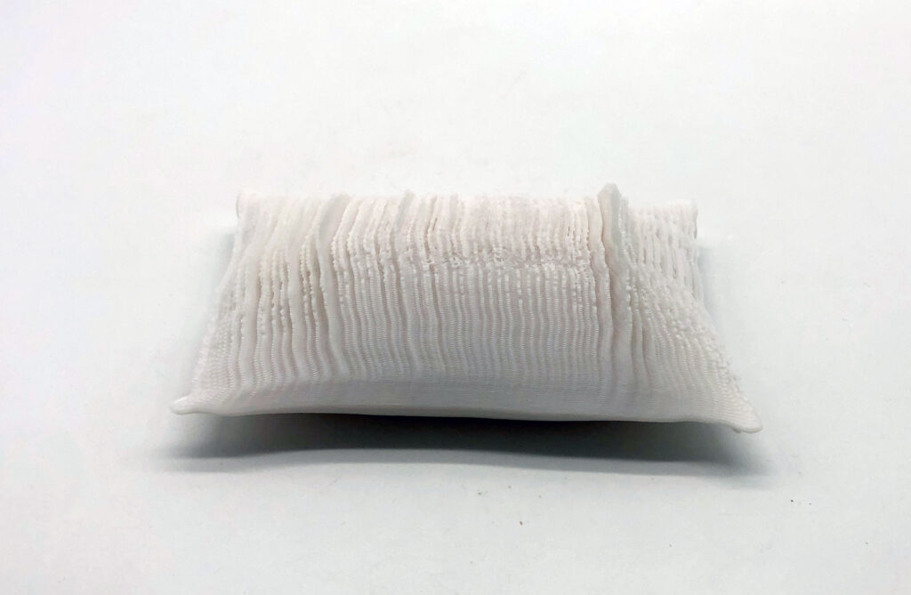
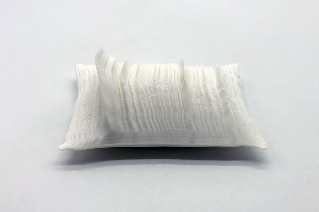
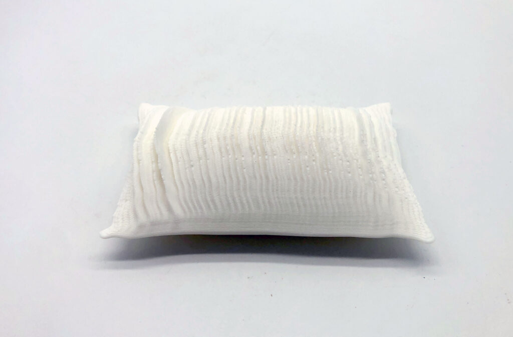
Having a seizure disorder was very disruptive to our lives, so I wanted to represent this with the forms I made. I decided to replace the middle horizontal curve with the graph of my partner’s heart rate. This would make a the gentle curve of a pillow into a jagged form. I played around with how to do this, and found that if I used a whole night’s data on one pillow, the data was too scrunched together to get a form that would print well. I figured out that I could get forms I was happy with by splitting the data into 40 minute segments and using each of those on one pillow. I also scaled the vertical axis of the data so that it was not too tall. I used the plot function we made in class and then the Flow node in Grasshopper to bend the plot to fit the middle curve. Here are seven pillow forms that represent heart rate data on January 16, 2022 from 1:50AM to 6:30 AM.
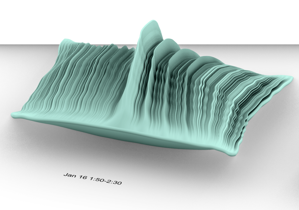
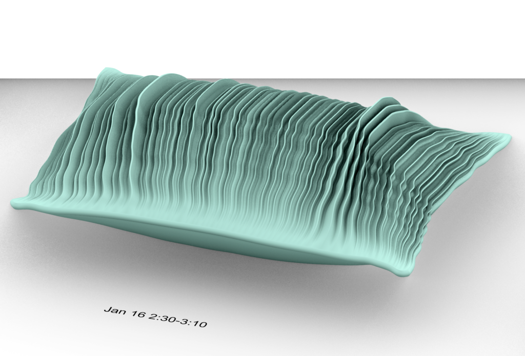
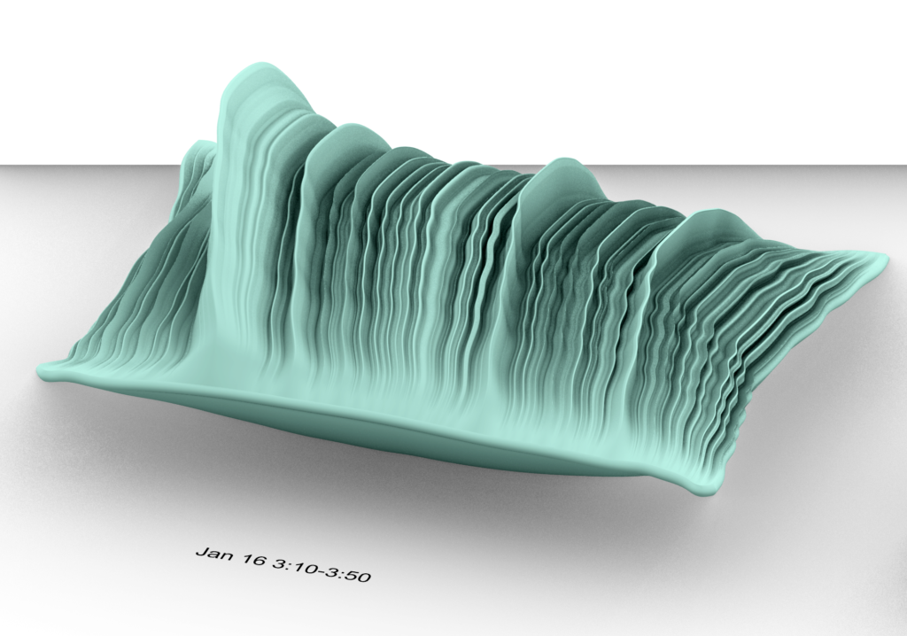
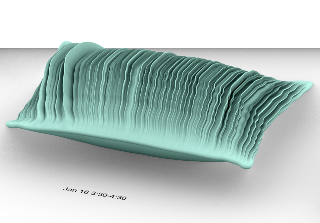

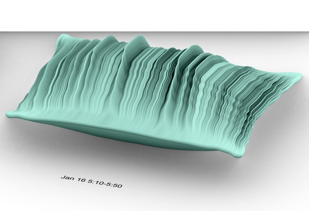
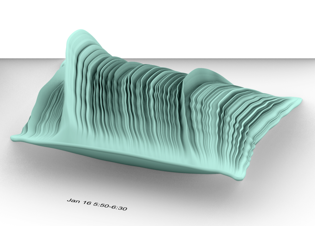
Here are pictures of my 3D printed forms
Overall, I enjoyed trying to physicalize data even though I found it difficult. It forced me to make forms that I would not have made on my own. I found it difficult because it feels like there are infinitely many ways to represent data and each one imbues that data with different meaning. I found it hard to figure out what I was trying to communicate by physicalizing the data. Even though I like my idea, it feels a little route one or on the nose. I did like that I did not have to have all these answers when designing objects that represent data. I was not making a graph or visual representation that had to be published or used to make sure others fully understood the data. Making these objects allowed me to try to communicate a feeling more than just pure information. I also worried that I was exploiting my partner’s illness for a class project. He gave me his permission to use the data, but I still felt a little uneasy using personal health data. On the surface, data can seem impartial and just a true recording of what happened, but this project reminded me of how much control we have over the meaning and feeling of the data by how we present it.
Hi Camila,
I love how much thought you put into the design and representation of this data, adding the curves to the pillow makes a really powerful statement. I know you and I have already discussed the complicated implications of exploiting data for art, but I feel like you’ve represented something very personal in a thoughtful and very respectful way. I really love these pieces.
Thanks Jamie!!
Hi Camila! I’m very enthralled by your pieces. I love how multidimensional they are, forming meaningful connections between the information, the form, and the impact on your lives. I found it very inspiring how you implemented something personal and significant. I appreciate that you put thought into how to imbue feeling, and how to communicate something through the physicalization, going beyond just physicalizing it because we can. I can see why you have qualms about using this data, though I really appreciate the vulnerability and artfulness you shared though the project. I don’t see it as much as exploitation, but rather a way to make a piece of art that can hold a part of that time in your lives, and that this assignment created space for you to do that. I understand how complicated the feelings around things you create can be though – I think that art is a big part of how we are able to parse through complicated feelings.
Thank you for sharing!
Thanks Lauren! I really appreciate the kind words and it’s good to hear that my concept was communicated well.
What a fantastic idea, set of data and your design all working together as one. You totally nailed it in every aspect of this assignment. The data in particular was a great idea especially having to deal with it on an intimate level. And what a great way to physicalize the situation happening to your husband. I really enjoy your presentation. Thanks for opening our eyes.
Thanks Christopher!