Data:
For my assignment, I was able to find data on road vehicle accidents from 1988 to 2019:
https://crashstats.nhtsa.dot.gov/Api/Public/ViewPublication/813141
(Data used on page 35 of the pdf, 19 of the article)

Design:
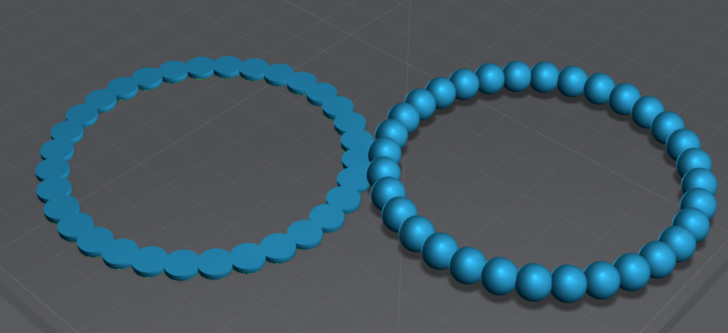
While designing my shapes, I had one single idea in mind that took up most of my time for the assignment. I wanted to create a ring of spheres/ovals/eggshapes, and their height would change based on the given data (by year). I was able to achieve this shape with some difficulty in the printing process. But I was able to design very close to exactly what I was looking for. The other two shapes I did were vessels similar to what we did in class, which both represented the data a different way.


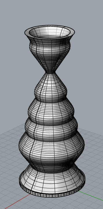
This shape is represents the number of fatal crashes from each year. The bottom of the shape is 1988, and the top of the shape is 2019. I did find it interesting that the number of fatal crashes (or total crashes in general) did not change drastically over the course of 31 years. This is the largest shape, the printing process took about 10 hours.

This shape represents the change in the number of crashes from year to year. The radius of the vessel decreases if the number of total crashes went down from the previous year, and the radius increases if the total crashes goes up from the previous year. Printing this shape took about 3 hours


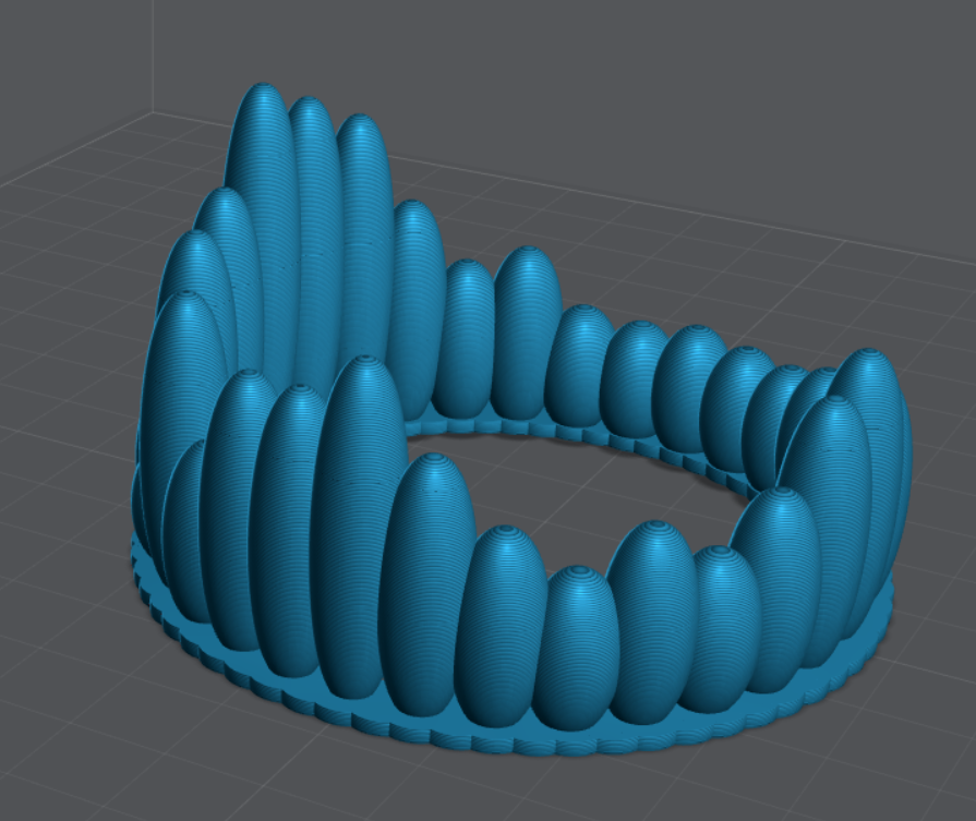
This shape took up the majority of my time for the project. Each egg is representative of a year, and the height of the egg is determined by the difference between the total amount of crashes that year and the average amount of yearly crashes across the dataset, the larger the difference, the taller the egg. While I was able to model very close to what I had envisioned when I started the assignment, printing said model did not work out initially.
Printing:
Printing the first two shapes was straightforward, but the egg shape took some effort. Without a base, the eggs only had a small contact patch on the printing plate. And the printer ended up printing only small dots that wouldn’t always stick to the plate. I then tried to cut out the lower parts of the eggs so that their contact patch was larger. This did work to an extent, but there were still some eggs that were not sticking to the plate. At this point, I ended up creating a base from similarly sized spheres to match the width of the actual print. To create this base, I cut off the top and bottom of the base spheres to get only the widest point, and merged that into the eggshapes. This print did work, but the base turned into a bit of a mess as a result. There were definitely better ways for me to resolve the issue I was having (building a base through grasshopper was probably the correct way to go), but this was the solution I went with, mostly because I was curious if it would work.


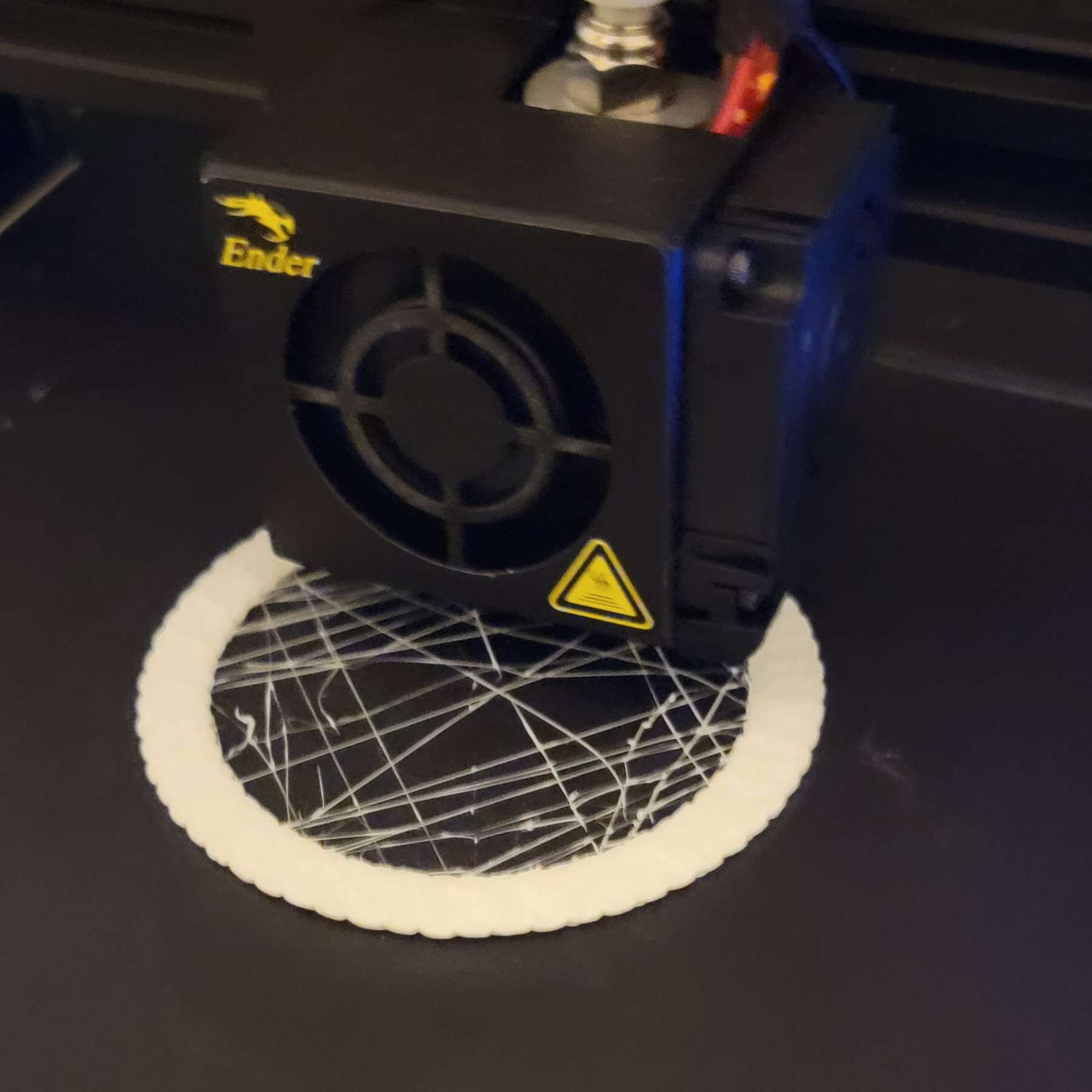
On the left is what resulted after just cutting off the bottom of the eggs, some eggs would not stick to the plate. on the right is what I was able to print.
Reflection:
This was an interesting project, and I’m glad I was able to pull off the egg shape design (with some difficulty). Working with data actually made designing the shapes a bit of a challenge, as I had to try to find a way to express the changes in data. There are a lot of interesting ways to represent data. It is interesting to visualize exactly how the data changed over the years.
My Code download link: https://handandmachine.org/classes/computational_fabrication/wp-content/uploads/2023/10/AndyThornhillLA3.gh
CSV file used download: https://handandmachine.org/classes/computational_fabrication/wp-content/uploads/2023/10/AndyThornhillLA3.csv
Hi Andy! Great job on your data physicalization. I really appreciate how your three forms are all representing the same data set, but in completely different ways. Instead of just picking a subset or different part of the data to physicalize, you used your other forms to interepret the data in a way that helps us understand it better. Your second vessel is such a simple, yet effective, way of representing data. It distills the data and forces the viewer to only notice what you want them to notice about the data. I also love the ring of egg shapes and appreciated that you pushed yourself to model different forms with the data.
Hey Camila! I’m glad the second vessel ended up working out as it did, I didn’t want to have 3 different datasets so I had to try to find different ways to look at the data and I’m glad it worked out.
This was a great way to look at car and driver data. Being able to see the peaks and then go back to see what may have caused such up or down swings in the data and the design is important and makes it feel much more real. And I love the design of the eggs. What a different look into other types of data. Good job.
Hey Christopher, I’m glad my prints turned out visualizing the data as well as they did, I’m also glad you liked the egg shape as thats the one I spent the most time on.
Hi Andy, I really liked your egg shape data form. I never would’ve thought to make the data into different egg-like shapes and make a crown-like appearance. Very cool, great work!
Hey Nathaniel! I ended up spending most of my time on the egg shape so I’m glad it turned out as cool as it did.
The eggs remind me of coral polyps and other marine invertebrates–I love your interpretation of the data. I am also really curious to try Lychee Slicer now as well!