Choosing My Data Set
I knew right off the bat, that I wanted to use data that was associated with elevation. I found a database that contained a lot of information on a lot of topics. Data.gov. I found a data set that measured the minimum and maximum temperature at a certain elevation and that amount of precipitation in Petersburg. The data represents the whole year of 2010, with an elevation of 466.3 and latitude and longitude of 48.0355 and -98.01. My cleaning process was fairly simple. There was some repeat days that was in the data and I decided to get rid of the Station, Station Name, Elevation, longitude and latitude since those are all final and don’t change throughout the data set. I am going to attach the cleaned data set, and the original data set to see the cleaning process. The first one is the cleaned and the second is the original.
Figure 1. Minimum Temperature and Maximum Temperature
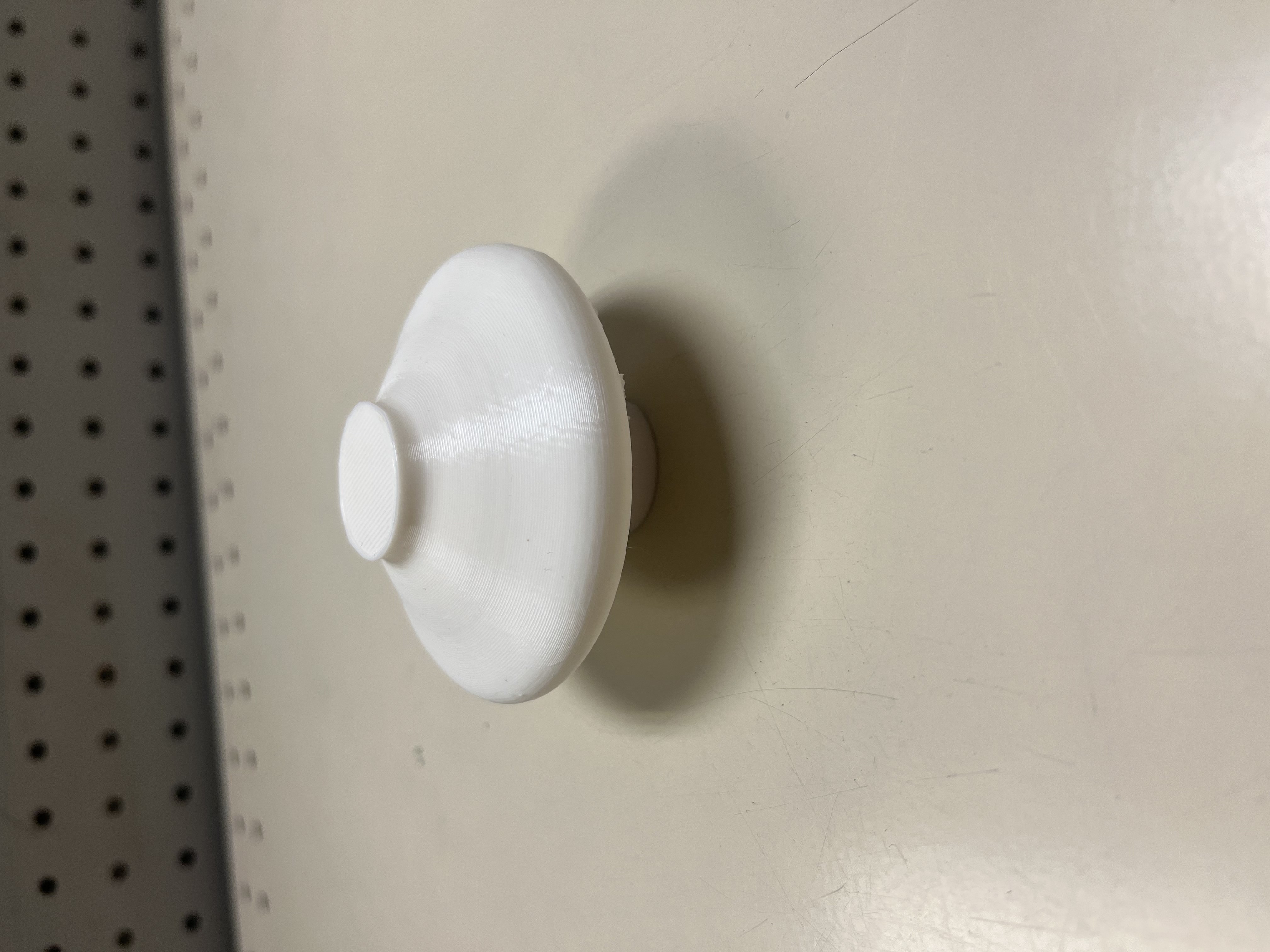
For this figure, I created the graph based of the min and max values of the temperture for the whole year. It created a parabolic type graph. In my original object, the middle of the graph would be lower than the sides of the object, so I decided to cut it off in cura.
Figure 2. Maximum Temperature and Minimum Temperature
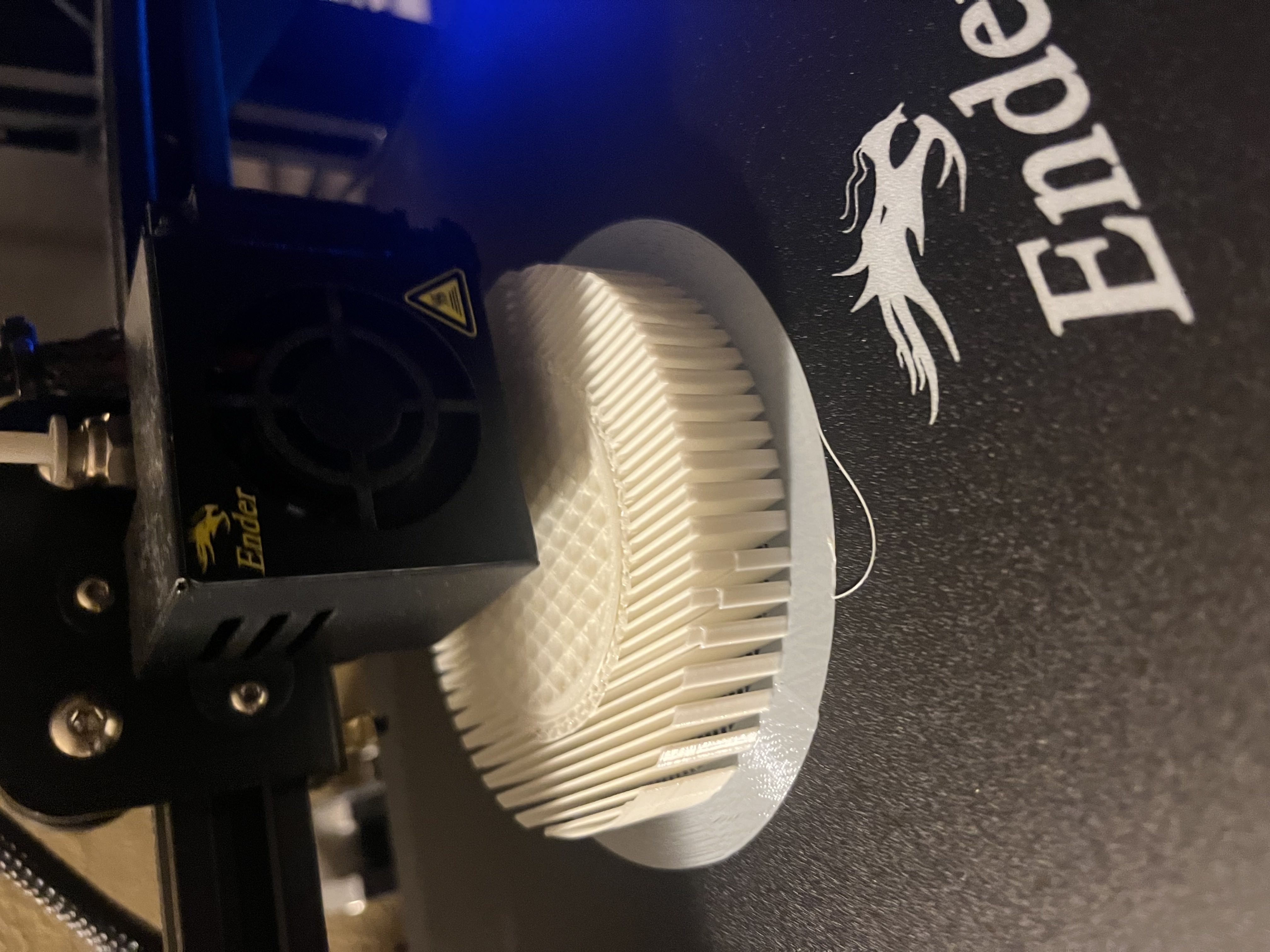

For this figure, I flipped the data values when plotting the points of the graph. In the object diagram from rhino, you can see the actual graph of the data. This object gave me problems with printing because of the extreme over hangs, I had to put supports on it. I tried to make the walls thicker and the infill a better pattern, but it really needed the supports to print successfully.
Figure 3. Maximum Temperature and Precipitation
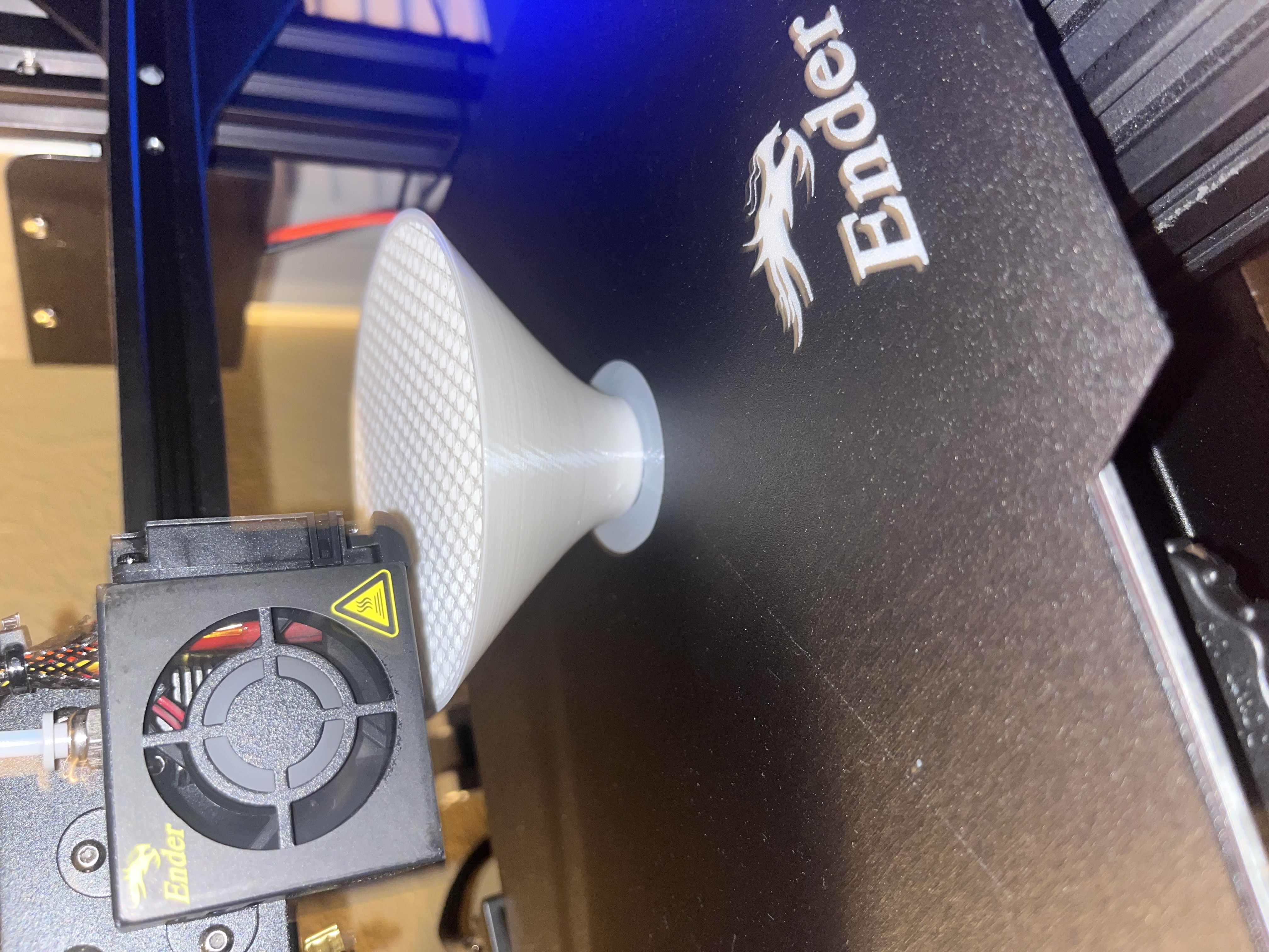


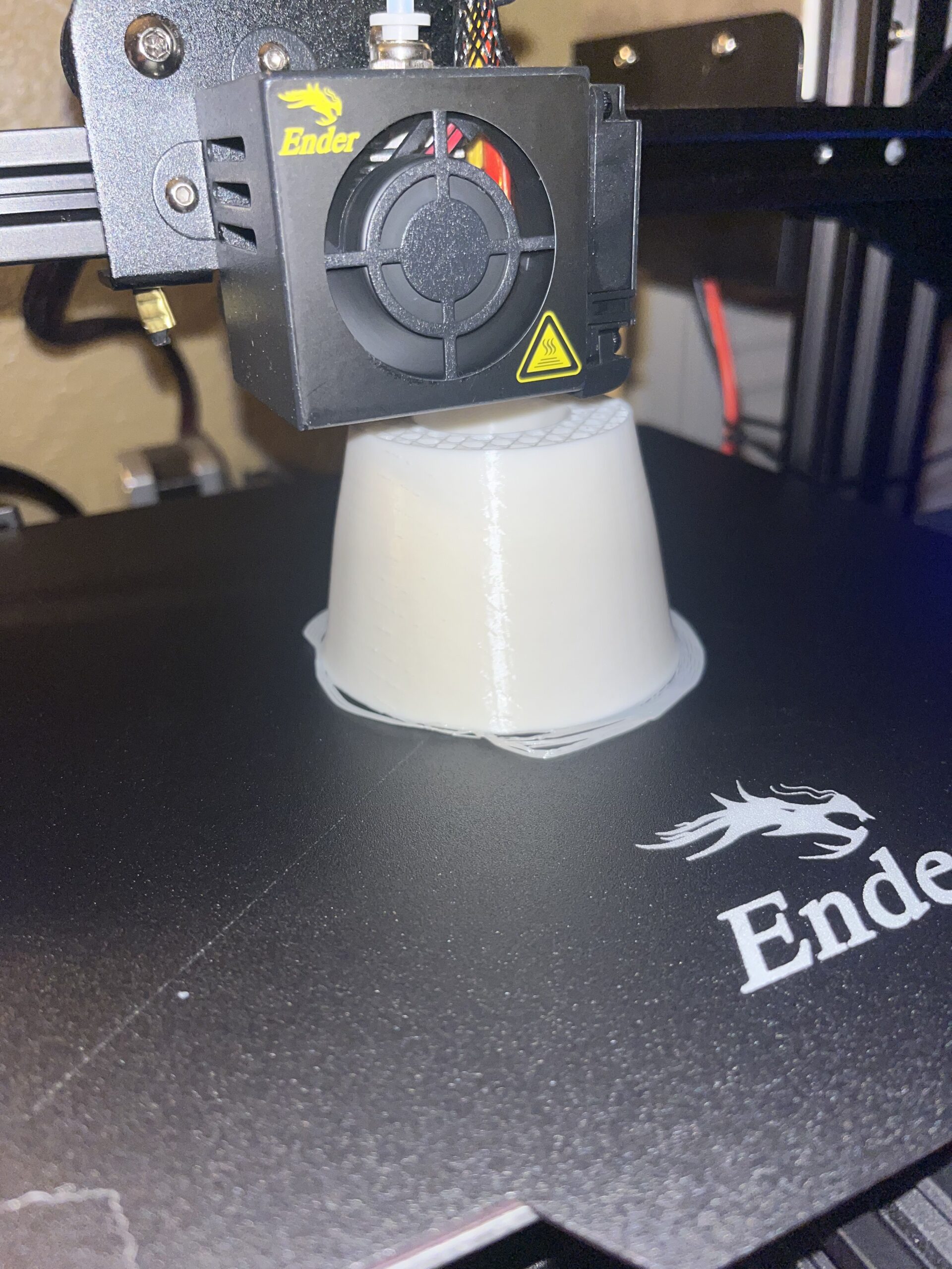
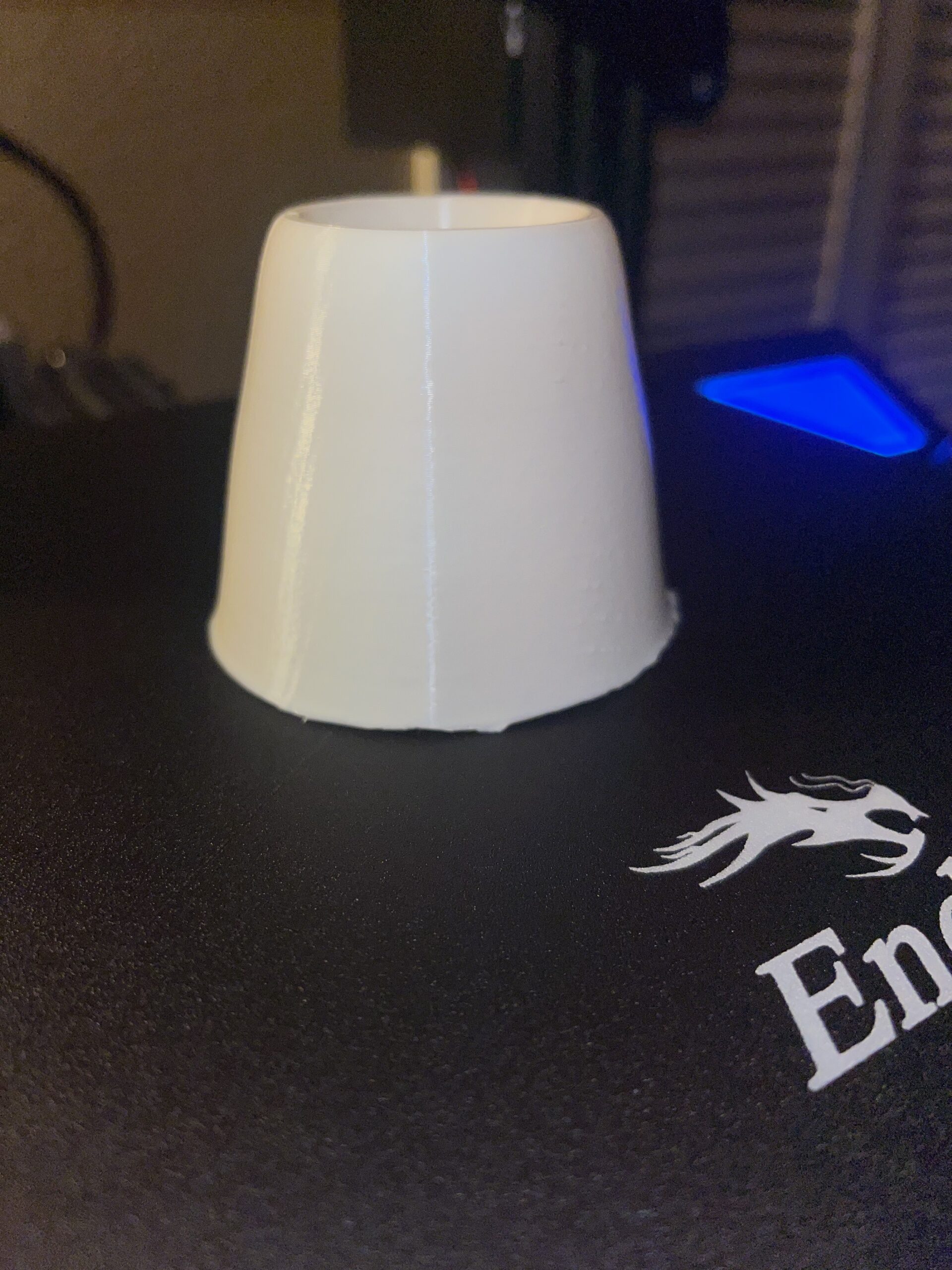
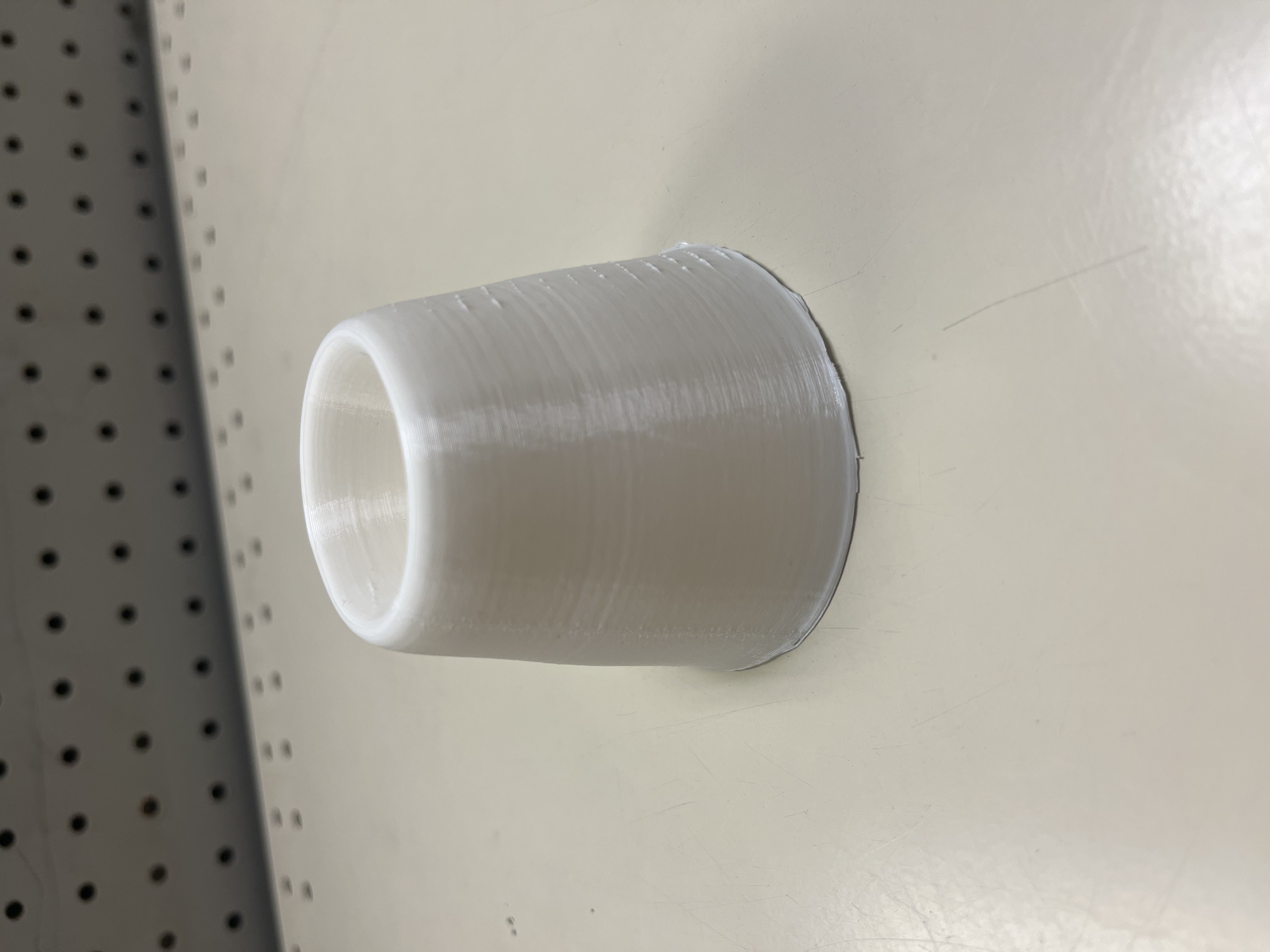
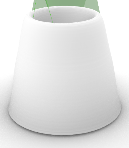
For this figure, I plotted the maximum temperatures and the precipitation for each of the days in the data set. It created an interesting graph that just wrapped got bigger over time, creating some sort of cone/ pyramid shape.
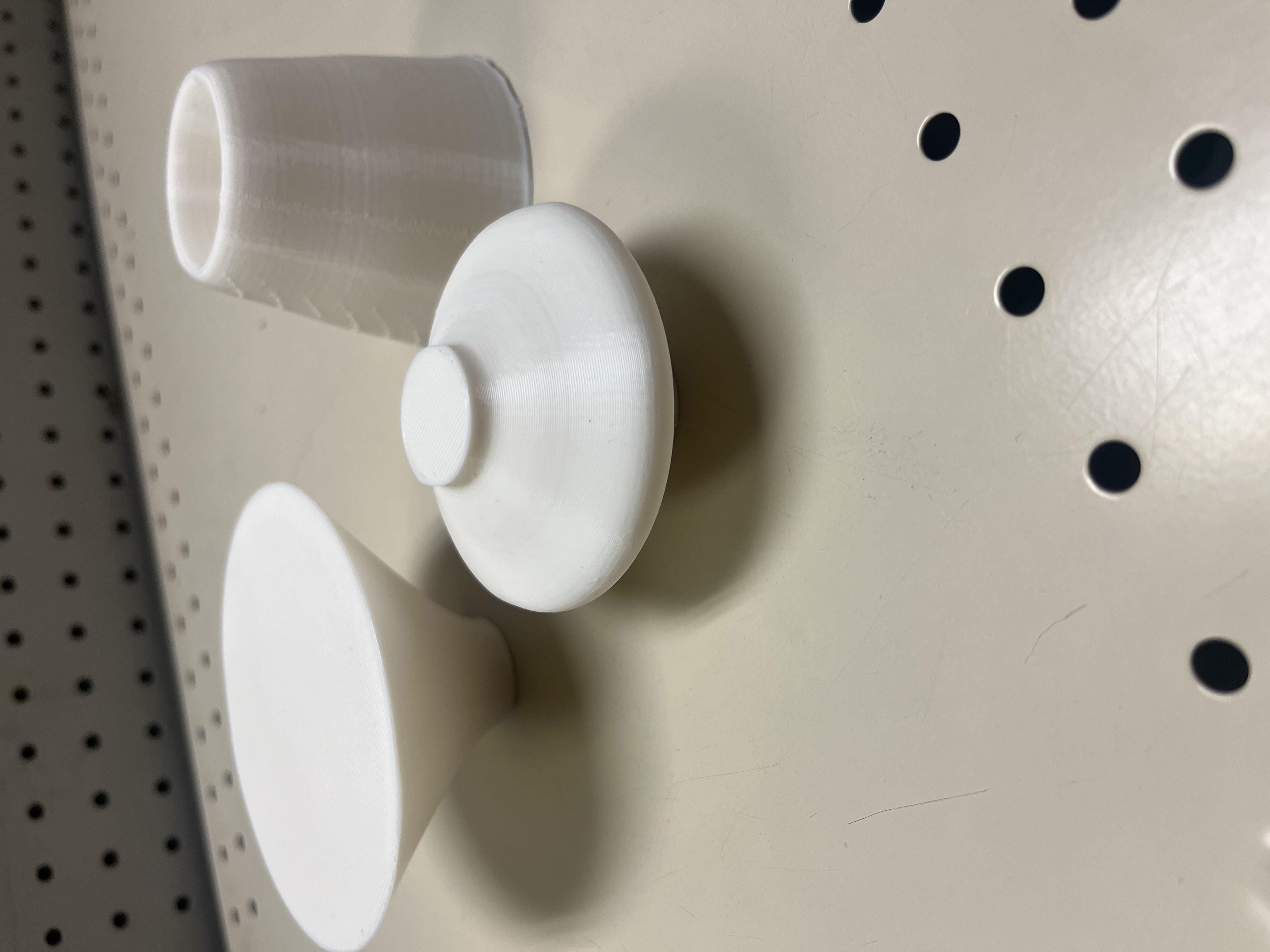
Final Objects
Reflection
The process of creating 3D objects that represent data is really exciting. Instead of just creating the graph and examining it, we can hold the data in our hands and really see what is happening with the data. With 3D objects, we can see what exactly is happening with the data, and where the extremes are in the graph. For example, in my first object we can see that the data creates a parabolic function.
My printing process went much more smoothly this time than the previous assignment. The only problem I had was my initial layer wasn’t sticking to the bed. After watching a video on improving my prints, I cleaned my bed and edited the printing settings to provide a better adhesion design and my prints were printing successfully. This time the only object that needed supports were my second object. Just like the first assignment, I had to keep my family from messing with my prints, which happened a lot more than it should have.
Here is my code.
I don’t know why I am surprised that the lines of the physicalization reflect the data we chose. I initially missed the parabolic function in your first form but now that you pointed it out I see it!
Hi Erin, When I initially got the data into grasshopper the lines were so big that I had to zoom all the way out just to see the physicalization. I was really lost with that until Professor Leah helped me.