1) Visualization of the world’s birthrate:

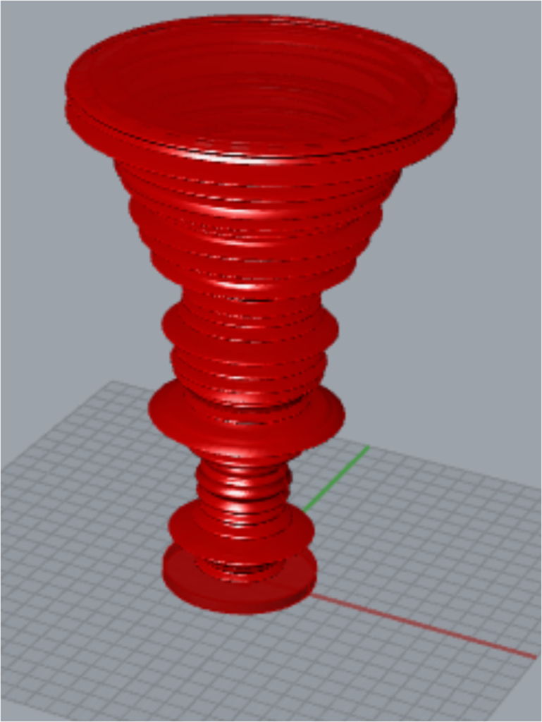
The dataset is from Kaggle, which is avaliable here. The file used in this project is called life_expectancy, which contains life expectancy information of 165 countries. For each country, there are four vectors, male_life_expectancy, female_life_expectancy, birth_rate and death_rate.
For this project, I used only the birth_rate vector following the process from class. First of all, I plot different countries along the x axis and their birth rates along the y axis. The outer surface was then generated by spined the curve around the z axis. It was almost the same process after that, except that I adjusted the birth rate by subtracting a distance. As a result, I am able to obtain the inner surface of the object. Finally, I added a base.
My first try failed because the wall, which is the distance between the outer surface and inner surface, is thin. The final project is still not perfect. More supports should be helpful in the furture.
2) Side view of Washington


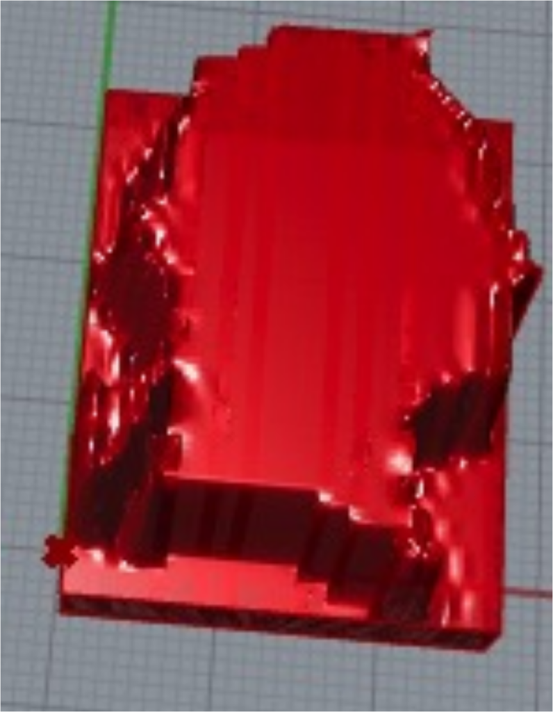
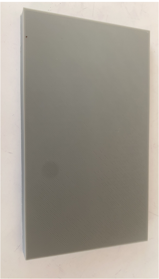
Based on the last two classes, I created the second project using a side view image of Washington. The most challenging part of this project is finding the right image to visualize. With only two colors, this picture is much easier to present as a beautiful and meaningful visual. A further challenge is that if I use the code from classes to bake, I only harvest a rectangular prism, as shown in the last figure. In order to bake the second project, I had to merge the wall and the upper surface together.
3) Protein structure visualization


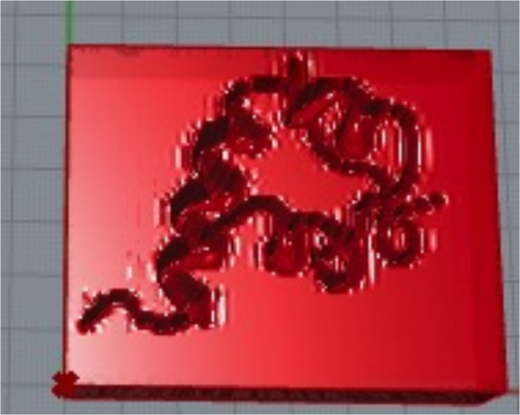
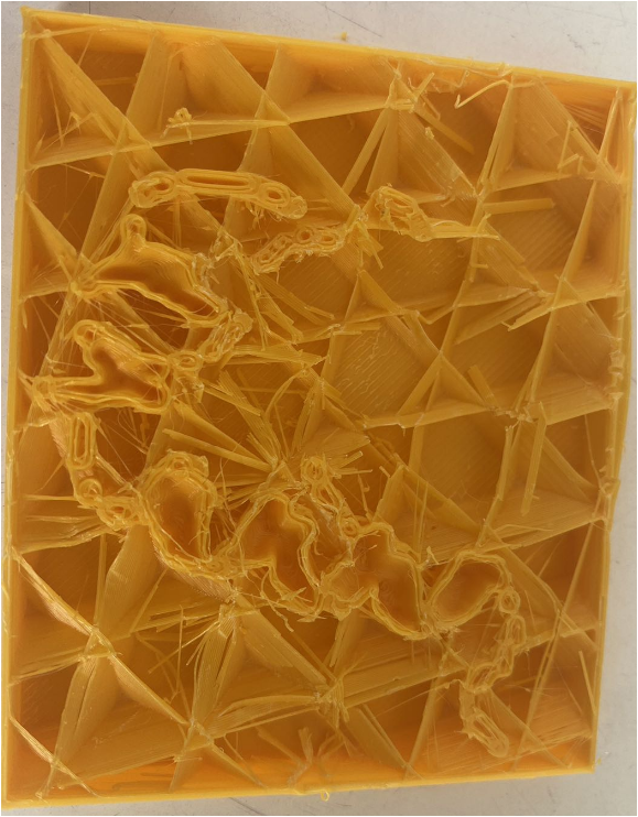
A protein called “1BOM” is shown in the picture. This picture was generated using ChimeraX, a software program for visualizing proteins. The protein structure was printed on a plain using a similar process to that used in project2. Similar to the projection of a protein’s secondary structure on a plain, we can observe α helix on it. The last one shows a failure due to a stuck filament.
Reflection
The most significant difference is that I am able to touch the date. As an example, consider the third project. α-Helix refers to a second protein structure. Looking at the 2D image, I can visualize it as a spring-like structure. However, by printing it on plain, I am able to touch and feel the 3D structure. Therefore, this process is more conducive to the visualization of 3D structures. Additionally, visualization learning is an important component of learning. The best way to teach students what a cube is by showing them a cube; similarly, the best way to teach students what a protein is by showing them a protein structure. In this regard, 3D data visualization is the most effective method.
The codes are available herehttps://handandmachine.org/classes/computational_fabrication/wp-content/uploads/2023/10/JingboLiangLA3.zip.
Hi Jingbo!
It’s fun to see the data you chose and their corresponding forms; I look forward to seeing them in person Tuesday. I particularly enjoyed your point that data physicalization is a profound tool in education. I think packaging information in as many different mediums as possible is critical to providing the best education for everyone.
Hello Erin,
Thank you, I also like your project.
Hi Jingbo:
The idea of mapping the protein contour and Franklin side face onto a 3D printing artifact is brilliant! Great work!
Thank you
I also enjoy your 3D demographic map.