Part 1: 2D Tiles
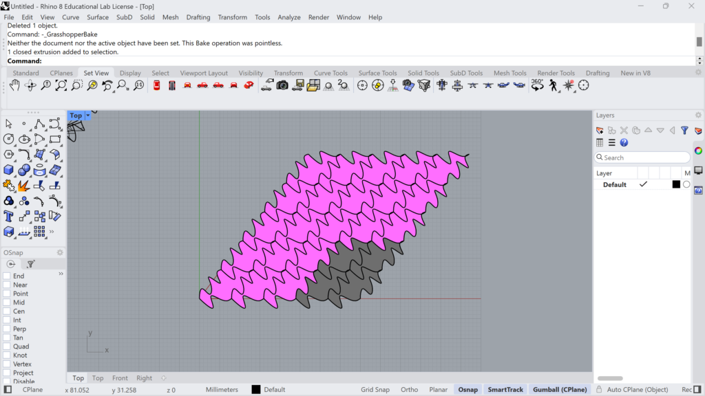
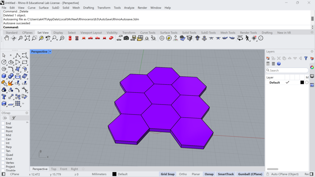
I really struggled with this assignment. Not because it was necessarily hard, but for some reason I misread the prompts and made it way more difficult than it needed to be. For the design of my 2D tiles I just played around with curves until I found a pair that made a nice set of tiles / tiles that I liked the look of. The code for this part was pretty self explanatory so I didn’t have much trouble here, it was mainly with the hexagonal and surface morphs prompts. For some reason I made the hexagonal portion way more difficult than it needed to be and trying to make it super similar to my other tiles. At the end of the project I realized that I was making it way too difficult on myself and redid my code in a way that made way more sense and was way easier. All of my code is located at the zip at the end of the post.
Part 2: 3D Printed 3D Tiles (70%)
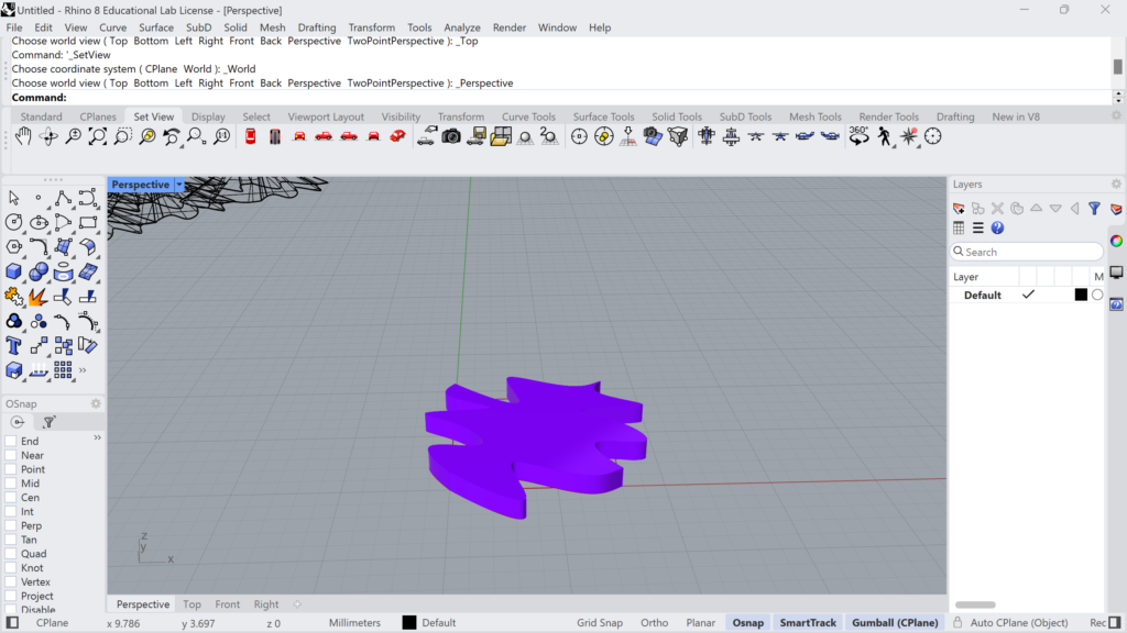
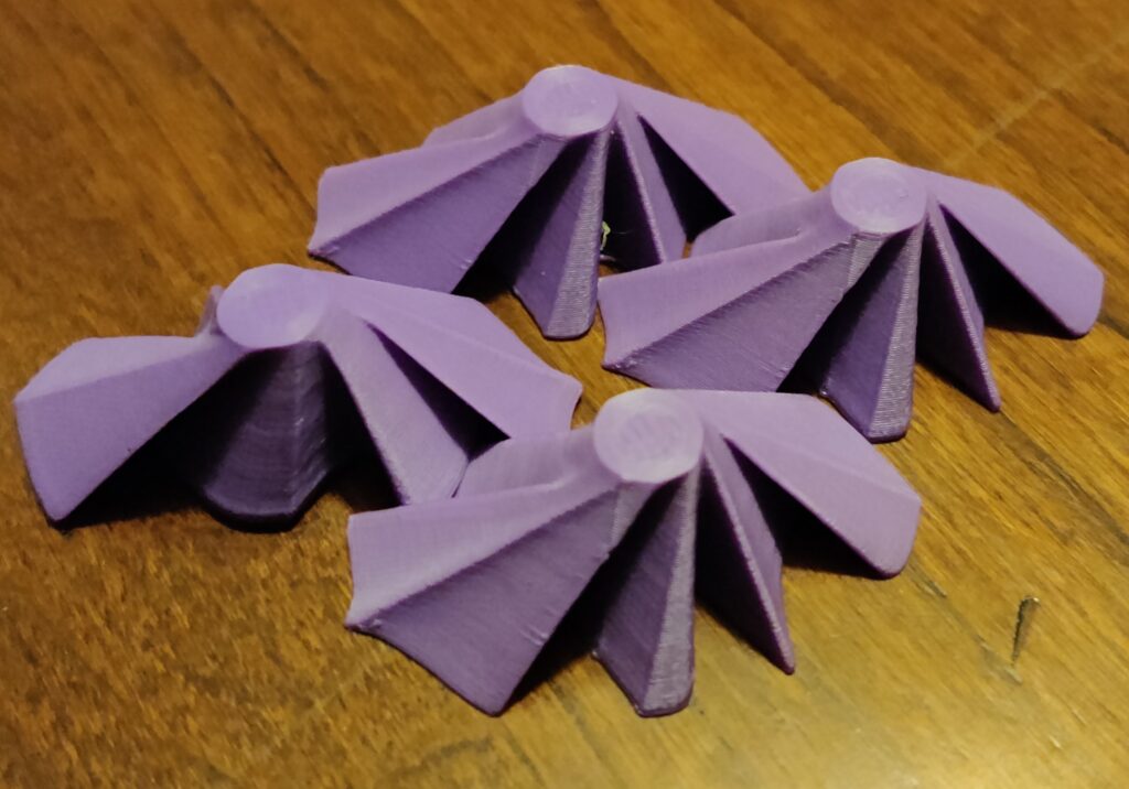
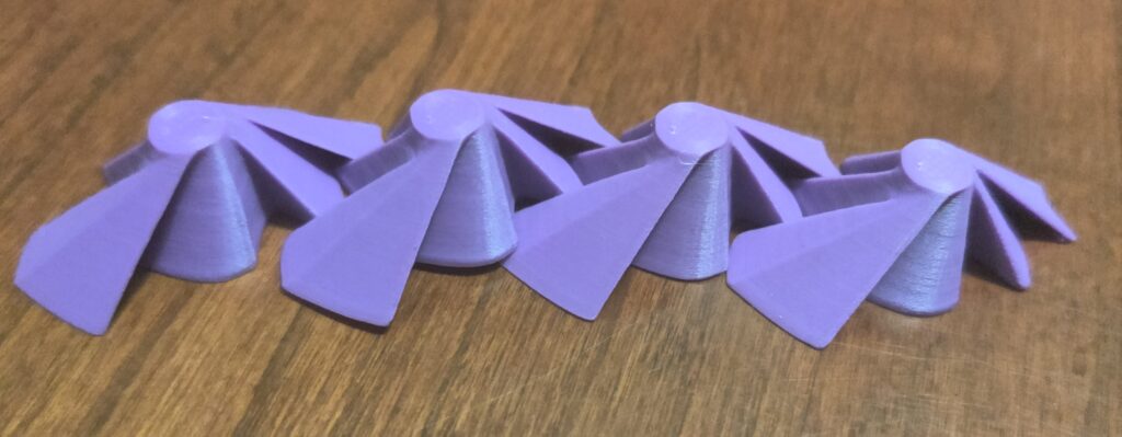
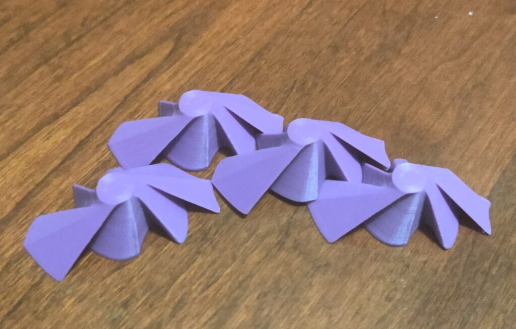
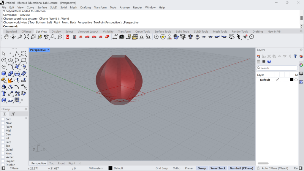
I already liked my escher-like tiles from part 1 so I just lofted it to a circle up top and it came out with some really cool shapes/angles. If I had more time I would’ve ironed out some of the edges of my tiles so that they fit together in a more coherent way, but I think the sharp edges look really cool.
- Part 3: Surface Morph (10%)
For the surface morph I really struggled because I forgot that I was rotating the curves in my escher code, so I spent hours and hours trying to figure out what I was doing wrong, but all I had to do was comment out one line of code.
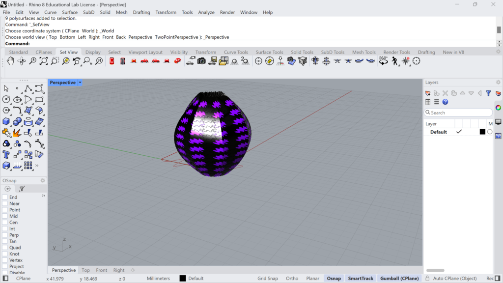
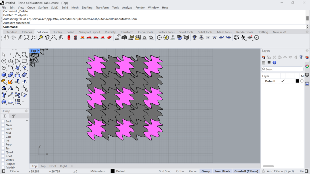
Hello Andrew! I am sorry you had so much trouble with this project. I like the sharp edges of your tiles, they are really eye catching. It is crazy how much of an effect the angle has on the surface morph. So frustrating to spend so long trying to solve a simple issue. Your designs came out nicely, good job.
Hi Elektra,
I really enjoyed the edges of my tiles, and yeah the seam on the surface morph was really interesting. Thank you.
Hi Andrew,
Your idea of using a shape to loft your original Escher tile into was a nice little idea, I had been thinking of something similar and using multiple shapes to give it a goofy design. Your edges sure are indeed sharp and it looks like the little fans they use in restaurants to keep the flies away. The hexagon code definitely seems like it can be a hard thing to design from the initial look at our original code, but I’m glad you were able to find a alternative to create it!
Hi Andrew,
I totally agreed that the hexagon code can be complex, but the way Leah explained it in class made a lot of sense and using alternative methods is always useful. I didn’t think of the fly fan, but i can totally see what you mean.
I had a lot of trouble getting the hexagons to work as well, I’m curious if you ended up solving it. Did you use the lattice like the escher tiles or just translating completed hexagons. I also really like how your 3-D tile came out. The windmill shape that came out of the lofting is really neat, it gives a nice folded look.
Hi Christopher,
I didn’t get it working with the lattice, I just made the hexagons and used an offset to place them. I really liked the loft since it added what I thought was needed complexity.
Hi Andrew,
Your 3D tiles are very neat! They look like sci-fi brooches to me. It’s cool that you were able to get such a complex result from that loft.
Thank you Louis,
I really liked how the loft came out and thought it added some much needed detail to a pretty plain tile.