Part 1: 2D Tiles
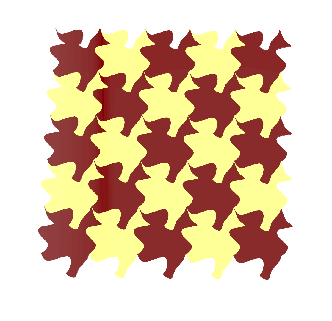
My design process started with using the foundational code provided in class, focusing on creating unique, interconnected curves for an Escher-style tiling. I experimented with a few ideas, particularly around symmetrical forms, like frogs, bats, and fish, as I thought these shapes would tessellate naturally. However, none of these options seemed to work quite right. Next, I attempted a more abstract approach, trying to develop a human-like character, but this also didn’t produce the intended effect.
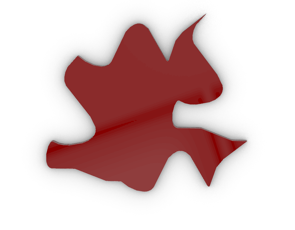
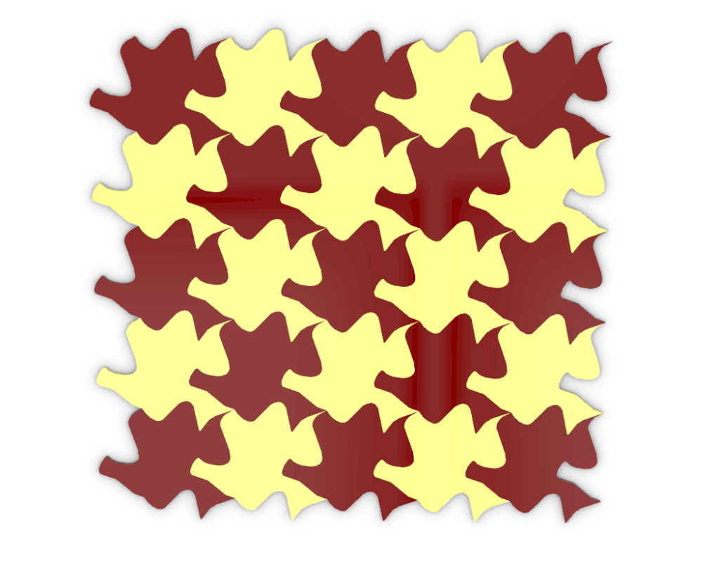
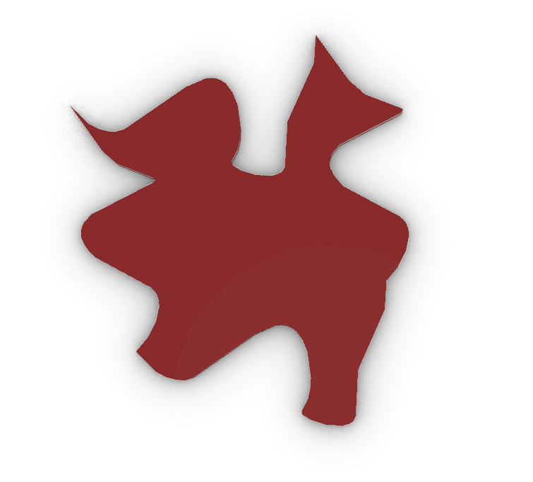
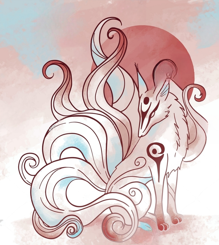
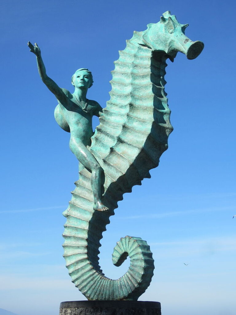
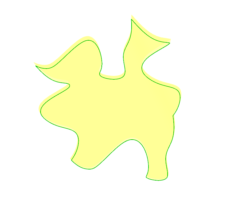
After several attempts, I found inspiration in the shape of a gingerbread man. Although the final design doesn’t look exactly like a gingerbread man, it sparked ideas that led to a pattern I found visually engaging. My brother and I looked at the pattern and saw different shapes within it—he and I thought it resembled a ghost in motion, a person riding a seahorse, or even a fox. This ambiguity added an interesting layer to the design that I hadn’t initially anticipated.

Part B
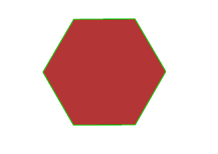
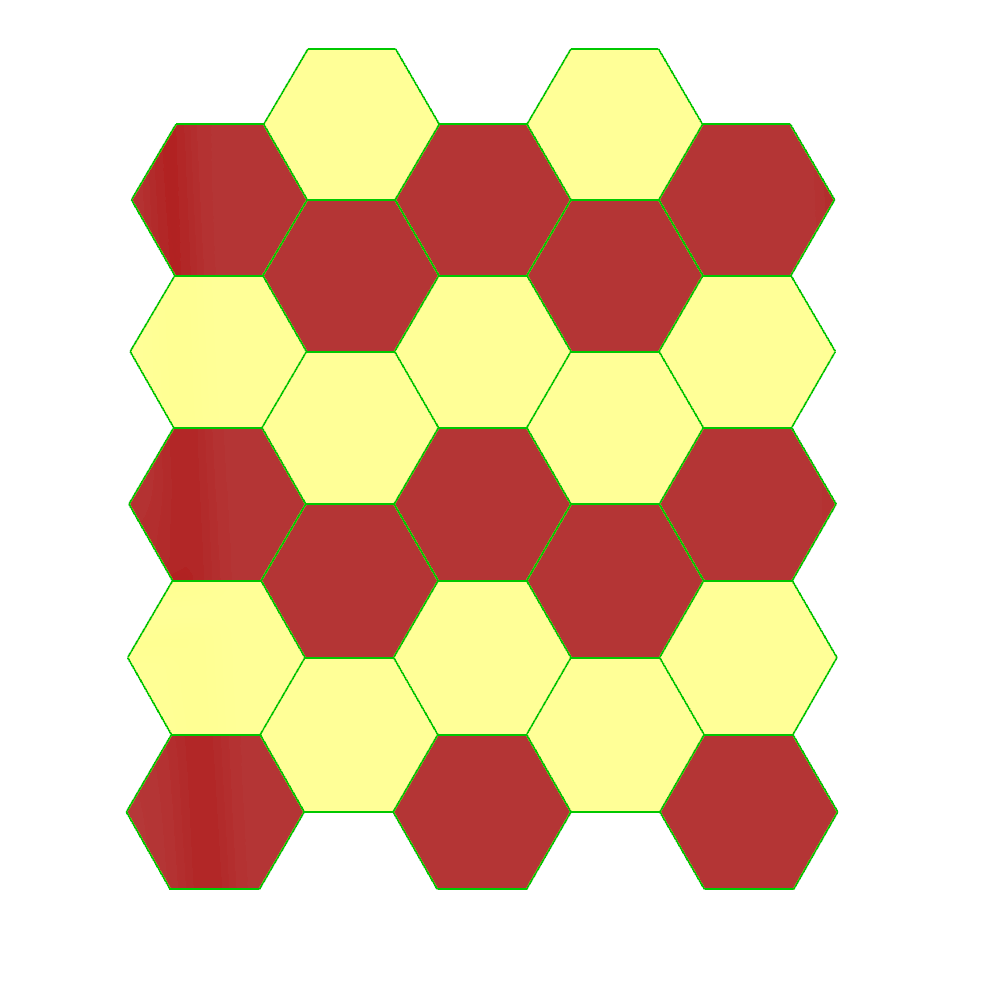
The hexagonal tiling design arranges hexagons in a staggered grid to fully cover the XY plane without overlaps or gaps. Each hexagon is created with vertices at 60-degree increments, ensuring a consistent shape. For positioning, each tile’s horizontal (x) and vertical (y) offsets are calculated to align edge-to-edge, with alternating rows shifted vertically by half a hexagon’s height. This offset pattern produces a seamless lattice. To visually confirm the tiling’s accuracy, hexagons are colored in a checkerboard pattern (pastel red and white), with alternating colors applied based on row and column indices. The design process guarantees a formal tiling that fills the plane and satisfies non-overlap requirements.
Initially, I attempted to modify the given lattice code to meet the requirements for hexagonal tiling, but encountered challenges in aligning the hexagonal tiles correctly and avoiding overlaps. Due to these difficulties, I decided to create my own code to achieve the precise positioning needed for a complete hexagonal tiling. This approach allowed me to control the angles and offsets more effectively, ultimately producing a seamless tiling that fulfills the XY plane requirements.
Part 2: 3D Printed 3D Tiles
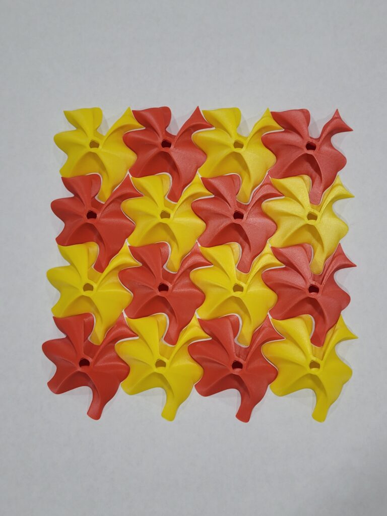
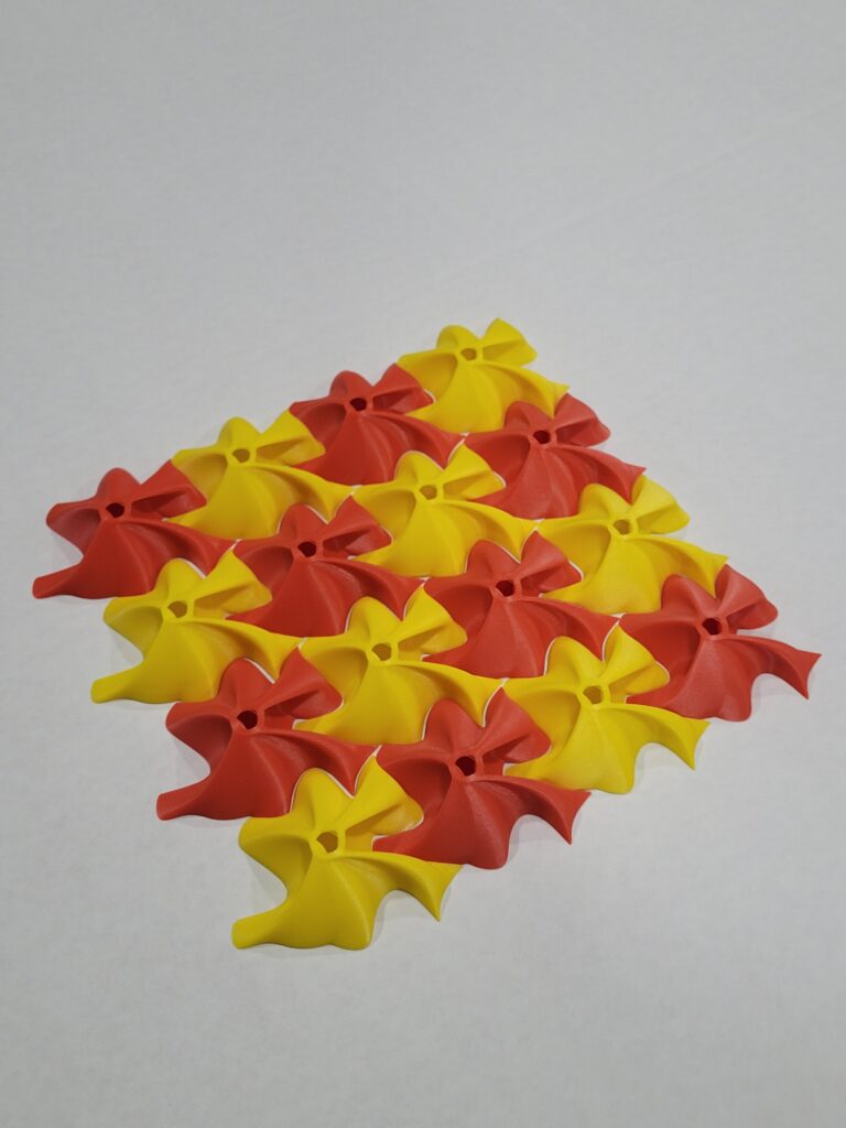
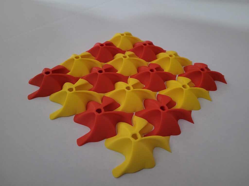
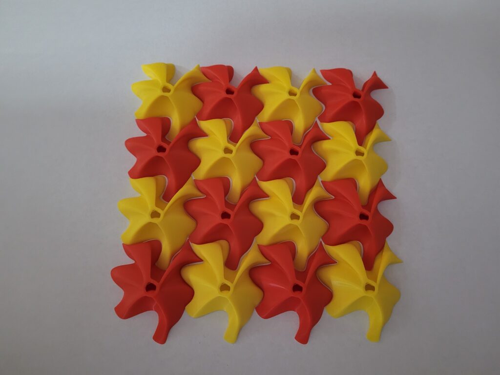
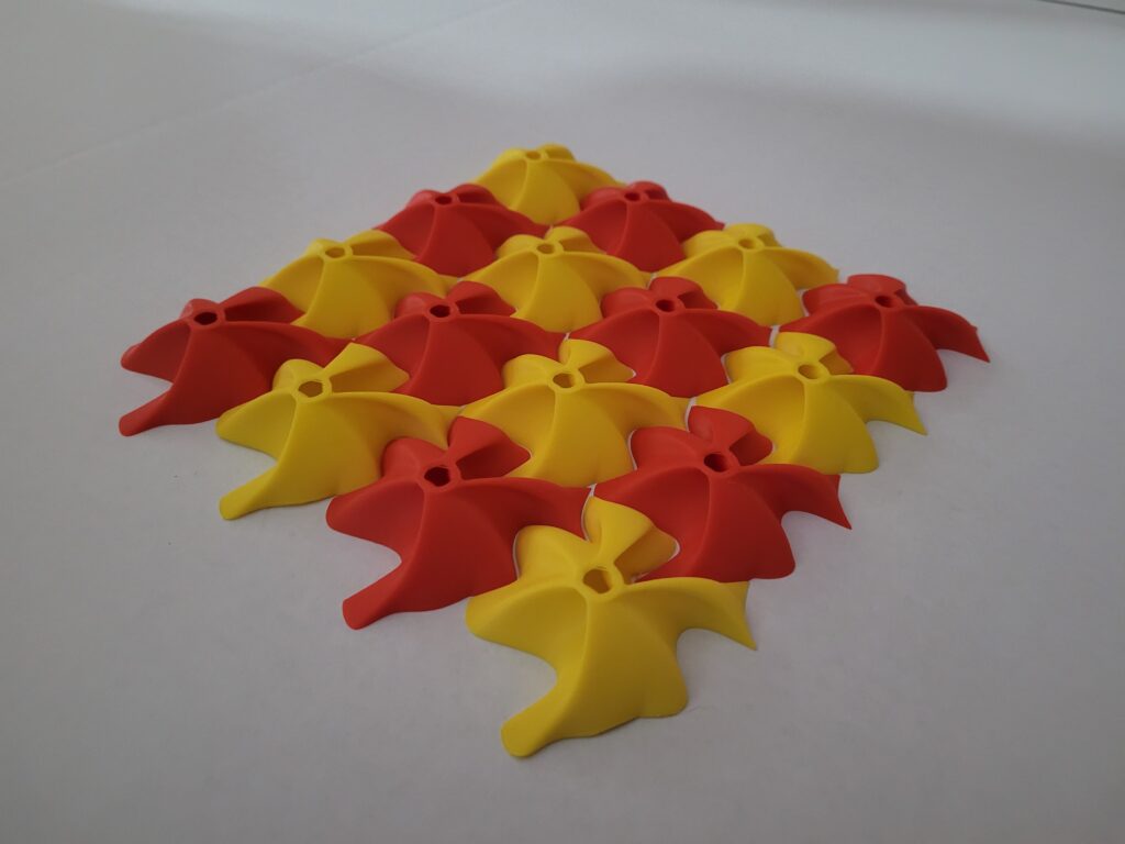
For my 3D tile, I chose to work with the Escher-style tile I created in Part 1a. To meet the requirement of adding a geometrical change in the z-direction, I experimented with several methods. Initially, I tried using an “extrude point” technique, which would have satisfied the requirement, but I wasn’t satisfied with the overall look. Instead, I decided to add dimension by incorporating additional shapes within the tile.
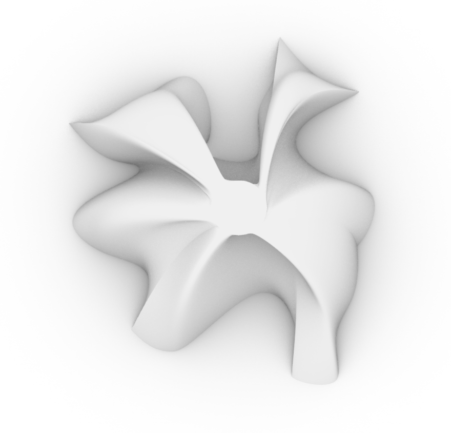
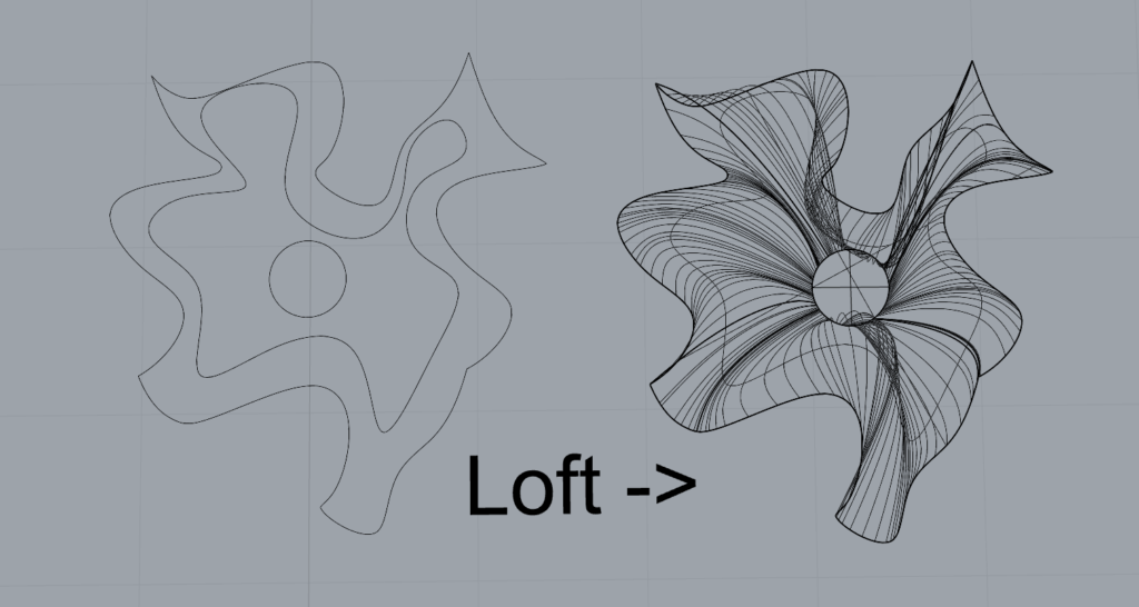
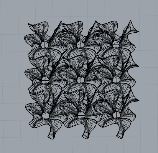
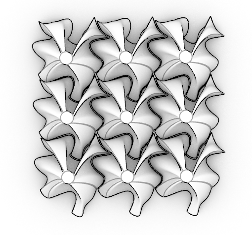
To achieve this, I started by creating a smaller, nested curve inside the main Escher tile outline and raised it along the z-axis to a specified height. Then, I added a circular curve, also raised along the z-axis, and lofted these curves together to create a smooth, cohesive 3D form. This design introduces a subtle elevation change that adds visual interest and depth to the tile, while still allowing it to tile seamlessly across the XY plane. I applied a -0.2 inward offset to ensure all pieces would fit together precisely without leaving gaps.
For printing, I initially attempted to use G-code directly, but this method led to unsightly, free-standing lines during the print process. Ultimately, I opted to use Cura for slicing, which resulted in a cleaner and more professional-looking finish.

Part 3: Surface Morph
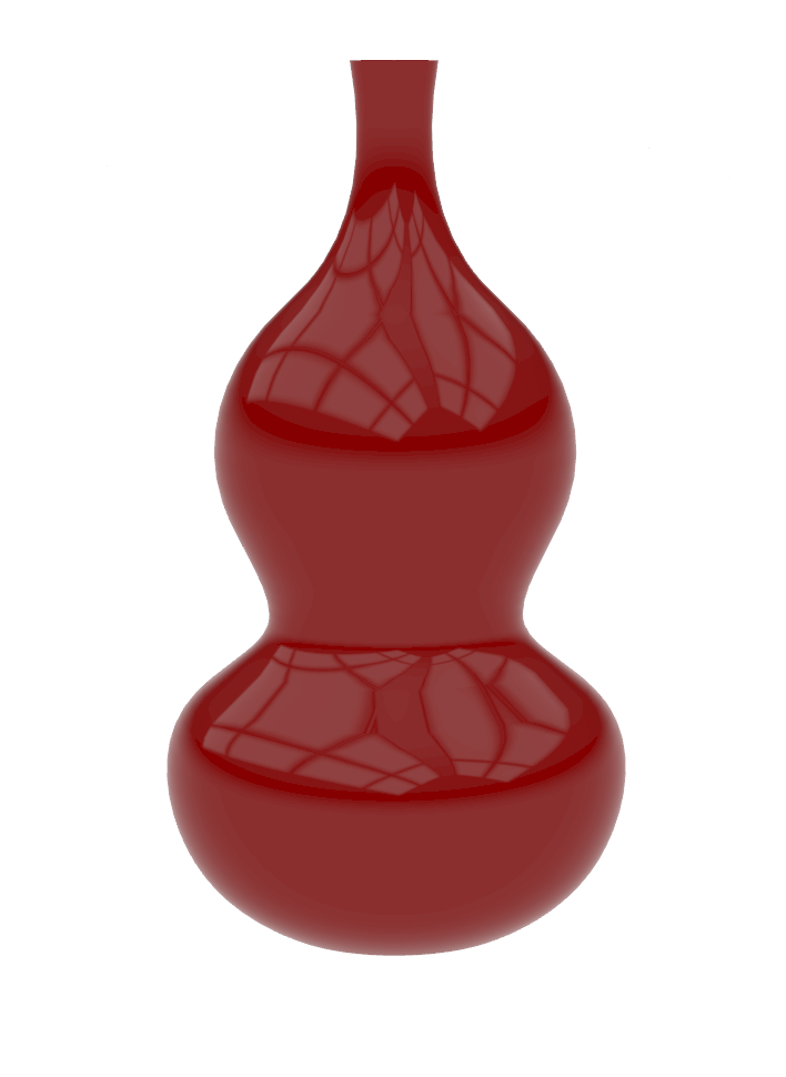
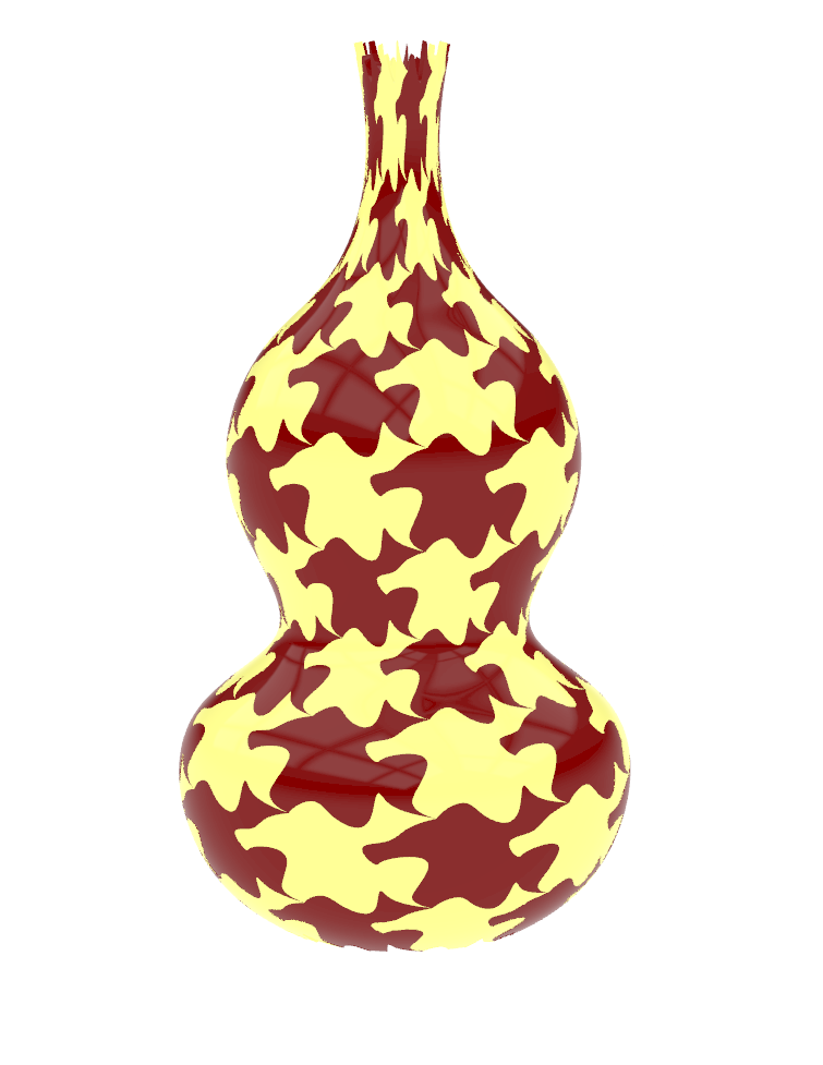
For the surface morph task, I chose to use the gourd-shaped vessel I created in Large Assignment 2: Parametric Vessels as the base surface. Using the code created in class, I applied a surface morph technique to map my tile design from Part 1 onto the gourd vessel. Initially, I encountered an issue where the surface morph was only producing a single instance of the tile along the gourd’s surface. After troubleshooting, I discovered that this was due to having two data dams in my Grasshopper script, which prevented the data from fully updating when I adjusted values. Once I corrected this by ensuring data transfer across all nodes, the tiling pattern successfully applied across the gourd surface, creating the desired effect.
Hi, Daniel!
Great job on this assignment! I like your 2d tile and surface morph! Your surface morph part look very mesmerizing. You said that you had issue with your surface morph where it was producing a single instance of the file along the surface. How long did it take you to troubleshoot it? I had similar issue and it took me quite a while. Overall, great job!
Hi Bat! Thank you so much for the feedback! I’m glad you liked the surface morph—it took a lot of experimenting to get it to look right on the gourd surface. Troubleshooting that single-instance issue was definitely a bit of a process. Once I figured out it was due to the data dams, I adjusted them to allow continuous data flow, but finding the root cause probably took me about an hour or so. I had to redo all the code from the slides twice to figure out it was the data dam. I had to redo all the code from the slides twice to figure out it was the data dams.
Hi Daniel,
I like you final designs and your overall design process. I had a similar situation in which I found it much easier to just make my own script to generate the hexagonal tiling. I kind of see the pictured fox in you 3D printed tiles, it’s amazing how well they fit, and the use of different colors was a great idea in my opinion.
Hi German! Thank you for the kind words! I’m glad you could see the fox shape in the tiles—it’s fun how the design seems to shift depending on how you look at it. Making the hexagonal tiling script from scratch definitely made things more manageable, and it’s reassuring to hear you went the same route. The different colors really helped bring out the shapes, so I’m happy to hear it made an impact. I would have loved a brighter yellow filament to match my surface morph.
Hi Daniel,
Great presentation today, I really enjoyed your 3D prints and the different colors are so cool! You’re shape really could represent a multitude of things if your look at it at the right angle. I also really appreciate your whole post layout, the rhino renderings match your filament colors and its really great. Lastly your surface morph came out so cool, I’m really impressed.