My Process and How My Code Generates My Three Shapes
My design process began with exploring the Extruder Turtle Library, which provides functions for generating G-code for 3D printing. I started by implementing the examples presented in class and then proceeded to experiment with different shapes that caught my interest.
During this exploratory phase, I created numerous designs, but I encountered significant challenges. Many of my initial attempts resulted in poorly printed artifacts or outright failures. In total, I would estimate around 40 failed or subpar prints during my experimentation. This struggle stemmed from a combination of issues, including difficulties in generating effective G-code and ensuring compatibility with my specific printer model, the Ender V3 S3.
I focused on developing three unique shapes that I believe cannot be easily produced by traditional slicing software. These shapes not only showcase the capabilities of the Extruder Turtle Library but also highlight the importance of iterative design. My final forms emerged from a rigorous process of trial and error, allowing me to refine my G-code and adapt my designs based on the results of my previous prints.
Overcoming Slicer Limitations: A Case for Custom G-code
The shapes I created for this assignment cannot be generated by traditional slicing software due to their complex geometries and non-standard printing requirements. One of the designs incorporates freestanding lines of filament (Droopy Sun), which require precise control over the extruder’s movement to ensure stability and adherence without additional support structures—something that slicers typically struggle to accommodate. Furthermore, another shape features non-planar movements of the nozzle (Sine_Cylinder), allowing for intricate layering and variations in filament quality as the extruder moves above the print surface. This complexity in toolpath—where the Z-axis continually shifts for each layer—exceeds the capabilities of standard slicing algorithms, which primarily focus on planar layer-by-layer generation.
1. Lattice/Chain Like Structure
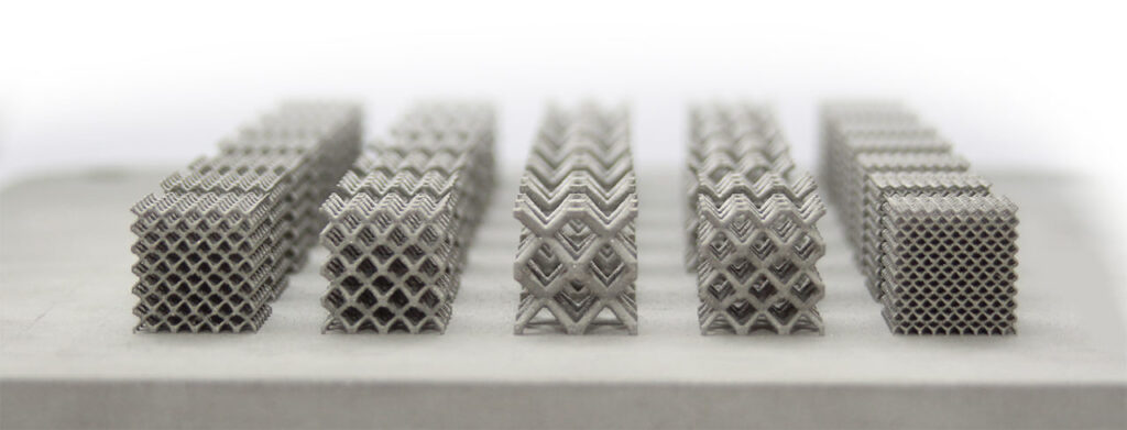
Source: How 3D Printed Lattice Structures Improve Mechanical Properties – 3D Printing
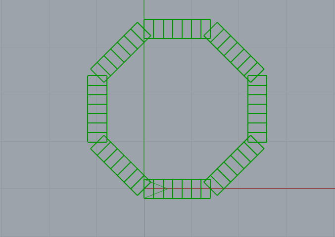
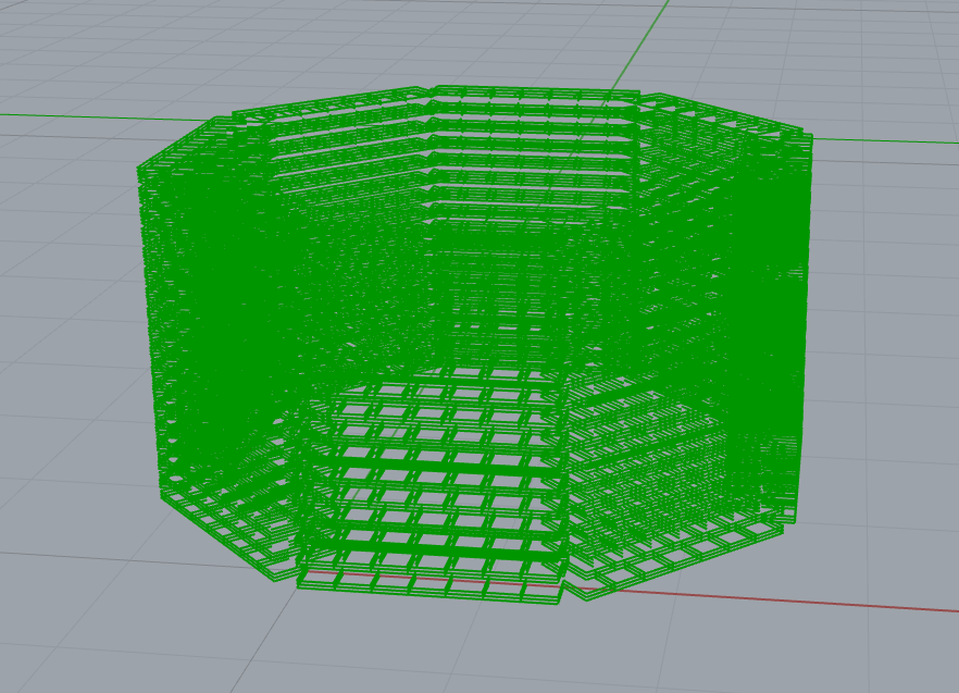
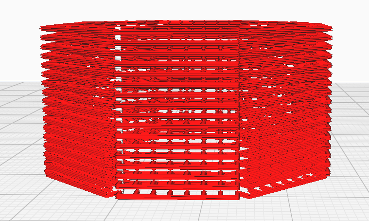
For the first design, I aimed to create a lattice or chain-like structure, inspired by 3D-printed lattice forms commonly used to improve mechanical properties in engineering. Although I originally planned to apply the lattice pattern to the entire hexagon, I could only focus on just the perimeter. My initial expectation was that this would result in gaps, similar to a chain-link fence, but the final print came out fully connected. Surprisingly, this gave the structure significant strength, exceeding what I had anticipated while still maintaining the open, lightweight feel of the design.
2. The Droopy Sun
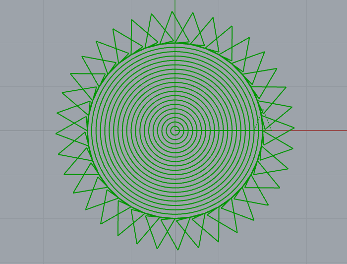
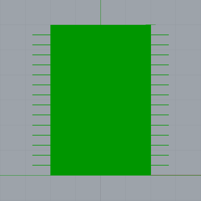
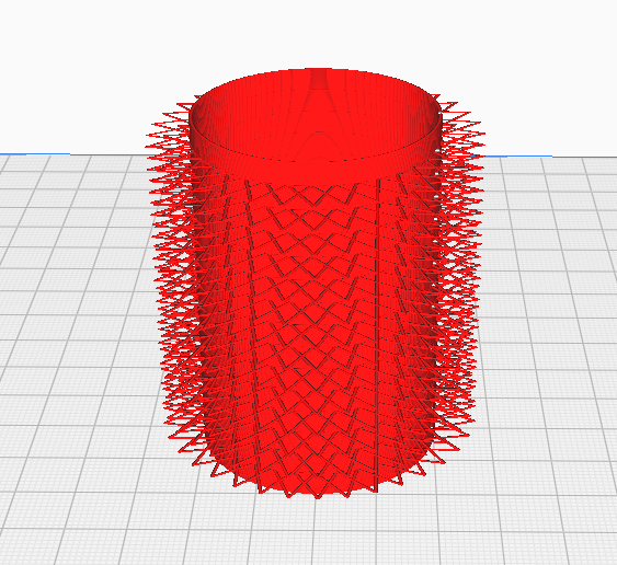
The second form, which I call the “Droopy Sun,” incorporates freestanding lines of filament that were intentionally drooped to form a wavy, suspended pattern. Traditional slicers struggle with freestanding elements like these, but through custom G-code manipulation, I was able to control the movement of the extruder to create this unsupported structure. The challenge was balancing the extruder speed and the height of the nozzle to avoid breakage while maintaining the intended design. While the final print turned out delicate, it successfully demonstrates the limitations of slicing software when handling complex, non-planar geometries.
3. Sine Cylinder
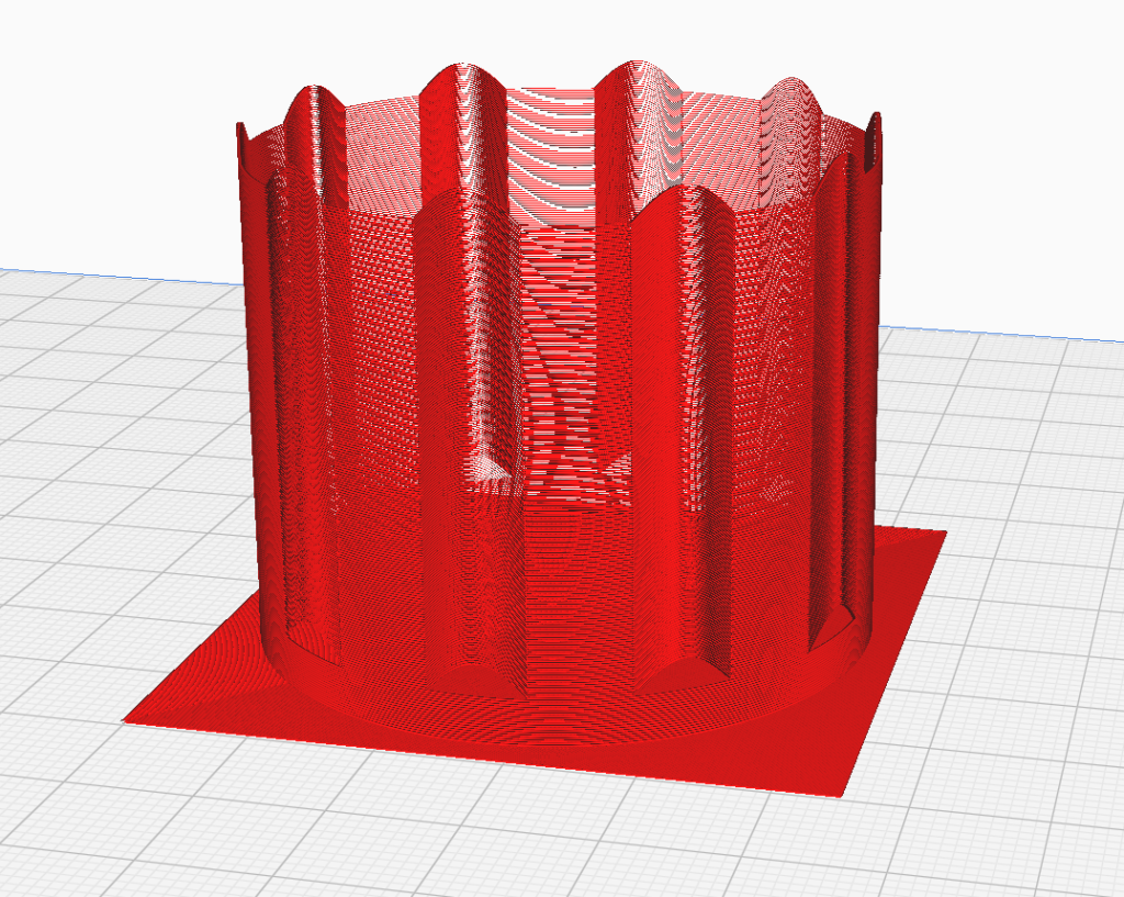
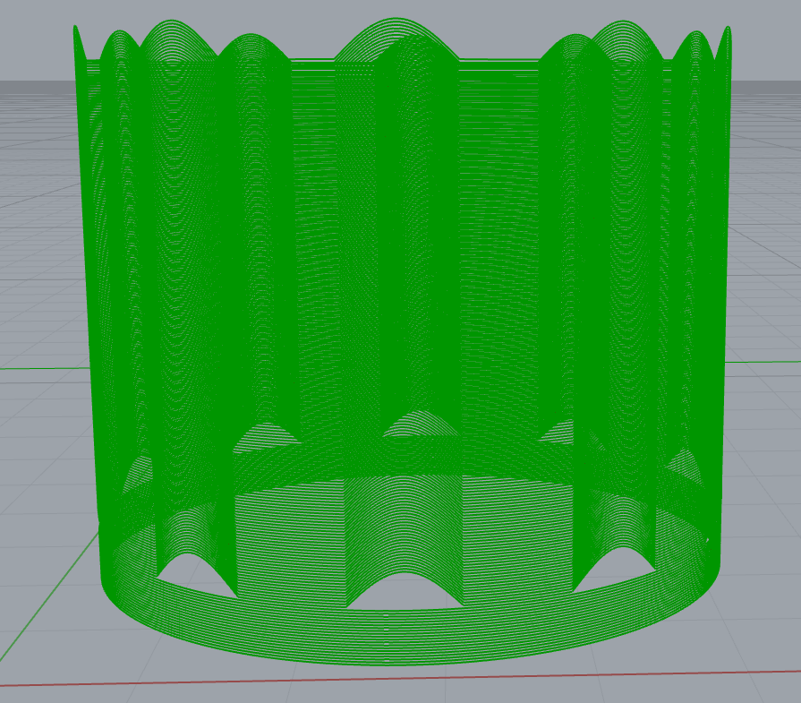
For my third design, I implemented a sine curve integrated into a circular pattern using the Extruder Turtle Library. This design showcases non-planar Z-axis movement by varying the height of the extruder according to the sine wave function. The extruder moves in a circular path while simultaneously oscillating vertically based on the sine values, creating an intricate wave-like surface. Specifically, as the extruder completes each revolution, the Z-coordinate rises and falls, generating positive sine variations that enhance the visual complexity of the print. This technique not only allows for dynamic layering but also results in an engaging texture, as the filament’s position varies with the sine wave, highlighting the capabilities of custom G-code to achieve intricate geometries that traditional slicing software cannot produce. I began by first printing a square bed for the shape, then printed 20 circles and 180 sine wave curves.
Final Prints
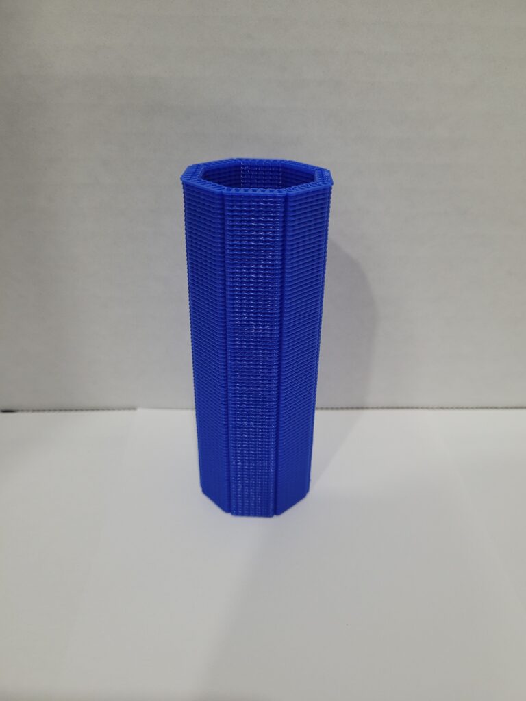
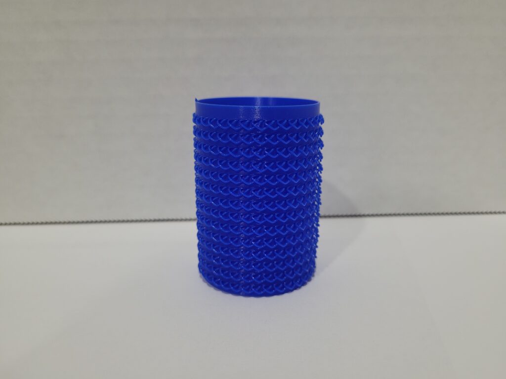
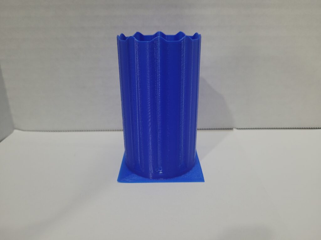
If you’re downloading my file, please allow a moment for it to load—it may take a little extra time.
Daniel,
Great job on these prints, they came out really clean. Looks you coded it just right to create those loops on the last print, very impressive. For your first print, the free standing layers is really neat. Did you have a lot of trouble getting those to print out straight? Any issues with unwanted drooping? The lattice idea was really cool and you implemented it very well. All the prints are amazing, can’t wait to see what your next prints look like!
Justin
Thanks, Justin! I’m glad you liked the prints! For the first print, I was actually expecting some drooping too, but surprisingly there wasn’t any. The chains ended up sticking together more than I anticipated, creating a solid structure. I think if I had increased the Z-axis height between layers, I could have achieved more of the drooping effect I was going for. Appreciate your feedback!
Daniel,
Your prints came out amazing! I love your droopy sun print, when I was experimenting I had a harder time creating loops, but yours came out perfect. Did you try to print the droopy sun without the inner-wall, so it was just built out of loops?
Thanks, Andrea! I didn’t try printing the Droopy Sun without the inner-wall, but that’s a great idea. It could definitely create some interesting effects with the droops. I might experiment with that next time to see how it turns out! Thanks for the suggestion!
I know it’s a bit late to discuss these projects, but since I forgot earlier I thought I’d come back and leave some comments!
I’m sad I didn’t get to see your objects in class when we presented! All three of them look really high-quality. It’s hard to say which one is my favorite.
The lattice/chain-like structure has a very attractive texture, and it does look very structurally sound. I’ll definitely consider using a technique like that in the future!
I’m amazed at how the droopy sun effect came out so uniform! I tried to do some stuff with free-standing lines, and unfortunately mine ended up looking very messy. I was going for more of a fuzzy effect though, and I think the loops on yours seem to be more predictable. In the end, I think you succeeded at doing the kind of thing I originally hoped to do!