Dataset
When it came to choosing my dataset I was fascinated to find one about consumer spending on US Governmental Data, this has been a big topic especially among the news and financial experts that I watch.
Despite wanting to pursue a career in CS and Engineering I have become more and more interested in the world of finance so when I found this consumer spending percentage dataset it caught my attention. The file contains percentages in consumer spending for each day of the year for varying spending categories groceries, healthcare, entertainment etc. Given that most indexes like to leave out volatile values I decided to utilize the overall percentage that averaged all different categories. However, there was a column dedicated to the FIPS which are identifiers for each county in each state. The dataset collected five FIPS from the state of Connecticut. I didn’t know much about each category so what I did is also averaged the five FIPS values to create one average for each day. Then with my code I took those newly averaged values and separated them into different datasets based on the year that they were recorded. I used data from 2021-2023 each starting with from January 1st to December 31st, the first year had 365 consecutive days, but the second year only had about 185 total days of records, and the final year was horrible with only 53 days. There was data including 2020 and 2024, but 2020 was a unique year and its starting date for the data was later than the rest and 2024 wasn’t fully recorded since we haven’t finished the year. So I removed those years entirely to make the dataset smaller on my end, however, I did leave the other categories and their percentages just to see what is taken into account when they find consumer spending and their averages. I would have liked to do a monthly average, but that wouldn’t have made for very many data points, so I’m glad that I went through each day because it made some very interesting prints, especially for 2021 since there were so many days that I had to scale it down because it wouldn’t be able to print on my 3D printer.
Design
When I first saw the csv dataset for the consumer spending, I knew I had to compare the averages for each day of the year. I was happy to see that there was multiple years included in the dataset since this would hopefully give me distinct and interesting forms to create. I figured with negative values there would be some very good contrast between some layers since some days people spend more and other days they spend way less. It was somewhat of a positive to find that once I ran the datasets into lists that each year there happened to be less and less days recorded for each year. This shows greatly in between the sizes of the vessel. Since the layers were very fragile and some points were so thin the base and top were barely touching, I printed all my vessels sideways with supports and they each took about 5-6 hours to print.
2021 Percentage Consumer Spending – 5hrs
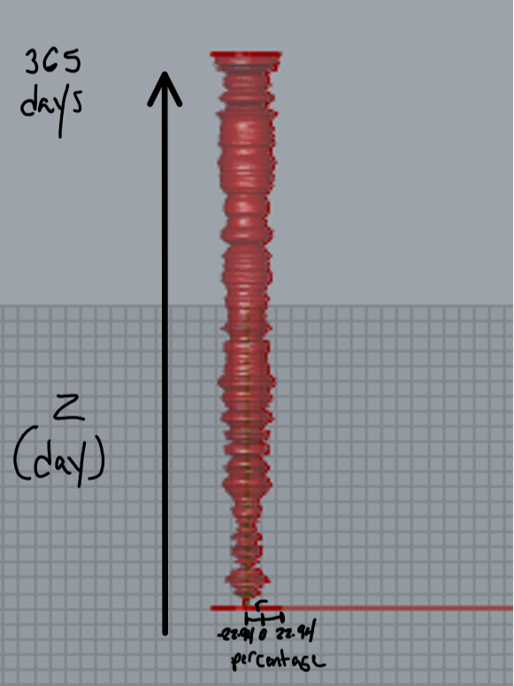
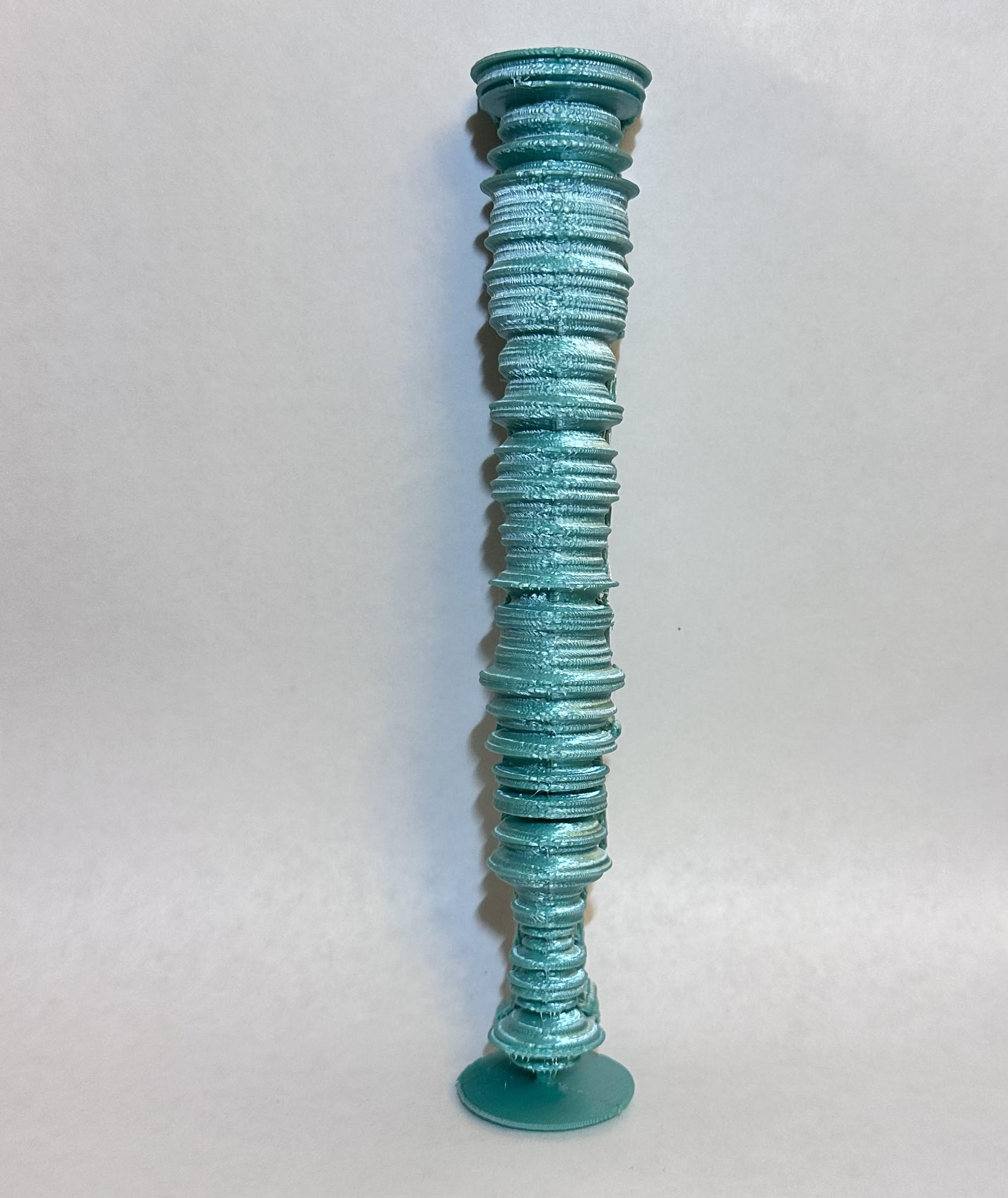
With this graph for 2021 you the greatest change in consumer spending was 22.94% for one of the averaged days. This is a very significant increase especially during a time where the nation was unstable when it came to the economy. This print had so much data that the original size for the print was 14.5 ish inches and stuck out way past the print dimensions for Cura and my Ender 3. I scaled it down to half its original height and it barely fit on the printing plate for my 3D printer. My radius was definitely interesting since it wasn’t a 0 to any percentage. There were a lot of negative values in the dataset for 2021 so my range is essentially -22.94 % to 22.94%. I really enjoyed watching this one print since it was so large and seeing the 3D printer create something sideways with a bottom support was an interesting experience.
2022 Percentage Consumer Spending – 5.5 hrs
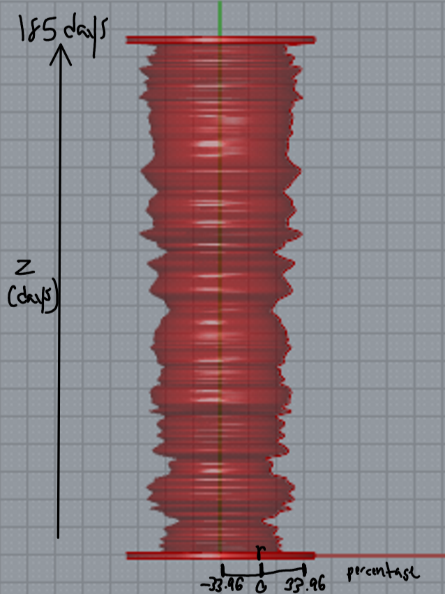
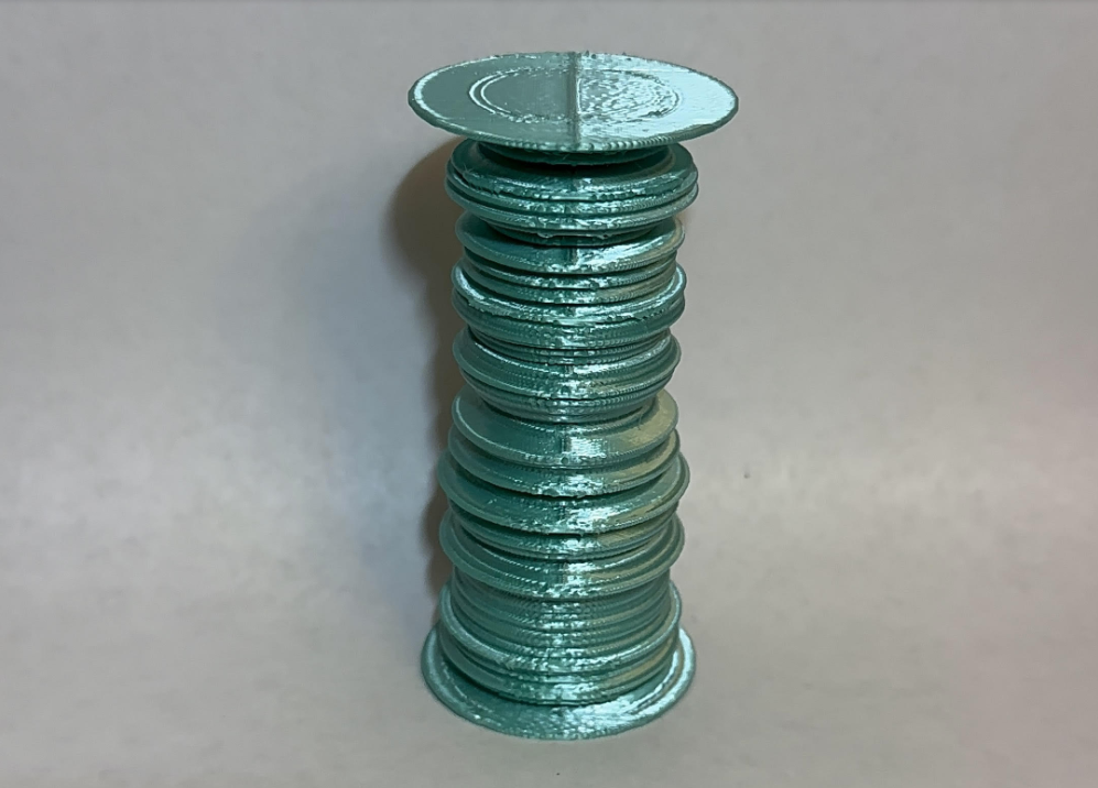
With this print I had nearly half as many days recorded compared to 2021. This print came out very average as I expected it to be, but it definitely showed that consumer spending was increasing since there was a larger radius and the consumer spending change seemed to be very constant towards the end of the year so it showed the spending was at a constant rate. The beginning of the year took a big dip after the first recorded days of the data set, but towards the middle of the year things seemed very volatile.
2023 Percentage Consumer Spending – 5 hrs
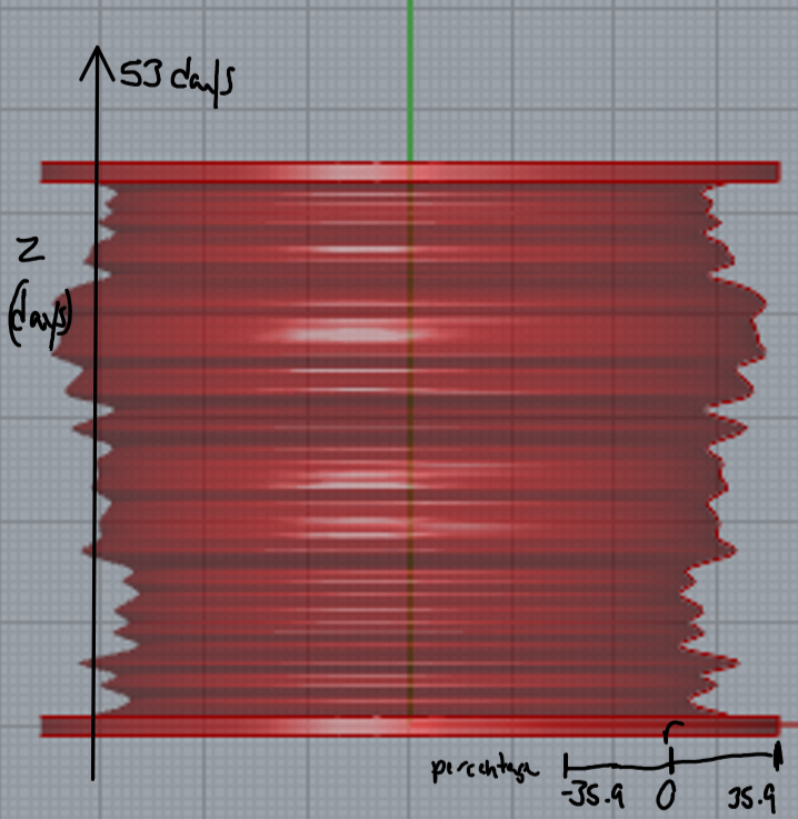
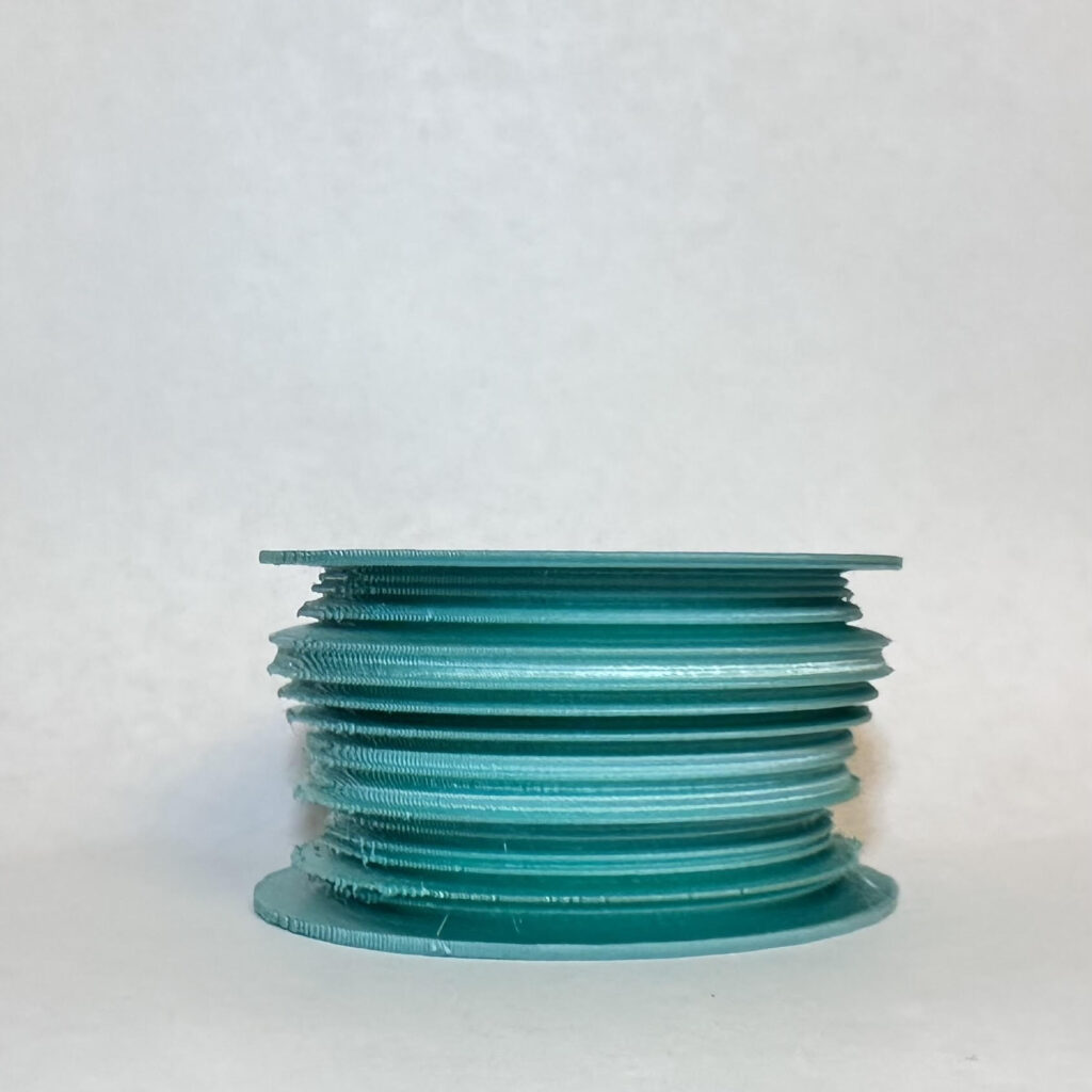
When it came to 2023 with such a small data set of 53 days I knew it was going to be a short stack, however when it came to comparing the other prints I realized that it was going to have greater changes in consumer spending percentage changes. Glancing through the data it seemed that the average values for 2023 were overall higher than previous years and we can tell that since for some time the percentage change was positive and up to 35.9% which displayed the greatest increase in spending. I wondered what this graph would have looked like if there was more data so I could compare all years equally and purely focus on their percentage changes hoping to notice certain events or dates that may have impacted people spending habits. I also noticed that towards the end of the end of the dataset spending increased consistently and it seems to be linked towards the time right before the big holidays at the end of the year.
Reflection
Overall creating these vessels were very interesting, I didn’t realize how much more visual you could make a data set besides making a simple graph on Excel or Google Sheets. Creating these vessels gave more life to the data providing a physical object that can help aid with the understanding of it. I wouldn’t have been able to just look at my dataset and visualize all the ups and downs of consumer spending, especially in Connecticut. Creating the three vessels to represent 2021,2022, and 2023 give me a straightforward comparison of how a state of people’s spending can fluctuate and in a way, we can inference how spending was conducted overall throughout the entire United States even without that data. I think that by using GrassHopper, Python, and Rhino we can help a certain category of people who are more kinetic learners to understand data in a more physical environment rather than one that is purely visual. I myself am physical and kinetic learner, I like to do and play with things in a more hands on manner and by physically feeling data it generates a more in-depth understanding and realization of what the change in data values actually feels like. In summary, I believe that by using 3D prints to convey data it unlocks a new level of data representation especially when you can physically quantify data by touch and feel, rather than visualizing millions of values of data on a plain white spreadsheet.
Hey Andrew,
I also chose to represent % change, but in revenue instead of spending! I like the approach you took, and I think it’s especially nice you had enough data to really get a line-graph look for the z-axis of your objects! I didn’t have as much data, so mine looks more like a bar-graph.
I agree with your statement about kinetic learning; these kinds of 3D data representations definitely make it easier for me to understand data! And it’s very interesting to see the three different time scales you used for your prints. It puts the data into a perspective that helps me understand the ways spending rates change over different periods of time.