Dataset
The dataset I chose to work with is from the National Center for Health Statistics: https://www.cdc.gov/nchs/nvss/vsrr/drug-overdose-data.html
Unfortunately the dataset I chose is very bleak. It chose overdose death in the United states by state and by type of drug. I wasn’t to eager to choose this data set, after examining the numbers I became very sad. I finally settled on it because, although the data can be tough to look at it is very important and unfortunately the sad truth. In order to use this dataset in a time practical way I chose to look at deaths categorized by two drugs Heroine and Natural & semi-synthetic opioids (T40.2) (natural opioid analgesics, including morphine and codeine, and semisynthetic opioids, including drugs such as oxycodone, hydrocodone, hydromorphone, and oxymorphone (T40.2)). I also trimmed down the date range from the year 2016 – 2023. There were rows within the .csv that encapsulated the entire US making the set easier to use. I’ve attached my version of the data set after I cleansed it.
Design Process
3D Object 1
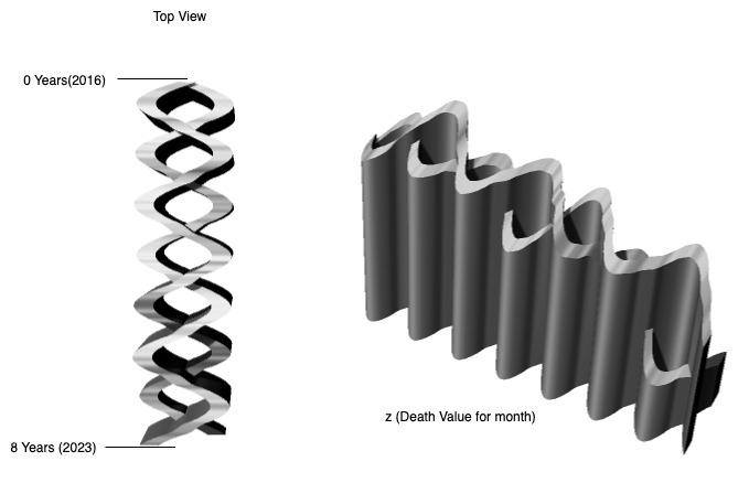
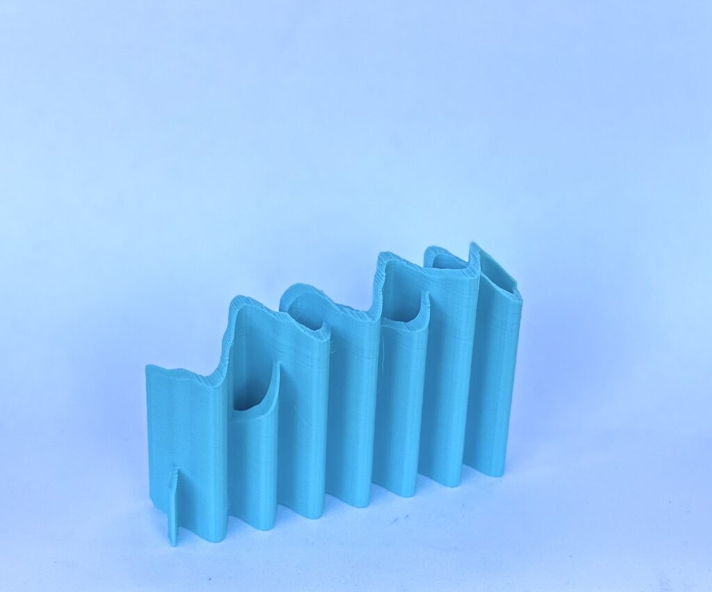
When designing my first object I wanted to encapsulate both the death rate per each drug in one singular object. The goal I had was to avoid doing a traditional bar graph. In this object the z-axis represents the death rate, there is a point for each month in the year. The intertwined pattern allows each year to be separated. I first created a set of point on the (x,y,0) plane using a sin function to create a smooth wave for the y-coordinate. Then I used a set of points in the (x,y, death_value) plane to create the height of the object. This object allows a viewer to see the comparison between the years.
3D Object 2
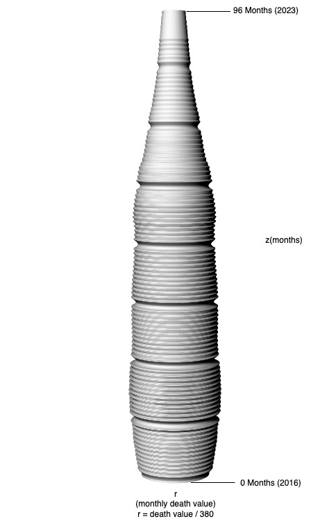
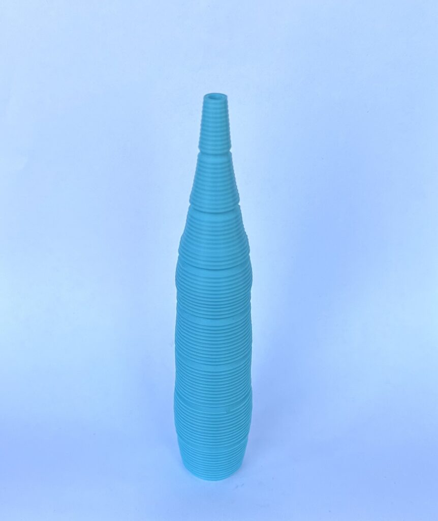
When designing the second object I wanted to focus on the individual months death rate values. In order to do this I chose to focus on one drug in this case this represents Heroine. I created a vessel with ripples. Each small ripple represents each individual month (96 Months!), I also created a smaller radius to give separation for each year. This vessel give a closer look how each months death values changed. Unfortunately I would have had to create a very large vessel in order to see the changes more visually.
3D Object 3
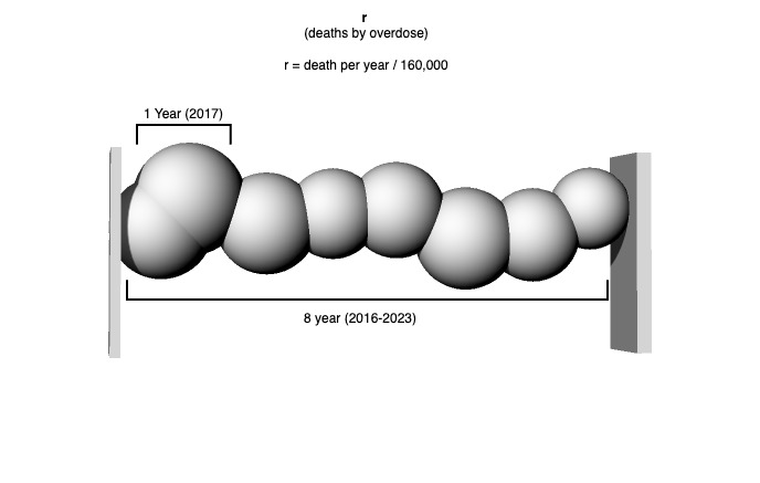
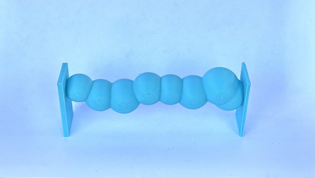
Finally when designing my last model I wanted to switch my focus to Natural & semi-synthetic opioids (T40.2). In this model I created a set of spheres representing each year of overdose deaths due to the drug. Each spheres radius is a ratio of the death rate. I created random placement on the y-axis to give this object a much funner shape.
The goal with each of my three vessels was to create object that represent the scale of overdose death rates as well as see the changes through the years. After evaluating my figures, its clear to see that Natural & semi-synthetic opioids (T40.2) are causing a bigger impact in overdoses. Also to my surprise there seems to be a decline in overdose deaths. The mm to death value varies from object to object.
Reflection
After completing this assignment the dataset I choice to examine really left and impact on me especially when I had to significantly scale down the death rate number to make the object a reasonable size. I feel like more project that physically can represent datasets are important because most people are visual learners and it can really put into perspective ratios of things. Creating object also allows for unique interpretations that can represent data, in my case I choice not to lean into specifc object to display my data because that did not see appropriate. However while doing this project I had plenty of ideas on fun data set that one could make unique shapes for that correlated with the data.
On a design note after this assignment I am officially frustrated with my printer I had one to many failed prints and they always seemed to happen midway through. However the design aspect was actually quite fun, I was really cool how we has to think about the different way in which to represent data so someone else could also interpret.
The figures and differences in the shapes you show are incredibly impressive! The first one is probably my favorite since it takes on the shape of a DNA strand which are considered one of the building blocks of life. Correlating that with the death rates of drug use makes the data feel more impactful.
I had the same problem with my data being way too large to be suitable for printing. Seeing how highly occurring my type of data is made the data more emotional especially when designing it myself.
Hi Ryan, I appreciate your feedback! I also noticed that my first print looked like DNA strands. The correlation between DNA and the building blocks of life is really powerful.
On the note of the data being large it would be really cool to see what could be incorporated into these models with we had a larger printer and maybe even some faster computers to parse and do computations on the data.
Thanks Again 🙂
Hi Andrea,
I’m glad you chose to work with this dataset, even though it’s tough to look at those numbers because they reflect the lives that were lost. I think pushing through and creating these visuals can really force people to confront the truth of the drug overdose epidemic. I really like your first 3D object, it powerfully emphasizes the death rates for each month of each year.
Thank your for your comment Alan,
Choosing this dataset was a tough choice. I am glad I went through with it as well, it without doubt change my perspective to the drug crisis and help shed some light to just how devastating it can be.
Hi Andrea,
Interesting shapes and I would have never figured they would have come from those datasets. The third object I find ironic since its looks bubbly and cute but how it was created has some sad truth behind it. I feel like creating objects of these causalities can bring attention to the causes. I also feel your pain on the amount of failed prints I had for this assignment. I found making small adjustments in the figure or in the settings is a great place to start.