Dataset
For my data source I used data.gov, choosing the Austin Animal Center Intakes as my data set. https://catalog.data.gov/dataset/austin-animal-center-intakes.
I wanted to do something lighthearted and out of the ordinary so I decided to choose animals. The Austin Animal Center had a nice substantial data set over 160,000 entries spanning Oct 2014 to Present. Parameters of the data set included Name, Date, Location, Intake Type, Condition, Species, Breed, Age, Sex, and Color. In its original form, each entry is 1 individual check in, of which there were thousands. So to clean the data up I put it into excel so I could organize the data and look at totals for each of the given fields. For my purposes the data I used in my final prints is focused on intake type. The given intake types are Euthanasia, Owner Surrender, Public Assistance, Stray, and Wildlife. Each entry only lists month and year so the totals in the data set I display are by month. In the spirit of optimism I decided to make physical forms for Wildlife, Strays, and Public Assistance i.e. people assisting animals that they aren’t directly responsible for. I also have an overall graph of the total intake. Public Assistance for the record is when you check in someone else’s pet. Here is the cleaned up data set in case anyone wants to see what it looked like int its final form.
I would also like to shout out some interesting statistics that did not become part of the final print. Firstly the vast majority of Wildlife intakes was bats like of 6000 animals brought in 3700 were bats. Other less frequent wildlife that were seen include Armadillos, Snakes, Otters, Possums, and a Bobcat. Among strays, dogs and cats naturally made up the vast majority with 115,000 intakes, 50,000 Cats and 60,000 Dogs. The next highest were some 800 Rabbits, 400 birds, and 200 Guinea Pigs. Interestingly for Public Assists, despite there being a pretty comparable number of cats and dogs 5:6 for strays, of 10,000 Public assistance intakes, 8000 of those were dogs with only 1400 Cats.
Design
My design process was very straightforward, I wanted the forms to be easily comparable so I just stuck with the 3-D plots we learned in class. Instead I used 3 subsets of data from my dataset, each of which has a distinct personality to it. The only modification I made was I had it print half the structure so I could print sideways and avoid using structures (I only figured this out for the last print, I wish I’d done it sooner)
Graph 1: Public Assistance
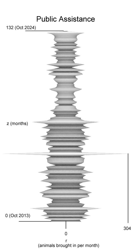
The Public Assistance graph is weirdly normal compared to the other graphs. You can see it thins a bit near the end around when covid happens but not by much. The only abnormality is a huge spike for September 2017, I don’t know what’s special about that date (each graph has unique patterns for spikes). It makes sense that this one would have the least variance because helping someone else’s pet feels more personal than finding strays or wildlife and I imagine would be less random.
Graph 2: Strays
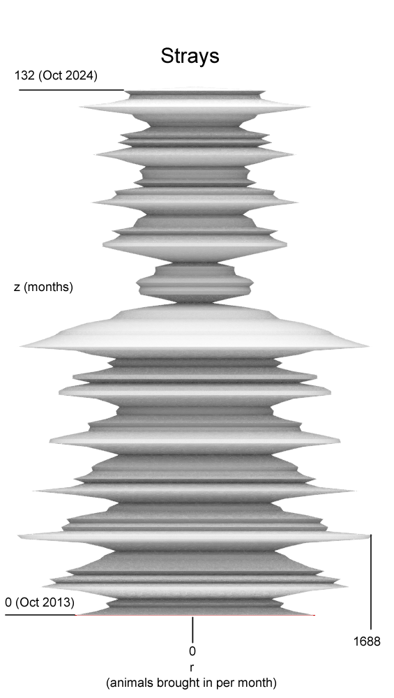
My favorite detail about the strays graph is this massive dip near the middle. This is of course 2020 when COVID was in full swing and lock downs kept people inside, naturally this meant people weren’t outside as often so they noticed animals less. It’s way less obvious on the other graphs, probably because the other graphs have much smaller sample sizes. Otherwise it’s remarkable consistent recurring patterns.
Graph 3: Wildlife
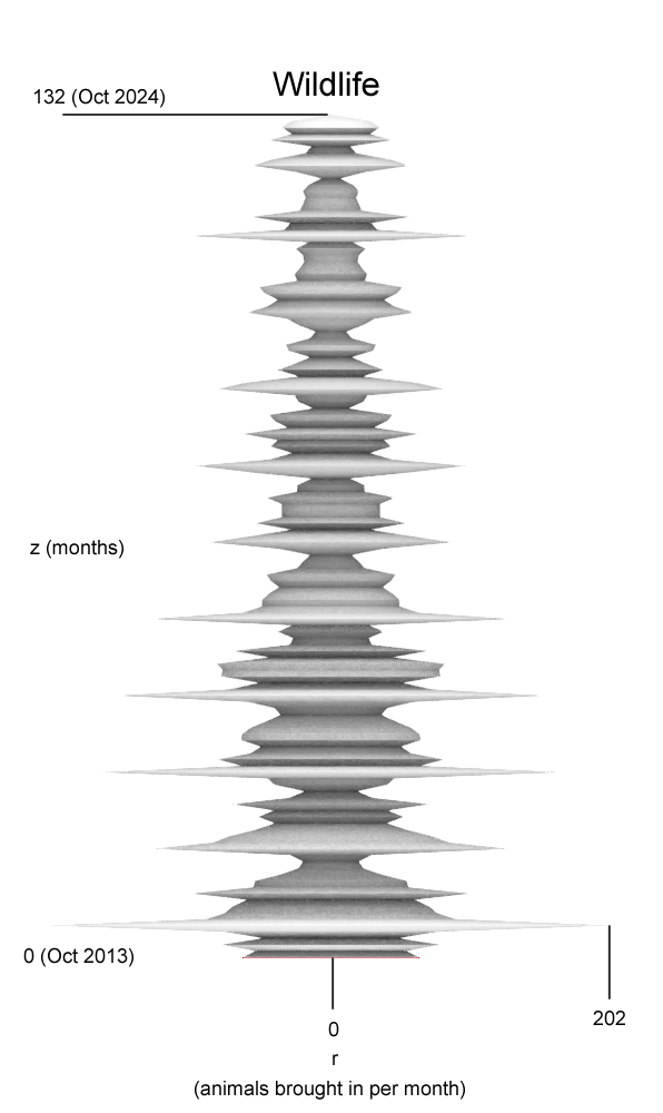
This one is by far the most erratic which makes lots of sense. I’m not a biologist but I would imagine strays would for the most part gravitate towards populated areas since they would be used to urban areas and people. Wildlife on the other hand would be less likely to consistently seek out populated areas and so you have segments of the graph with extremely low activity and other areas of very high activity (relative to the sample size) depending on external factors.
Graph 4: Grand Total
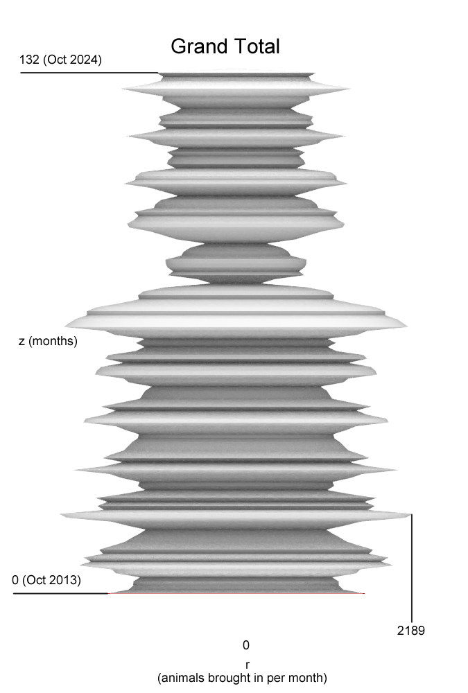
I just wanted to highlight how close this looks to the strays graph. That’s because 70% of the intake for the Austin Animal Center is strays. The graph is rounder and has more consistent trends, which makes sense since it’s taking in a larger sample size so small changes affect the overall shape less.
Reflections on Designing with Data
For me, there is something incomprehensible about spreadsheets and graphs. They are very abstract and don’t carry much meaning to me unless someone explains them. On the other hand, there is something very easy to grasp about 3D forms. Weight and volume can be very intuitive when you pick up an object and it is much easier to grasp on immediately understand at least the broader trends going on even if I don’t know exactly what they mean.
One thing that I didn’t expect from designing with data is just how abstract it gets. Even when working with parametric vessels there was a level of structure to it, we were ultimately making vases and there is a level of sensibility in that. But the graphs generated by the data had such extreme trends that some layers of the final forms are 1 segment of filament thick. This forced me to do a lot of experimentation with how I printed my forms working with supports, none, and finding designs that could subvert the need for them. It was an interesting challenge.
I’m a big fan of intuitive design, I like when you can convey something without explaining it directly. That is by far the most satisfying thing about prints like these. There is actual meaning in the form and you can feel it, the weight and the shape communicates a story rather than simply existing to fulfill some structural requirement.
Final Prints
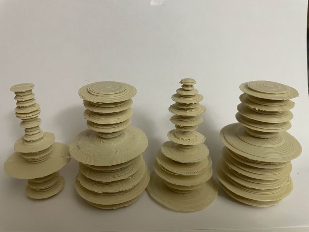
These were interesting, they pushed my 3D printing skills to their limit, the aggressive use of overhangs was very difficult to print and so I did a lot of experimentation with each model. The right one was printed without supports and somehow came out the cleanest. The second from right was done with supports and was so fragile I basically broke it apart layer by layer cleaned it and glued it back together. The second from left was strong enough I was able to mostly clean it without having to resort to breaking. The right most I printed as two bisected halves that I then glued together. Honestly the bisected strategy worked great, it was significantly faster than the others, much cleaner (for the most part) but the code required to create the bisected segments was more complicated by a large amount.
Code
As previously mentioned the bisected version was a lot harder, when you can’t just type cap it gets more complicated to create a closed shape. Mark you there is certainly portions of this I could have folded into a python file, it’s mostly just math. This just creates a 3D Plot and a bisected 3D Plot
Hi Beau,
I hear you on what you say about the abstractness of data. It takes some time and focus to really understand the vast amounts of data around. Even when the data is made into physical forms, some context is needed to really understand what is going on. We just see some peaks and valleys from plots, but we need some context to understand what the magnitudes represent.
One thing that jumped out to me was the peaks that seem to happen around February or so for surrendered animals. I’m making some assumptions here but I can’t help but think people get animals around the holidays, only to give up on them soon after. I hope I’m wrong about that.
I see how much your printer struggled with those overhangs! I tend to avoid printing structures like that because I don’t want to use supports. I think your idea of printing the models on their side is very good. This way you can avoid overhangs and the need for supports.
I will say looking at the data, I don’t see a specific spike around February for owner surrender, it looks more common in September October, but it might be for the same reason since a lot of people have summer birthdays. Hopefully not. Regarding the overhangs, I wanted to see if I could make it work, but I think I’m going to avoid going against the grain this hard next time because it was a lot of headache.
Hey Beau, I think your final prints came out in a very interesting manner. Personally, if I rendered those prints I would be scared to send them to my 3D printer as I feel like something would definitely go wrong. The fact that they came out so well is very surprising to me and I am glad that they did because they look very cool. I think you’re right when you say you pushed the 3D printer to the limit with the aggressive overhangs lol. your code file looks quite interesting and I would like to spend some time looking at it to see how all of the different pieces work together to create your final objects. I really liked the animal center data that you used, and I think your vessels display the data well. Looking forward to your future work, great job on this project!
They were certainly stressful, the one without supports came out surprisingly good. I wish I’d figured out the bisected print sooner because of all the grief the graphs gave me in printing and removing supports.
Beau,
Very interesting prints! They are interesting both in shape and in regards to the data they are reflecting. I am very surprised you were even able to get that print without using any supports! I agree with your reflection whole-heartedly, these objects we created put data into a more comprehensible story for people to understand , which often leads to a bigger impact in general.
(A little trick you might try for removing supports in the future, is to use the little clippers that came with the printer and trim and cut away at the supports. This helped me put less stress on my actual object, making the removal cleaner)
I will say the support less one did have a lot of strands hanging off of it which I cleaned up, but I am surprised with how solid it turned out. Also I have tried using the clippers, my problem was just some of the layers are too close and cutting stuff out would snap a layer off.