Dataset
The dataset I chose was from the US governmental data website: https://catalog.data.gov/dataset/motor-vehicle-collisions-crashes
At first I didn’t know which dataset to choose as there were a ton of options to choose from. I chose motor vehicle accidents because I wanted to put the amount of avoidable injuries/deaths that could be avoided if people put more effort into being safe. I hate the US infrastructure that makes many people dependent on cars so plotting this data was important to me. I chose NYC crash data because it’s a dense city and it had more data to pull from. At first the data was huge so I had to cut it down to the current year 2024 by deleting entries that weren’t this year. For one object I removed entries that had zero values since they caused points to appear way outside of the main coordinates in QGIS.
Design Process
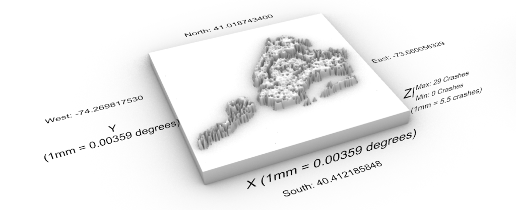
First 3D Object
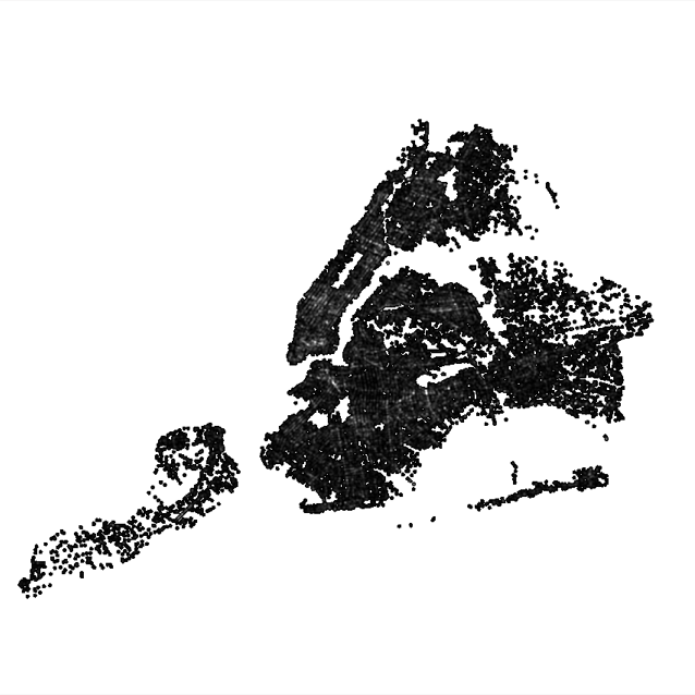
The process for this object was probably the most difficult due to all the issues I was having. First I imported the CSV file into QGIS and had it plot incidences of crash crashes and their locations using latitude and longitude given by the CSV file. I then used these points on the plot to convert it to a heat map using the processing toolbox. This allowed me to see what parts of NYC had more crashes. I then converted that to a .bmp file and used the same process we used in class to convert it to a 3D density plot. The units and scale are shown below in the first image:

Second 3D Object
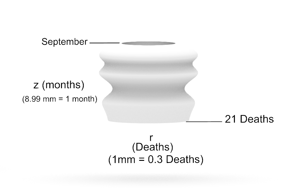
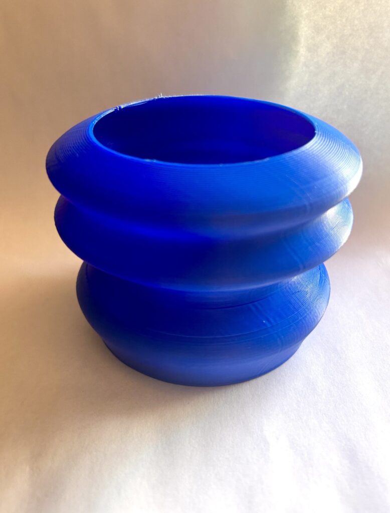
For the second 3D object I used the amount of deaths from motor accidents over the year 2024. For the z value I plotted the months and for the r the amount of deaths. The 3D form teaches you about the months that are the most dangerous around motor vehicles which can be due to many factors but some explanations can include people being out more, events, holidays, etc. The units and scale are shown below in the first image:
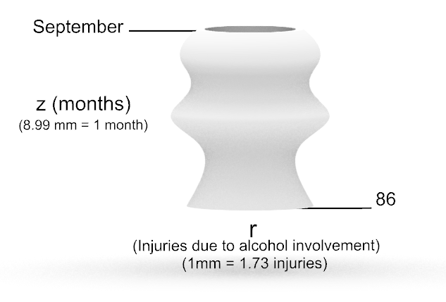
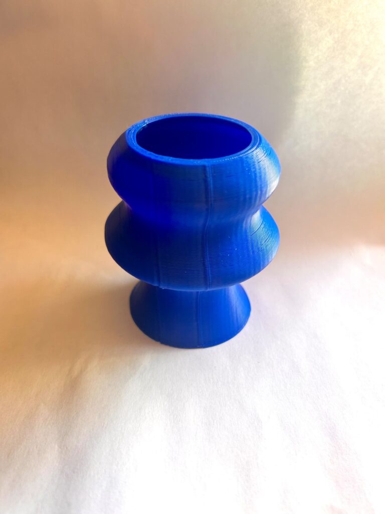
Third 3D Object
For the last 3D object I parsed data from the csv to include injuries and cause of motor accidents. I then summed up the amount of injuries that were due to alcohol involvement and plotted them on the r axis while the months were plotted on the z-axis. The form teaches you about the months where motor accidents due to alcohol involvement were high (About 5% of total injuries were due to alcohol involvement). Most drunk driving incidents are due to young adults. The form sections where the r is larger seems to coincide with start and end dates of semesters in school. The units and scale are shown below in the first image:
Reflection
3D objects can help people understand data better because it keeps people interested. When people look at simple 2D graphs it isn’t quite interesting to look at unless highly stylized. With 3D objects it adds an extra sense, touch, that makes people interact with it more and get a sense of the highs and lows of the data. Creating objects with data allows you to make more random shapes and forms that you otherwise wouldn’t really think of doing. These objects aren’t really something you’d have an easy time designing in rhino and they aren’t as straight forward as our parametric designs. The value and uniqueness of these objects is due to the fact you can feel them. Depending on the data it can even have an emotional layer to it for some people because the feeling aspect can make you feel “closer” to the data then just looking at it.
Overall, although I liked the concept of my dataset I wasn’t too happy with how things can out. I didn’t get interesting shapes due to the fact that there wasn’t too many variation in the values I was plotting. However, it does kind of show just how consistent the problem of motor vehicles is especially when the reasons for some of these accidents can be easily avoided! My favorite object was my first one because although it was difficult to create, I had a lot of fun (and frustration) learning QGIS tools. I also just made it extremely big which was fun in its own way.
Hi Ryan,
Your first model is really interesting to me, I didn’t know we could import a CSV file into QGIS to create a topography map. I’m glad you explained your process, and I’d love to try that as well. Did you create the base in Grasshopper or in Rhino?
Yeah the process itself is pretty simple but the first time my be tough. I saw the longitude and latitude measurements on my .csv file and decided to try it out since I knew that QGIS used a coordinate system from our class example. I created the base in Grasshopper using the same steps presented in the lecture. For some reason my base was surrounding my data so I had to make some tweaks to the code but it turned out well.
Hello Alan,
I found the heatmap of car crashes in New York to be fairly interesting. The only problem I had between this and your other forms is that it doesn’t really seem to tie in visually with the vessels you had created. You stated that your goal was to inform viewers about the amount of avoidable deaths. While the relationship between the second and third forms clearly paints your objective, the first form doesn’t do much for this narrative besides showing how many crashes can occur in a short amount of time (though it is visually appealing).
I do agree that making these stunning forms with data helps drive interaction from a larger audience. Take your first form for example; just looking over it helps people understand how common accidents are (considering that your heatmap basically drew all of New York).
Overall though, good work!
Ryan* (I don’t know why I typed Alan, I just caught that right after submitting this… Sorry!!!)
I’d argue that although they don’t tie in visually the first form definitely ties into the initial objective I had. I think people need to understand just how much these avoidable deaths happen which is why it’s the first vessel I created. Kind of like a hook in an essay. I see what you’re saying though maybe I could adjust my objective a bit next time.
Yeah seeing the comparison between a NYC map and this is kind of terrifying. You think it’s just a normal map of NYC but then you’re told it’s the amount of car crashes happening in a given area and then it’s concerning.
Thanks for the comment!