Dataset
For this project I chose three datasets which were Solar Flare Heights, ABQ Car Thefts, and Top 5 Major Virus Deaths. For all of my chosen datasets I took my filtered statistics to a Google sheet where it was organized for myself then generated graphs for me which I used the bar/linear shape graphs and the numbers which were scaled to 1mm representing measurements and form as my data.
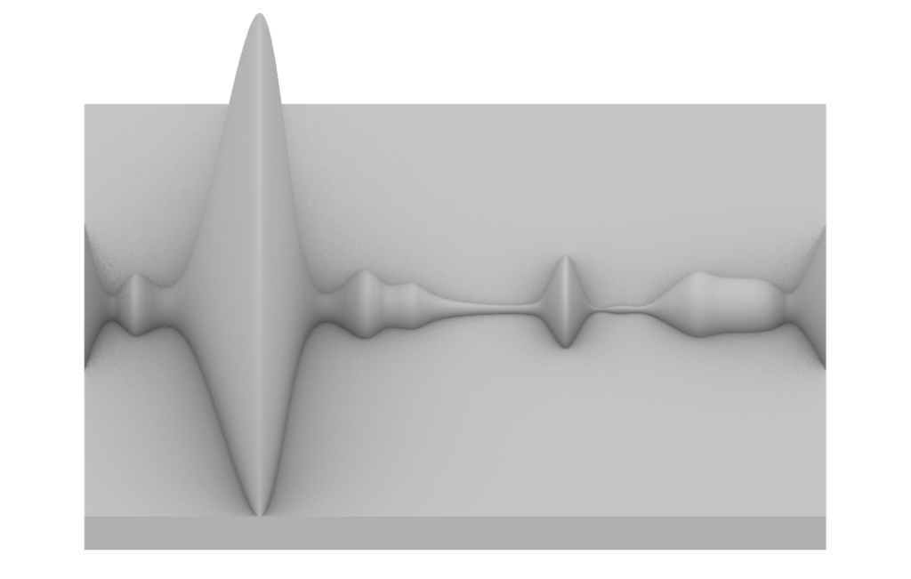
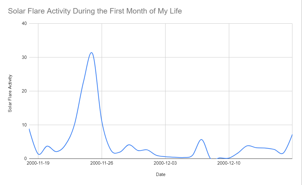
- The Solar Flare design process was filtering out a lot of data to reach the 30 days from my birthday then using the linear path from the graph I used the curve command in Rhino which was the starting point for my grasshopper code, the data is physically represented at plan and elevation views with dramatic flares rising within those 30 days.
https://www.ngdc.noaa.gov/stp/space-weather/solar-data/solar-features/solar-flares/index/comprehensive-flare-index/2000/cfi_daily_2000.txt (Used the data for 2000-Nov-18 to 2000-Dec-17. The first month of my life.)
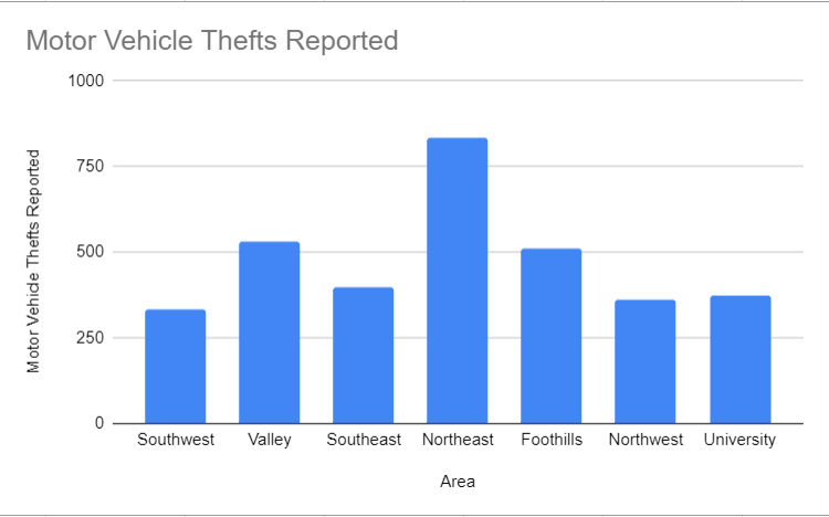
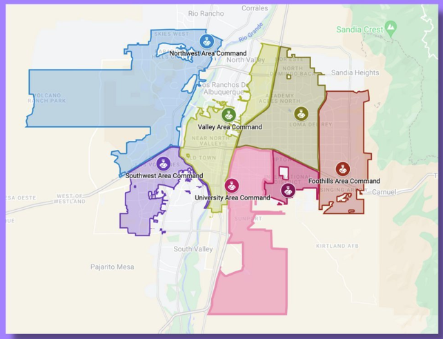
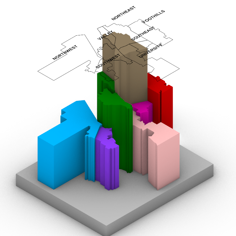
- The ABQ Car Theft design process was my favorite one for availably to data and the model. Outlining 7 different sections of Abq I used these curves which again was my starting point of my grasshopper code. Each slider consists of a certain number but how this data of each theft is represented is through height on the Z-Axis. Scale of how this is measured 0.01mm : 1 Car Theft, making each section have various heights to them.
https://www.cabq.gov/police/crime-statistics
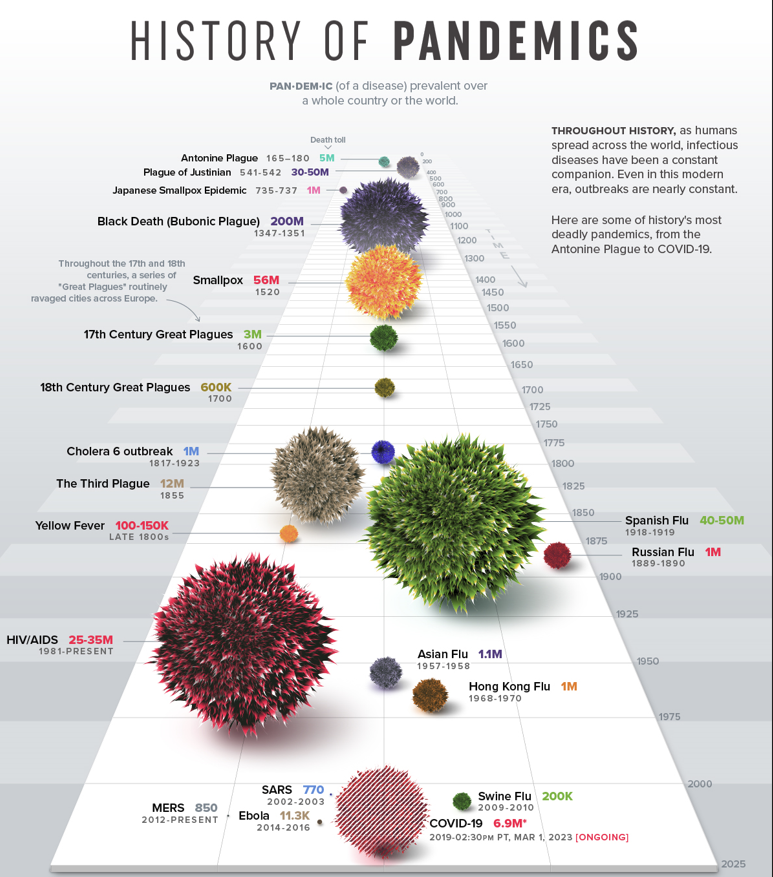
- The Top 5 Virus Death design process was the challenging design not for its access to data but filtering out 500 years and size. Reason for was deaths were too low to scale in the model, too many viruses, and the largest virus being too large in deaths for scale could not be modeled with others. Taking the top 5 deadly (filtering out Smallpox ) over 1 Million and recent viruses, its data is represented 1mm : 1 million Deaths, transformed to the diameter of sphere in mm. In my model there is a 1mm size virus (1 million deaths) which is used to show scale and intensity of viruses through time.
Covid-19 2019 – 6.9 Million = 7mm
HIVS/AIDS 1981 – 25 Million = 25mm
Asian Flu 1957 – 1.1 Million = 1mm
Spanish Flu 1918 – 40 Million = 40mm
Third Plague – 12 Million = 12mm
https://www.visualcapitalist.com/history-of-pandemics-deadliest/
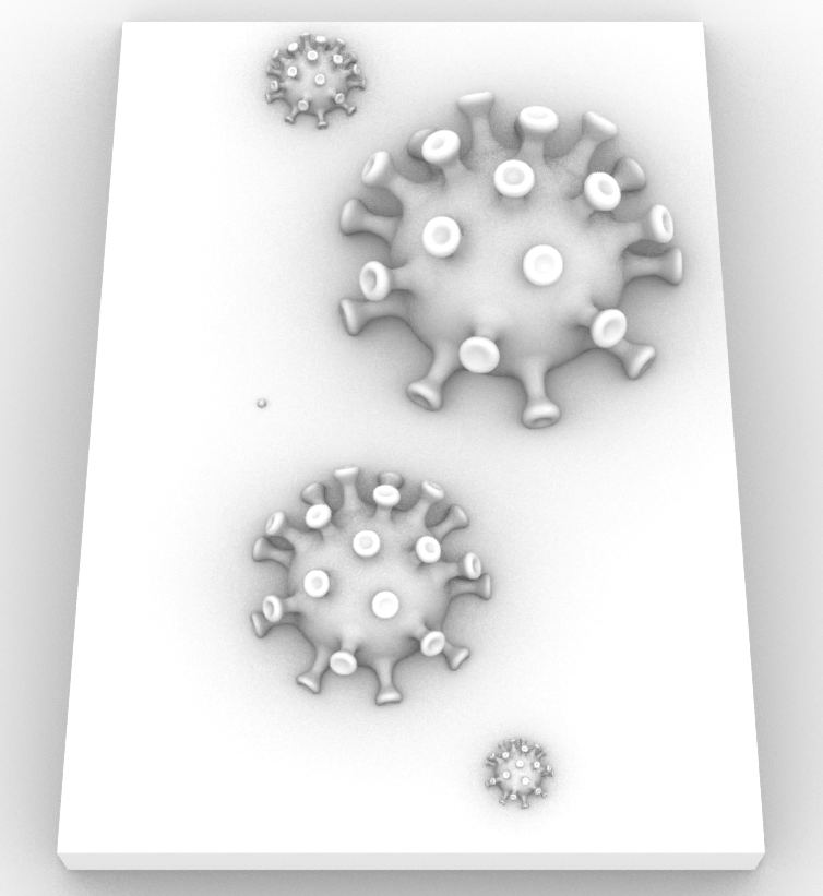
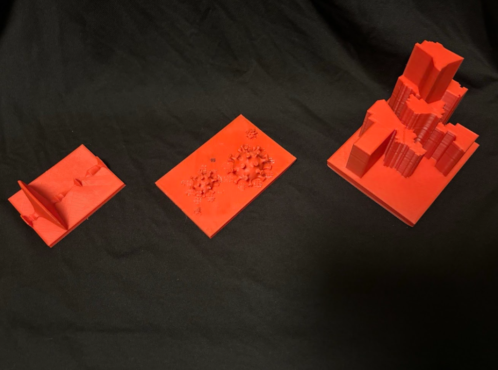
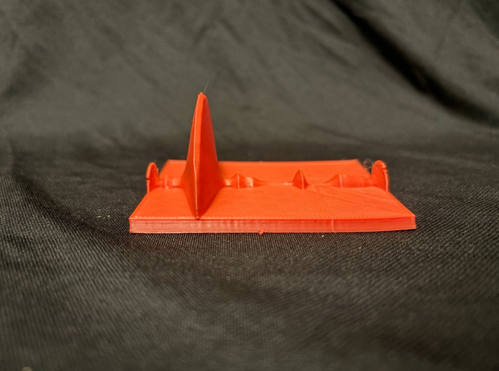
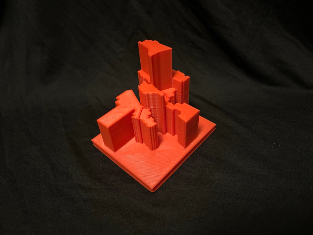
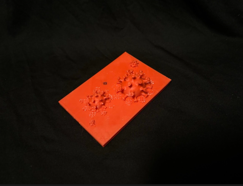
- Designing with data in my project involved transforming abstract numbers – such as pandemic death tolls—into 3D objects, using spheres to represent death rates over time. By adjusting the diameter of each sphere to reflect deaths (1mm = 1 million deaths), I visualized the scale of impact in a physical, understandable way. The process of placing these spheres along a zigzag curve for timeline in Grasshopper allowed me to explore relationships between data points in a way that goes beyond traditional 2D graphs. This method provided a physical form of storytelling through data, making it more intuitive to grasp patterns and timelines that might otherwise be overlooked in numerical form. Seeing data through physical models offers a new way to interpret information beyond traditional tables and graphs. While mathematics has long been used to measure and reference data, 3D modeling and printing provide an efficient experience, making concepts easier to understand with numbers. This technology allows for deeper exploration of patterns and relationships, offering a more automatic and impactful way to engage with data.
Hi Jyrus, the object you made for the ABQ car thefts is very nice especially since it combines the bar graph with the map to make it much easier to understand if you didn’t know every single area in Albuquerque off the top of your head. This idea also aligns with your reflection since otherwise, you would likely need more than just the 2D bar chart to get the same information and context that the 3D object gives.
Hey Luka, thanks! The ABQ car thefts print is my personal favorite. I’m actually surprised it turned out so well considering it’s a simple idea. My goal with this print was to visualize how certain areas have more car thefts than others. Notice how as you move up towards Northeast ABQ, the chances of getting your car stolen increase. This is what I wanted to help others visualize.
Hello Jyrus,
Your prints are extremely interesting and very different to my own. I really liked how you made data look in the 3D space. The virus and car theft prints are extremely interesting and fun to look at. I totally agree that 3D physicalization of data can help us delve deeper into data and make it more easily digestible.
Hey Andrew, thanks! I like how the virus dataset print turned out as well. It looks even better in 3D space than I expected. Although, I do have to say that I initially planned to print the top 10 viruses instead of the top 5. But the scale of some viruses were just too large and made it hard to fit all the figures. For example, I wanted to include Smallpox, but its 56m death toll visualized made every other virus pale in comparison and hard to print to scale.
Hi Jyrus, I enjoyed your process of transforming abstract data into something more concrete and easy to understand. What drew you to these three datasets? They are each quite unique, and at least from the design, very different from one another. I am also curious why you chose to manipulate the data around your birthday – are solar flares meaningful to you or was that an easy date to choose?
Hi Sachi, thank you! These are great questions. First, I do have to admit that I misread the assignment prompt and chose three datasets instead of one. That said, I was drawn to both the car thefts and pandemics dataset because it was simple and hit close to home. And for the solar flare data, I just thought it would look cool to somehow visualize solar flares and stumbled upon a huge dataset from NOAA. Which leads me to your second question: Since the solar flare index data was so large and comprehensive, I knew I had to focus on a small subset of it. Which simply lead me to choosing the subset of data centered around my birthday.