Data, Models, and Design
For this project, I took elevation data of a region in New Mexico from the USGS database, and examined average annual min/max temperatures in the same region from PRISM data in RGIS.
I was curious to see how elevation affects, if at all, the change in temperature of a point between its annual minimum and maximum. Or in other words, how drastically the temperature tends to change throughout the seasons. To accomplish this, I used the Raster Calculator tool in QGIS to create a new .tif file from subtracting the minimum temperatures from the maximum temperatures. The min/max temperature datasets have the same unit scale (1 unit = 1/100 degrees Celsius), so no extra work was required to perform the data transformation. When handling the grayscale image representation, QGIS automatically examined the highest and lowest values in the resulting dataset and normalized the brightness values accordingly.
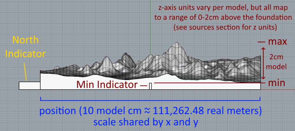
After exporting the four .tif files into .bmp representations (elevation, temperature max, temperature min, and temperature difference), I used Grasshopper to sample the brightness values at a lower resolution (1/10) and convert them to z-axis height, while the x,y coordinates were scaled down to fit a 10cm square. Minimum brightness corresponds to a height of 0, and maximum to a height of 2cm. Then, I made flattened copies of the perimeter edges to form the side walls and bottom of the model, with some extra height to provide a solid foundation for structural integrity.
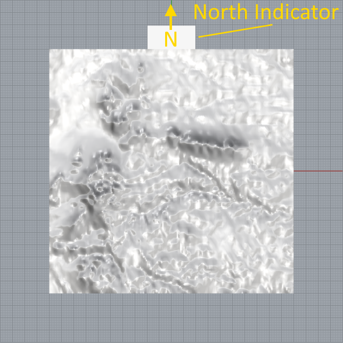
To make sure orientation is always clear, I extended out a small box from the north side of the model. In order to allow models to be placed together north-to-south, and to add a self-aligning feature, I cut out the same (but slightly larger) box on the south side, so pieces could slot together. Lastly, I cut out thin boxes on the east and west sides each as tall as the foundation, to indicate where the foundation stops and where the data begins.
Resulting Models and Analysis
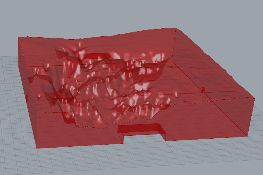
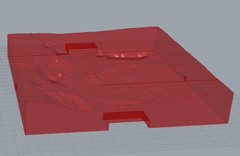
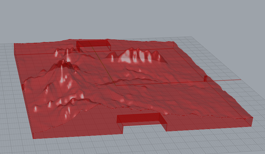
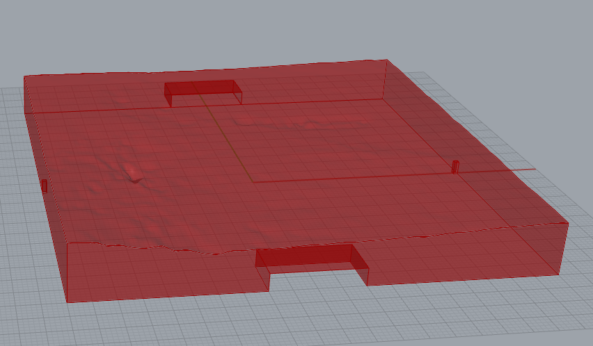
Here are the four models rendered in Rhino:
Diagrams of how to read the models:
Pictures of the printed models:
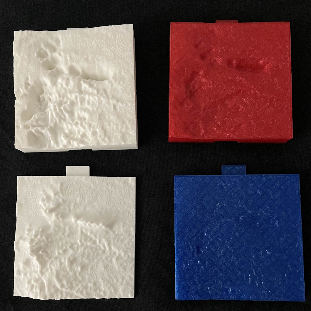
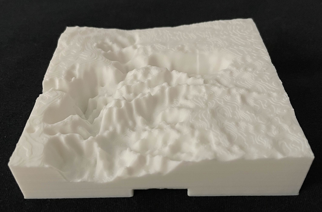
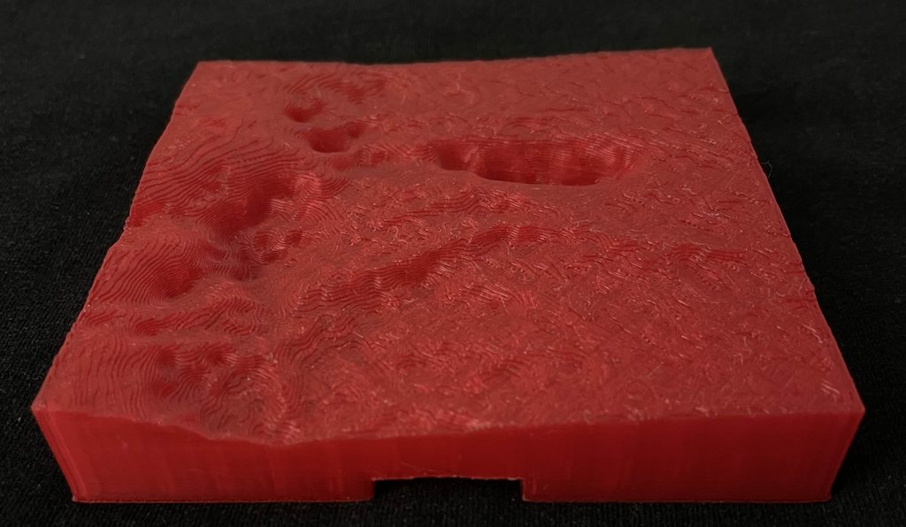
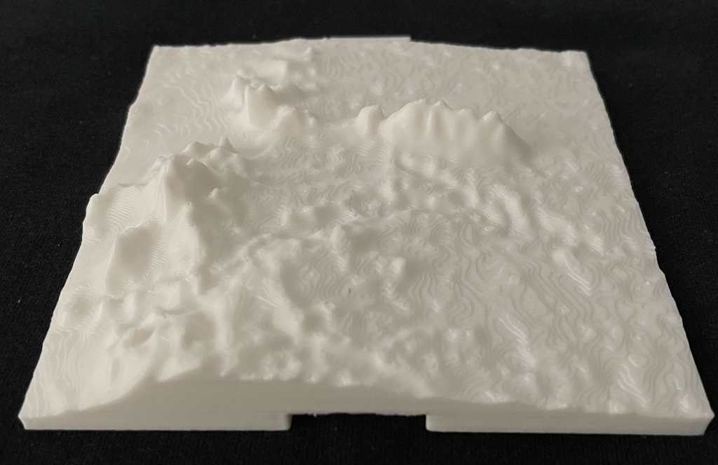
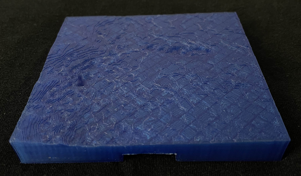
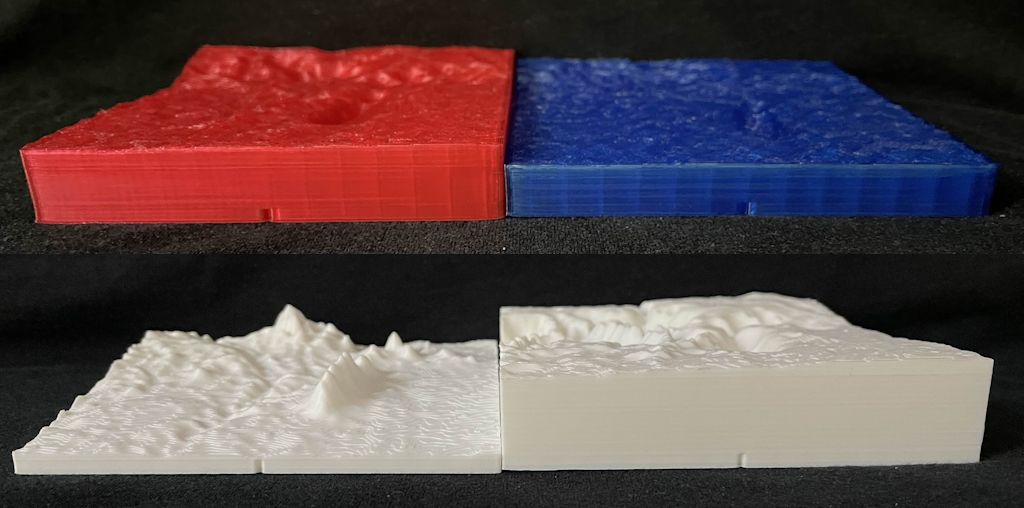
With the models in view, it’s immediately apparent that areas of high elevation lead to small temperature differences, while low elevations have larger temperature differences. That is to say, high-altitude areas have much more stable temperatures as seasons come and go.
Curiously, this trend seems to apply not just for steep areas like mountains, but also to shallow-sloped areas like the high-altitude region in the southwest part of the model. Its western side has a steeper TD (temperature difference) slope while the shallower east side also has a shallower TD slope, all while the highest point has a TD value almost as low as the TD values of the mountains. Thus, it’s less about mountains acting as large walls that outright block most airflow due to their height combined with their steepness, and more the raw elevation level itself.
Lastly, rivers appear to have high TD values, even in high-altitude regions. There are a few rivers which extend into the high-elevation region in the southwest, and while the river beds cause them to have slightly lower elevations, they still end up higher than the portions of the rivers in the low-elevation lands nearby. In spite of these river beds being fairly high up, they still have very high TD values, which makes sense as water transmits heat much more efficiently than stone or dirt. Also note that the TD values sharply fall off according to the surrounding elevation as soon as you look away from the river and onto land.
So, from this region of land (which has rivers, but no significant bodies of water of other types), it can be concluded that an area will have large temperature fluctuations throughout the year if it has a low elevation, or if it is a river.
Also, something else that can be gleaned from this is in what way the temperature differences are smaller at high elevations. A small TD could be from a lower max temperature, a higher min temperature, or both. By looking at the separate temperature models, it’s clear that the min temperatures aren’t all that different between the low- and high- elevation areas, while in the max temperature model there is a considerable height change in high-elevation areas1. Thus, the low TD values of high-elevation areas are driven by them not heating up as much during warmer seasons compared to low-elevation areas.
Likewise, the manner in which rivers have high TD values can be examined as well. The min temperature model doesn’t have any features that make rivers clearly visible. Meanwhile, the max temperature model shows them clearly in high-elevation areas due to the rivers heating up while the surrounding high land stays cool. However, the rivers are less prominent in low-elevation areas due to the water and ground heating up by nearly the same amount in those areas.
Reflection
Representing certain datasets as 3D models can assist in one’s understanding of them by displaying them in a more natural or close-to-reality form (like location-specific data), or by combining related properties into one graph to see relationships more easily than if multiple, separate 2D graphs were used instead. The effectiveness depends heavily on the kind of data and how it is being represented, however. In some cases, opting for a 3D representation can muddy up details, be overwhelming to process visually, or create difficulties in actually displaying the model on our 2D screens, especially if it’s being displayed in a medium that doesn’t support user-controlled viewing (rotation, panning, etc) or animated displays (pre-defined model rotation in a video).
Fortunately, some of these drawbacks can be overcome by using a physical medium in the real world. Though our eyes still technically create 2D images, the depth perception created by having two eyes and other post-processing done by our brains allow us to perceive things mentally much closer to that true 3D form. It does have limits of its own though, like distribution, cost, effort, and in some cases, not being able to physicalize the data at all (or without severe transformations or more creative but distant methods of representation) due to having floating, disconnected, or cave-like geometry. But, if your dataset is conducive to being made physical, it can do wonders for examining it in a more natural, hands-on way that isn’t limited by the flattening of 2D screens.
As for using data to drive purely artistic creations, I would say it would be much better to use perlin noise generation and other, similar methods instead. It provides a large collection of interesting data points like before, but allows for considerably more control over properties like variance, noise intensity, inserted patterns, and other features. It’s also (relatively) easier to acquire and work with, not needing one to search through databases for something just right, deal with mixed file types, respect usage licenses, or clean out extraneous, messy data.
Sources / Code
Precise unit/dimension details:
- Elevation:
- Units: 1 unit = 1 meter from NAVD 88 sea level
- White: 3548.71 = 3548.71 meters
- Black: 1354.27 = 1354.27 meters
- Temperature Max:
- Units: 1 unit = 1/100 degrees C
- White: 3190 = 31.9 C
- Black: 236 = 2.36 C
- Temperature Min:
- Units: 1 unit = 1/100 degrees C
- White: 2302 = 23.03 C
- Black: -830 = -8.3 C
- Temperature Difference:
- Units: 1 unit = 1/100 degrees C
- White: 1800 = 18 C
- Black: 1095 = 10.95 C
- Region Extents:
- Note: the temperature datasets have data for all of North America. Only data pertaining to the region spanned by the elevation dataset was examined for this project.
- North: 34.000555556
- South: 32.999444444
- East: -104.999444443
- West: -106.000555556
- This forms a square region of (very nearly) one arcsecond, so 1.001111112 arcsec = ~111,262.48 meters wide
- Main geographical points of interest:
- Sierra Blanca (mid-west mountains)
- Capitan Mountains (north-east mountains)
- Carrizo Mountain (north-west mountain)
- Rio Ruidoso, Rio Bonito, Rio Hondo, and Tularosa Creek
- Mescalero Reservation (southern region)
Sources:
– Elevation
– Temperature Max
– Temperature Min
Grasshopper and misc. generated files:
- The min/max values of both of the original temperature datasets correspond to the min/max values recorded across the full North American landscape, which is why their models don’t have peaks and valleys that span the model’s full 2cm range. Thus, it’s possible for one of the models to have a much shallower-sloped, flatter appearance overall. However, caution must be used when making such a comparison between models; if the ranges of the two datasets are vastly different, then comparing relative heights on their models could yield misleading results. Fortunately, the ranges of the two datasets are very similar; the maximum temperature dataset has a range only 6% larger than the minimum temperature dataset, which is much smaller of a difference compared to how shallow vs deep their models are compared to each other. ↩︎