2D Tiles
The inspiration for mine was fairly simple. I struggled to think of a four sided design I found compelling. The closest I got was the Spectre logo from James bond which I thought was pretty simple and evocative

My loose attempt comes off more as a bat than an octopus but I wanted to maintain the ragged bottom which I thought was the coolest part of the original icon.


I had no major issues with the code, mostly going off the examples from class. In an attempt to not redo work it is permanently attached to the 2.5 tiling thus why it looks kind of long.
For my alternative 3D tiling I did hexagons. They’re neat and I like that they keep orientation unlike triangles. This one was significantly harder as I had to isolate a repeating pattern you could that would consistently create hexagons I ended up latching onto the lower the bottom left corner and the 3 sides it took to create it. But once I found a repeating pattern it came out pretty cleanly.


3D Printed 3D Tiles
The main concern I had going into this one was I wanted it to have some kind of symmetry. It really bothers me how 4 sided tiles struggle with symmetrical designs and so I decided to go with hexagons since given the 6 sides you could have 120 degree rotational symmetry.

The crests from the war of the roses were an interesting radial pattern I like and so I decided to sort of ape it with half the sides of the hexagons having thorns and the other half having indents to almost serve as petals. In a different world I would have loved to make them 10 sided to better represent that but they wouldn’t have tiled.

The design revolves around the spiked hexagon pattern with two elevation shifts of the same pattern inside to represent the concave folds of a flower petal.

This one was pretty simple, since it was largely about repeating patterns it boiled down to tiling 3 subsets of tiles and then isolating and lofting the matching sets.
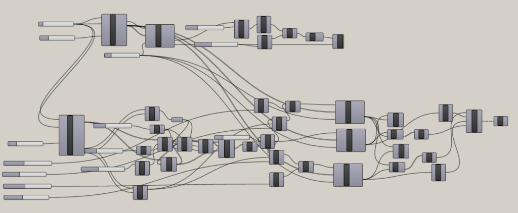
Continuing the motif of parasitic design, the massive tangled bottom half is almost entirely the construction of the prickly star shape of the tile and the various minor alterations I made for the inner rings to get the texture I wanted. Otherwise it takes all its vectors from the original hexagon tile code with some minor alterations for lofting the various tiers.
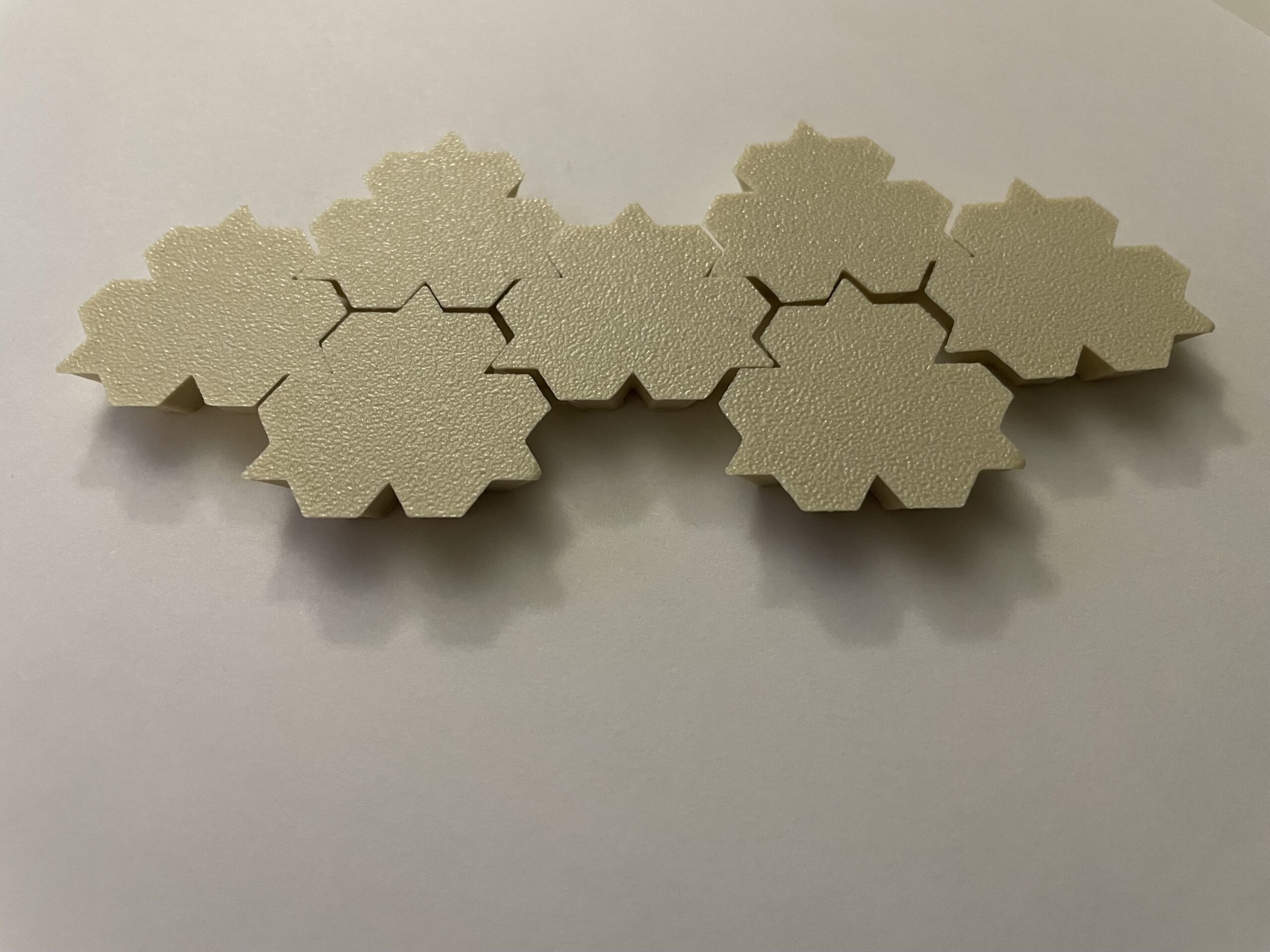
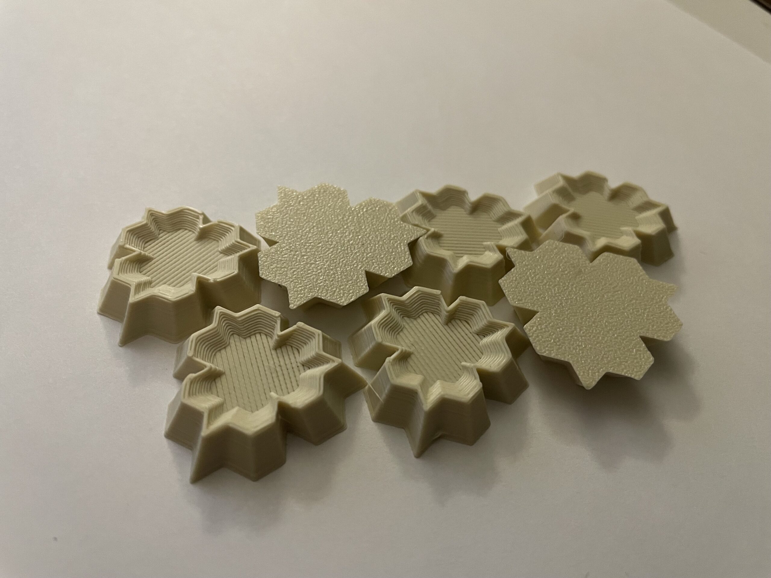
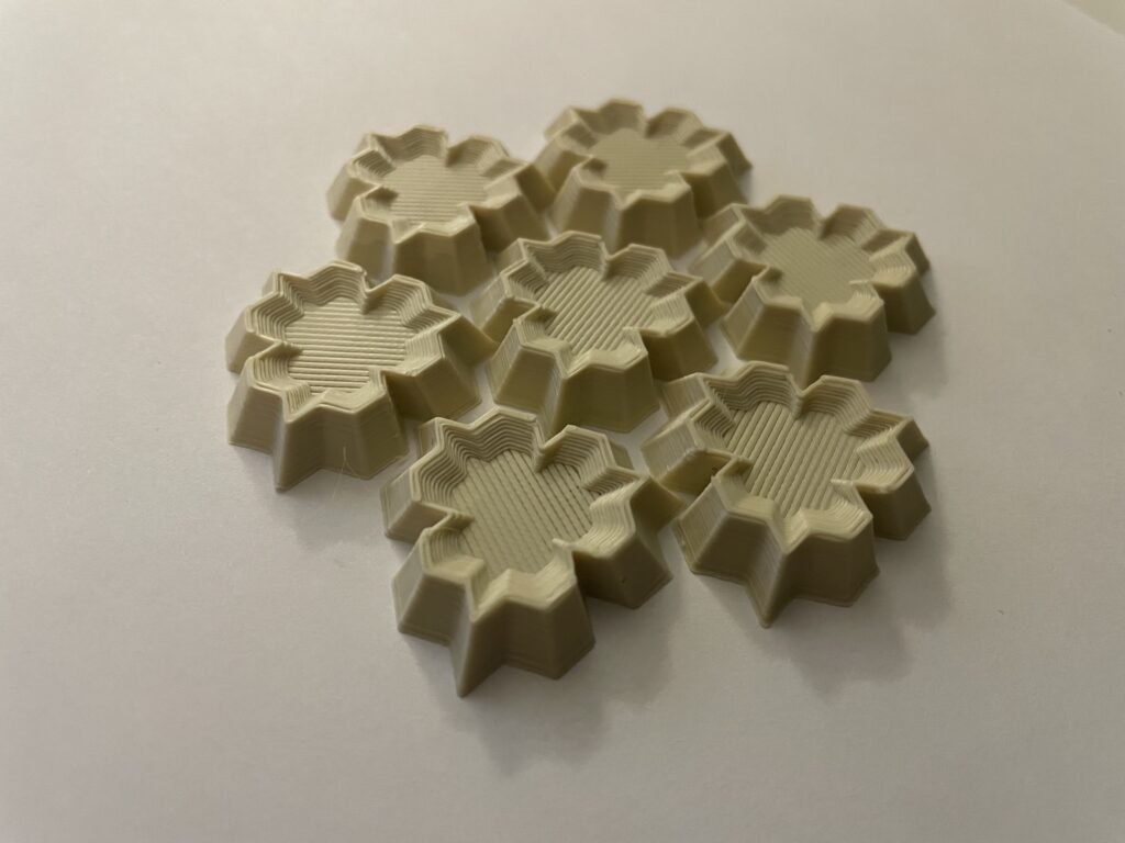
I’ve very pleased with how they printed. I didn’t have any major issues. I especially like comparing the tops and bottoms because you see the contrast between the 3D pattern and what a more basic extrusion would have created.
Surface Morph
Really the only issues I dealt with was just the how complicated surface morphing was. When I followed the slides step by step it worked pretty much without issue.
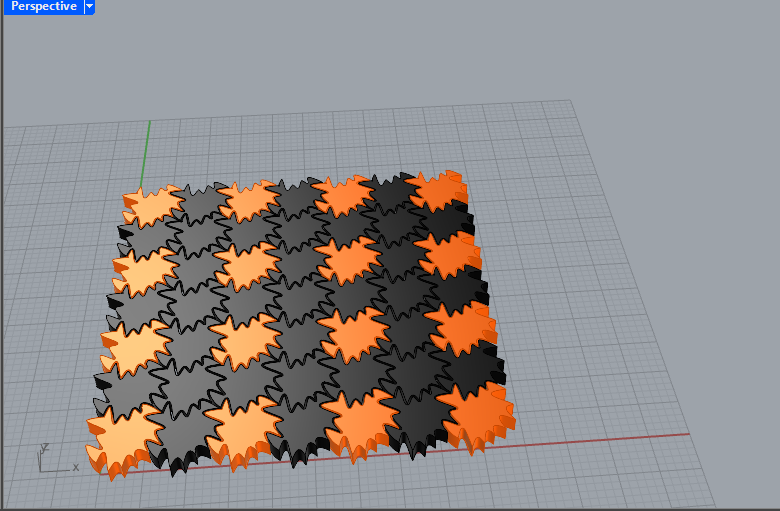
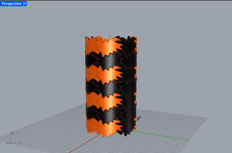
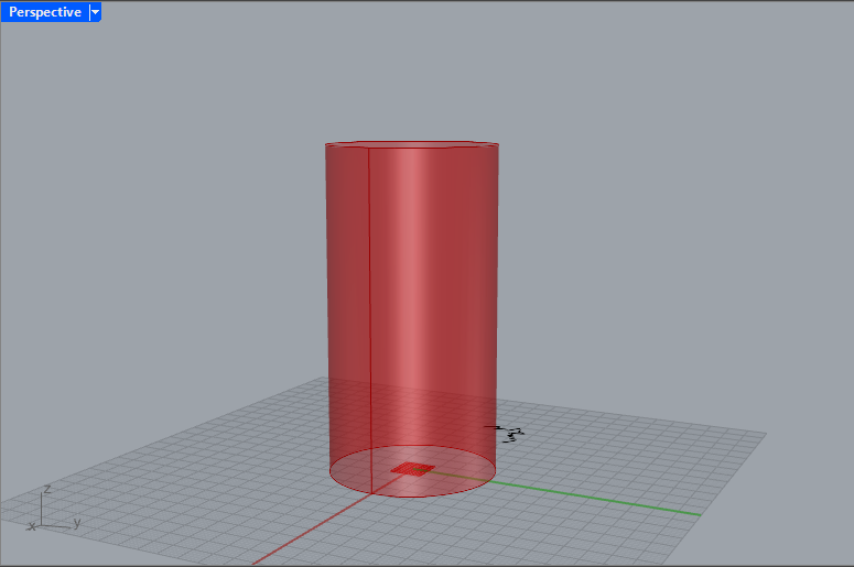
Due to how codependent much of the code is I’ve chosen to just leave it as a single file but I’ve also included a rhino file with the curves I used in my escher tiling.
Hi Beau,
I love your 3d tiling, I think it came out really well. They connect together very flush and it was very aesthetically pleasing to mess with them in class. I don’t know if I can explain this well enough but the prints almost look like there is an outer shell and a separate object put snug into it. I’m not sure if that makes sense but the way it printed is just really cool and it has an interesting design.
Thank you, I also noticed that interesting texture. The print pattern of the slanted walls versus the flat interior are so different they really do look like there are two different objects, it’s was entirely on accident but it is a very unique appearance.
Hi Beau,
I love that you took inspiration from that crest. Your tiles came out beautifully! How did you accomplish the elevation changes? Also, did you try surface morphing the base shape of your 3D tiles? I also like the sharpness of the edges on your Spectre logo/bat tiles. A very cool project!
Unfortunately I didn’t morphing my 3D tiles, it would have been really cool if it had worked, but the code for the 3D tiles was different enough I didn’t feel confident in trying it for my surface more. The inset surface was accomplished by lofting some resized and repositioned copies of the base shape, which actually made it a lot easier to tile.
Hi Beau,
Your 3D tiles fit together so well, I really enjoyed messing around with them in class. I think the bats would have been cool to print, but I understand what you were saying about the sharp angles as I had some trouble with that in my own 3D tiles.
Thanks, I’m glad they handled well. In a different world I would have loved to have printed more of the stuff I made, but with my tiles as they were I’m happy with what I made.