Project Description / Deliverables
For this project, me and Alan are going to be using data collected from the UNM Olympic and Johnson pools, since we both work as lifeguards there, we both thought it would be really interesting and beneficial. For our deliverable we are hoping to make 2 abstract 3d prints using seasonal data collected from these two pools. Specifically, we will be focusing on the PH, ORP (Oxidation Reduction Protentional) , Temperature, and Water Flow. For each model representing each pool we will be using a combination of different color filaments in order to make the models more visually appearing and interesting. In the end , we hope to be able to make 3d abstract art that an be displayed on the wall.
We are planning on first making a rectangular plane to represent the “timeline” grid of the data. The starting date will be july 2020 until 2021. For each day a small cylindrical figure will be printed in a space in the grid formation we have. For each figure, the temperature will control the height, the water flow will represent the width, the ORP will bend the figure.
As far as what we expect the data to look like, we do not know fully know what the finished figure will look like but we definitely expect to see some interesting trends in the ORP (chlorine level) and flow level due to the change in season and changes in activities / activity level in the pool (for example : summer season vs in school season).
If we have additional time in our project , we plan to incorporate changes in colors to represent if the PH falls below 7.2 (Black) or above 7.8 (Red).
Team Members
- Alan Paz
- Ian Kahn
Timeline
- Week 1 (Nov 1 – 11 ) – Organizing the large data set to be parsed, creating the python script to read in / output data correctly in the format we need. Researching what 3 filaments we want to use.
- Week 2 (Nov 12 – 22) – Inputting the Data into rhino, and testing various visualizations of the data
- Week 3 – Nov 23 – 30 – Prototype Prints
- Week 4 (Nov 30 – Dec 5) – Printing / Fixing details of prints / Final Print
Related Work / Inspiration
For our primary inspiration of this project, we were both inspired by this article ” Opportunities and Challenges for Data Physicalization” by Yvonne Jansen, Pierre Dragicevic, Petra Isenberg, Jason Alexander, Abhijit Karnik, Johan Kildal, Sriram Subramanian, and Kasper Hornbæk. This academic article delves into the benefits and opportunities offered by data physicalization, such as offering an intuitive and memorable way to model data that might otherwise might be too confusing or not engaging enough to properly understand. This is certainly the case for our project as well. The various measurements we are looking at in the pool, PH, ORP (Oxidation Reduction Protentional) , Temperature, and Water Flow quite simply just seem like numbers to the everyday viewer, but with the help of a model, especially a 3d physicalized model, it truly brings the data to life and much easier to comprehend and significantly more engaging and accessible.
The second academic recourse we used was the various water data physicalisations / visualizations from the United States Geological Survey (USGS). On this site there a lot of really interesting and insightful visualizations on topics about water ranging from unequal access to water to a map of the drought in California. In particular , one data model that we found especially interesting and relevant was the “Gages Through the Ages” model. The USGS made an interesting and accessible visual representation of this water data through chronological time stamps and similarly in our project to visualize PH, ORP (Oxidation Reduction Protentional) , Temperature, and Water Flow , we will be using chronological time stamps as well (likely daily). In both cases , of both our project and the USGS “Gages Through the Ages” model , the data is used to improve water quality / recourses while in our project the data we model / measure is also used to improve water quality / recourses while also helping ensure a safer swimming environment for patrons.
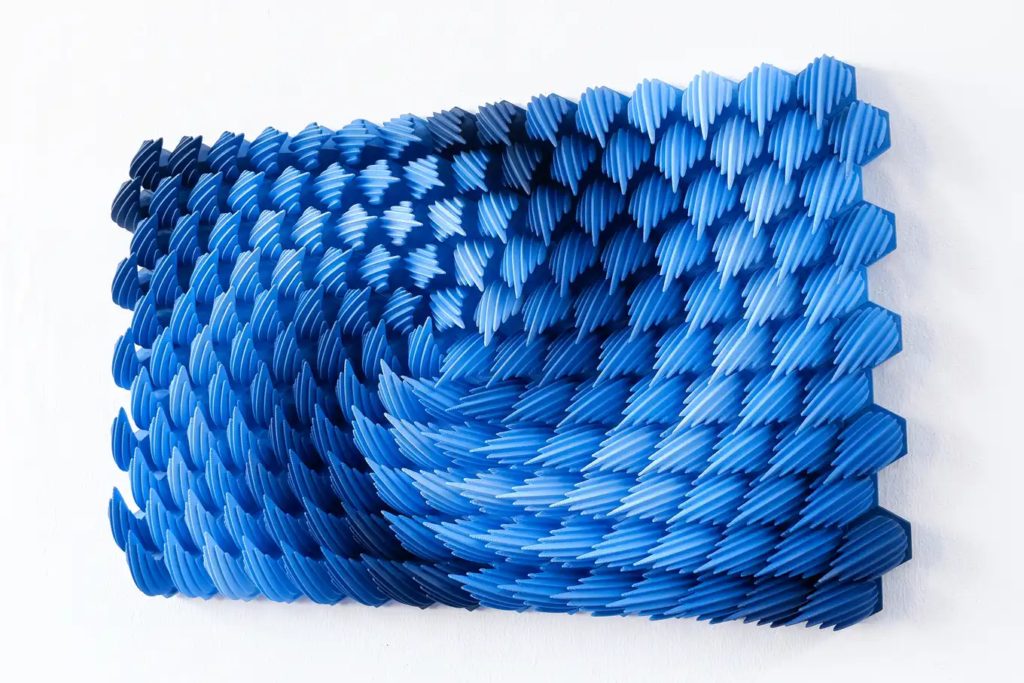
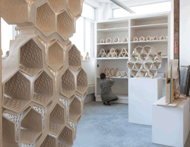
As far as our artistic inspiration, we were inspired by both of these pieces in particular. The first one by Herschel Shapiro we both found very inspiring due to the use of various shades of blue / purple and the incorporation of different filament colors, this is something we are both really wanting to implement in our project. Additionally, the use of the swirl pattern / texture was really appealing to us as well. The second design project (linked below) we also found very inspiring to us. In this one , we found the concept of 3d printing masonry to be very applicable since it is essentially a form of wall art in a way as well. Additionally, we found their design and printing process to be very organized. In their process , they first designed a computationally symmetric and cohesive 3d model and then began testing different scaled mockups, we plan to follow a similar plan on testing smaller scale mockups before committing to our final , large print.
https://labs.waterdata.usgs.gov/visualizations/index.html#
Artistic Inspiration:

Credit : Herschel Shapiro
https://herschelshapiro.com/maelstrom

Hey guys! I think that this is a great idea for a final project. Since you both have experience working with this data, I imagine that the final prints will be very meaningful to you both and you can explain the changes in data over time. I suggest that you add a lot of details about how we can interpret the data and understand it in your final print. I think your selected related work is fantastic and I hope you use it as a strong inspiration in your project. Looking forward to seeing how it turns out!
Thanks Wayne I appreciate it! Yeah that’s a good suggestion thank you. We plan to have each print contain lots of details in the structure(s) determined by measurements in the data: PH, ORP (Oxidation Reduction Protentional) , Temperature, and Water Flow.
Hi guys,
creative look on how to incorporate your job into data visualization. I wonder what kind of data the UNM pool keep tracks of. I know that when I used to work at a pool we kept track of the age, time, and programs of the individuals that would come in to use the pool for. I wonder when creating your model if its possible to add some design elements of an Olympic pool. For example, using lane lines to indicate different areas of the data and such. Good luck and can’t wait to see it!
Hello Ricardo,
Thank you so much for the comment. The data we keep track of and specifically will be looking at in this project is PH, ORP (Oxidation Reduction Protentional) , Temperature, and Water Flow. However, we do keep track of population / patron data like that as well and that certainly would have been a very interesting data visualization and physicalisation to convey. That is also a really good idea to make the model similar to the design layout of a pool. Thank you!
Ian
I think this is a fun project for you to work on especially since it is relevant to the current jobs that you guys have right now. Is there a particular way you hope to present your data, I know some of the previous students did surface graphs, bar charts, and then we also did the revolved data graph. Based on the UNM data are you guys going to utilize a csv python block in your grasshopper and rhino file, if that file format works with the data from UNM. Or are you guys going to carve out some time to observe and collect data on your own and then upload that data to an excel file?
Hello Andrew,
Thank you for the comment. Yeah right now we are planning to have a surface grid of shapes with each shape slightly modifies by the amounts in the measurements / data we are focusing on. Yes, we will utylise python to parse the csv file we have from UNM since this data is collected periodically by the Head lifeguards and management at the pool at UNM.
Thanks again for the comment. Ian