Data Set
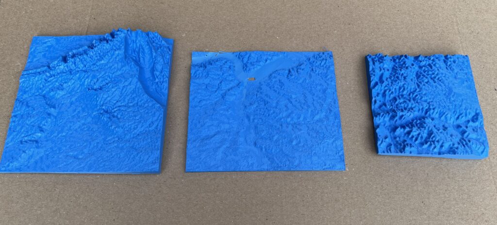
I used the USGS data from three different locations- Carlsbad, NM, Midland, TX, and Tioga, ND. I selected an area roughly a quarter of the map given by USGS.
Design Process
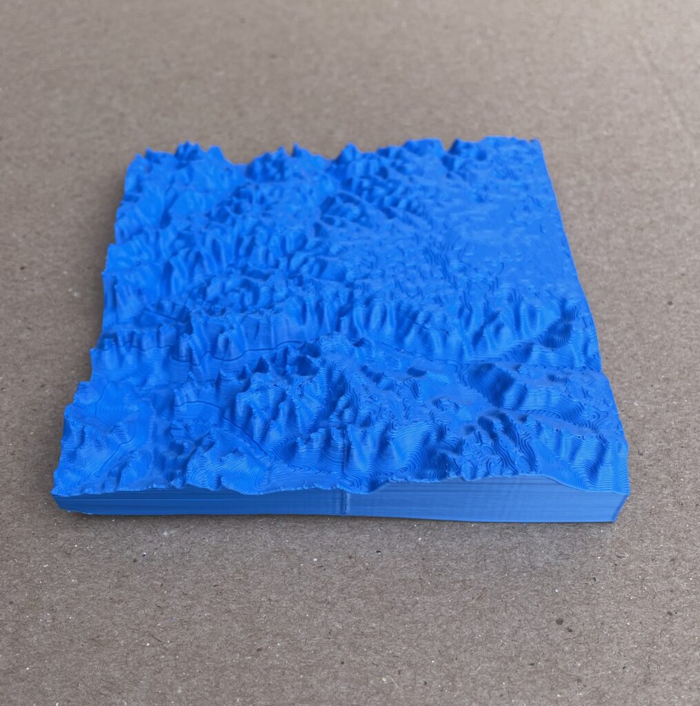
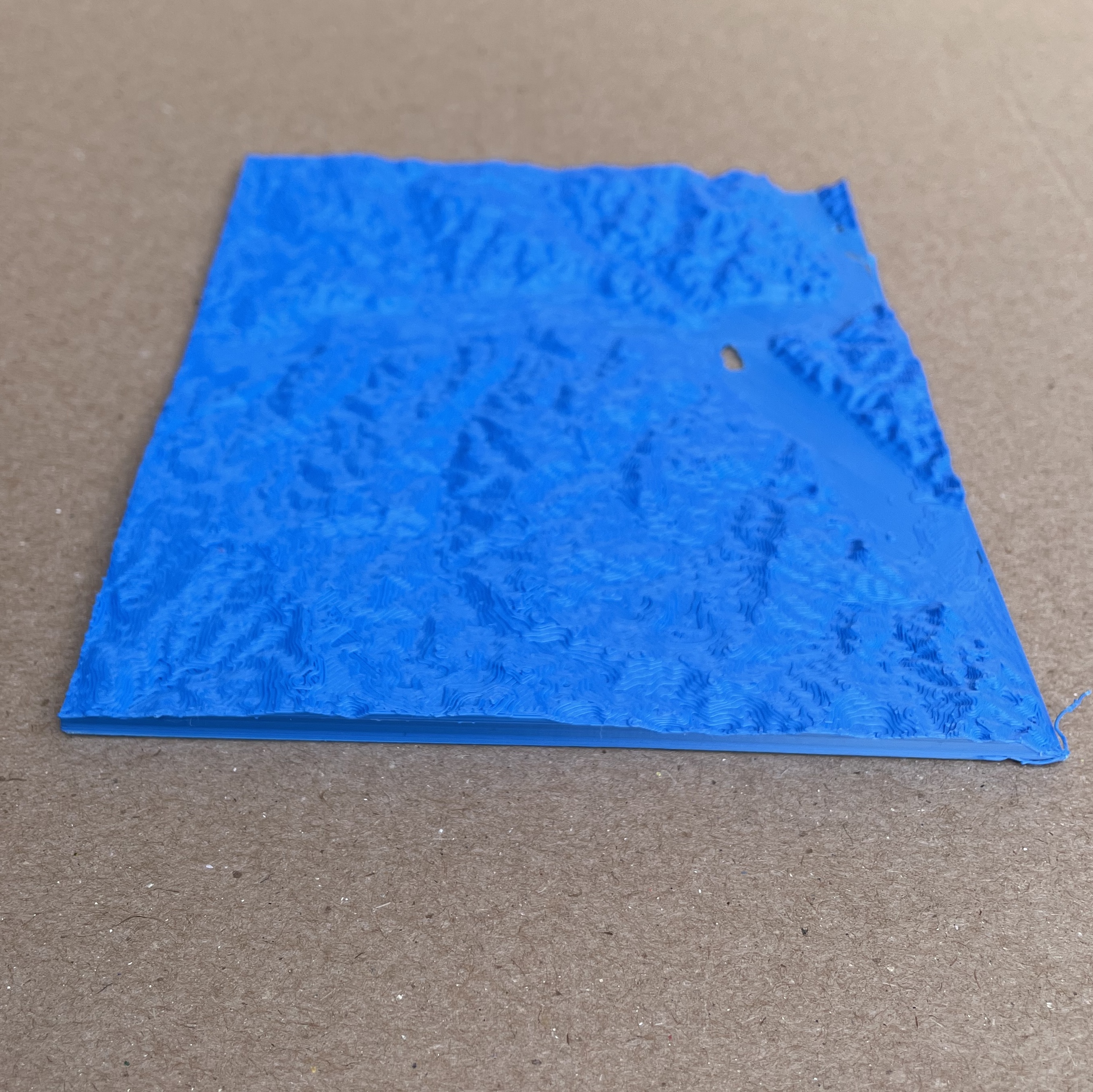
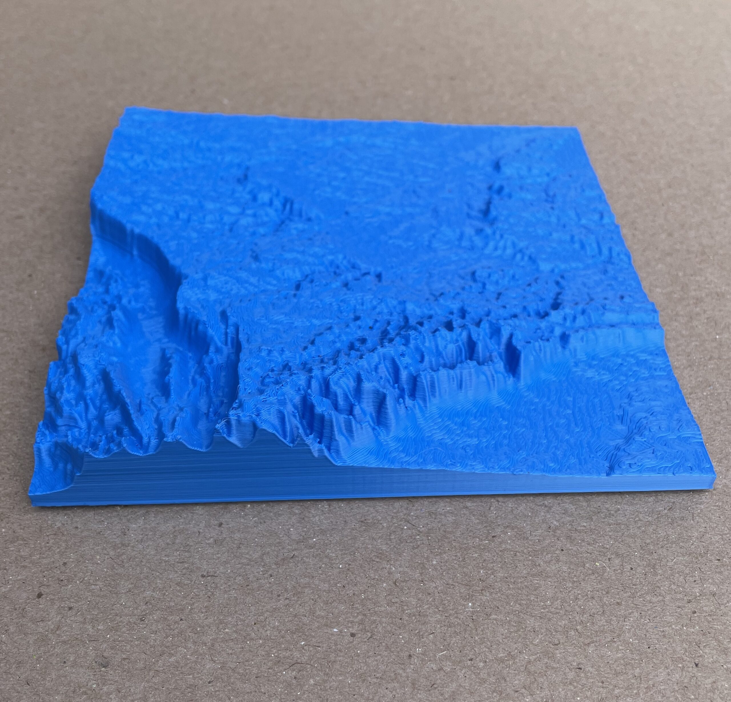
For my topography maps, I chose to represent areas above the three highest producing oil basins in the United States. Two are from the Permian Basin (located throughout eastern NM and West Texas) and the Bakken Formation (spanning North Dakota, Montana, and into Canada). In 2023, the US was the country producing the highest amount of oil in the world, with an average of 19.4 million barrels being produced daily. The Permian Basin, only three hours South of us, is the largest contributor to that statistic. Many New Mexicans do not realize the intensity or magnitude of the production here at home. Because oil drilling/fracking is done so deep into the Earth’s mantle (as deep as 10,000 ft or 2 miles) it is easy to separate that from the land we walk on. By printing topological models, I hope to connect people with the terrain and actualize what is going on. When I first rendered the three areas, both Midland and Tioga were so flat it was practically undetectable. I decided to scale the elevation data up by 200% to make the data more dramatic. Each model represents an area of land that is about 1 degree x 1 degree in lat/long or 110km x 110km. The models themselves are 150mm/150mm (with the exception of the Midland data, that was an error I’ll explain later) at 150dpi.


Reflection
I have never coded or really worked with high amount of data before, so starting this project was very daunting and difficult to start. I was a little lost on what I wanted to visualize and what was the best way to do so effectively. I started out looking at CO2/methane emissions in correlation to fracking in the United States, but handling the data I found was a bit out of my scope. However, when I was looking at the maps I was kinda fascinated that the substance that arguably makes modern society run is just lying under these flat(ish) plains. From there I decided to find these areas in the USGS data base and print them as topological maps.
Overall I am very satisfied by these prints, the maps are so interesting to look at and are quite beautiful. I had one mishap which is disappointing though: I was playing around with sizing and scaled the models down. I ended up printing the larger size, but the Midland map did not save over the smaller size on my printer sim and so I ended up accidentally printing the smaller version. I think that heavily affects the groups visual impact, so I may reprint later on. Other than that, I would hope that someone viewing these would be able to have a better understanding and visualization of what these plains of oil fields and fracking look like.
Being able to hold and feel something tangible makes a lot of things seem real. Even though these maps don’t explicitly talk about fracking or oil production, I think they would make great supplementary teaching material for learning about fracking and its impacts on the land. Especially with the increased conversation about Earthquakes due to fracking wastewater disposal, these could help physicalize a complicated topic to people who are learning.
Hello Astrid,
I also was lost at first on what I wanted to visualize, so I can relate to that! I think what you ended up deciding to do is really cool, not just because 3D printed maps look cool, but also because of the significance of the locations you chose to represent! I also love how you scaled up the elevation so the shape of the land was easier to see.
Hi Astrid,
I think your area of interest for this project is very compelling! The Permian Basin is at the intersection of several different interesting (and worrying) activities, so visualizing the land itself makes for a cool project imo. I also liked how you scaled the elevation!