Hello fellow classmates (and professor?), welcome to an eye-catching visualization of energy. Throughout this post, we will explore my ideas for visualizing the historical datasets on (i) The total annual electricity produced per state from 1990 – 2023 and (ii) the total CO2 emissions of each state within the same time frame. For the forms, each dataset had to be filtered so that the first column included the year, the second column contained the state, and the third column had some arbitrary data for each form (the data chosen in the third column for each form is explained further below.
Annual Electricity Produced per state, per sector (unfiltered): https://handandmachine.org/classes/computational_fabrication/wp-content/uploads/2024/10/annual_generation_state2.xls
Annual Estimated Emissions per state, per sector (unfiltered): https://handandmachine.org/classes/computational_fabrication/wp-content/uploads/2024/10/emission_annual.xlsx
Design Process
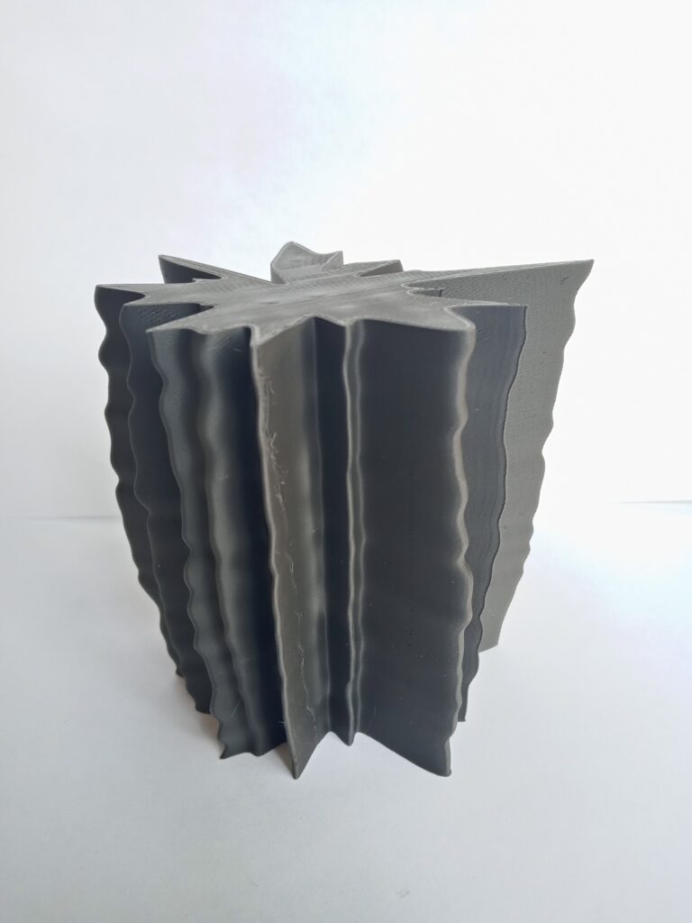
My goal was to effectively display the differences in energy production for each state within a single form, while also displaying each state’s difference in production for each year within the dataset. After some tinkering, I created a set of lofted, radial forms with the following representation:
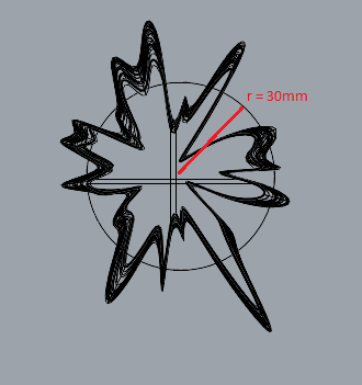
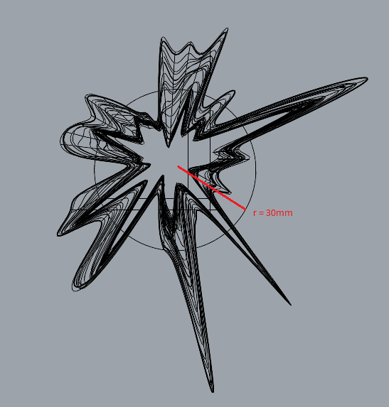
A closed curve is created for each year using a set of evenly distributed points around a circle of base radius r0, where each point represents a state recorded for that year.
Radius: Let the total average energy/emissions production across all years in the dataset be avg and let there be an arbitrary point pc in the base circle. Let pc have XY-coordinates equal to r0. Now, let d be an arbitrary data entry for energy/emissions. The point in the resulting form pf is then calculated as pf = [pc . X * d/avg, pc . Y * d/avg, pc . Z].
Using more English, the amount produced by a state in a given year is represented as its deviation from the total average, where the radius of the base circle represents the average. If the radius in part of the form is less than r0, the state has produced less than the total average. Similarly, a portion with a radius greater than the base indicates a greater production than the average.
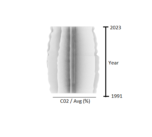
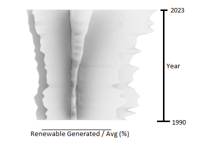
Z-Axis: The year that electricity generation was recorded, from 1991-2023 bottom to top respectively. Scaled so that years are separated by 3mm to meet the volume requirements.
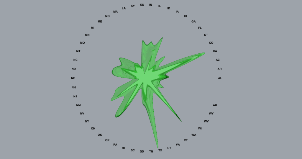
Circumference: Each difference in radius across the circumference of the form indicates a different state that was recorded.
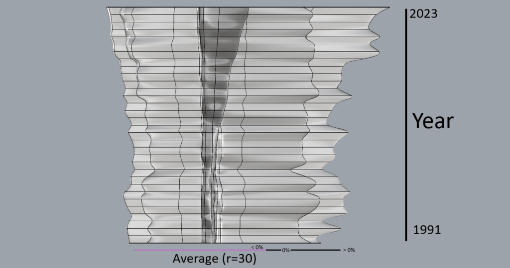
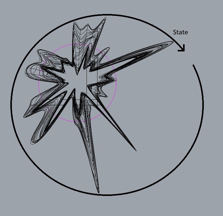
Forms
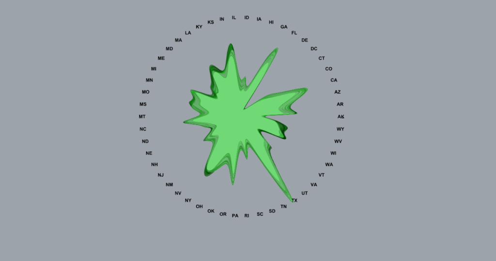
The first form I created following the parameters made above visualizes the total energy production per state for each year. In Annual Electricity Produced per state, this is easily found by filtering the data to only have rows with Type of Producer = “Total Electric Power Industry” and Energy Source = “Total”. The average for this dataset was 75,151,035.28 Megawatthours.
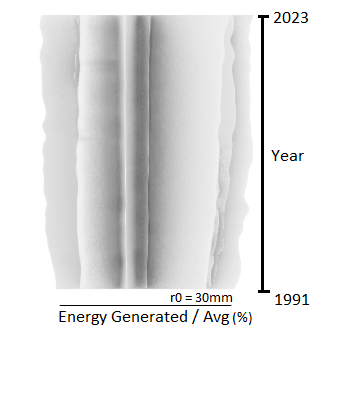
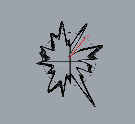
Filtered Dataset: https://handandmachine.org/classes/computational_fabrication/wp-content/uploads/2024/10/electricity_generation_us_1990-2023.csv
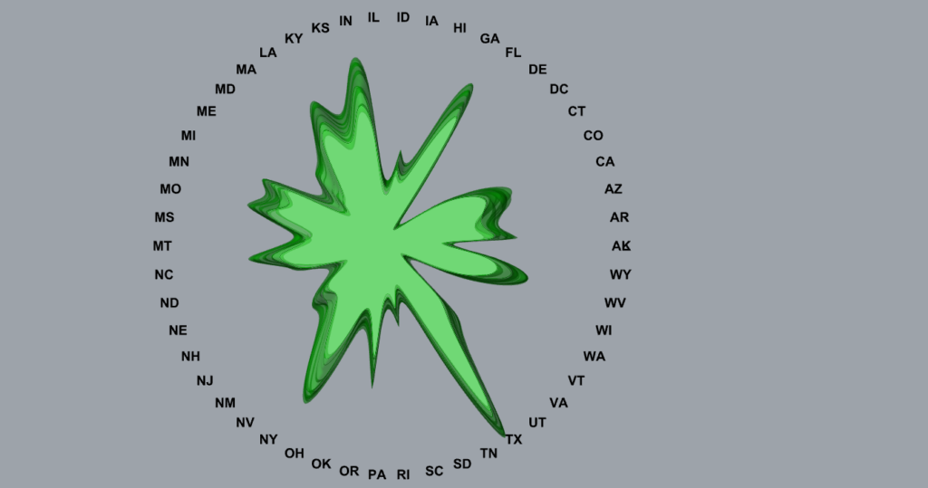
The second form takes information from a separate dataset created by the same organization, providing the estimated amount of emissions for each state. Though this dataset provides multiple emission sources, for this form I only focused on the CO2 emissions. The average for this form was 42,369,861.89 Metric Tons of CO2 emissions.
Filtered Dataset: https://handandmachine.org/classes/computational_fabrication/wp-content/uploads/2024/10/co2_annual.csv
The third form narrows down the exploration of the Annual Electricity Produced per State dataset by only visualizing the total generation from renewable sources each year (Hydroelectric, Wind, Biomass, Geothermal, and Solar). This took the longest to create as these totals aren’t readily available in the dataset. Additionally, Delaware, Washington DC, and Mississippi are not included in the set as these states did not have any recorded production from these sources until later on. The average for this data was 9,036,842.455 Megawatthours.
Filtered Dataset: https://handandmachine.org/classes/computational_fabrication/wp-content/uploads/2024/10/annual_renewable.csv
Final Prints
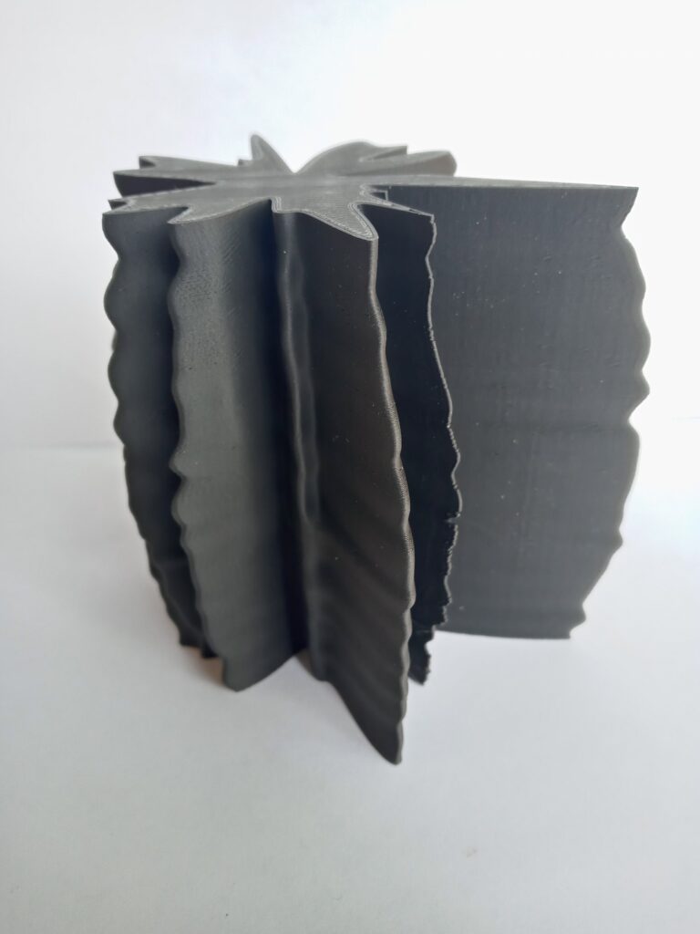
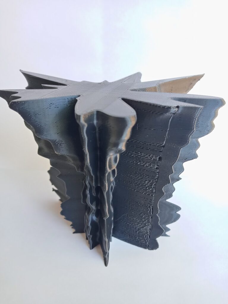
Bloopers (failed prints/ideas)
I originally wanted to make these vessels, but the usual methods for adding a wall thickness in Rhino weren’t working (some walls were too thin). This was an attempt with the Vase setting in Cura. Printed well, but fell apart upon touch.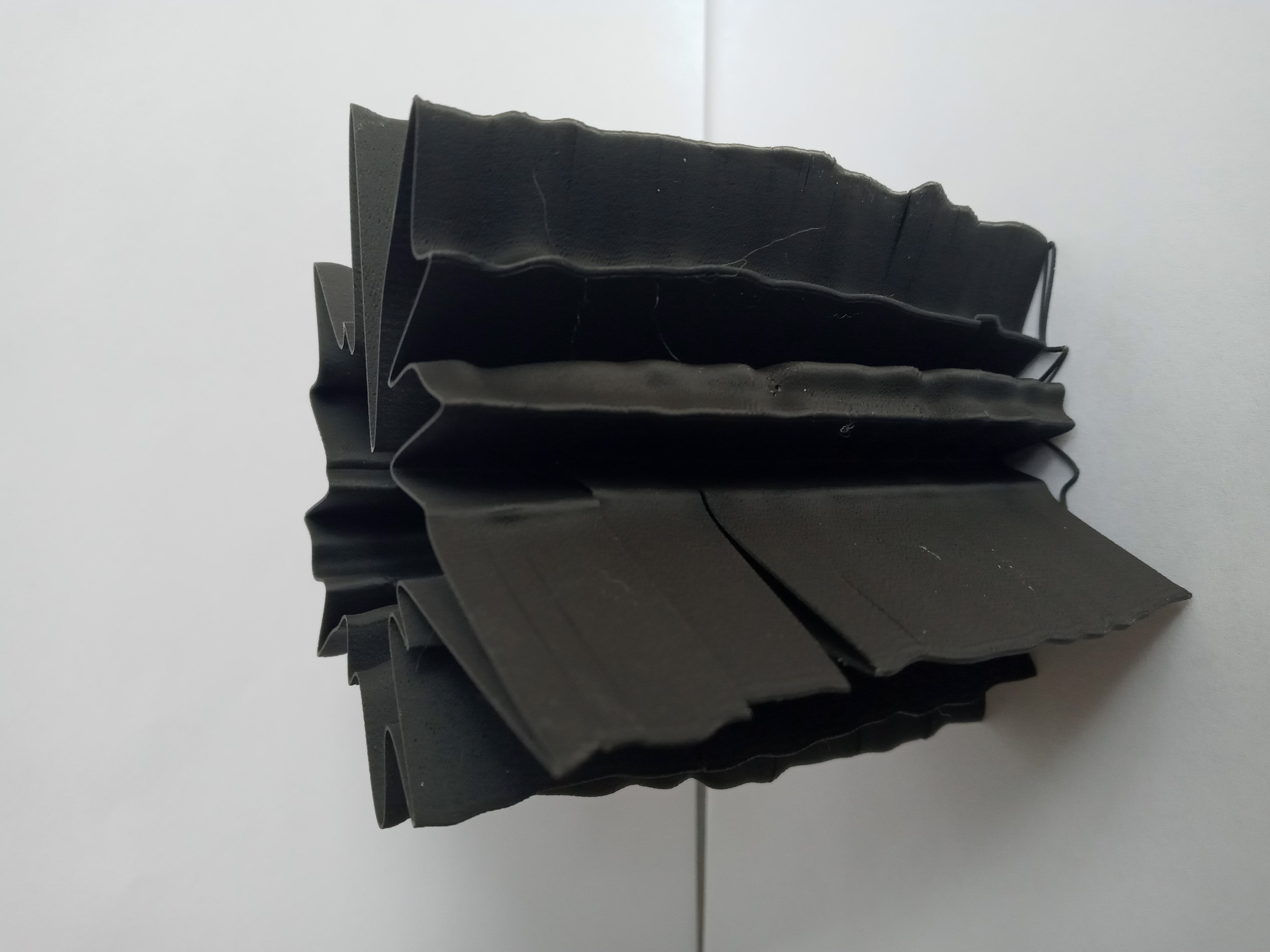
This was a cool print, but the subtlety of the curves from the scale factor used betrays the data being represented.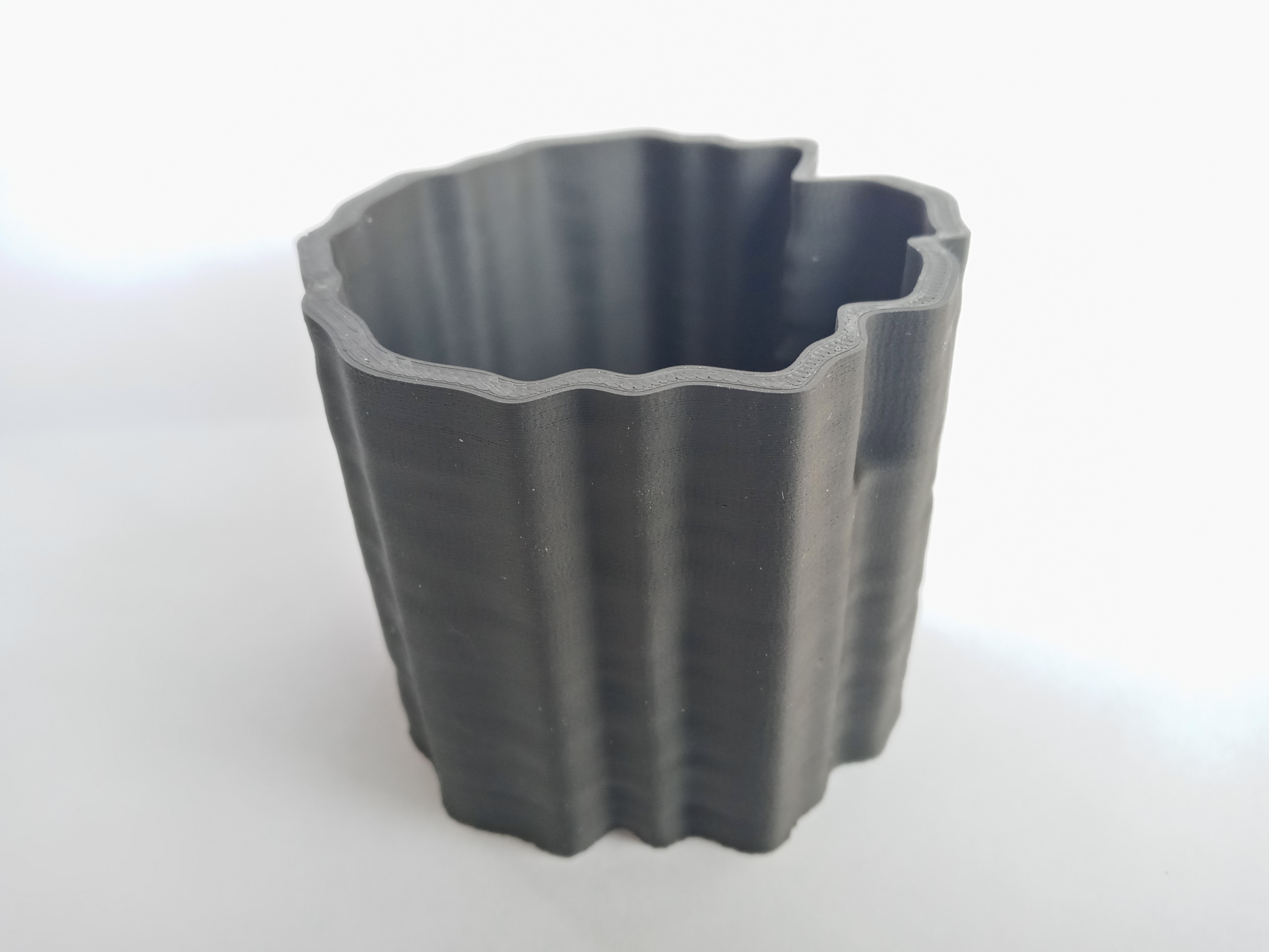
TOO BIG!!!!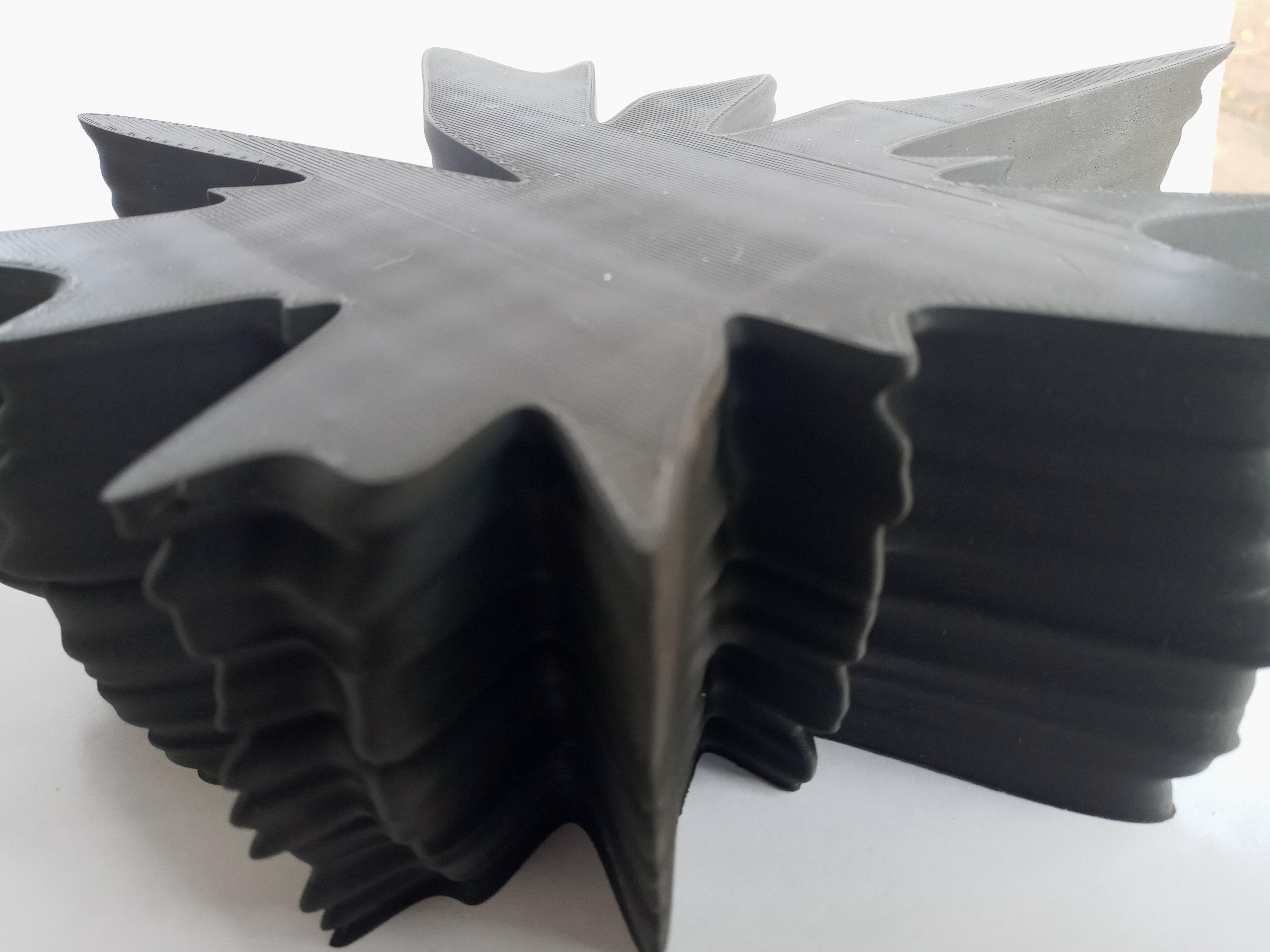
Reflection
I found working with data to be a challenge. Much of this challenge is due to the initial design considerations that need to be taken, such as how to scale data, and what could be made that’s both eye-catching and displays some meaningful information. Such challenges are also what makes data fun to work with; it gives a story to the final form. A majority of the population responds better to images than raw data, so the story behind a data-driven form has a use for displaying a message to larger masses in a way that can be appreciated. For example, my first form on renewable electricity generation from states over the years comes from cleaning a dataset of 62,282 entries (and the totals of renewable data aren’t even readily available in the original set!). While such a dataset could be painstaking for an observer to find meaning from, the form created concisely informs an observer with a general idea of how renewable electricity generation has changed over time.
From the perspective of a designer who possibly cares much less about what their created form represents, using data as the primary inspiration for a design also creates some unique patterns (depending on how that data is used). The splatter-like pattern I achieved on the circumference of my designs is truly unique to the data, which may be difficult to replicate with either traditional or parametric design.
Hi Nathan,
You came up with a very distinctive way to represent your data! I love the chaotic explosion of each form. Do you know which spikes/recessions correspond to which state, at least for the extreme ones? In my experience, people definitely respond better to images than to walls of data. I find that the tactile aspect of 3D prints also helps take understanding even further than a 2D image does.
Hi Liz!
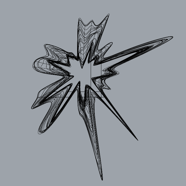
Which area of the form corresponds to each state is a great question! So, I did a quick implementation to map this for each form. Take a look at the mappings under the Forms section of the post!
The states are ordered alphabetically in the forms, counterclockwise. Texas always has the largest spike in the first two forms, while California challenges the position of the largest spike in the third form (renewable generation). You’ll also notice states missing in the third form. This is deliberate, as I removed some states that were missing data for some years.
Hey Nathan! I agree with Liz’s comment that you did come up with a very interesting and chaotic way to represent your data. You came up with designs that I haven’t seen anywhere else. Do you think you might print out a ring as a key that goes around your printed objects just so people know what state is represented where? I can see why you found this kind of object to be challenging but I think that it is one of the most unique ways I’ve ever seen data visualized so I’m glad that you chose it. Keep up the great work!
A ring could be cool! Like a pedestal or something with a grove for each model to sit in, where the pedestal has the keys for each model. I won’t have something like that before today’s presentations, but it would be a neat addition.
Hi Nathan,
This is an awesome and intriguing way of visualizing this data. I love the visual produced from the rendering, and this is a case where I think the black filament really adds to the design. I like Wayne’s idea of creating a guide of sorts for the vessel so that it can be oriented by a viewer. Awesome job overall 🙂