Data
New Mexico gets a lot of lightning, and Albuquerque is no exception! For this project I’ve created a physicalization of when and where lightning strikes in the Albuquerque area, with several forms showcasing different parts in time.
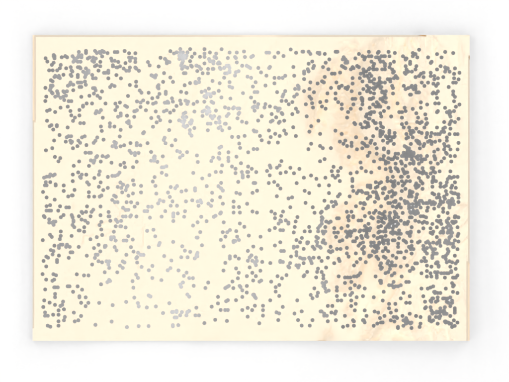
My primary dataset is a compilation of lightning strikes that occurred in New Mexico in 1999, <courtesy of the the UNM RGIS program>. This data includes the time and location of each recorded strike, of which there were 3239 in total.
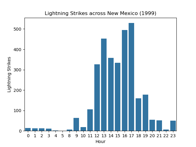
Looking at the distribution of strikes by month and by time of day, I found a neat (if unsurprising) pattern – most strikes happen in August, and most strikes happen the afternoon. This nicely matches the pattern of monsoon weather which typically occurs in late summer.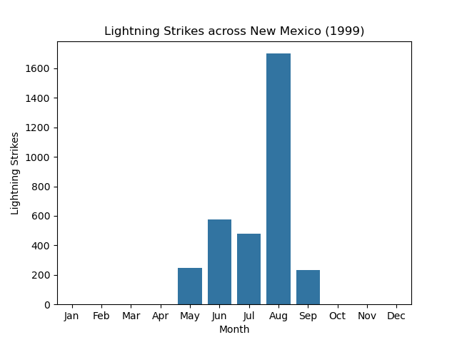
I decided to focus on the portion of this data that occurred in the Albuquerque area, thinking that there may be interesting local patterns of when and where lightning strikes beyond what the analysis above showed. I fetched a map of DEM data <via the USGS National Map application>. I used QGIS to inspect and crop this data to my area of interest (a view of the data from QGIS included below). This area roughly centered Albuquerque, with a bounding box of 7.04km by 6.75km.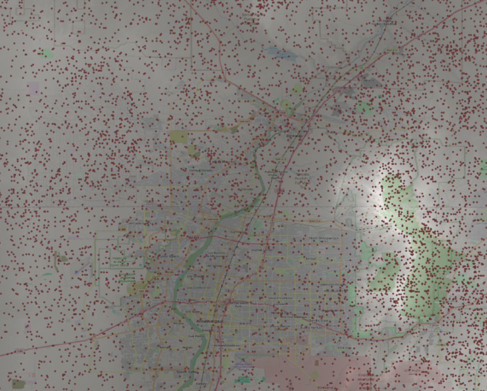
Design
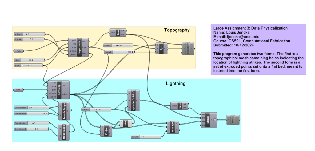
I designed two forms that slot together – one of which shows the physical space of Albuquerque, and the other highlighting what strikes occurred during a specific timespan.
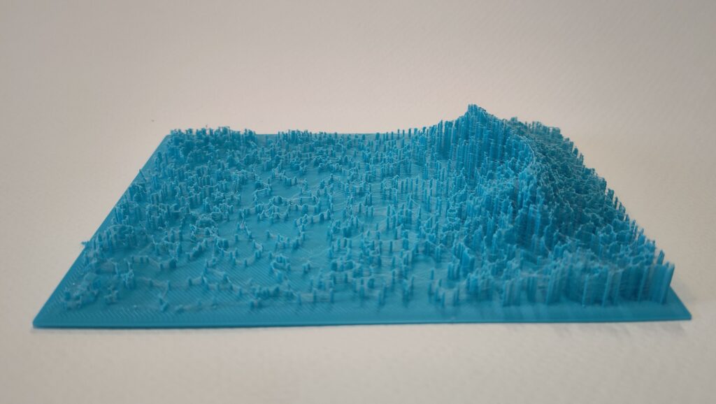
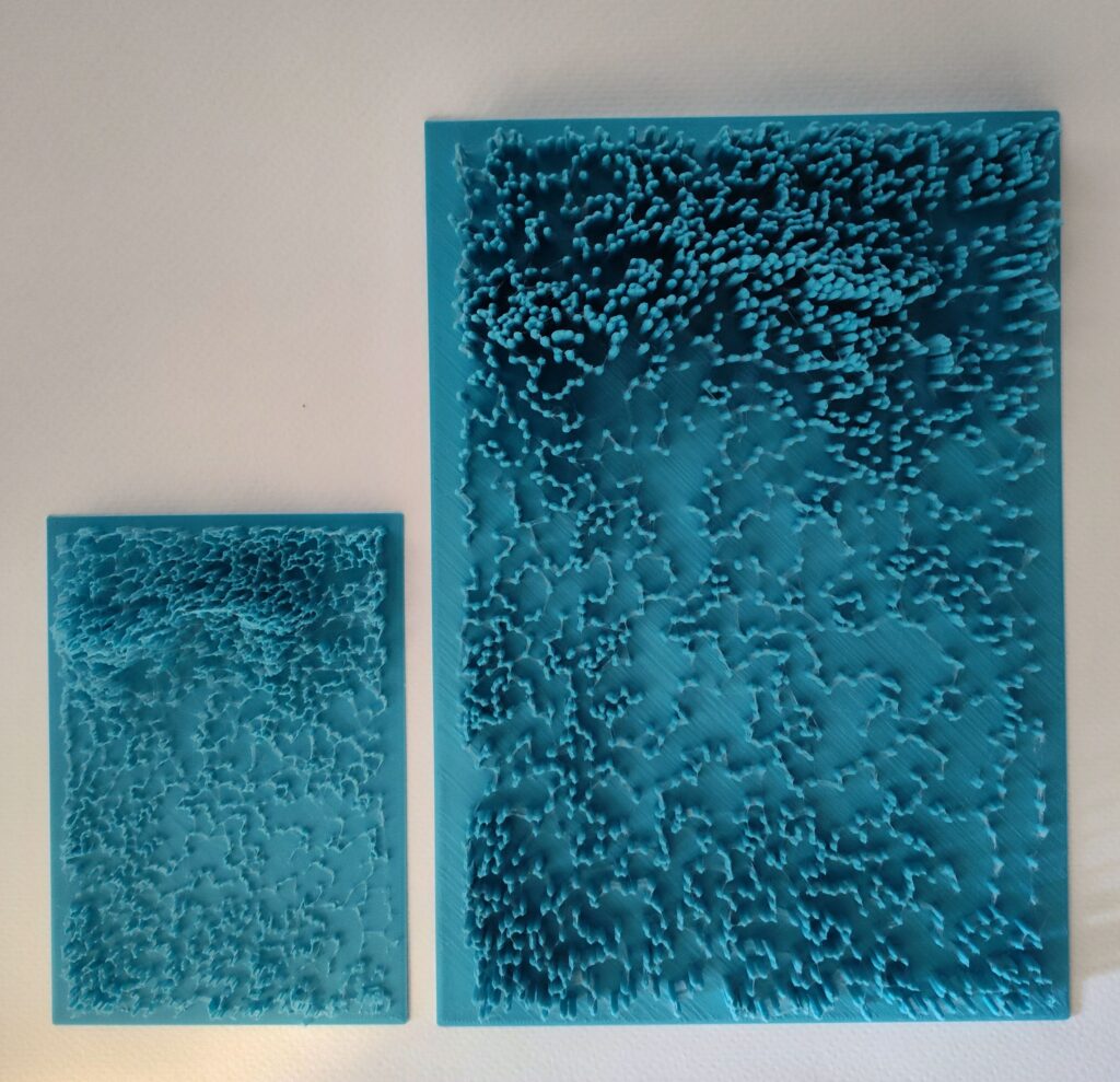
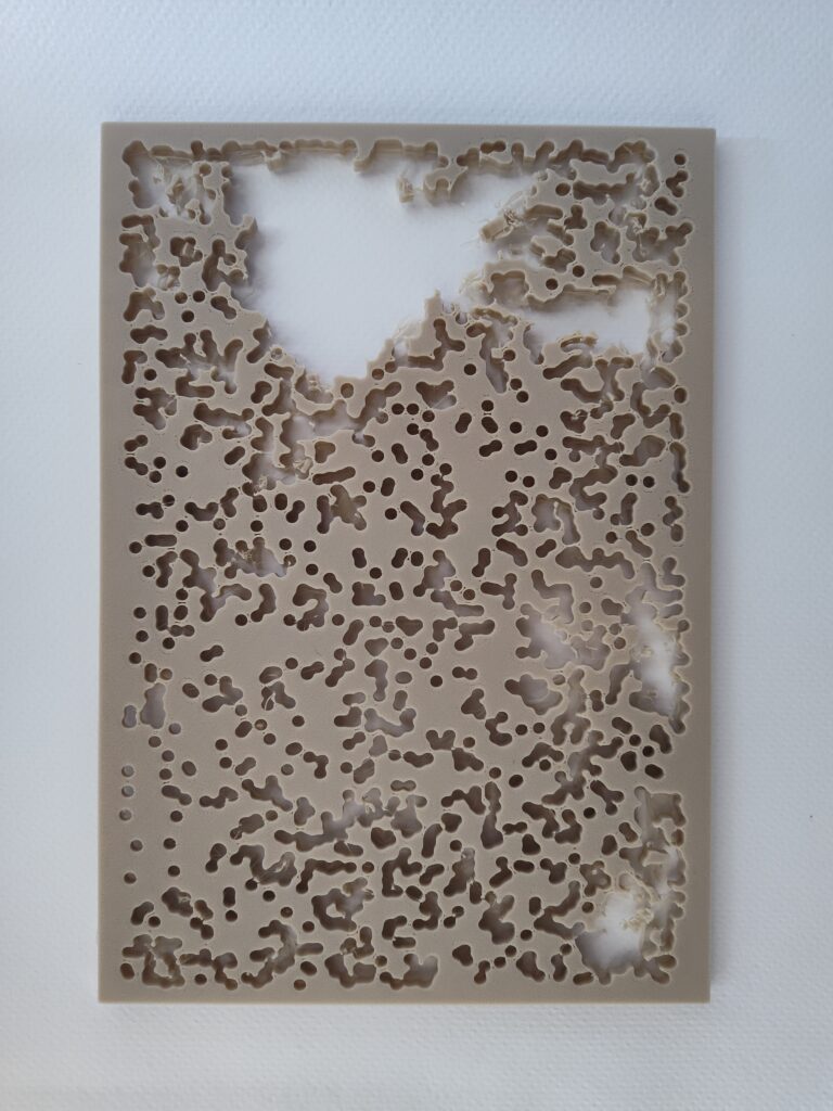
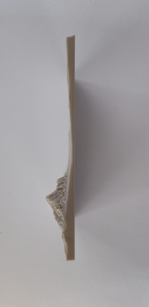
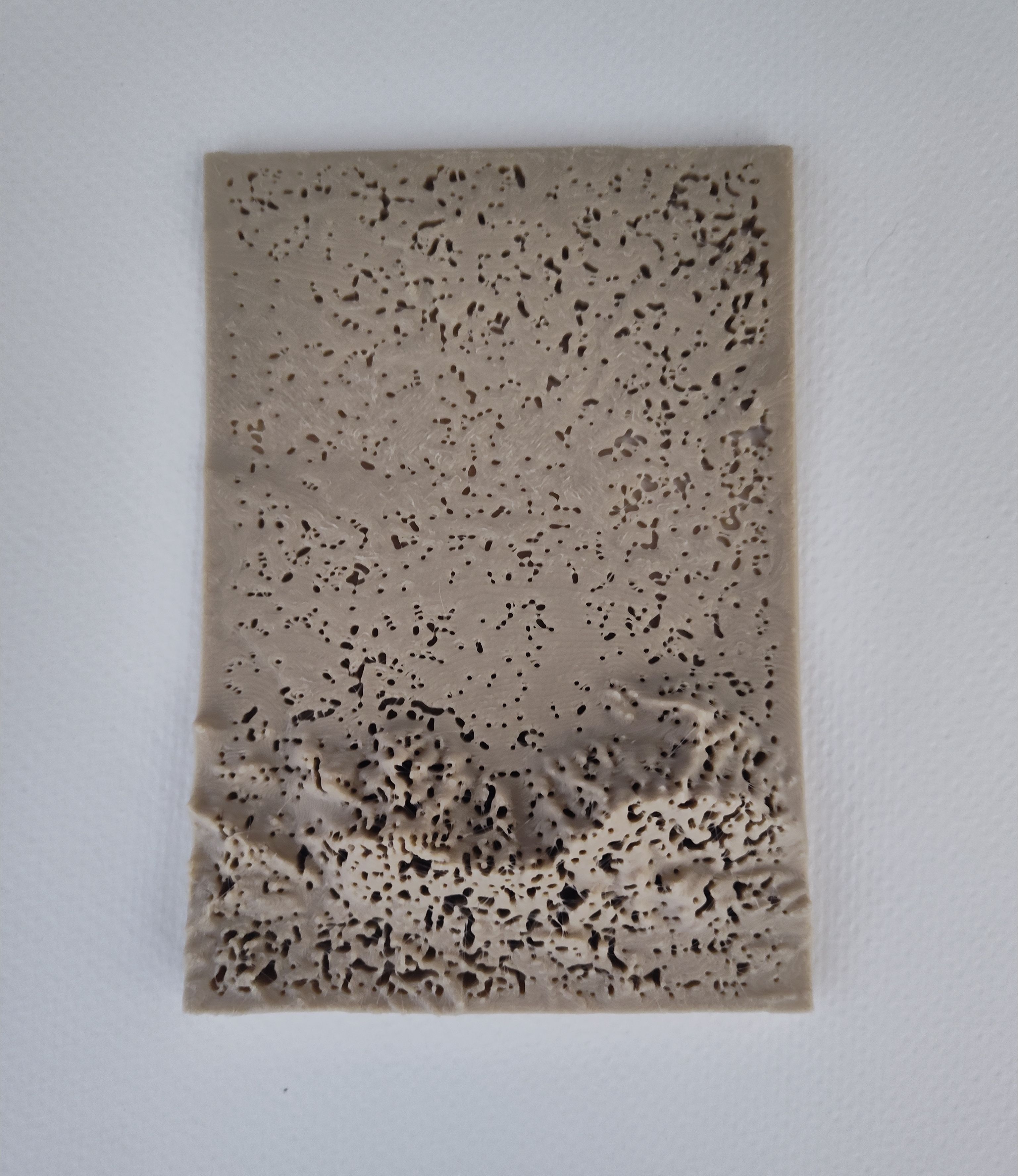
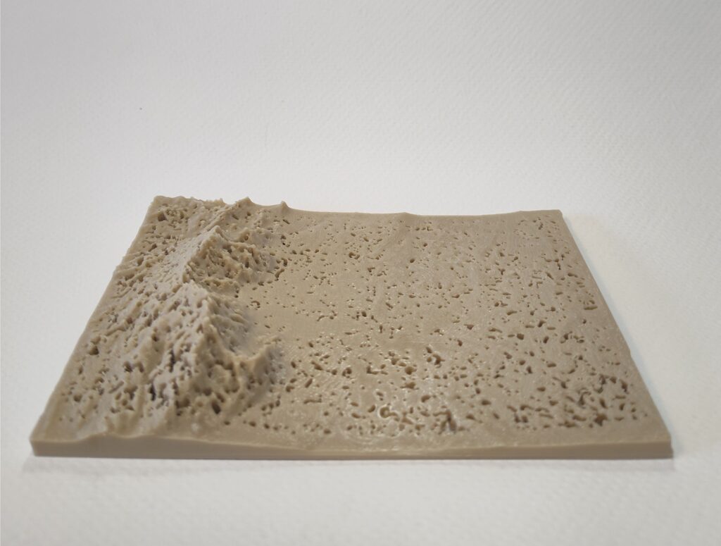
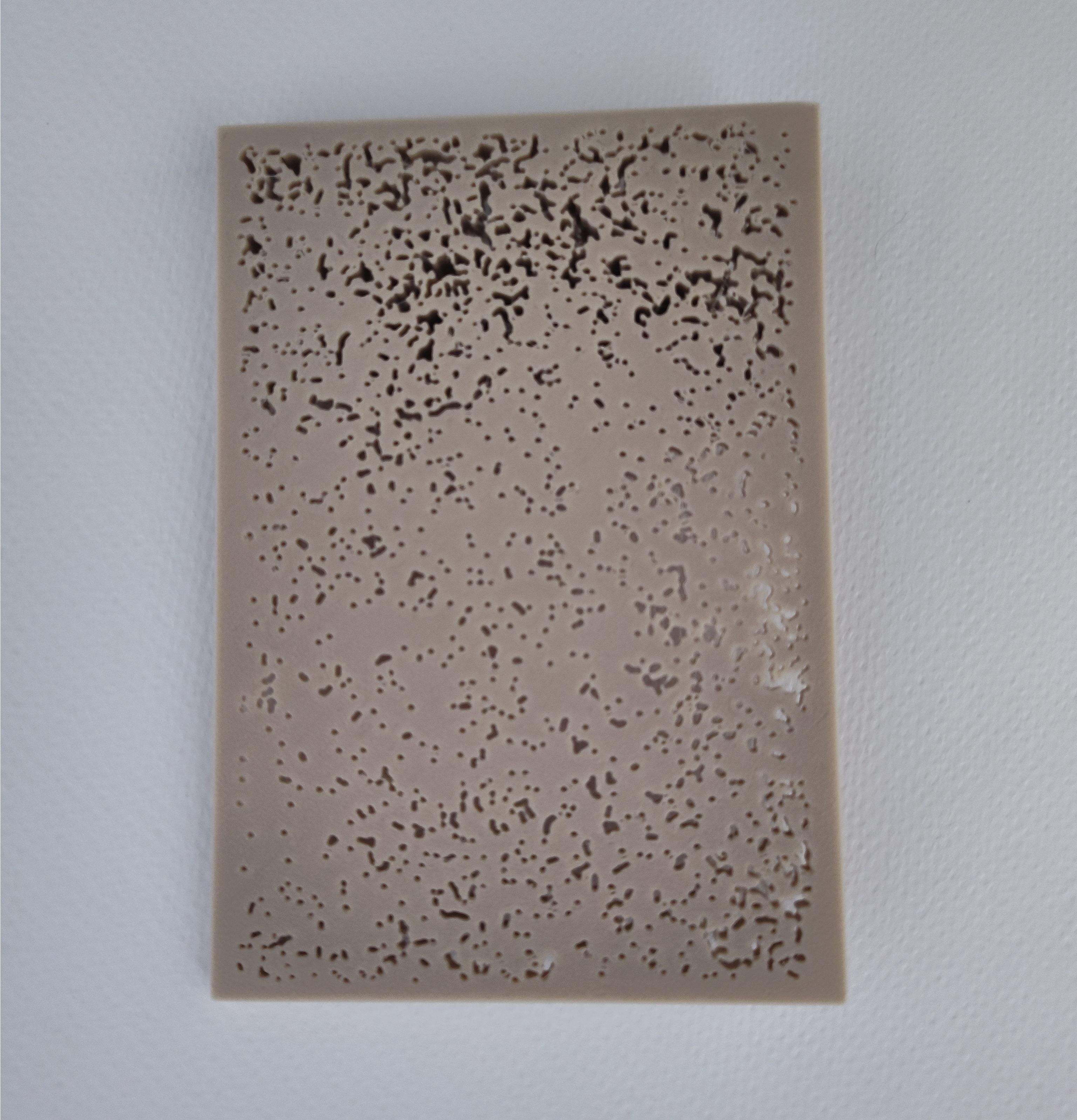
The first form is a topographical mesh of Albuquerque, with holes inset corresponding to each lightning strike from the dataset. Height is exaggerated by a constant factor of 5 to help the viewer in recognizing the landscape of Albuquerque. The data has been sized down to 265mm by 185mm, which would be a 0.003764% scale.
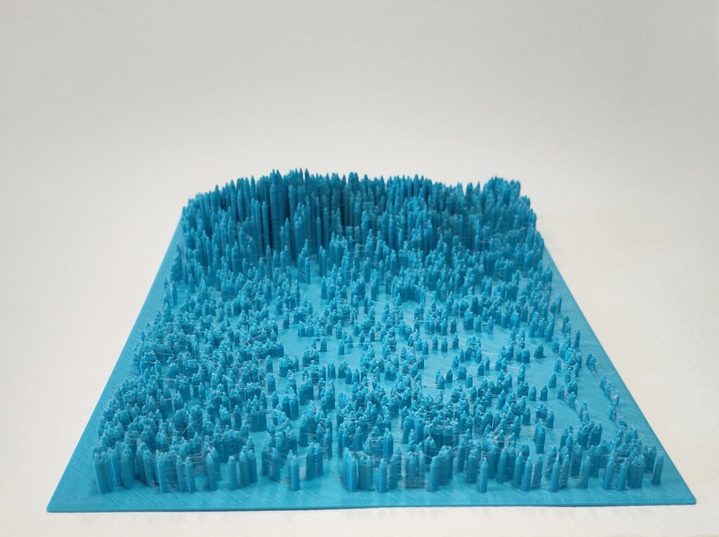
The second form contains a set of pins which fit through the holes in the topographical mesh of the first form, sized to pop-out just above the surface. These pins show a group of lightning strikes in time. I created three iterations of this form – one showing all strikes from 1999; another shows only strikes that happened in August; and the final one contains just lightning strikes from afternoons in August. These forms are meant to be considered in order, so that you can contrast them and discover what’s been removed with the additional constraints.
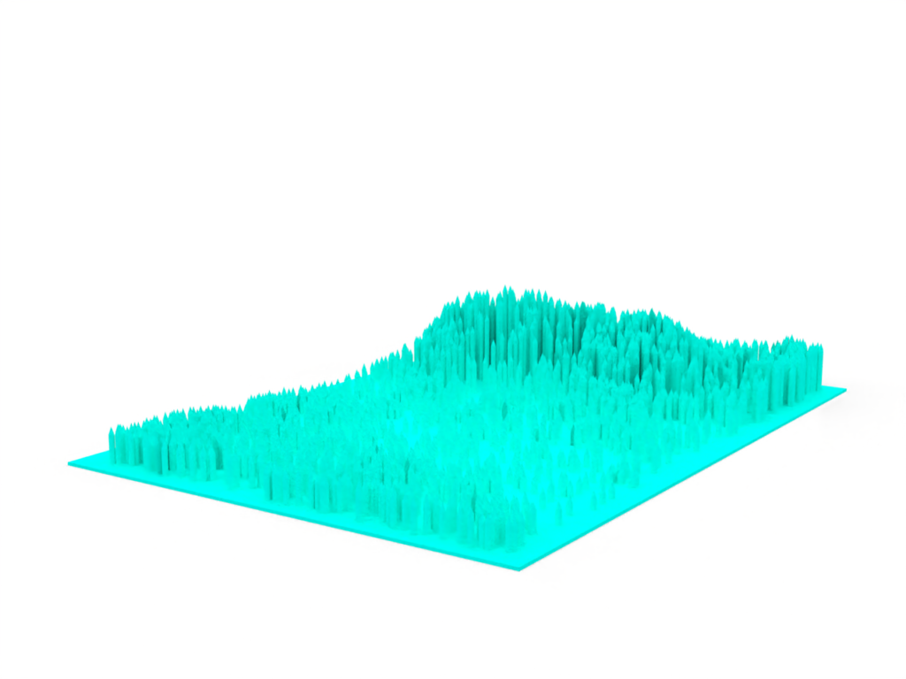
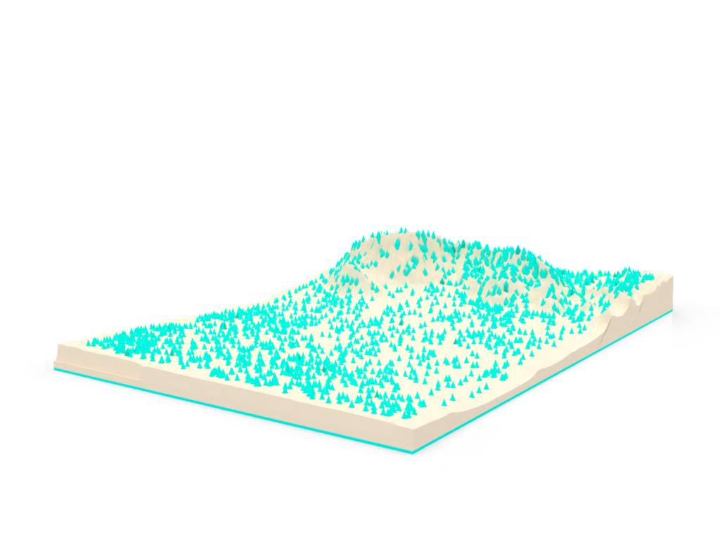
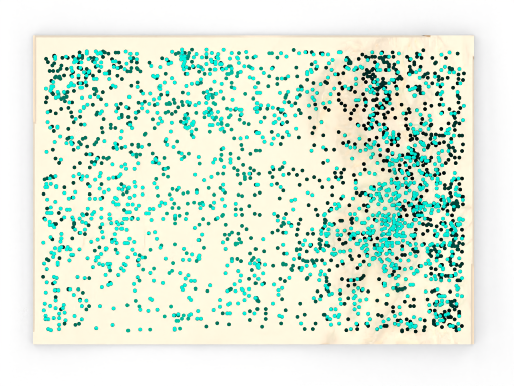
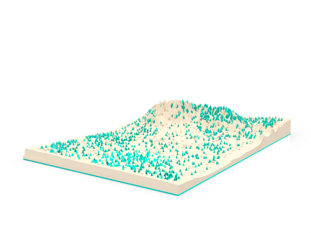
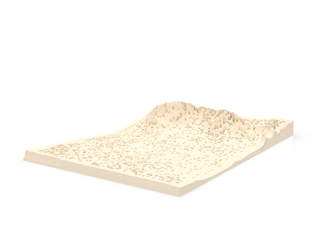
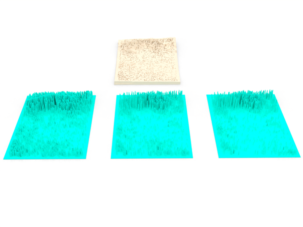
This approach to data visualization, where a view of the data are rendered in 3D physical form, is quite exciting! It enables us to communicate features of our data in a very intuitive way – particularly when there are more than two dimensions involved. Consider the two-dimensional figures from earlier in this post, where I examined the distribution of lightning strikes in time, and in space. Individually these plots are easy enough to comprehend, but I think it would be tricky to represent their intersection two-dimensionally, with as much clarity as we can achieve in a 3D physical form.
I think this approach is very well suited to data that are intrinsically 3D, like the topographical GIS data I’ve incorporated into this form. You can show a topo map fairly well two-dimensonally using contours, or hillshade… but I think an actual raised relief map is clearly better at communicating the depth and detail involved.
And of course, these forms are engaging because we can examine them via touch! As 3D models these data visualizations are visually interesting, and capable of communicating much of the same information, but aren’t really engaging (in comparison at least). After they’re physicalized, the contours can be felt; they can be interrogated against different lights; the distribution of physical mass can be discovered in your hands. All of this is missing when the data are trapped on a computer.
Printing
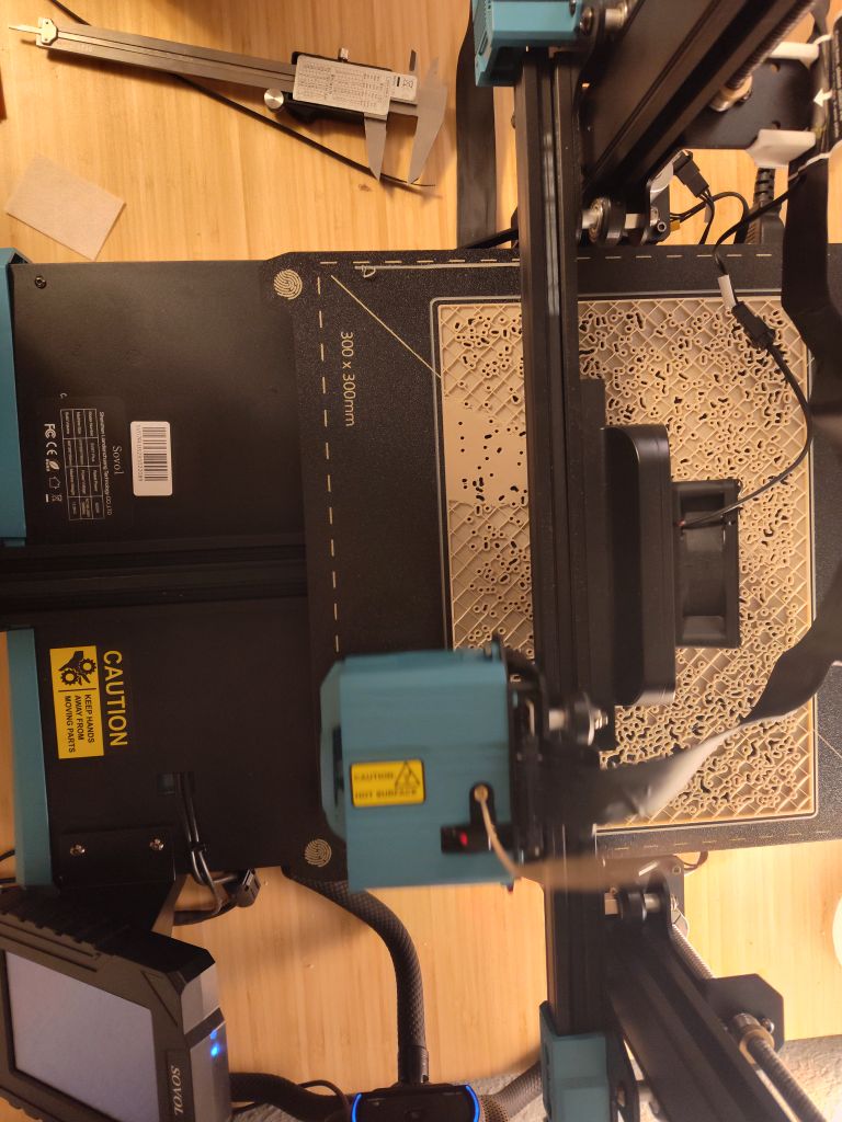
Although I was able to print all of the component pieces, I was not able to make them fit together successfully. These are my reflections on the design and printing process.
1. Fitting two components together can be tricky
The limits of my printer’s dimensional accuracy were really tested by this print! Although the exterior size of the entire print is fairly close the the mark, I found that the internal holes were less accurately sized. They were typically smaller by 0.1 – 0.7mm, but were not consistently smaller by the same amount.
When printed at small sizes (150mm or less), the diameter of the pins became tiny — around 0.5mm, which is just a bit larger than the nozzle size on my printer. Although this was printable, it wasn’t very robust.
2. A dense dataset
I found that the pins needed to be at least 1mm in diameter for their own strength, but preferably larger. This led me to a size of 1.5mm for the holes in the topographical mesh; but with the typical reduction in size of internal holes, this was too small.
I tried increasing the hole diameter to 2.5mm. At this size most of the Sandias were lost however, thanks to the density of strikes there. These data may be too dense to be printed reasonably in this design.
And finally, designing a mesh with that many internal holes made the whole process slow! Generating a mesh in Rhino took as long as several hours; slicing it in Cura would take around and hour; and printing it would take 14 to 26 hours, depending on the scale.
3. Odds & ends
- I found Ellis’ Print Guide to be an excellent resource for troubleshooting issues with my prints for this project.
- From the advice of others online (and my own personal experience now), one should allow at least 1mm margin in pieces that fit together, to account for dimensional accuracy differences.
- Cura can expand internal holes via the “Hole Horizontal Expansion” parameter. This can save you from needing to generate multiple versions of a mesh in Rhino. However, if your model has thin connective pieces, then using this approach can segment your model and complicate the printing process.
- I didn’t find stringing to be much of a concern with my past prints — but in this much more intricate print, there was a lot of stringing! It wasn’t a functional issue, but it did impact the look of the pieces.
Hi Louis,
Your dataset seems extremely interesting to work with! Aside from the bounding box, was there any filtering you needed to do? Your designs look awesome. I look forward to seeing the final product! I agree that being able to physically touch the data and turn it over in your hands makes it much easier to engage with.
Thanks Liz!
Apart from the bounding box, I also filtered by timespan to create the three different iterations of the lightning “spikes”.
Additionally, I needed to handle missing data. The topographical map had a handful of pixels with no elevation data — I replaced these with an interpolated guess from the surrounding values.
Hello Louis,
I think your prints are extremely interesting. I really like how they all fit together and really are like a family of prints. I also found this way of data physicalization to be quite exciting and totally agree that it allows us to communicate data in an intuitive way. I personally really liked the visualization of data in a 3D space because it made it more easily digestible for me.
Thanks!
Haha — after printing this dataset, I want to print *more* topographical maps. They’re not just intuitive, but are quite fun IMO.
Louis,
I think you chose a perfect way to visualize this set of data! Do you have a way of knowing which area of the city maps to your Albuquerque model of lightening strikes? I’m also really interested to hear more about the printing process and any complications you may have encountered along the way. I agree, this approach is way more engaging than any computerized visualization of data.
Thanks Desiree! Although the forms didn’t print like I had planned, I rather like the designed visualizations as well.
We can approximate where in the city the strikes are by matching up the terrain with my own understanding of ABQ… but that’s not very precise. The full-resolution DEM data actually includes a lot of city-level detail — streets, large buildings, the airport runways, etc. Unfortunately though, it was too computationally demanding to generate a mesh with full sampling in Rhino, so my version lacks that detail.
There were some serious printing complications haha. I’ve updated my post with the details.