I’ve always been passionate about exploring CO2 emissions, particularly as it relates to global environmental impact. Initially, I wanted to focus on the largest contributors to modern-day emissions: China, the United States, and India. I thought it would be fascinating to visualize the immense levels of CO2 these countries produce annually, given their significant role in climate change. By using data visualization, I aimed to create physical forms that represent their contributions and help people understand the scale of modern emissions.
However, as I worked with the data, I found that the numbers were so large it became difficult to create designs that were practical or realistic to produce. The vast emissions made it challenging to create models that could be visualized in a meaningful, manageable way.
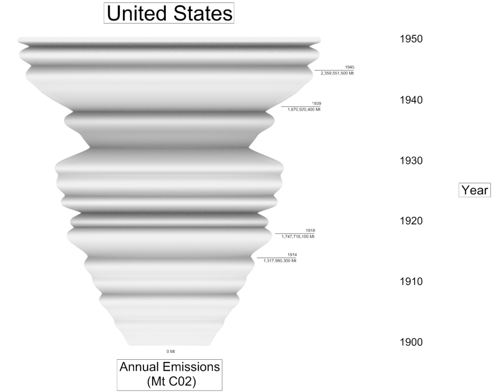
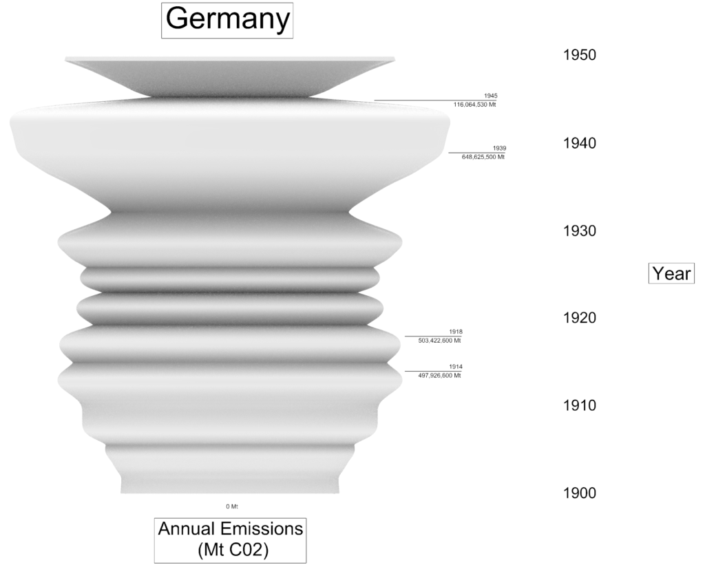
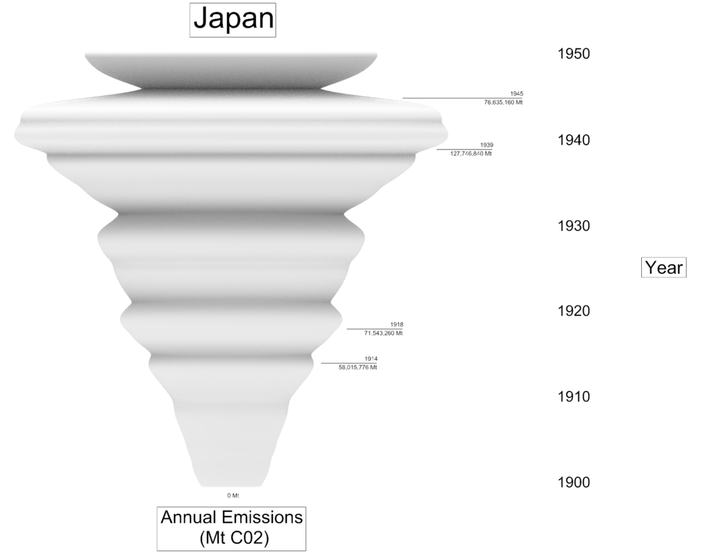
Given this, I decided to scale back my focus to something that would not only be more feasible but also tap into another area of personal interest: World War I and World War II. These periods were marked by significant industrialization, and I thought it would be interesting to see how CO2 emissions evolved during those times. By narrowing my focus to the years between 1900 and 1950, I could explore the emissions of major wartime powers—the United States, Germany, and Japan—and see how their industrial activities during and after the wars shaped their CO2 contributions. This range offered more manageable data while still illuminating important historical events through physical data visualization.
United States Render
Germany Render
Japan Render
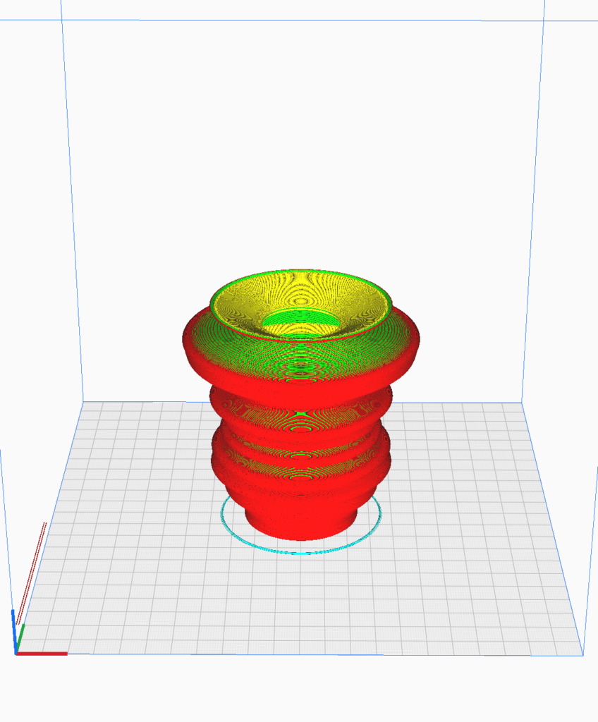
As I began exporting my objects, I noticed that the sizes were inconsistent due to variations in the data, making the designs difficult to compare. To fix this, I implemented a normalization process in my code, which scaled the CO2 emissions data between 0 and 1 based on each country’s maximum value. This allowed me to bring the objects to a consistent scale, making them proportional and easier to handle. After normalizing the data, I had to retake screenshots, re-export, and re-slice each object, but the result was a set of forms that were uniform in size and visually comparable.
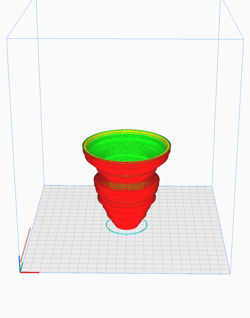
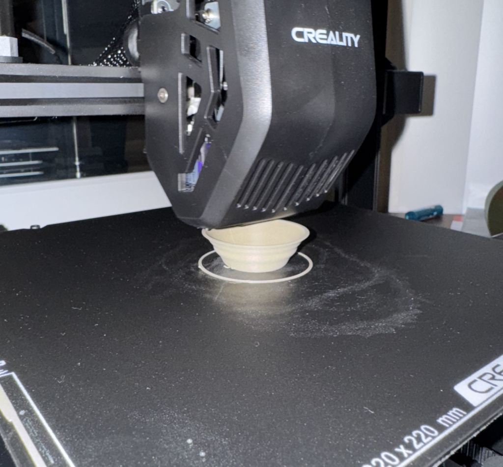
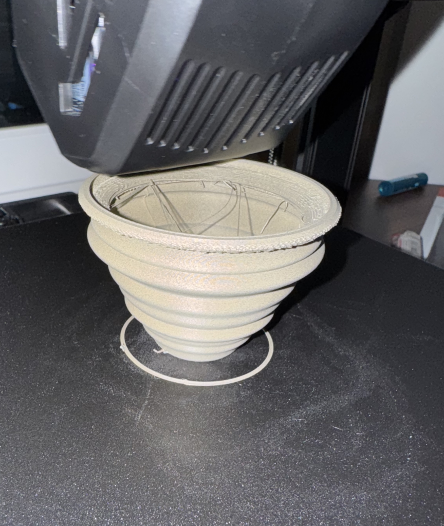
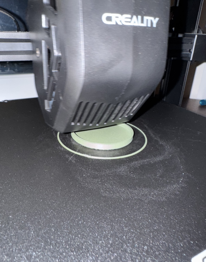
Printing Fails
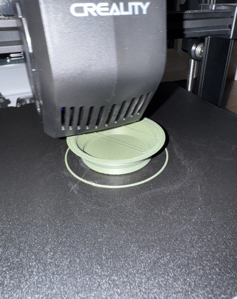
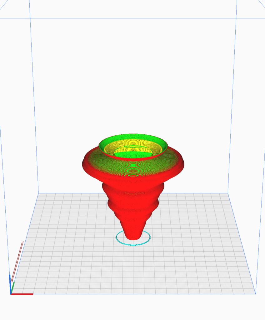
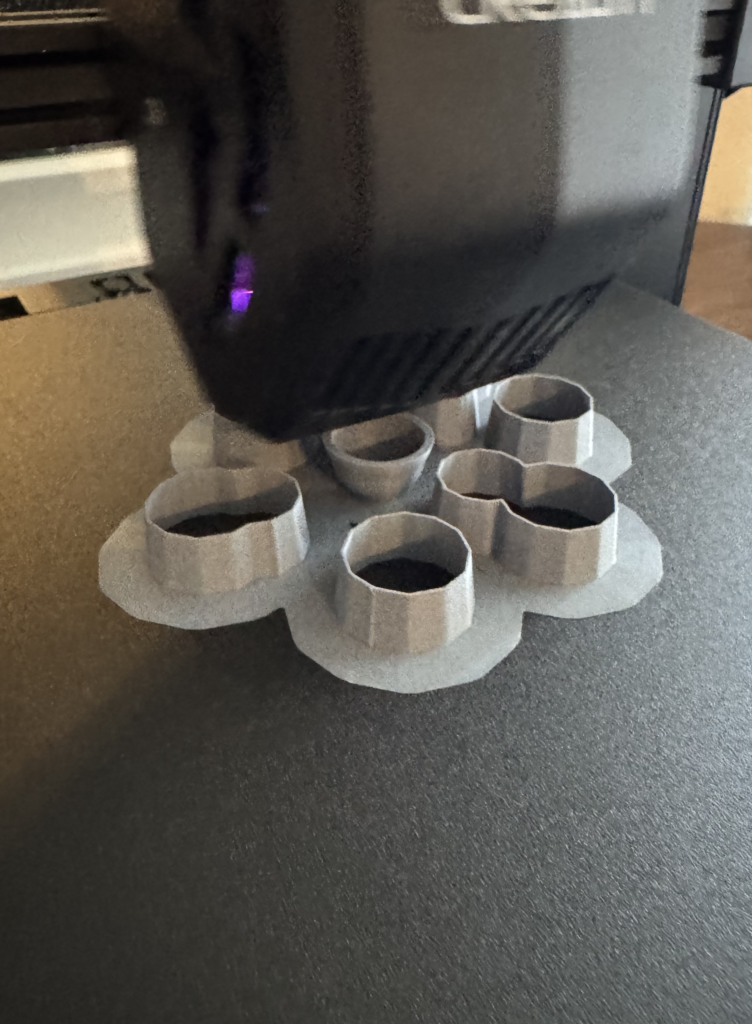
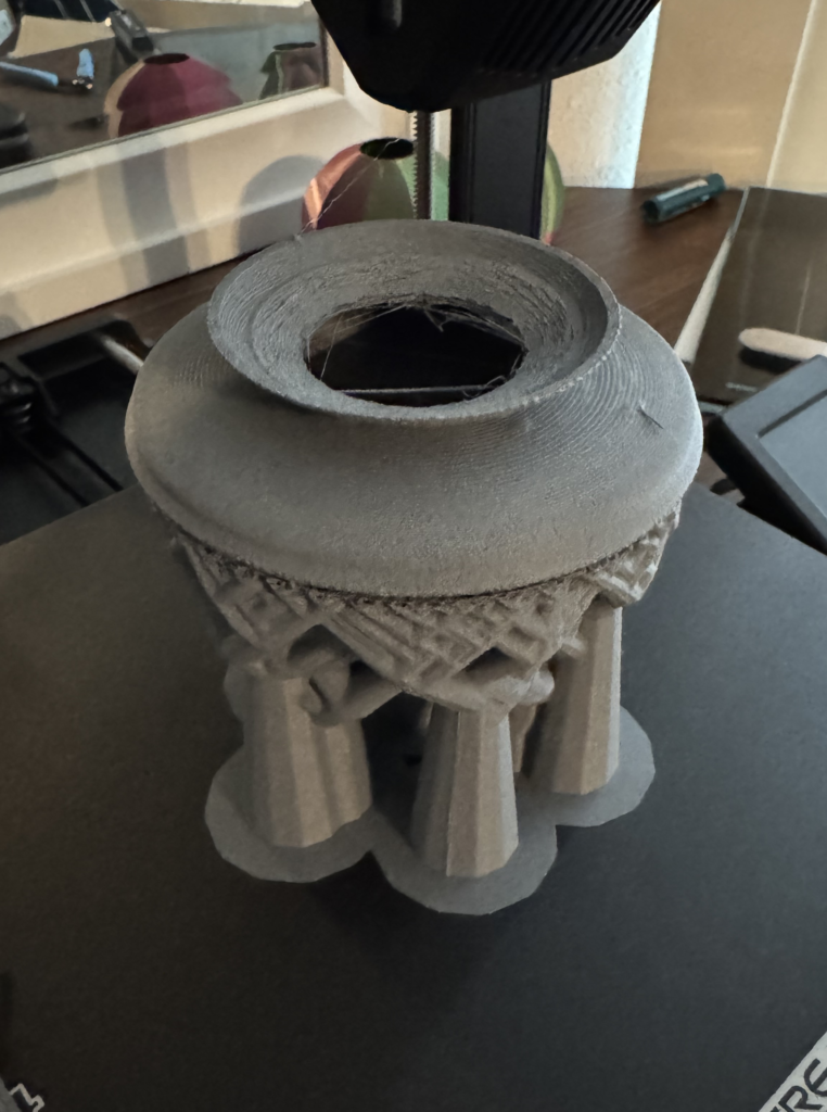
While printing the third object (Japan), I initially attempted the print without using any supports, which resulted in a major failure and a significant amount of wasted filament. This was the most notable issue I encountered, alongside some textural inconsistencies in my prints. For example, during the first print, I noticed excessive stringing between parts of the model, even after reducing the printing speed several times. Unfortunately, these adjustments didn’t result in any noticeable improvements. Additionally, some areas of my prints appeared lumpy, and I couldn’t quite determine whether this was due to the printer settings or the filament itself. Upon reviewing the filament specifications, I realized it was meant to be printed at a nozzle temperature between 210°C and 240°C, but I had kept mine at 200°C throughout the entire process, which may have contributed to the issues.

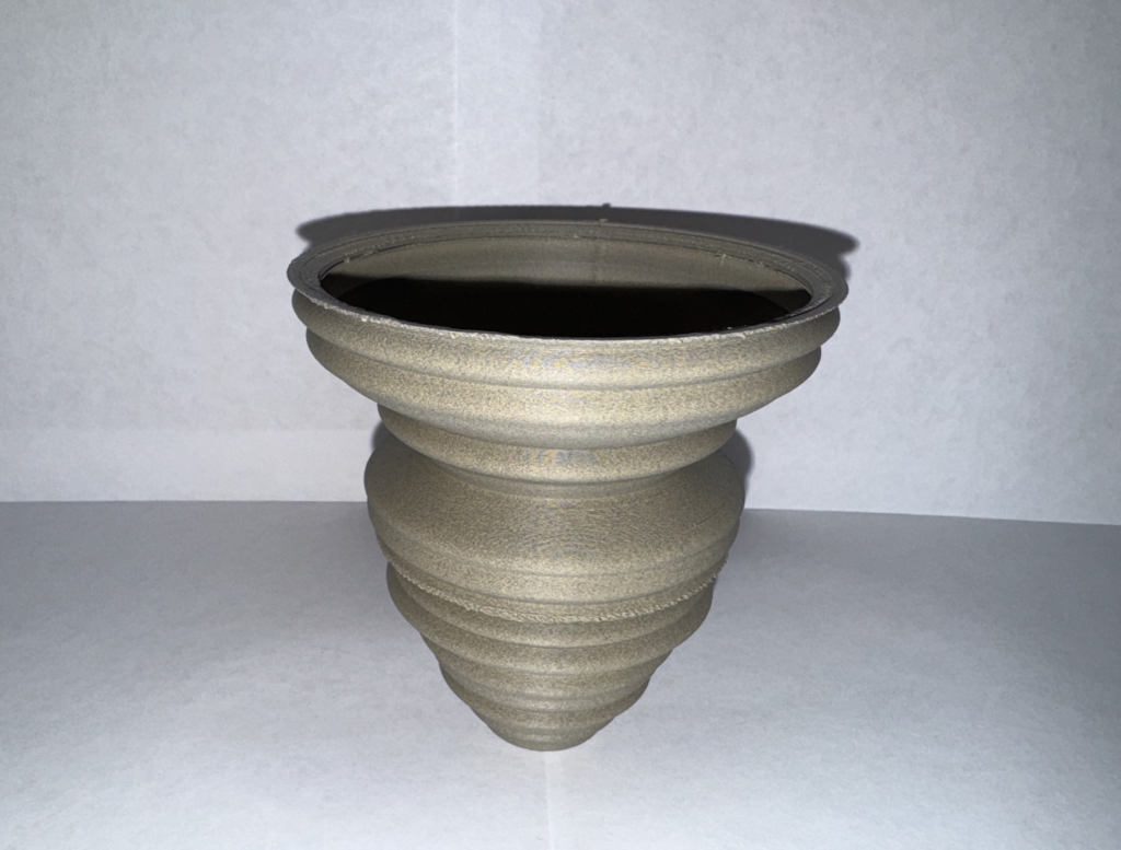
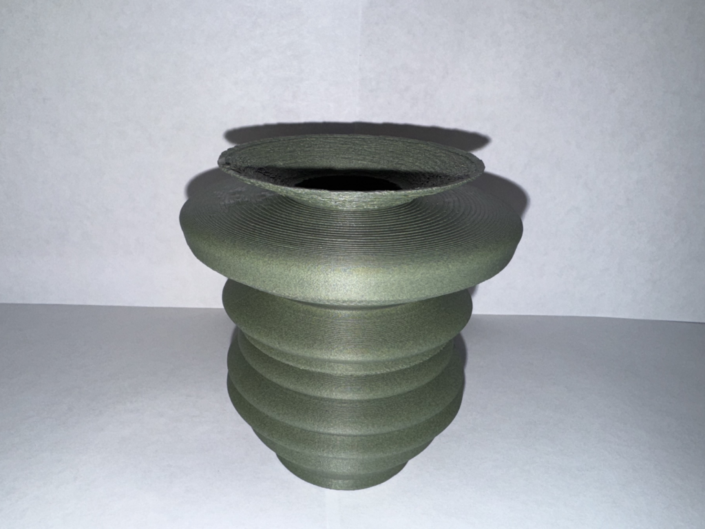
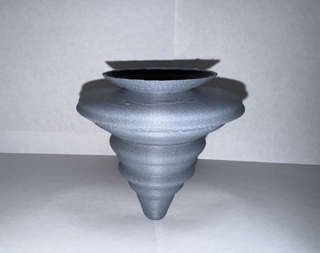
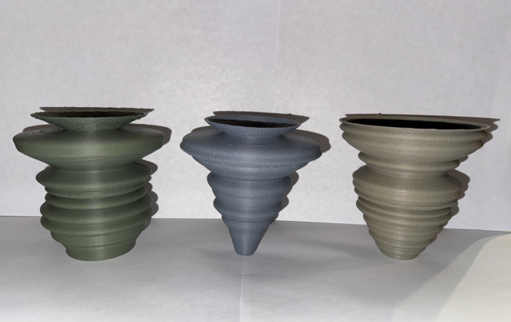
Final Prints
I had a lot of fun with this assignment. Despite the challenges I encountered along the way, I’m pleased with how each of my prints turned out. They effectively represent the set of data I chose, and seeing the physical forms based on CO2 emissions over time was really satisfying. The process of translating raw data into 3D models helped me appreciate the power of data visualization in a new way. Even with the issues I faced, I learned more fine-tuning print settings, which is never a bad thing. Ultimately, this project combined my interests in both historical events and environmental data, and I’m really happy with the final results.
Resources and Files
https://ourworldindata.org/grapher/annual-co2-emissions-per-country
Hi Andrei,
I like the motivation of your work. Yes, the problem of global warming has become more and more serious in recent decades, which is worth thinking about. Visualizing it through 3D printing is a good way.
In addition, it seems that you have encountered the same trouble as me. The object I printed a few days ago is the same as yours, an inverted triangle, funnel-shaped object. Its bottom area is very small, but as the height increases, its upper area becomes larger and larger. The method I used at that time was to rotate the object 180 degrees around the Z axis in Rhino, so that its bottom area is very large, and it becomes smaller and smaller layer by layer, which is more stable in theory. But I also failed to print successfully. It seems that adding supports is a good choice.
Hi Qinghong,
Thanks for your feedback! I tried rotating the object by 180 degrees in Cura before printing, but I ran into an issue with the object being capped on the wrong side. This happened because I modified the G-Code to stop printing at a specific height, and rotating the object would have caused the cap to form on the incorrect side. If I had more time, I would have explored a solution in Rhino, but I decided using supports would be the simplest option due to the deadline.
Hi Andrei,
The concept of your project is very well thought out. It’s kind of depressing that modern emissions were too large to effectively work with, but taking the historical route was a great choice. I didn’t even know that CO2 emissions were being logged that far back. I love that you can see historical events baked into the data even aside from the wars, like the Great Depression and Japan’s rapid mechanization in the early 1900s. It would be interesting to see other events compared like this, such as emissions from East and West Germany during the Cold War. On the technical side of things, normalizing data seems like a simple and effective solution for the scaling. Despite all the difficulties your prints look great! Using different filaments is a great idea for keeping track of which one is which.
Hey Liz,
Thanks so much for your thoughtful feedback! I agree, it’s surprising how much historical context you can pull from the data, even outside of the wars. It’s fascinating to see how events like the Great Depression and Japan’s industrial boom reflect in CO2 emissions. I hadn’t even considered comparing East and West Germany during the Cold War. That’s a fantastic idea! Normalizing the data definitely helped with scaling, and I’m glad the prints turned out well despite the challenges. The different filaments really helped keep things organized. Thanks again for your support and ideas!
Hey Andre,
I loved your prints because they were quite different to my vessels. With my data set, the numbers were quite similar, allowing for less of the large bulges in and out like in your vessels. I really enjoyed that you decided to choose an environmental data set as it is something you are passionate about. I had a printing issue like you did on my last project so I know how frustrating it can be. I think that 3D data physicalization makes data more easily digestible for visual learners and I had a blast on this project.
Thanks, I’m happy you liked my prints! I noticed how different ours were, which is one of the coolest parts of this project. I enjoyed working with environmental data, and it made the project feel more meaningful for me. I can relate to the frustrating printing issues, but it’s all part of the process, right? I agree, 3D data physicalization does make complex information easier to grasp, especially for visual learners. I had a blast, too! I’m glad we both got something out of it!
Andrei,
Great choice of data set and the time period you picked it in. There was a massive shift in industrialism, especially after WW II. We can really see the change around 1945, visualizing really helps you see the relation. It’s sad if you look at the growth, but very cool at the same time. Also, are all three of your vessels a different color? If so, that’s super cool. Great post, I look forward to see what you make next.
Justin
Hey Justin,
Thanks for the feedback! I agree, the post-WWII industrial boom stands out in the data, and it’s both fascinating and a bit sobering to see how emissions spiked after 1945. Visualizing the data definitely makes those trends more apparent. And yes, all three of my vessels are different colors! It helped me keep track of which print corresponded to which part of the data set. I’m glad you liked the post, and I’m looking forward to seeing what you come up with next, too!