Dataset
I was interested in finding a dataset related to music for this project. After searching online, I realized that I was most interested in using an audio file as as dataset instead of analyzing data about music. I chose a recent release by one of my favorite artists: “rain” by mxmtoon. I downloaded an mp3 from the official Youtube visualizer for the song (see below).
Once I had the mp3 file, I needed to figure out what aspects of the audio I wanted to analyze. I wanted to represent the melody and volume of the music, and I found the Librosa Python library which has a lot of feature analysis for audio. For the melody, I used Librosa’s pyin feature to find the different pitch frequencies (Fig 1). For the volume, the rms or root-mean-square feature calculated the amplitude of the audio for each time step (Fig 2). As for the third aspect of the data, the chroma features caught my eye. I didn’t know what chroma was at first, but I found that it is used to represent chords and harmonic progressions in music based on the intensity of each pitch class at that point in the audio. I utilized the Short-time Fourier transform (STFT) version in order to create a 3D Plot (see Fig 3).
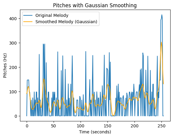
Figure 1. The originally detected pitches along with the smoothed version
The original melody seemed quite noisy, so I first downsampled the data to reduce its amount. Then, I used a Gaussian filter to smooth out the curves. Although this obstructs some of the understanding of the melody in the figure, it allowed for better printing, and the sense of changes in pitches was still translated.
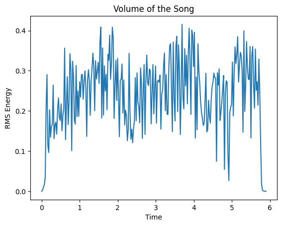
Figure 2. The RMS data of the audio
This data was also noisy, so I experimented with changing the amount of data that was sampled. This successfully reduced the data to an amount that Rhino could handle while preserving the general trends of the volume in the song.
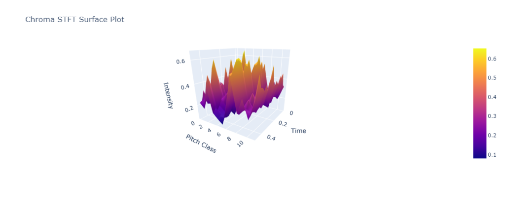
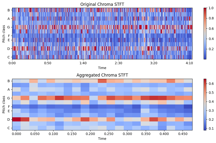
Figure 3a. Left: 3D Surface plot generated from the aggregated chromagram.
Figure 3b. Right: Original Chromagram from Librosa on top and Aggregated Chromagram on bottom.
Finally, the chromagram presented the most complicated dataset, but it was the easiest to generate into a plot. Once again, I reduced the amount of data by aggregating based on moving averages.
Data Process
I started with the volume data. Because it was a 2D set of data, I wanted to use Revolve Surface to create an interesting form. After an initial attempt, I realized it looked like a vinyl record which I thought connected to my music theme quite nicely. I needed to scale the data, so I added some scaling parameters in the Grasshopper code. I ended up choosing parameters based on what looked most like the record shape I was hoping for. When it printed, I found that the amount the volume varied throughout the song was not all that significant, but it was neat to be able to see the high and low points of the sound based on the form. Although I manipulated the scale of the amplitude, the form also reflects how the song is low in volume most of the time. The x-axis (see Images 4a and 4b) is time in seconds, and the z-axis is the amplitude of the audio in RMS.
I proceeded with printing the 3D surface plot of the chromagram. Originally, I wanted to use the surface as the top of a box and tried to use Box and Split to create this solid. That didn’t work well, so I switched gears to use OffsetCurve. I liked this surface a lot more, and it illuminates how the music grows and dips in intensity throughout the song. As in Images 3a and 3b, the x-axis is time in seconds, the y-axis is the pitch classes (B through C), and z-axis is the normalized intensity of the pitches. The normalization would go from 0 to 1, but the song maxed out around 0.65.
Finally, I returned to Revolve Surface for the melody form. The scale of the pitch frequency (Hz) on the z-axis was much greater than the volume’s amplitude, so I actually had to scale this form down rather than up. Though the x-axis is not the same scale, the melody form also uses the length of the song in seconds on the x-axis. The contour of the melody within the same is shown by this figure, and it seems like the melody stays at a relatively high frequency, which makes sense since the singer has a relatively high voice.
Images
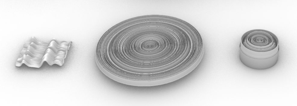
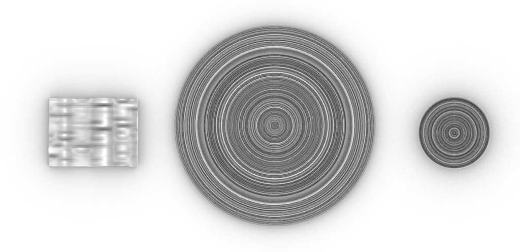
Images 1 and 2. Forms in Rhino. From left to right: Chromagram, Volume Form, and Melody Form.

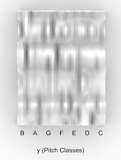
Image 3a and 3b. Units for the chroma form.
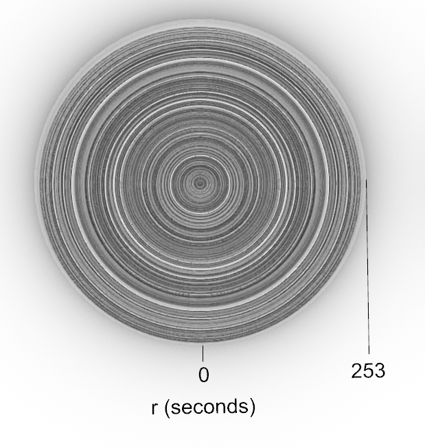

Images 4a and 4b. Units for the volume form.
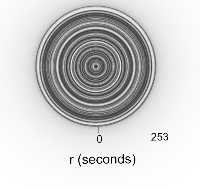
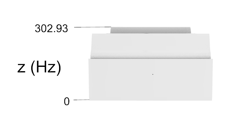
Images 5a and 5b. Units for the melody form.
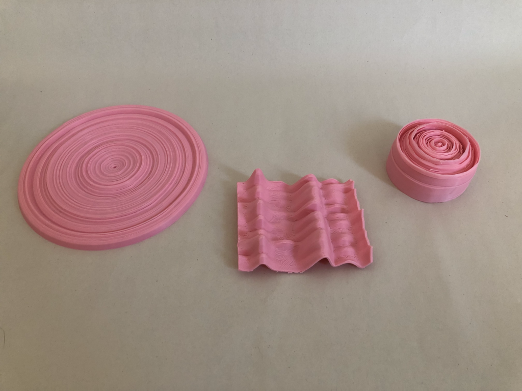
Image 6. Final printed forms. From left to right: volume form, chromagram form, and melody form.
Reflection
I really enjoyed exploring how to physicalize data! The visual and tactile aspects of 3D forms make it more intuitive to understand the data patterns and trends. For the volume and pitches that I represented, it helped me listen to the song with more intention. It was interesting to listen after printing these forms and physically touch the same contours that I could hear in the music. It would be interesting to use different songs, especially ones from other artists and genres to compare the types of forms that can be generated from their music.
The chromagram was a completely new way of analyzing music, and though I can’t necessarily hear those details precisely when listening to the music, I could understand how the changing pitch classes made the music flow. The physicalizing process in general allows us to connect with the data in ways that engage different senses. I believe it also allows us to get more meaning from the data that we might not achieve through looking at numbers of graphs. For instance, this data might help us understand why some parts of the song make us feel more deeply, or why we like some parts of the song over others. It also might help us make connections between datasets – perhaps if I had printed similar forms for other songs, I could find a pattern of pitches that resonate with me.
Hi Sachi,
What a cool project! Your prints turned out fantastically, especially the record-shaped volume form. How did you print the chromagram? On its side, like a wall? You make an excellent point about being able to derive more meaning from these prints about how songs affect us. I might use these techniques to look for trends in the music I listen to!
Hi Liz, I actually printed the chromagram flat as shown in the image! I printed it with normal supports which turned out to be a pain to get out of all the grooves. But otherwise it came out okay.
Hi Sachi,
This is an amazing approach to visualizing datasets. I really like all the objects you created, they clearly represent the style of the music. I’m not great at identifying pitches either, but watching the video while looking at the objects helped me make a guess about what pitch was coming next. Amazing project, and I’d love to try something like this as well!
Hi Alan, Thank you so much! I’m glad to hear that you got to listen to the song while looking at the objects. You’ll have to let me know if handling the objects at show and tell also changes your perspective on the song.
Sachi,
Great job on this print. I also used an mp3 to create my prints as well. I went a different route mainly using the chroma functions in librosa. The way you used Gaussian to smooth the melody was awesome. I should’ve used that for mine, curious if pseudo_croma function in Librosa would give you something similar. Did you have to use a specific frequency range for the singer?
The pitch idea was really cool too, did you have any trouble printing that? I saw it doesn’t have a flat base.
Anyways, really great post! I really enjoyed working with Librosa. Cool to see someone else use the same library and find a completely different way of representing the data.
Justin
Hi Justin, I’m glad to hear that you share an interest in music! I ended up using a C2 to C7 range so that the relative pitches of the melody would make more sense intuitively.
I did have some trouble with printing the pitch form – it actually printed upside down to the way that I have it shown in the photos which I didn’t catch somehow. So the top you can see was actually printed first. It’s not perfect, but the print did a decent job of capturing all the changes in pitch.
Your project was awesome! It really shows how much effort you put into fine-tuning the data you chose. I was in band throughout middle school, high school, and even my first year at UNM, so I definitely appreciate your passion for music!
Your final prints turned out great as well! It’s got me thinking about what physical prints of some of my favorite songs might look like. I think you did an amazing job!
Thank you so much! I’m currently in band at UNM and play the oboe, so this was a really fun project to put together. One of my original ideas was to use a band/instrumental piece to see if I could get a dataset that represented the orchestration of the music, but it was way too complicated for this project. Maybe next time!