Dataset – The dataset that I chose to work with examines the abortion rate in New Zealand (1980-2019). You can find the dataset here with Statistics New Zealand: https://www.stats.govt.nz/large-datasets/csv-files-for-download/ . I chose a dataset like this because I am very interested in historical data that shows a strong trend over the course of many years. When I looked at this particular dataset, I could see how the abortion rate had a gradual increase from 1980 until about 2003, and then it had a gradual decrease. I thought that this particular data set would generate some interesting vessels, and I was very happy with the results I achieved. I had to do minimal filtering since the data set already came with just 2 columns. I just needed to have an abortion rate (as a percentage) and a year.
Design and Grasshopper/Rhino images –
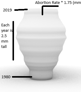
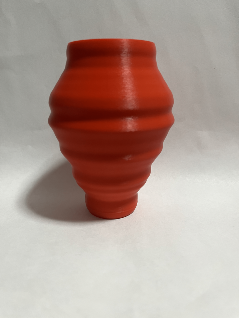
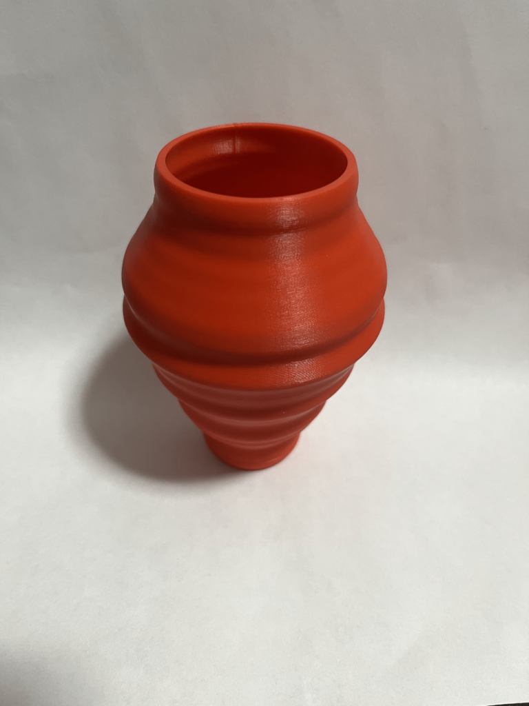
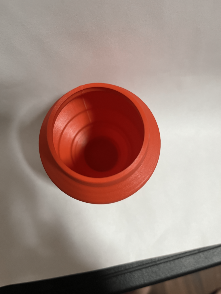
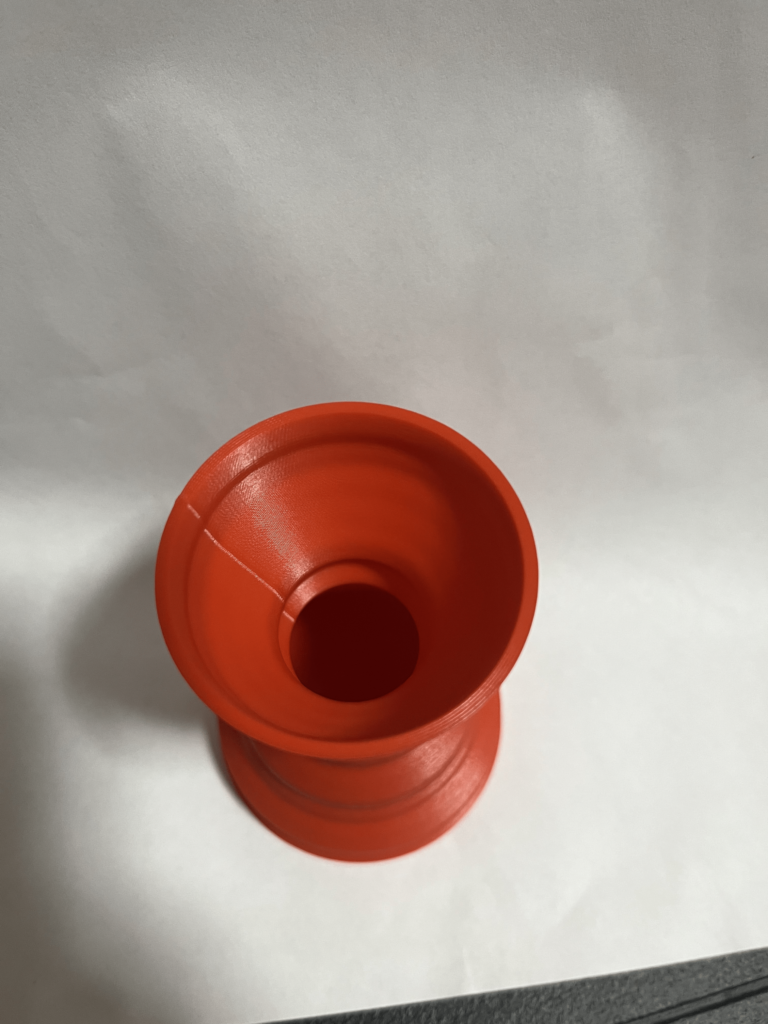
[Object #1]- For this object, I decided that I wanted to design a practical vessel. I wanted it to look something like a flower pot or a vase. The radius is dictated by the abortion rate. The diameter is generated with a simple calculation (abortion rate *1.75) gives you the diameter in mm. The height is generated by 1980 starting at 0, and each year up to 2019 is 2.5 mm tall along the z axis. You can see how the abortion rate in New Zealand grows and then shrinks between 1980 and 2019. I generated a series of circles with variable radius ascending the z axis and then lofted the circles.
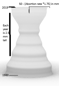
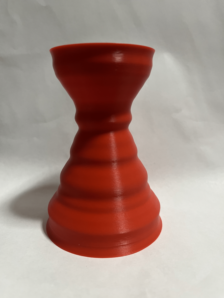
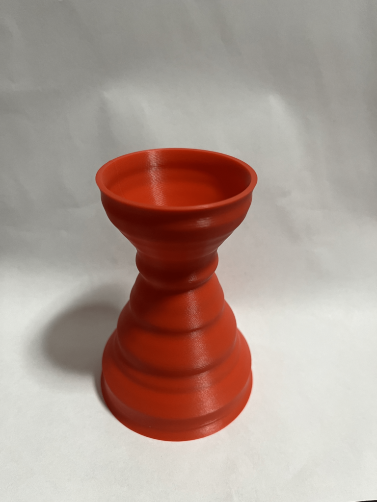
[Object #2] – For this object, I also wanted to do a vessel/vase, but I wanted it to be the inverse of object 1 in a way. I have it set up so that the base is very wide and that as the abortion rate increases, the diameter of the vessel at that particular sop on the z axis decreases. The diameter is 50 – (abortion rate * 1.75) mm. The height is the same as the other vessel: generated by 1980 starting at 0, and each year up to 2019 is 2.5 mm tall along the z axis. This vessel represents the data well, because when it is thin, you can tell that the abortion rate was higher, and when the diameter is larger, the abortion rate was lower. You can see how the trend changes over the course of time. I generated a series of circles with variable radius ascending the z axis and then lofted the circles.
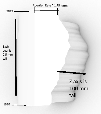
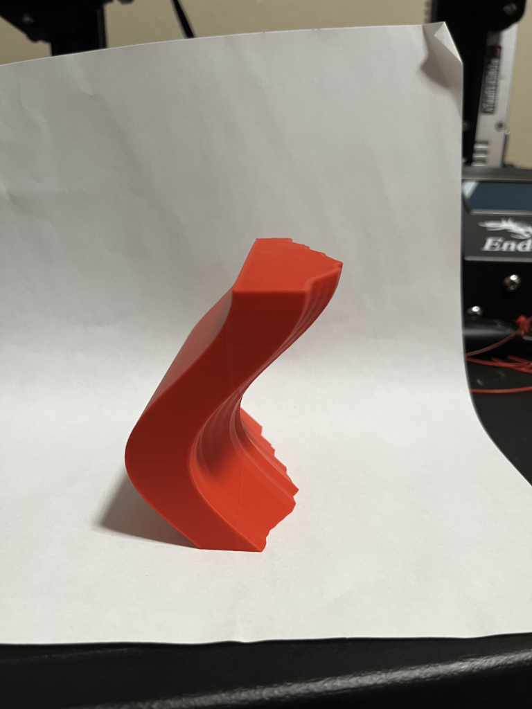
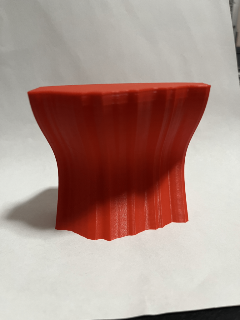
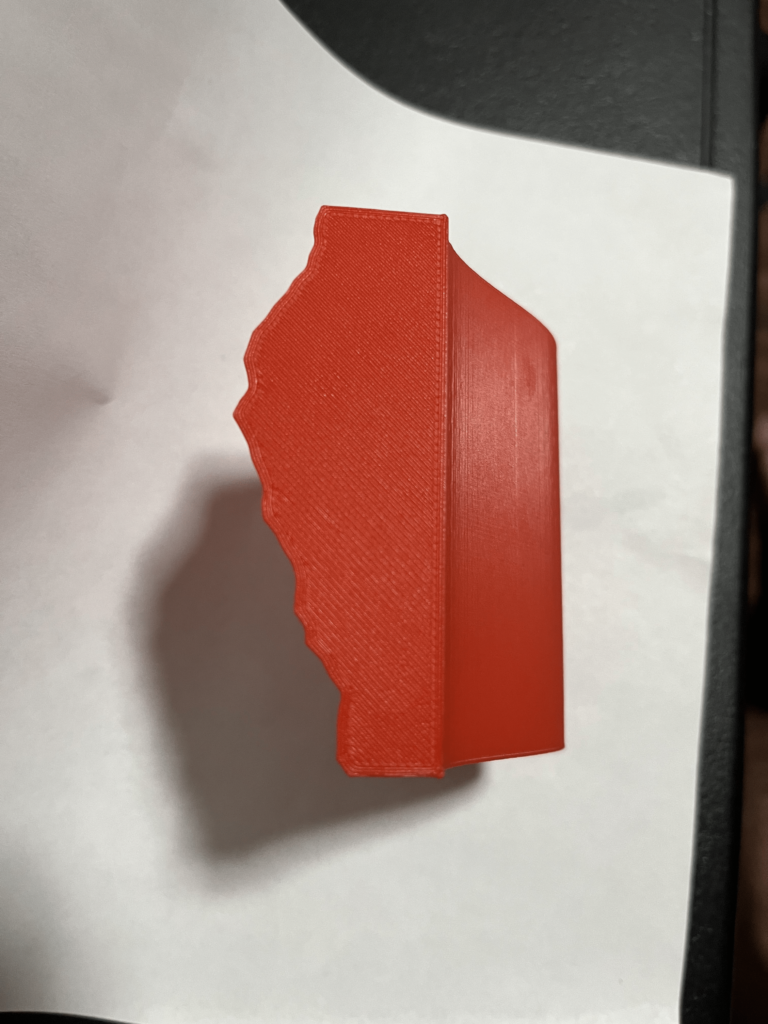
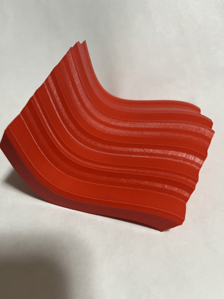
[Object #3] – For this object I wanted a very experimental looking result. I decided to graph the abortion rate as an x value flat on the X,Y plane. I then filled it in to make a box with the X values being the only thing that wasn’t straight. I then copied this up along the z axis 100 times. The x value (on the right of the image) is equal to (abortion rate * 1.75) mm. The y value is: generated by 1980 starting at 0, and each year up to 2019 is 2.5 mm tall along the y axis. The z value is from 0-100 to give it height. The reason the whole object is wavy in the x axis is that it is offset by a cosine function as it moves up the z axis. This means that at each layer, the x direction is translated to the value of 20*(cos(z/30) offsetting each layer. Doing this action of offsetting it for 100 layers made a nice and smooth shape. I then lofted each of these 100 polygons together. This one is a little hard to see what the data representation is, but if you know where to look (the changing x values) from a top down perspective, you can see how it is just like vessel 1 having a sliced interior view. I think it is sort of a puzzle, but once someone figures it out, they will appreciate the interesting way the data is represented.
Print Pictures –
Object #1 –
Object #2 –
Object #3 –
Reflection on Designing with Data –
I really enjoyed this particular project. I really like data science, and after I graduate I hope to go into it. I currently work at the Bureau of Business and Economic Research here at UNM working with data. A lot of my job consists of making visualizations for NM statewide data on our website. I am used to making a lot of 2D charts and graphics for people to interact with. I think this project showed me how cool and interesting it can be to take data that is normally visualized in 2 dimensions, and display it in 3 dimensions.
I think that these visualizations could go a long way towards teaching students and showing them how numbers can be tangible. I imagine that if you were to just throw a bunch of numbers at highschoolers it would mean nothing to them. But, if you were able to make a physical vessel/object showing something like test scores, it might mean a lot more to them and get them interesting in data/statistics/fabrication. I think that being able to physically touch the data and see how it looks represented in our world gives us a stronger connection with it and it therefore imparts more meaning to us.
Grasshopper Code –
Hi Wayne,
Nice work on your models, they came out looking really good. The vessels have really smooth “peaks” that correspond to the years, I had assumed that the peaks would be steeper. I guess it’s probably the scale that helps make them so smooth.
Interesting topic that you decided to research on. I know it can be controversial to talk about abortion, but perhaps it would beneficial to make it a normal thing to talk about. I wonder what might have caused the decline in the rate recorded, could it be sex education? the use of contraceptives? Interesting to think about.
Thank you for the great feedback! I was really happy with how smooth the models came out. I think that making so many layers to loft is what really helped me out. I agree that it can be a taboo subject, but I think that having a model helps us begin talking about something that is generally avoided. I think that seeing the increase in abortion rate and then the decrease does bring up questions like you mentioned. If I can get the person holding my vessel to ask questions like that, then I think the art has done its job. Thanks again for taking the time to reflect on my work!
Hi Wayne, Very interesting choice of dataset and vessels. The first two are especially clear with the information they were trying to convey, and it makes me wonder what social, political, or economic factors might be influencing the trends in the data. The final form is unique and striking as well. I liked your reflection on using this process of physicalization for education. It also makes me wonder if taking a more abstract route in representing data could explain to people how statistics can be manipulated. With a highly politicized issue like abortion, it might illuminate how information can be misleading.
Hey Sachi! Thanks for taking the time to reflect on my work! I was hoping the vessels would bring up questions just like the ones you are asking! I think that if you become more invested in the subject because of my work, then the art has done its job. I think that abortion can be a taboo subject and I am hoping that this can be a means to bridge the gap and start conversations. I think that this method could be very useful in education and I think we should physicalize a lot more datasets. Thanks again Sachi!
Hi Wayne,
Great Shapes! I’m amazed on how smooth they came out. I wonder how long it took to print these shapes? Definitely an interesting topic and the amount of data must have been massive. In order to not have the height massive did you scale down in the end or did everything workout? The third object is my favorite since it reminds me of a skate ramp/ water wave.
Hi Ricardo! Thanks for taking the time to reflect on my post! I was very happy with my shapes too, shape 1 took about 4 hours, shape 2 was 6 hours, and shape 3 was 5 hours of printing. I did end up scaling and modifying the height of the data to manipulate it into making a smooth and pretty vessel. I was happy with how the scaling actually made it look. The 3rd object is my favorite too, I love the idea of it being like a skate ramp/water wave. I just wanted to make something very out of the ordinary, but still showed the data if you know where to look. Thanks again for your great feedback!