Dataset
The dataset I chose for this particular project was from the US Governmental data website given to us from the PowerPoint slides. The dataset is titled, Crime Incidents in 2024, “which contains a subset of locations and several attributes associated with crime incidents reported in the ASAP (Analytical Services Application) crime report database by the District of Columbia Metropolitan Police Department (MPD).” This is essentially a geographic way of assigning crime data in Washington (Open Data DC). That being said, there was a bit of inspiration behind my choosing of this dataset, influenced by a strange encounter I had last week. Otherwise, I thought that the data presented in this particular set would make for interesting graph parameters that caught my eye over some of the other crime related datasets. Unfortunately, this particular file had about 25000 rows of collected data which made my initial programs crash immediately. I filtered the data by removing any columns and rows associated with an empty cell (depending on the information that was being plotted). Anything after required sorting (smallest to largest), removing data for the sake of my program, and more information centralized filtering.
Link to dataset: https://catalog.data.gov/dataset/crime-incidents-in-2024
Design Process:
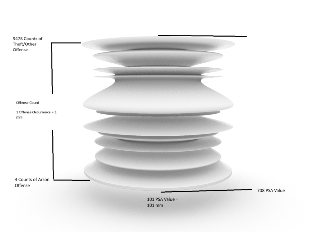
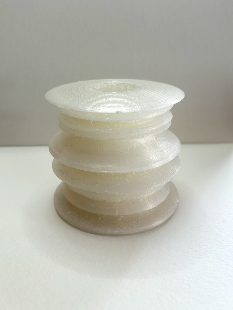
For my first print, I used the Offense and PSA columns to plot and create my model. The offense column lists the type of offenses that were committed for that specific crime, whereas PSA is the acronym for Public Safety Assessment. For these specific cases where a column takes a string value instead of a numeric value (Offense), I went to a separate government site linked in the original to pull the numeric values from the bar graphs that graph the counts of each Offense, and mapped each label to their value in Grasshopper (to maintain consistency of meaningful data). The unit for the Offense column is the count for each offense and the unit for the PSA column is the risk assessment value associated with that offense. Since this file had many rows which translated to points, I attempted to evenly delete data throughout the set to prevent Rhino from crashing. Once doing so, I ordered the data by their Offense values up the Z-axis and graphed the PSA column along the X-axis. Once having created this plot, I used a modified version of the program from class to create the vessel-like object. I also decided to use support structures everywhere for this print, which took about 24 hours to complete, and an additional 2 hours to remove the supports. Fortunately, I had a successful print the first go-around.
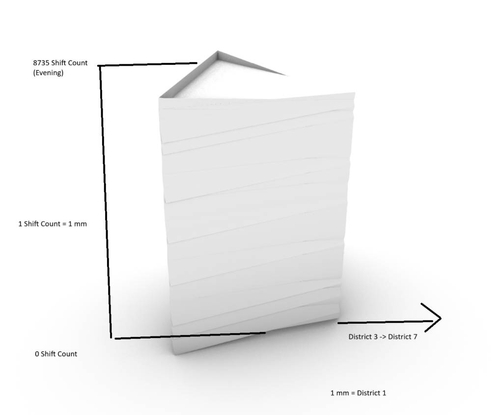
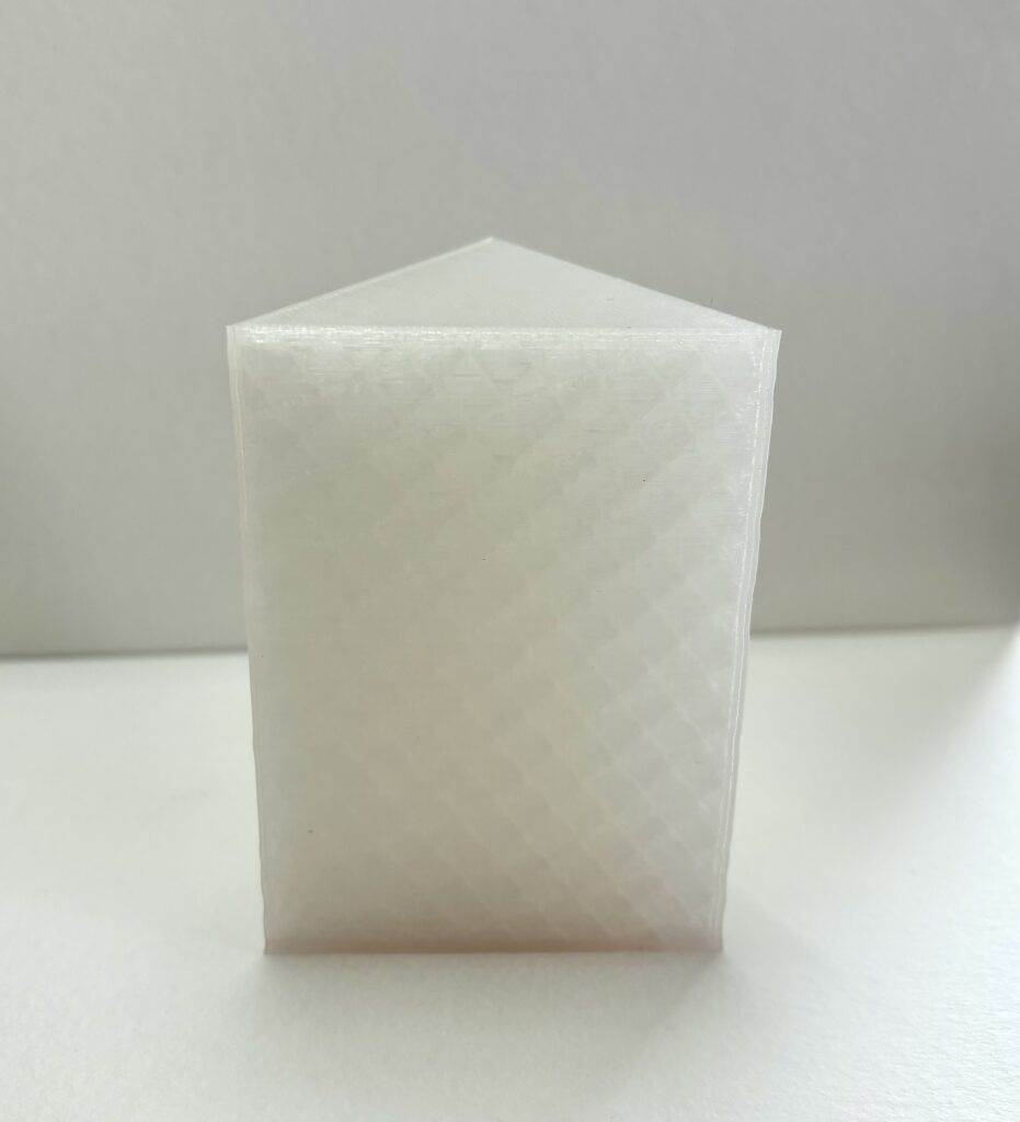
For my second print, I used the Shift and District columns to create the plots. The Shift symbolizes the “time of day” in which the crime (evening, day midnight) and the District is the District identifier number in which the crime occurred in. Similar to the previous model, I mapped each of the Shift labels to their respective count values pulled from the online bar graph. Once determining what the string values mapped to, I plotted the curve with District on the X-axis and Shift on the Z-axis. As for the spreadsheet, I sorted the spreadsheet by Shift values in increasing order, and left the District column as is. Once I had this curve graphed in Rhino, I used the program from our last large assignment to create a triangle polygon at the bottom point of the curve, and extruded it up that curve to create a different representation of the data. Since the X-axis plot had small value changes in comparison to the Z-axis, the model printed with very subtle shifts as the Z-axis values (Shifts) increased. This print took about 4.5 hours and gave me the least amount of trouble, however, the infill pattern took over the appearance as the filament is “clear-like.”
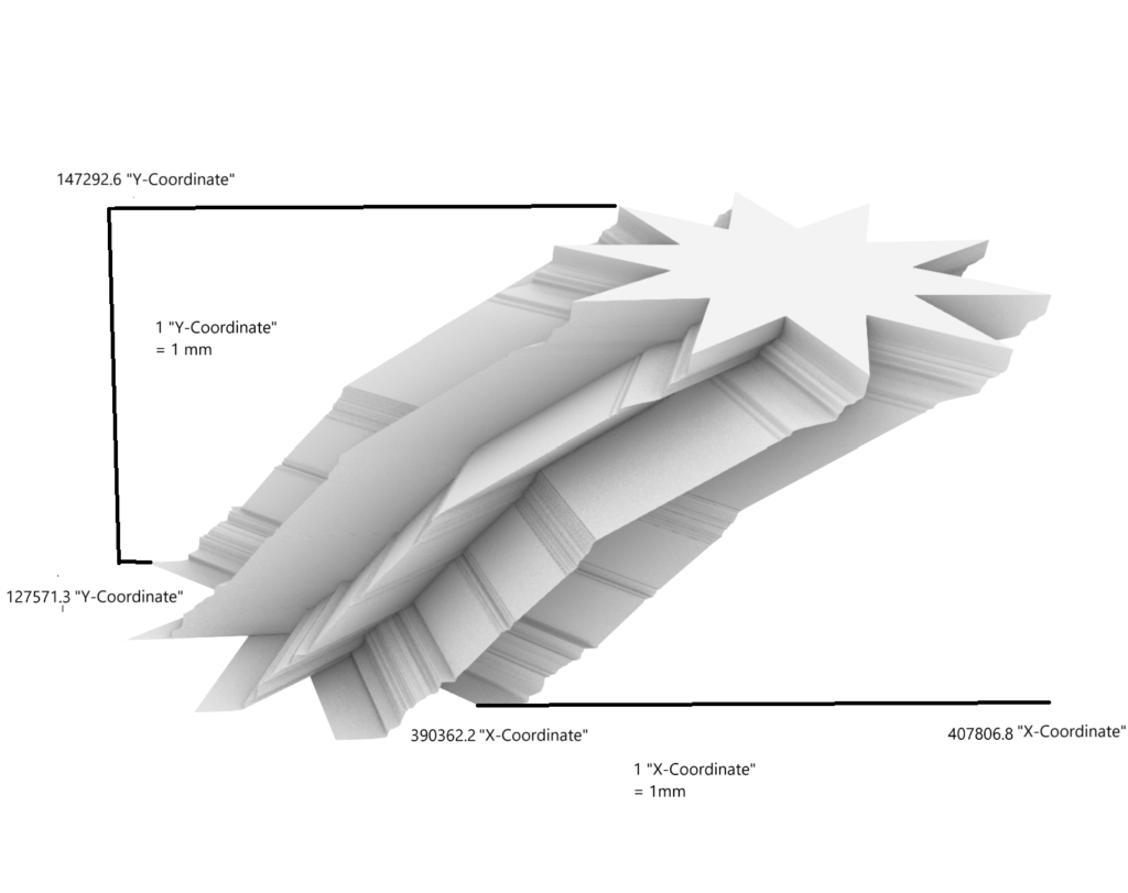
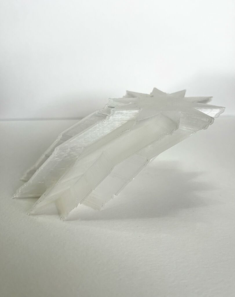
The final print follows a very similar process that my second print did. However, the columns used for this object were the Block Locations for crime points which were expressed in X,Y coordinates pairs. Since ordering by pairs is a bit different than ordering by one column, an additional step was required of filtering the unordered values from one of the columns after the other was sorted. For example, I sorted the values of the X column in increasing order, and filtered out/deleted all the unordered values from the Y column that were “unordered”, which meant that both columns resulted in pairs that were both sorted in an increasing order. Once these coordinates were plotted, I extruded a Triangle Gear shape along the curve to create the final data representation model (X coordinate on the Z-axis, Y coordinate on the X-axis; I did it backwards on accident). This print took about 4.5 hours and didn’t use any supports.
Prints are ordered below:
Rhino Images
First print:
Second print:
Third print:
Print Images
Reflection
Overall, the most difficult part of this project was trying to figure out the different ways to model the data without causing Rhino to crash whenever I tried meshing or exporting the object. 3D objects can allow data to be visualized in a more physical way than a graph or spreadsheet may be able to, possibly making it much easier to interpret relationships between different values and how they scale together. Personally, I find that looking at data in the form of a 3D printed object is much more pleasing, engaging, and fun to look at/work with in comparison to any other graphing method. These models become an object that hold and interpret data rather than just being an object that was printed because it was aesthetically drawing to an individual.
Hello Desiree,
I absolutely love your prints and especially your third print is really cool to look at! I had the same issue with the last assignment as you with grasshopper and rhino lagging for a long time and eventually crashing any time I tried to mesh or render my artifacts in rhino. I wonder if it is just my laptop’s computing power or if rhino could be the issue. I also love the glossy finish of your filament, very good work on those prints!
Thank you! I did enjoy using a different filament color, however I think it was too transparent. The infill pattern in my second print took away from the shifts up the z-axis, but they can still be felt! Sounds like it could very well be a grasshopper and rhino issue if several of us are having the same problem. Thanks again, Patrick!
Hi Desiree, your final prints came out very cool and I like the variety between them, also are you using a transparent filament for this set? Your last object is probably my favorite since it is just so interesting to look at and also uses x and y coordinates in a way I wouldn’t have thought of. I also agree with you that it is much more interesting to look at these 3D objects than at a 2D plot that represents the same data.
Luka,
I am using a transparent filament for this set, but like I had explained to Patrick, I regret using it for my second print. I think increasing the wall thickness or printing with 100% infill (or even 0% – but was concerned about the top part of the print failing) would have fixed the transparency problem. My goal was to model the data in different ways so I’m glad you found it interesting! Thank you!
I’m impressed with the information density of your prints. Mine were just graphs over time and I find the idea of doing hybrid graphs where the x and y values are both describing different things very interesting. It sounds like you mapped each incident to your graph which is very cool and very data intensive. I might recommend using programs like excel that can count similar data points by date, crime, etc which would hopefully help runtime.
Hi Desiree,
Nice job handling such a large dataset! It’s often a struggle, especially when things are crashing. I agree with Beau that your decision to plot various categories together rather than relating everything to time was a good one. Your prints turned out really well! The filament you used really suits them. For the gear print, are the X-Y coordinates for a specific category, or are they from across your whole dataset?