Dataset
For this assignment, I had a little trouble deciding on a dataset to use for my project. I explored the links that were provided and others I found independently. I felt overwhelmed at some point because there is a massive amount of data on many subjects that it’s hard to focus on a single thing. In the end, I found two datasets that were interesting to me, one related to college graduates characteristics in this website: https://ncses.nsf.gov/surveys/national-survey-college-graduates/2021#data.
There were many interesting tables with various categories such as median salaries, graduation rates based on sex, ethnicity, etc. This dataset, however, I felt was still too big. I ended settling on a data set related to the number of motor vehicles registered over time since 1900. The dataset can be found here: https://catalog.data.gov/dataset/motor-vehicle-registrations-dashboard-data.
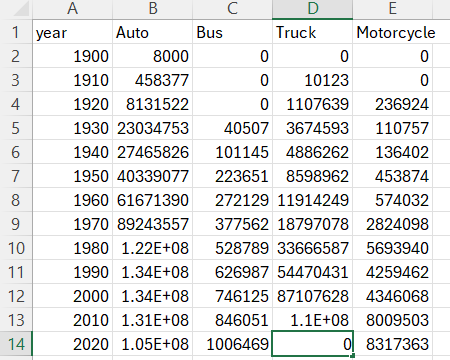
In the aforementioned dataset, there were four categories for the collection of data: autos, trucks, buses, and motorcycles. The data was collected separately for each year, and for each state within the categories mentioned. The reason I picked this dataset was because it felt more manageable with fewer categories of data. To use the data, I processed it to include the sum of the totals for every state, every 10 years. This way, I have a dataset that can be interpreted more broadly. Admittedly, this leaves out much detail, but the original source file is freely available for review. I made a small python script (outside Grasshopper) to process the source file:

The resulting file was a reduction from 6k+ rows from the source to this:
Design Process
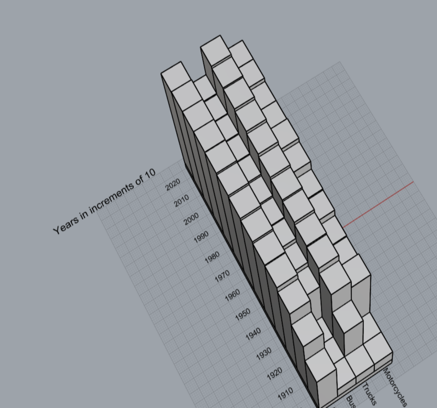
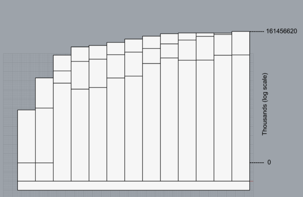
The models I generated from the dataset are rather basic; I decided to make physical 3D plots from the data, since I believed that this would be a good way to interpret it. The first model consists of a bar graph in three dimensions. Vehicle categories on the x-axis, years on the y-axis, and cumulative number of vehicles on the z-axis.
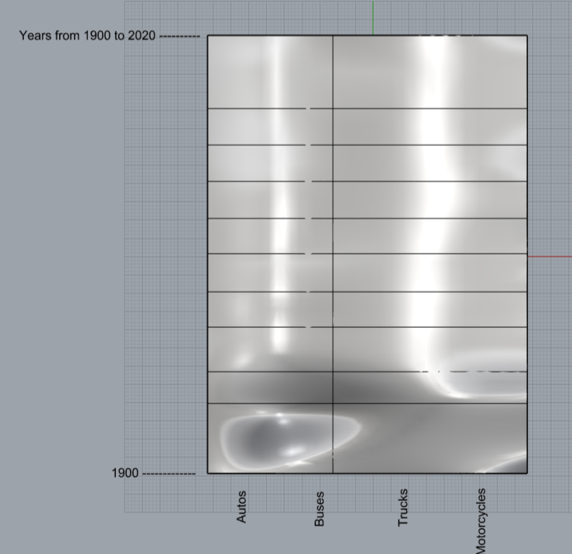
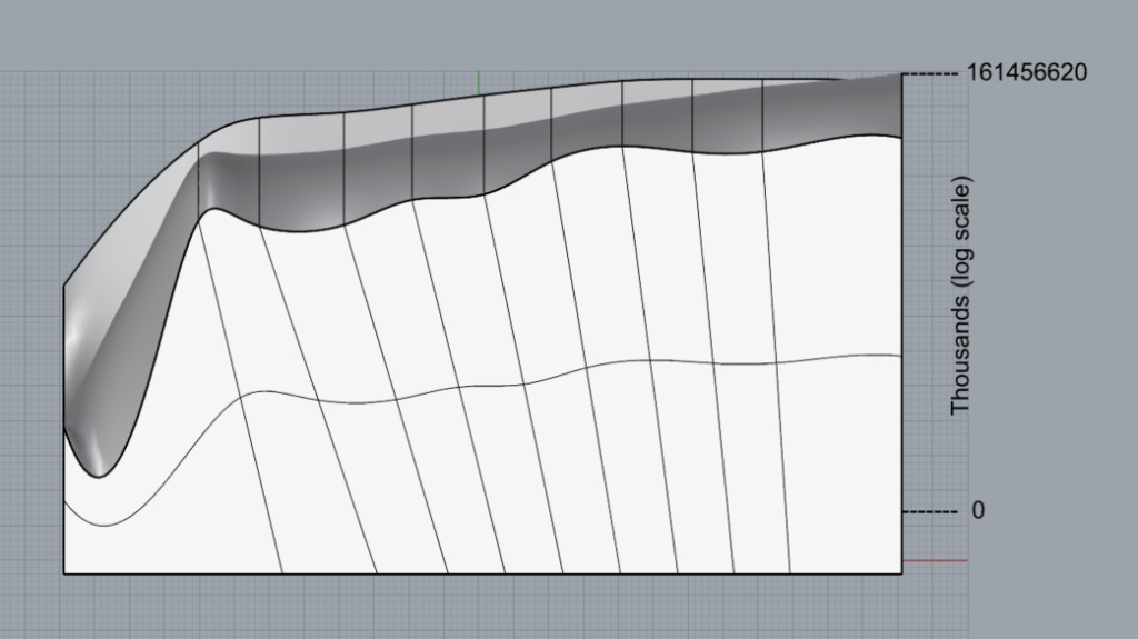
For the second model, I used the same source file, but made a surface graph instead.
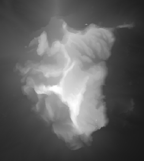
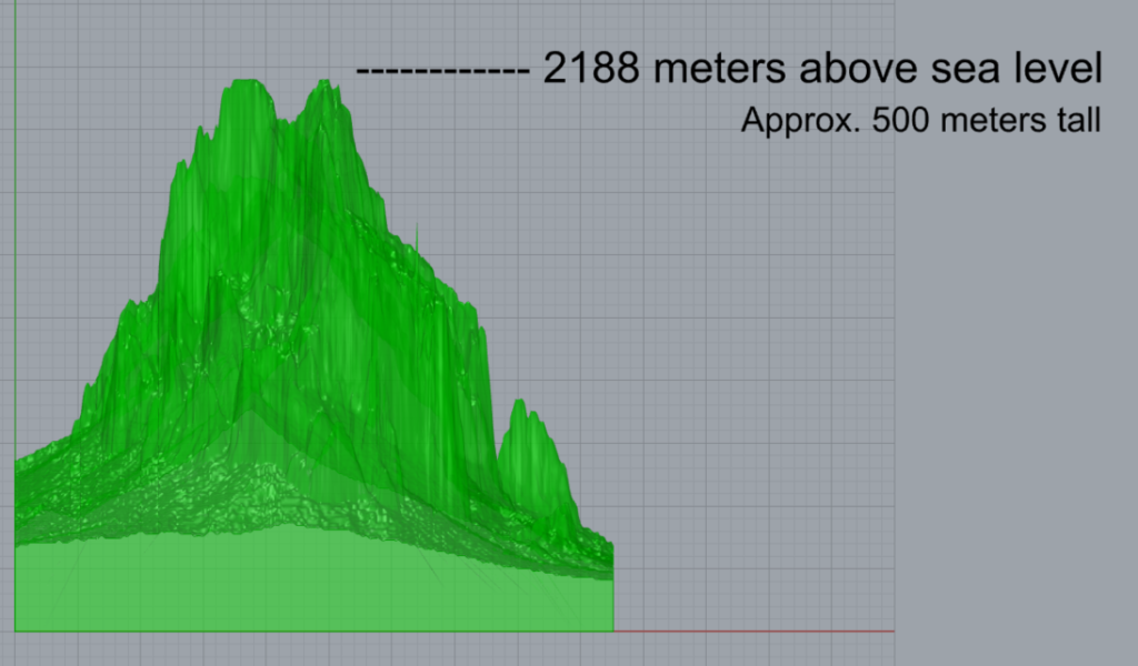
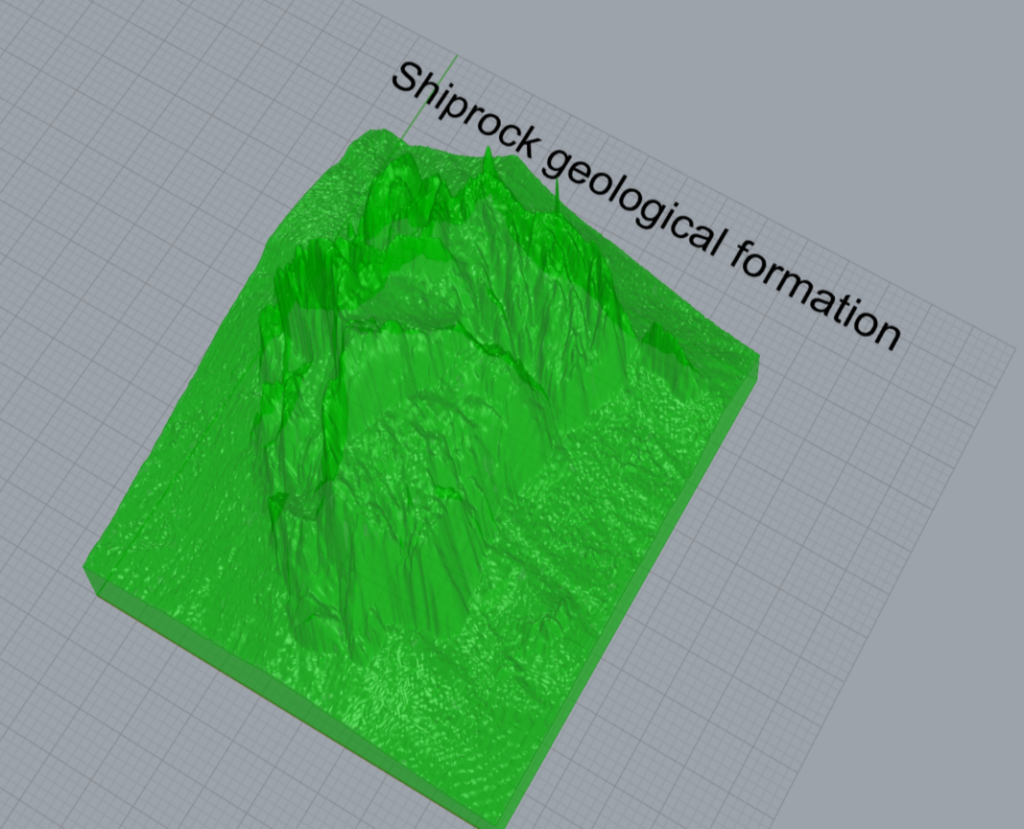
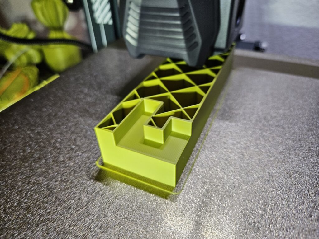
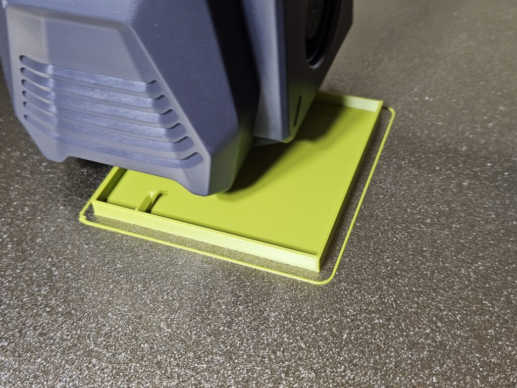
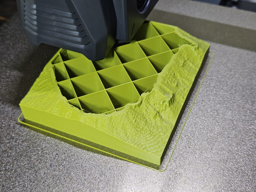
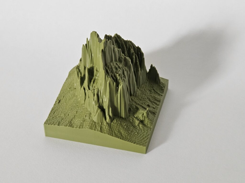
For the third model, I really wanted to “print a mountain” after watching the demonstration in class. I knew exactly which mountain I wanted to print: the Shiprock geological formation located on northwest New Mexico. This model was much more involved than the previous two. Due to the relatively small scale of the formation, I could not use the bitmaps found in the USGS map generator website as we saw in class. There just wasn’t enough detail to make a good model. I scanned the area using the “Elevation Source Data (3DEP) – Lidar, IfSAR” option and found much smaller scale sections. This, however, provided me with a “.laz” file that I had to process with some LAStools software that I was not familiar with. After processing the .laz file, I loaded the resulting file on the QGIS software, then I generated a “rasterized” image from the source file. The resulting file was then fed to the python script as a bitmap to generate the model.
Reflection on designing with data
In making the models for this project, I realized many things related to data interpretation. It is really important to include scales, measures, units, etc. for audiences to get a good understanding of the data representation. In my plots, it was not possible for me to make the important values on a 1:1 scale, given the range of the values. I had to use a logarithmic scale for my models so that they would fit under my printer volume. This sort of illustrates my point: data can be manipulated to fit the needs of anyone. Without the scales, units, etc. mentioned before, no interpretation of the data would be accurate.
For the surface graph the situation worsens. Due to the interpolation of the point mesh, the details of the data are muddled even further, as the soft curves hide much detail. Additionally, I scaled the model to make it better suited for my printer and to comply with the size requirements, worsening the accuracy of the data representation.
On a lighter note, the process of physicalizing data was really fun. I especially enjoyed printing my own mountain. Again, it is not to scale, since I had to manipulate it’s dimensions to preserve detail. This manipulation also introduced some small artifacts that were probably introduced during the various processing stages, but overall I was very satisfied with the final product.
Printing Process and Final Models
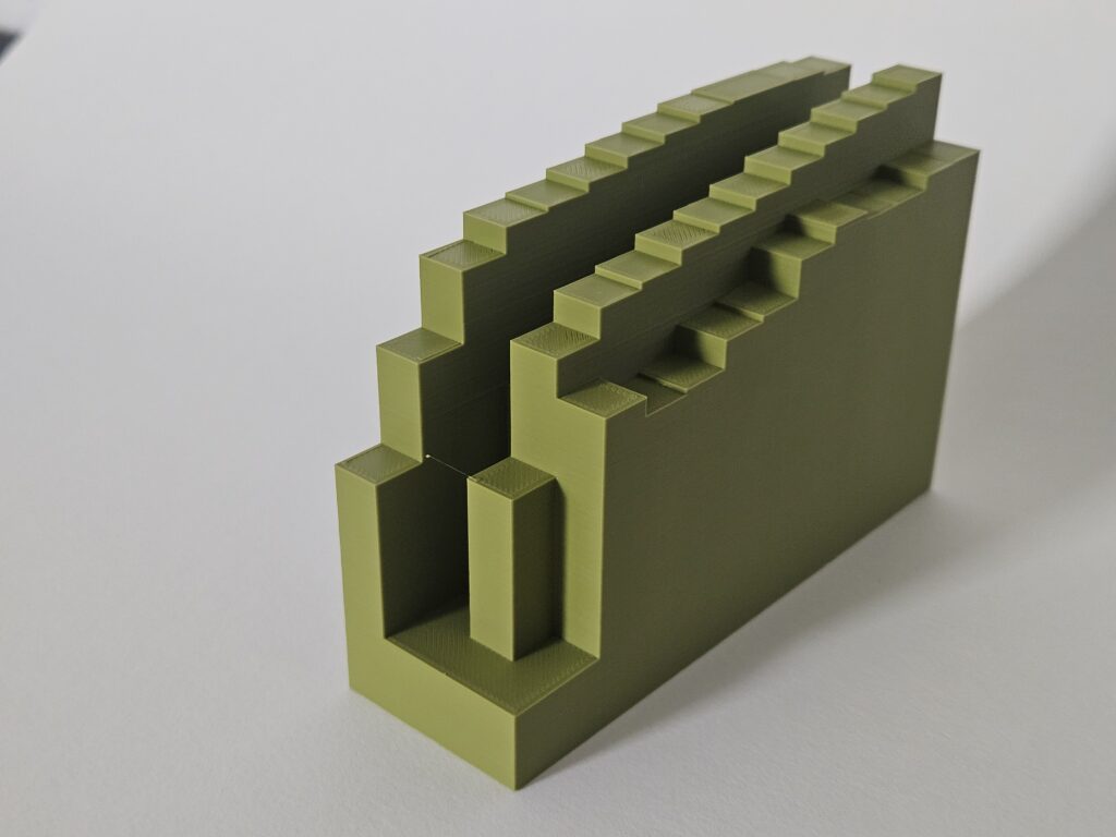
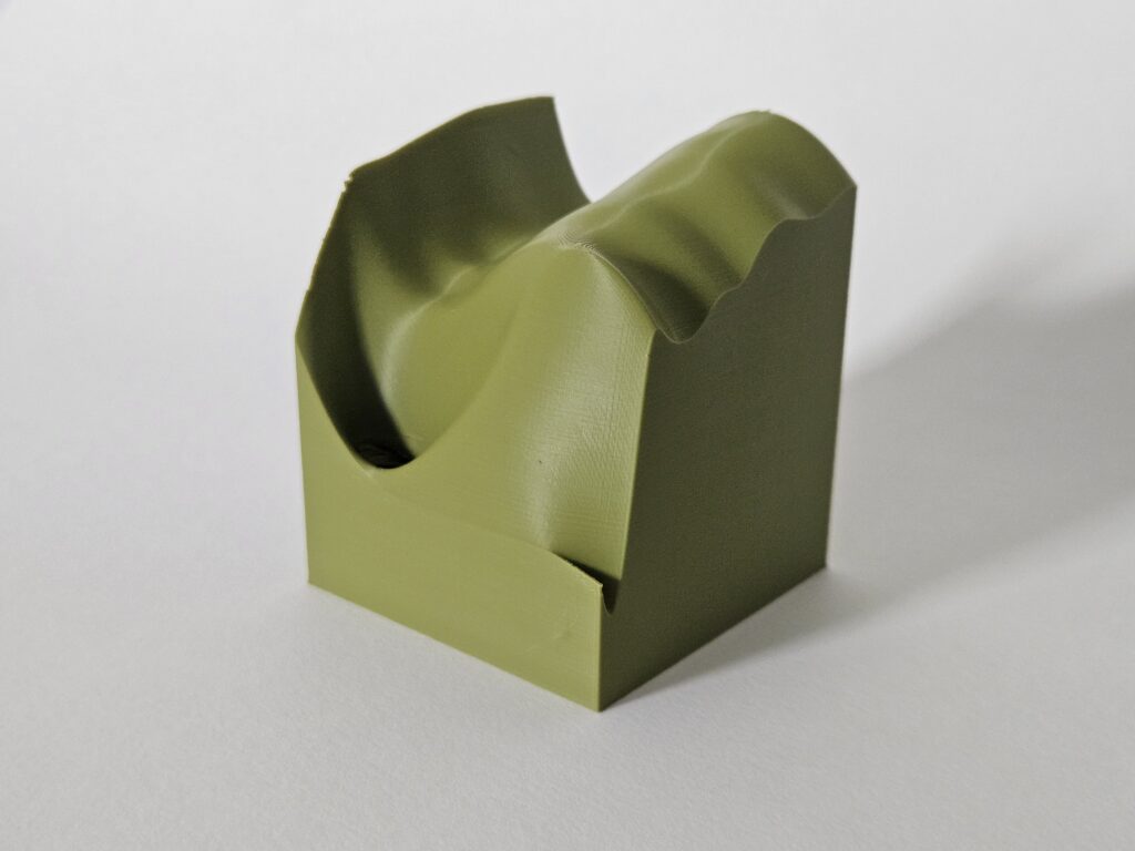
Grasshopper code used in this assignment:
Hey German,
It’s great to see how you navigated through the large datasets to find something that felt manageable, especially with the vehicle registration data. Your approach to processing the data by summing totals every ten years makes it easier to interpret, even if it means losing some detail. The models you created sound effective, especially the 3D bar graph and surface graph, as they provide clear visual representations of the trends in vehicle registrations.
I find your idea of printing a mountain really interesting, especially since it involved so many steps and new tools that we barely just learned. It’s impressive that you tackled the challenges of processing the lidar data and generating a raster image for the model. Your reflections on the importance of scales and units in data interpretation resonate well, highlighting how manipulation can affect understanding. It’s cool that you had fun in the process. I would have to say that my favorite is the mountain print, and with your filament color it came out really nice!
Hi Daniel,
Thank for your kind comments. I am glad to see that my models representation of data makes some sense. The mountain is my favorite too! Thankfully I started with this model first since it took much longer from start to finish. I might not have printed it if I made it last as I was running out of time.
Hi German, I think it’s cool how you can compare the bar graph with the surface graph since they showcase the same data differently. It is very easy to see those leading zeros in the first few years for some of the vehicles and all four categories can more easily be referenced at the same time in comparison to a 2D plot. I do agree with the part in your reflection that the most important thing to showcase data is units, scale, and measurements, as long as these are understandable almost anything can be used to represent data.
Hi Luka,
Thank you for your comments. I agree that providing some context is essential to make sense of the physical models. As you mention, the surface graph demonstrates how extreme values (zeroes) can affect the way the data is referenced.
Hi German,
I had a tough time narrowing down a single data set for my project as well. Initially, I wanted to visualize inflation, specifically in fast food restaurants, but I struggled to find enough data. Then I shifted my focus to car thefts, specifically Kia thefts in Albuquerque, but again, I had trouble finding sufficient data. In the end, I decided to work with CO2 emissions data.
Your prints turned out great, and I think they represent your chosen data really well. Great job, and I’m excited to see what you come up with for the final project!
Hi Andrei,
Thank you for your comments. Finding a good data set was probably one of the most difficult part of the assignment. I spent a considerable amount of time studying datasets on the government data link provided to us. There were a lot of interesting topics, but when I tried to follow them, I found many dead ends. It’s a shame that you couldn’t find data on KIA auto theft for Albuquerque, I think that would have been a very interesting topic.
Hi German,
I really like how you took a 2D figure and made it 3D with the bar graph that you created in your very first print. I was fascinated to see you take that same data and interpret it as a surface graph, it is cool to see how they compare! I commend you for creating a 3D model of the Shiprock formation. It is such an interesting thing to model and I am curious as to how long it took since it looks very detailed from the data process we used in class. When it comes to your reflection I like how you discussed scales, units, and measurements because this is a very important aspect in data and without it the data can have no meaning at all unless you explain it to the audience clearly.
Hi Andrew,
Thank you for your comments. I was inspired to make my 3D graphs in part by having worked with MATLAB in the past. Even though I don’t particularly enjoy working with that software, I always liked the 3D graphs that it can generate. I am glad to inform that python can also make nice 3D graphs. Printing the Shiprock formation took around 8 hours at 10% infill, with “fine” setting in Cura slicer. What took me the longest time was in processing the files until I had something I could feed into the Grasshopper program.
Hi German,
I like the bar graph and the smoothed version, but I wonder if you did normalizing of the data (the last bar should be 1312500 time taller then the frist?).
I also love that color and how lighting makes it look different.
Hi Nicholas,
Thank you for your comments. I didn’t normalize the data for the graphs. I used logarithmic scale to represent the height, otherwise as you mention, some of the bars would be much taller.