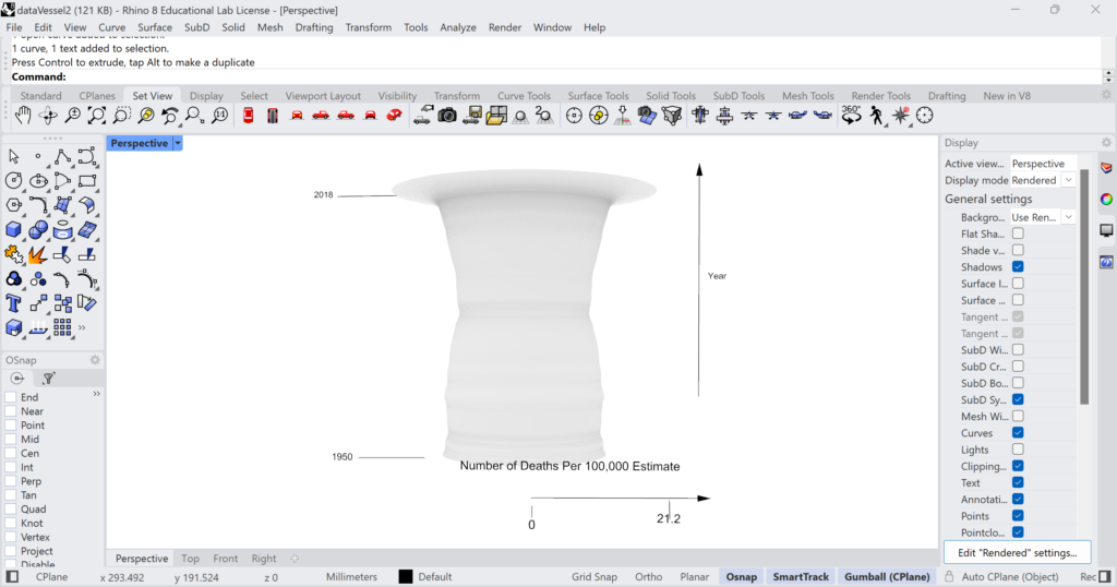
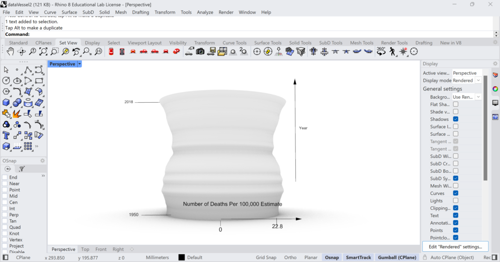
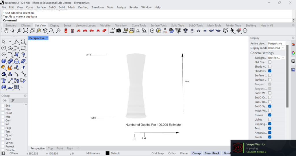
I chose this data set because I wanted to make 3D visualizations of data that was important to me. I used the data to generate a vessel like shape in rhino by using the year as my z axis and the estimate of deaths per 100,000 as my r axis. I did this for all persons, male, and female. I wanted to do it with races as well, but I didn’t have enough time to get all of them done and didn’t want to present an unfinished family of vessels. I chose to use vessel shapes as I thought they were a more elegant way of depicting data rather than just using a graph. Within rhino the units are 1:1 as each step up in z correlates to a year (Note: 1950, 60, and 70 are included as decades as the data for these times is less precise), and each unit on the x axis represents an increase in the number of deaths estimated per 100,000 persons.
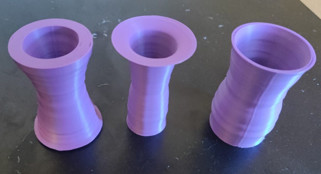
- Excellent images of your final printed artifacts against a simple background. Follow the photo tutorial.
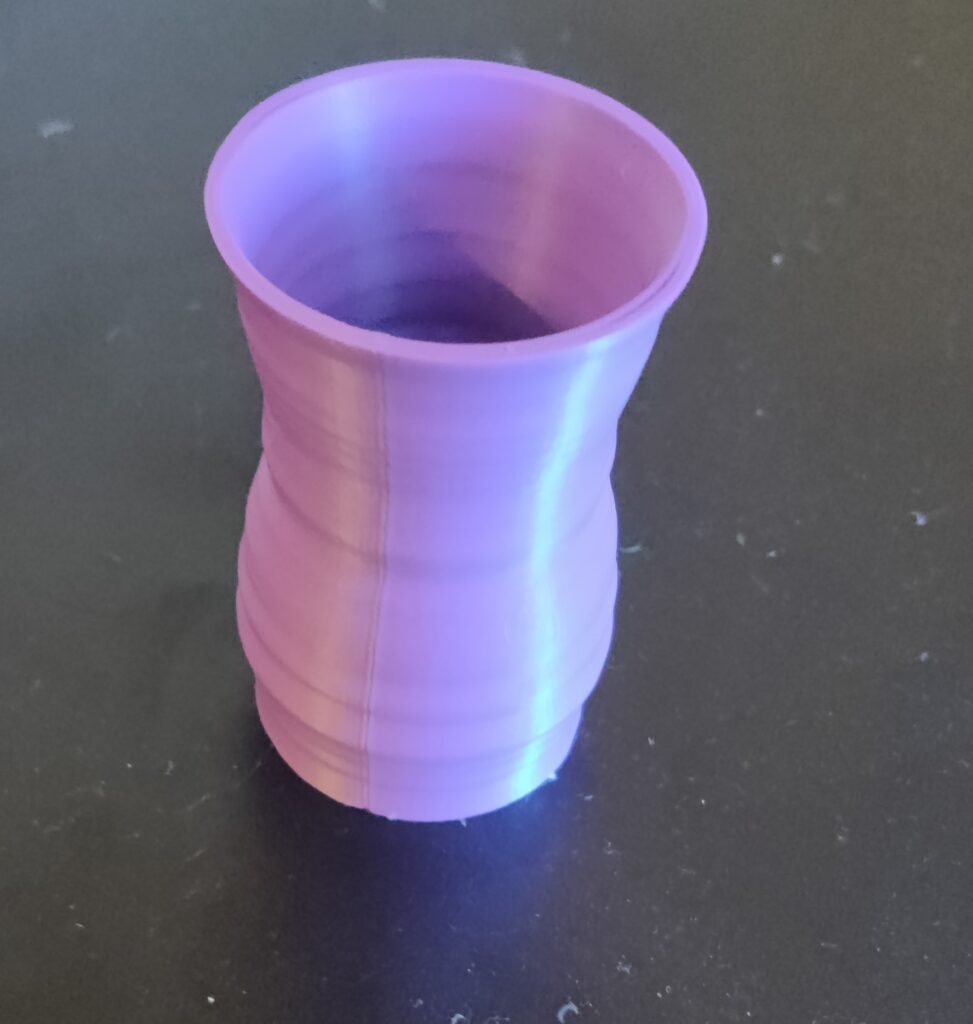
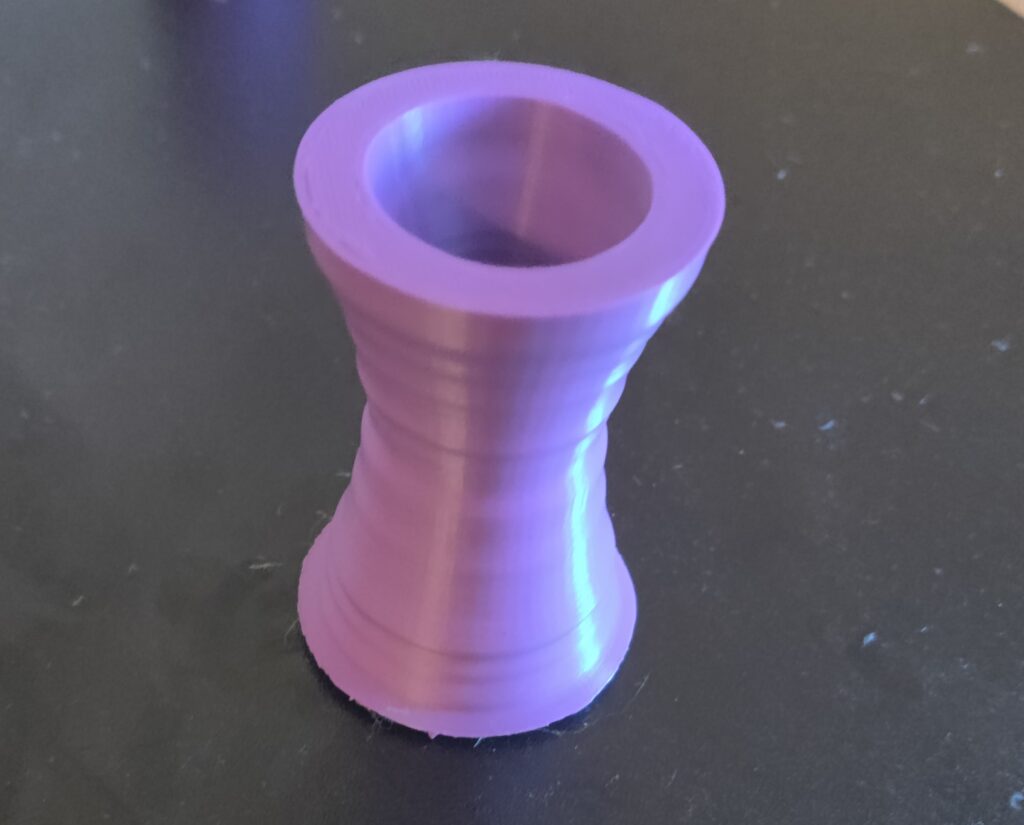
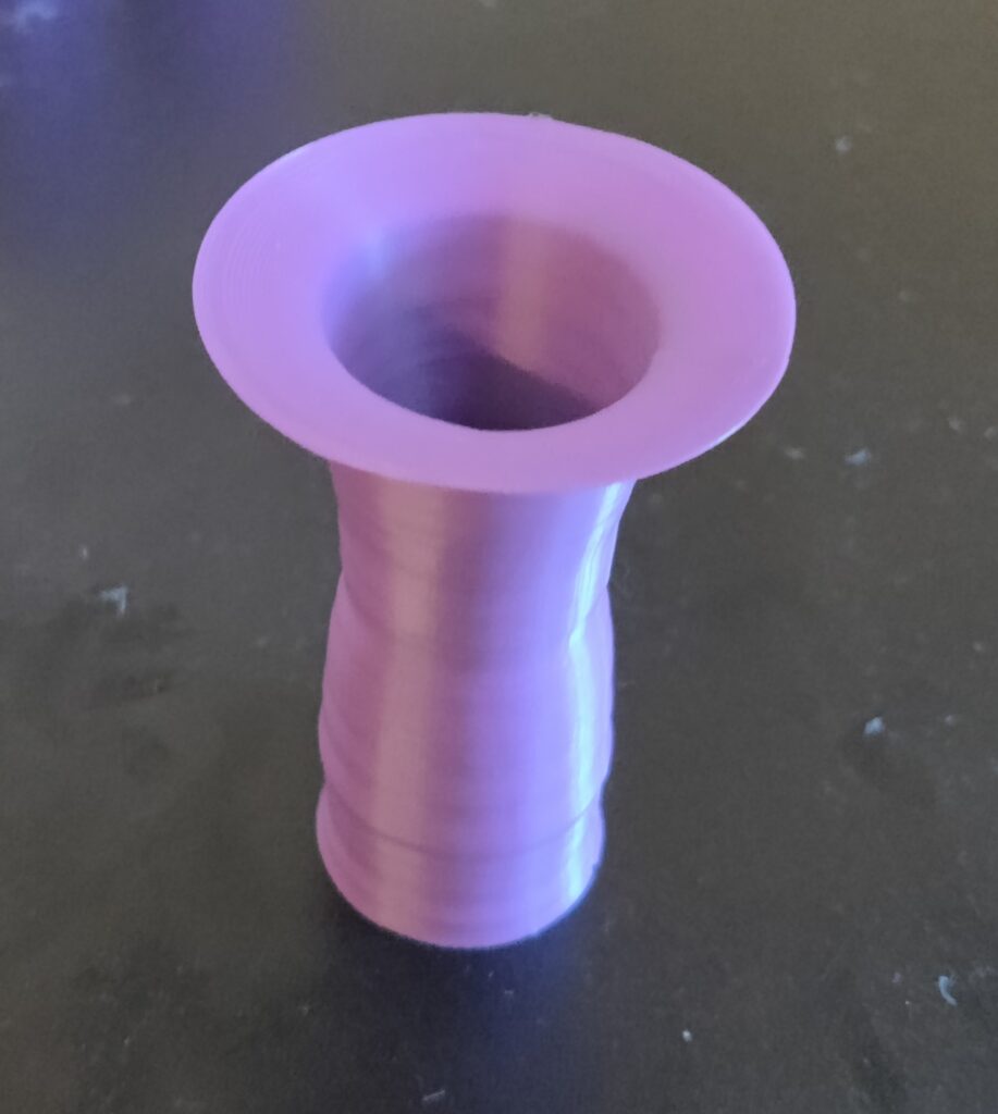
I think 3D objects are able to help people understand data in multitudes of ways. The first and most prominent example is that 3D objects are more easily digestible forms of information than a giant spreadsheet of data, and some people are visual learners so just looking at numbers doesn’t really mean a whole lot to them. These objects can have super unique meanings as they show a story of data within a 3D space. Each plot or vessel tells a story of data, whether that be super serious data like the set I used or a more light-hearted and fun story. Using data allowed me to create a vessel that had some real-world applications and one that actually said something rather than a vessel that I made through just playing with parameters. I think that in my major path, this is one of the most interesting projects that I have made.
Hi, Andrew!
Great prints! For the first print, I can see that the number of death significantly increased. What could be the cause of it?
Also, I agree with you that 3D objects/vessels are more easily readable than data file. It makes it more digestive as you said! Overall, great work!
A heavy subject matter to be sure but I appreciate the presentation. If I understand this correctly you did a vessel for both genders, male, and female. Is that the ordering left to right? Also is the one on the right has a different thickness than the other two why is that? I will also add I’m curious how the statistic scales with population because the US has over doubled in population since 1950, I wonder how much that would change the shape of the vessels.
Hi Andrew,
It’s an interesting topic that you picked as a data source. I think I can interpret the data just by looking at your models. In the combined deaths, it looks like there was a massive spike around 2018, I wonder if that was an artifact generated in rhino or if it’s real, I am also curious what might have caused it if real. I can also see that the suicide rate for males is much larger than that of females, but both models have a reduction around the middle. I was aware that the suicide rate had been worsening in recent years, but the combined rate of 21.2 per 100k seems staggering.