Links
https://catalog.data.gov/dataset/water-quality-data-41c5e
Model 1
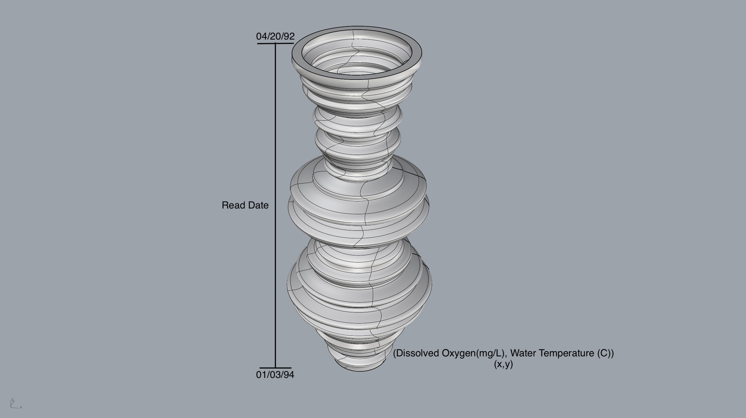
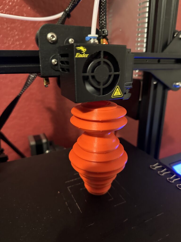
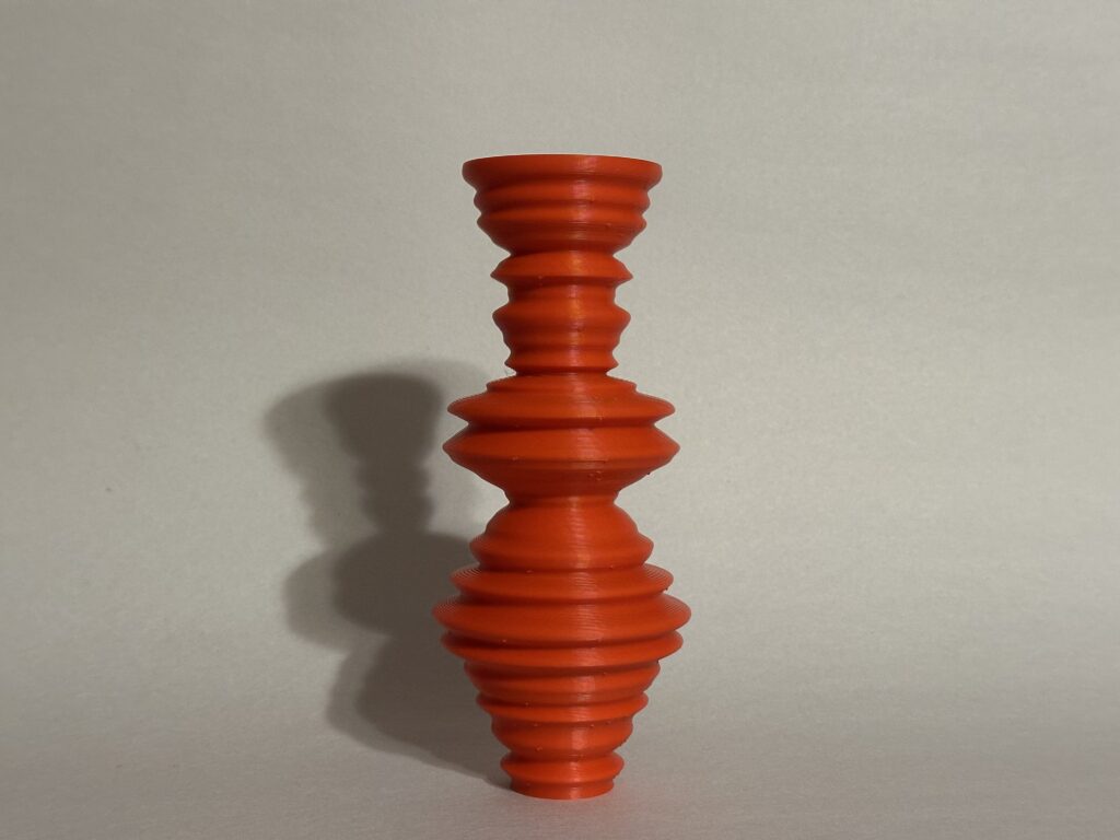
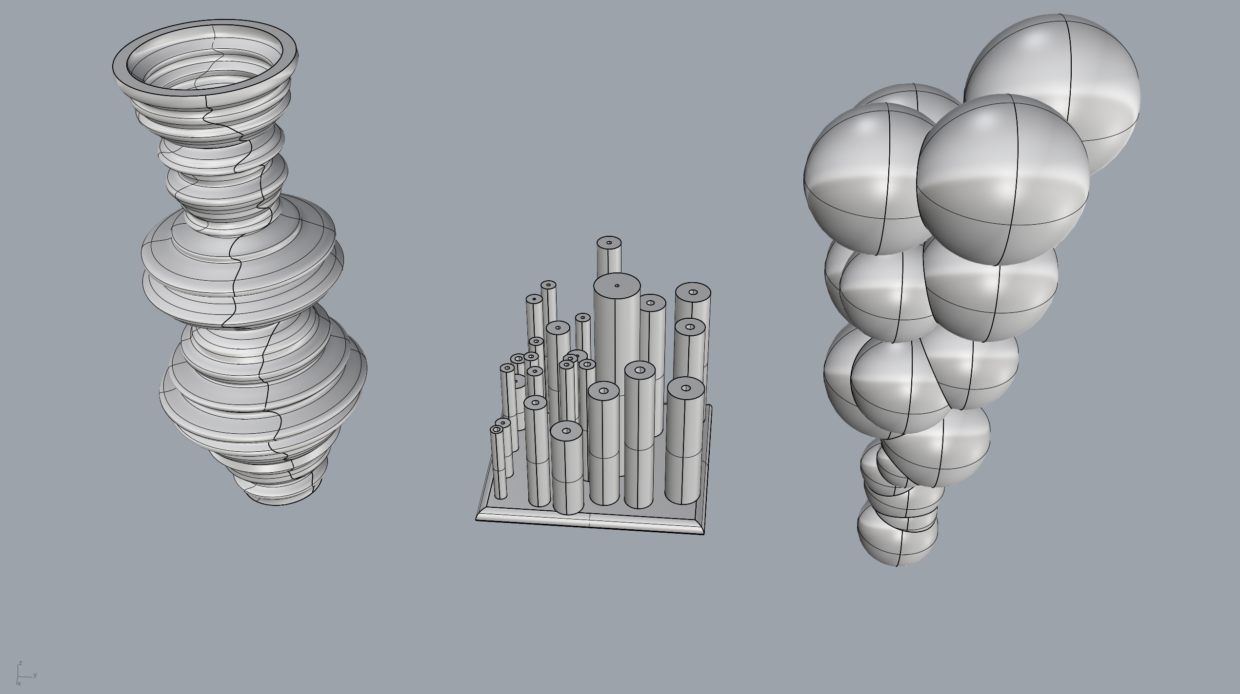
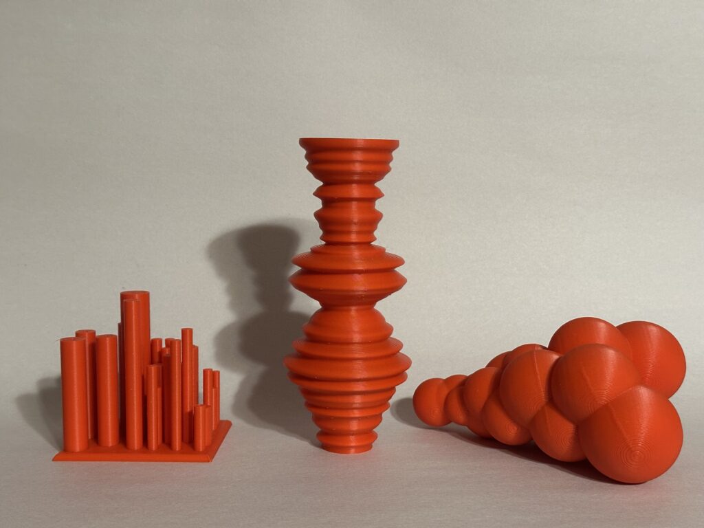
For my first 3D visualization, I wanted to start simple and see which data would be easier to visualize. I decided to plot dissolved oxygen on the x-axis and water temperature on the y-axis. However, I don’t think this 3D model fully captures the relationship between dissolved oxygen and water temperature. There are some visible slopes that indicate either high or low water temperature, and the larger the radius, the more oxygen was dissolved on that day. Overall, I like this model because it clearly shows the amount of dissolved oxygen, and I think the design looks clean.
Model 2
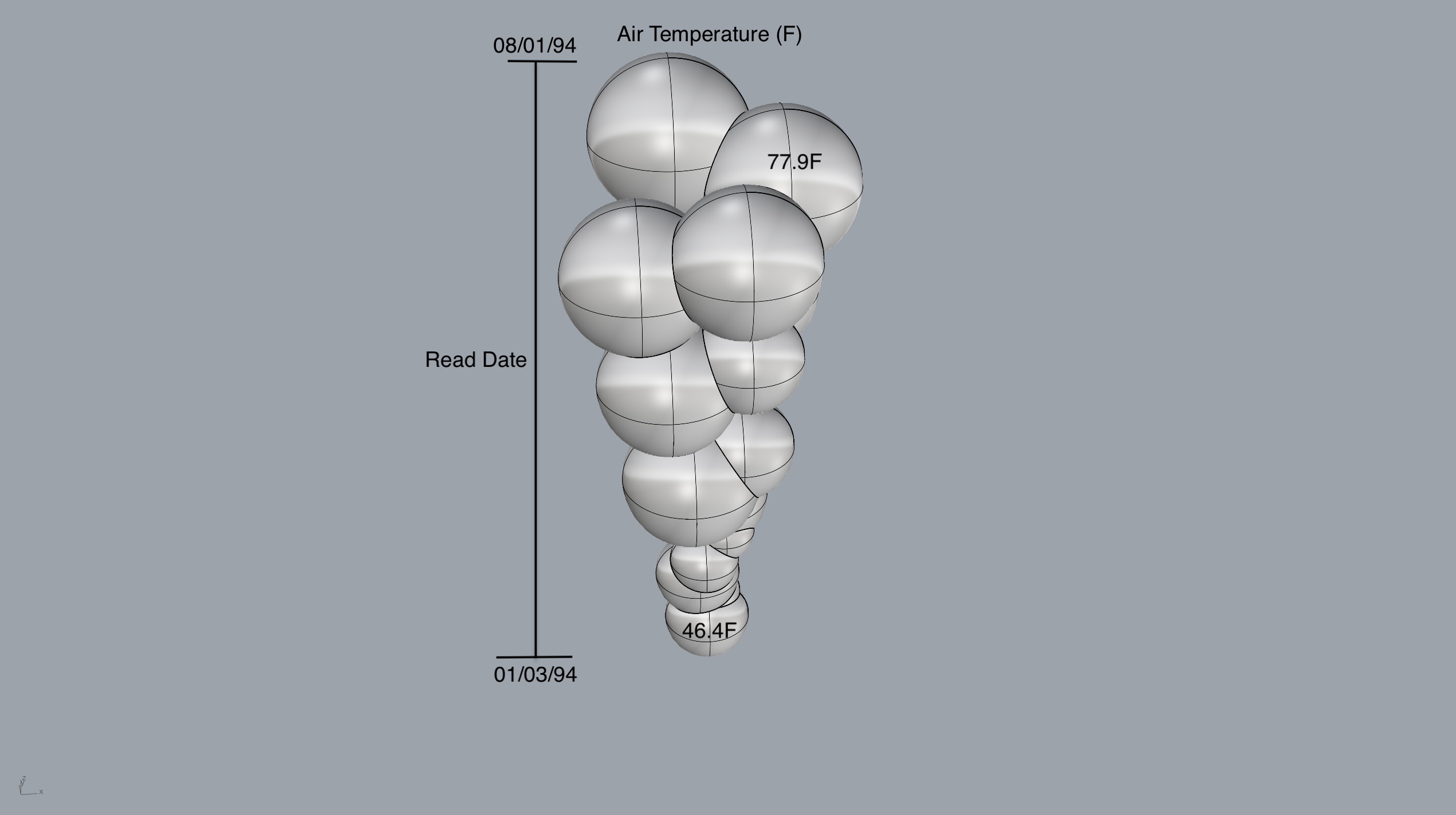
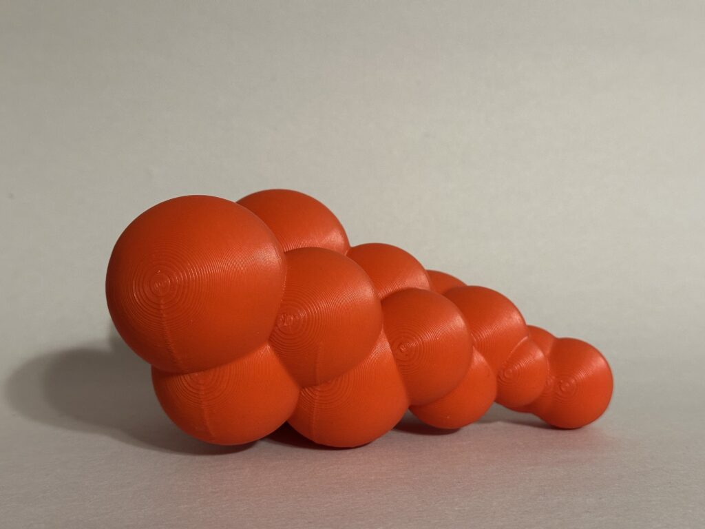
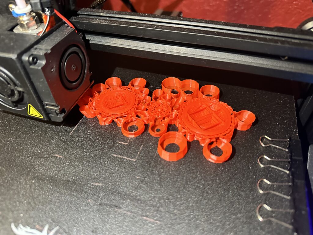
In my second 3D visualization, I aimed to create a bubble-like model, but my little brother quickly humbled me and said that they looked more like grapes! The radius of each sphere is determined by the air temperature in Fahrenheit. My main issue with this model, and with the next one, was the placement of the individual shapes. There were supposed to be smaller spheres on top, but they were enveloped by the larger ones. I struggled quite a bit with figuring out how to arrange them so that each sphere was somewhat visible and printable. Despite the challenges, I think this is my favorite 3D visualization.
Model 3
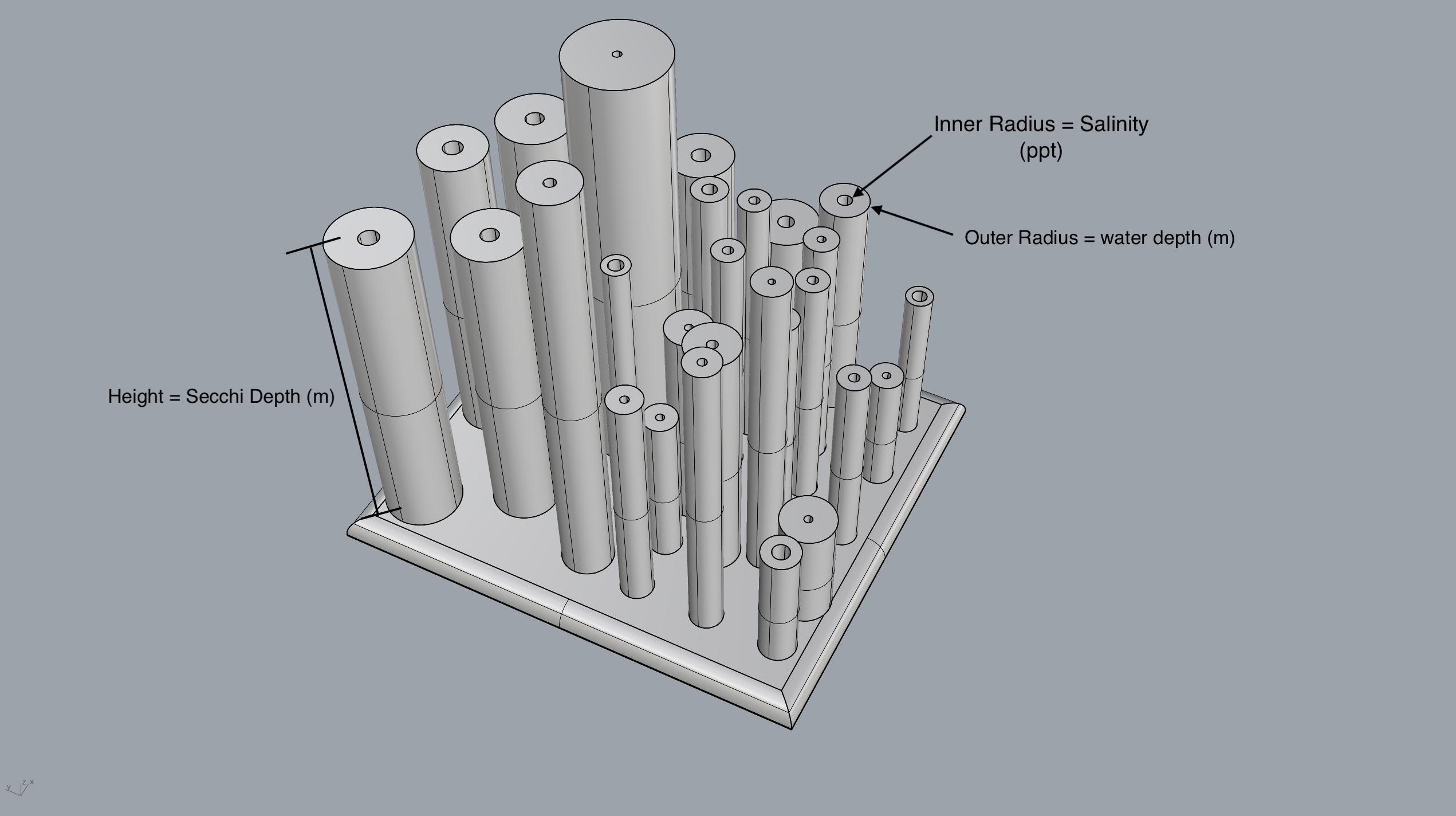
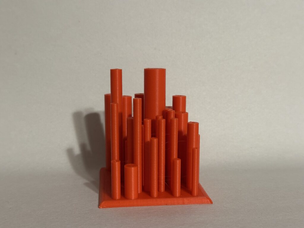
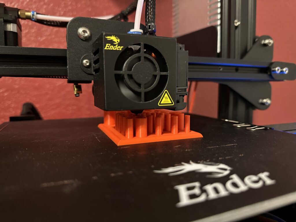
In my final 3D visualization, I struggled to come up with a new shape to represent the data. In addition to figuring out the design, I encountered difficulties with Grasshopper and my computer, some lines of code had to be rewritten because Grasshopper couldn’t open my saved files. Eventually, I decided to create cylindrical structures with varying heights and inner radius, and I was glad I managed to execute that. My main challenge again was the placement of each cylinder. To solve this, I manually moved the cylinders that overlapped and created the bottom surface manually as well. The height of each cylinder represents the secchi depth (water clarity), the taller the cylinder the clearer the water. The inner radius indicates salinity, while the outer radius reflects the overall water depth. I think the visualization looks better in pictures than in person
Dataset
I was unsure which dataset to use because I wanted to create a good visualization with the data. I had a few ideas, such as using pool inspections or water quality data from Albuquerque or Taos, but those datasets weren’t available. In the end, I decided to go with the water quality data collected by the US Fish and Wildlife Service. The dataset includes information on dates, types of water bodies, environmental and water temperatures, pH, salinity, and water depth. For data cleaning, I deleted some empty columns and replaced empty cells with a value of 1, as setting them to 0 was causing issues when parsing and rendering the data in Rhino.
Reflection
Presenting large datasets through words alone can make it difficult for people to fully understand what the data is conveying. Using 3D objects to represent the data helps people better grasp its significance and how it might be affecting the environment or society. By explaining how the 3D object represents different aspects of the dataset, people can visually measure its impact and ask more informed questions. These 3D visualizations offer a more interactive way of engaging with datasets, which is not easily achieved through simple bar or line graphs.
Hey Alan I really love the bubble like model you made it is extremely cool. This definitely inspires me to incorporate more sphere like shapes into my data 3d models. Great work! ian
Hey Alan,
I love your bubble print! It is really throwing me for a loop, I have no idea how you printed that but it is really impressive. Using the temperature to create that object is a very interesting concept. Your third model is similar to my prints, I think its a cool way to represent data, especially since you are changing the height and the radius based on the clarity and salinity of the water. Overall very impressive and thought provoking prints.
Hi Patrick,
I was worried about how my bubble model was going to print, the supports were printing in an unusual way for me I thought it wasn’t going to work. I’m glad the support did work.
Hey Alan,
Your use of water quality data is really cool, and I like how you tried different approaches with each model. The dissolved oxygen and water temperature plot is simple but effective, and it’s interesting how the larger radii show more oxygen dissolved on certain days. Even though you felt it didn’t fully capture the relationship, the slopes do give some insight into temperature variations.
I also like the creativity behind your “bubble” model, even if it didn’t turn out exactly as planned. The idea of using sphere sizes for air temperature is clever, and the challenge of overlapping shapes is something many of us face. Your final model with the cylinders showing water clarity and salinity is another great approach, especially with how you worked through the technical issues. It’s impressive that you manually adjusted the placement of the cylinders to get the right effect. As the other replies say I also think that the bubble model is really cool and good looking!
Hi,
I was trying to use actual shapes to represent the data and I’m glad they came out ok. Hopefully in the future I can use more abstract shapes to visual these data.
Alan,
I like the experimentation and creativity behind your prints, it shows your care and interest in the assignment. Each of these models I feel serves a different purpose when targeting various demographics for the visualization, the bubble would be great to show to kids.
Nice job!