The data set I chose is actually from NOAA water level data that I had been working with during my summer internship in ST. Petersburg , Florida so I thought it would be extremely interesting to make a 3d model of this water level data especially since that area of South Florida right now is going through extreme hurricanes and weather events.
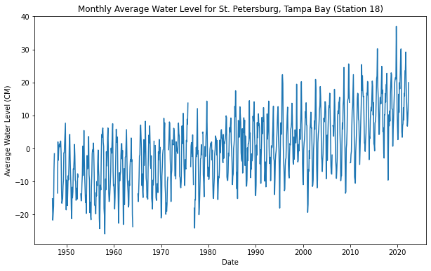
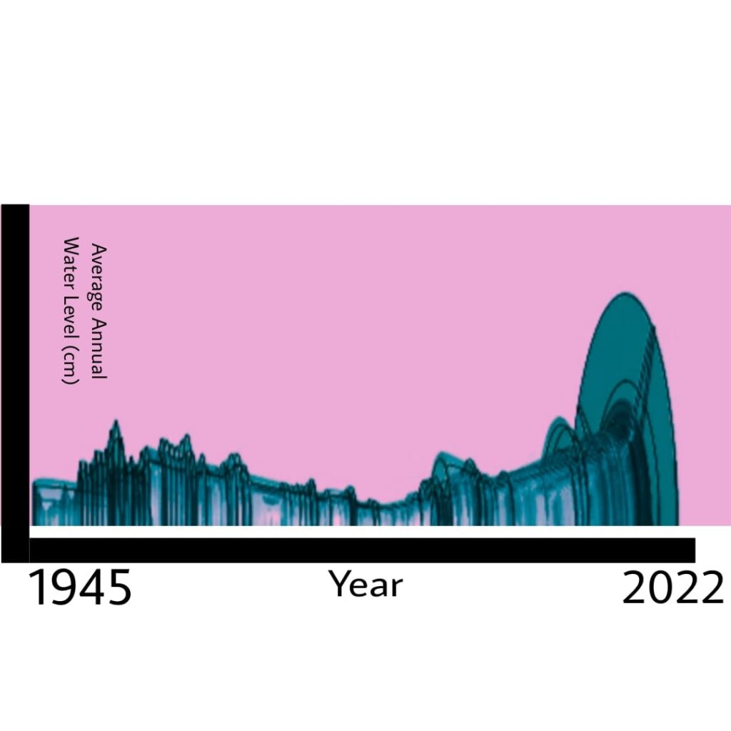
Above is a graph I made parsing this data using an additional python script to specify the focus on the St. Petersburg, Florida NOAA water level monitoring station. As you can see, it is quite evident there is extreme increases in water level within a relatively short period of time.
Object 1
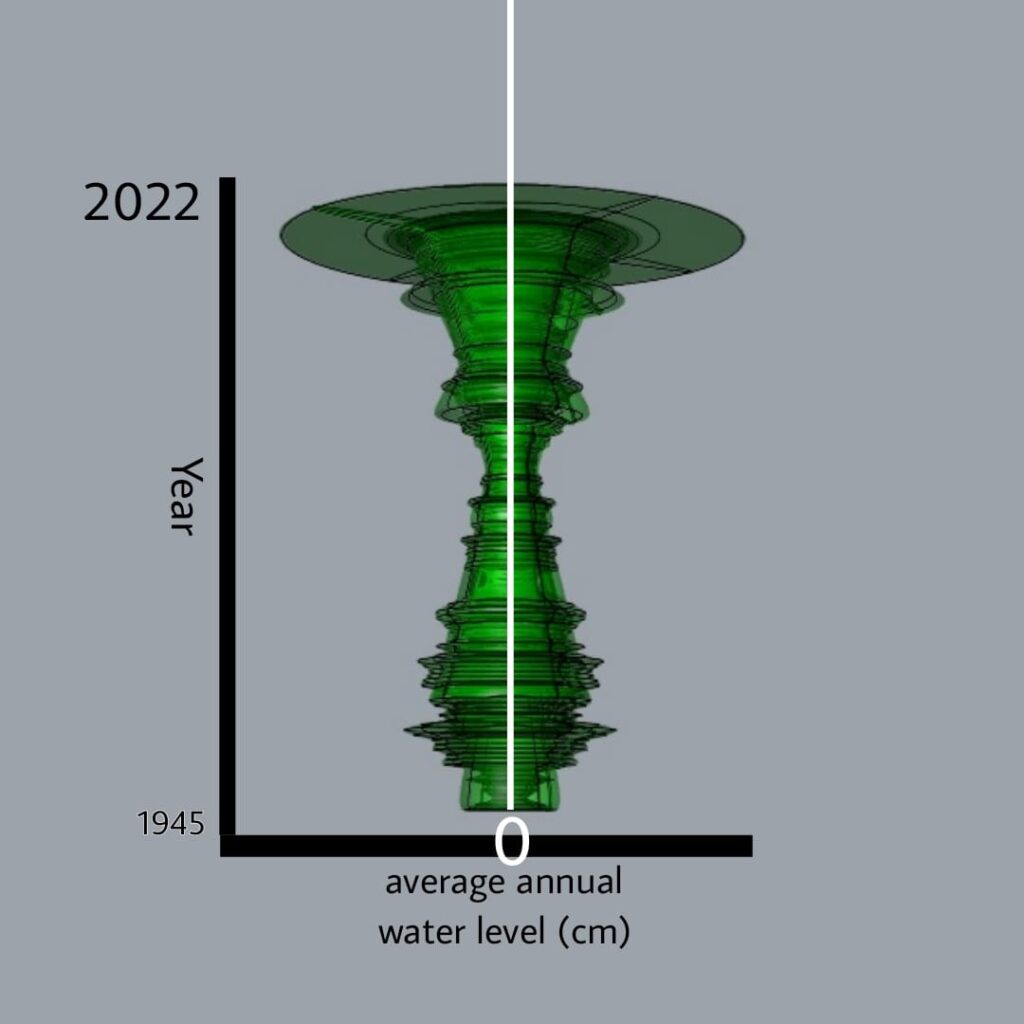
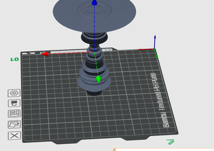
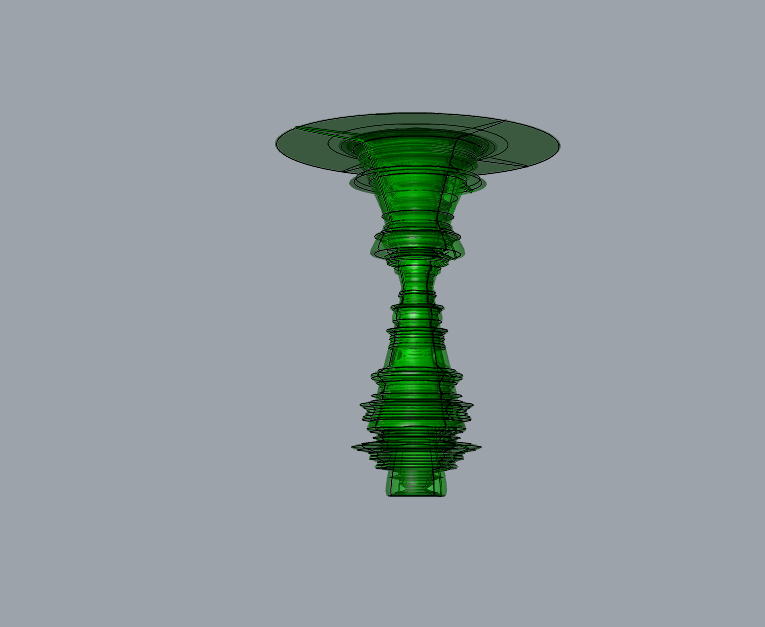
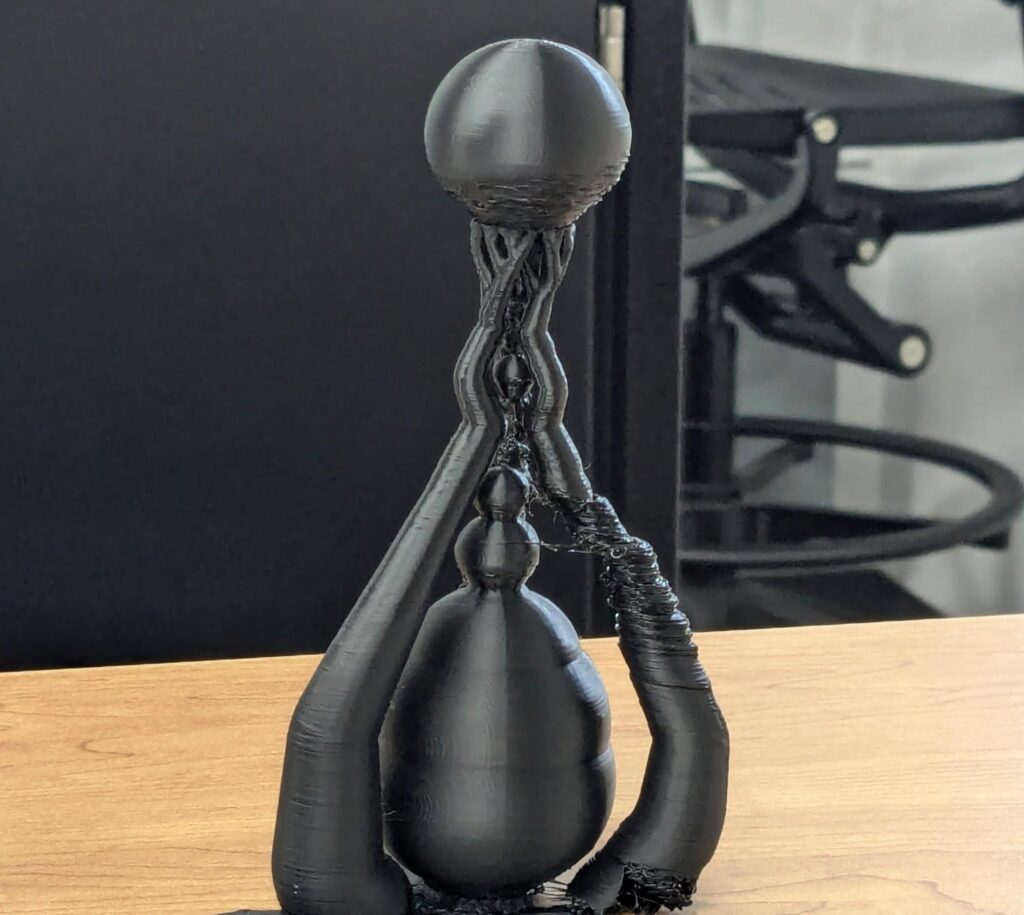
I found the formation of this model to be extremely interesting especially in this orientation at this scale. I can clearly see the increasing water level trend as demonstrated on my first graph evident in this model only but in this case in a 3 dimensional scale. I can really see the recent increase as demonstrated by the saucer section on the top. It is also important to note that it was extremely difficult for me dealing with the issue of incomplete and missing data not collected by NOAA and this caused problems when compiling my model. I had to incorporate additional checks within my python code to ignore these nan sections to not cause problems.
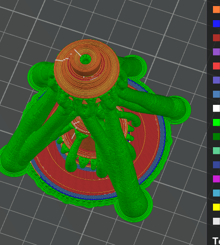
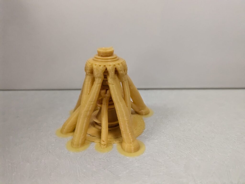
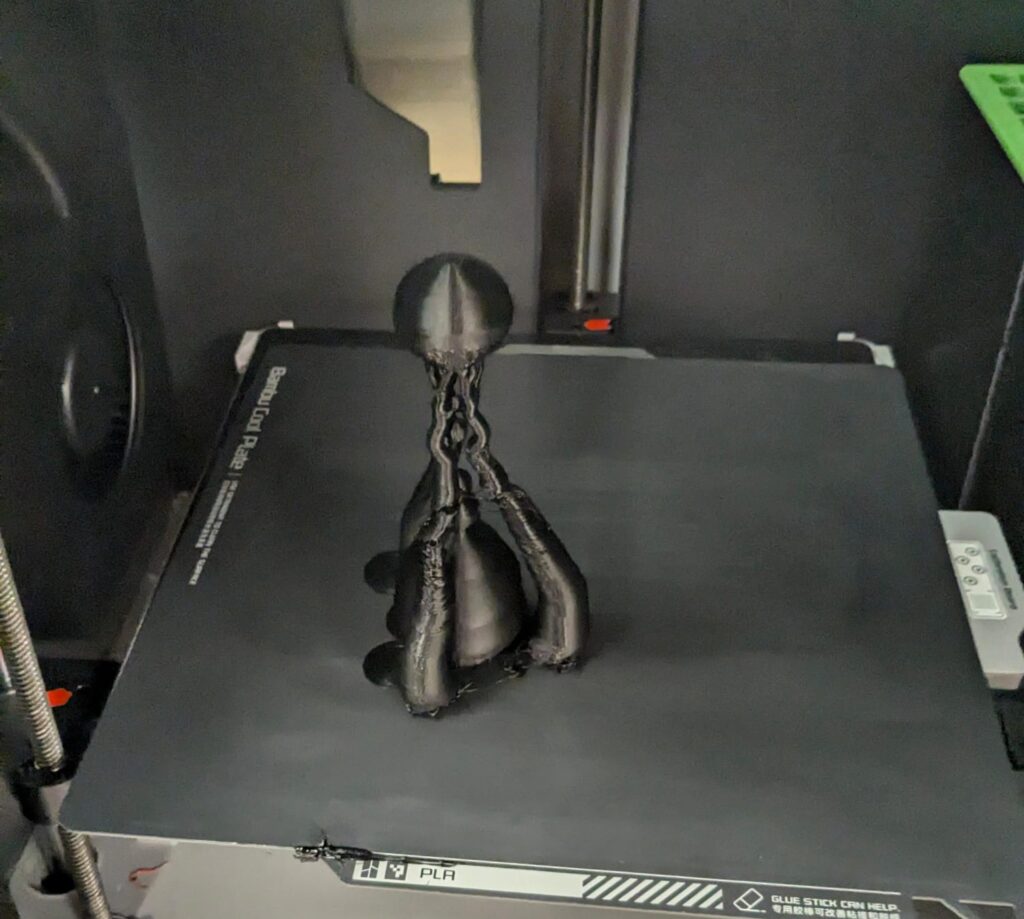
During the set up of my first print, my print slicer software recommended supports so I decided to go with the supports to stay on the safe side. I selected the tree method.
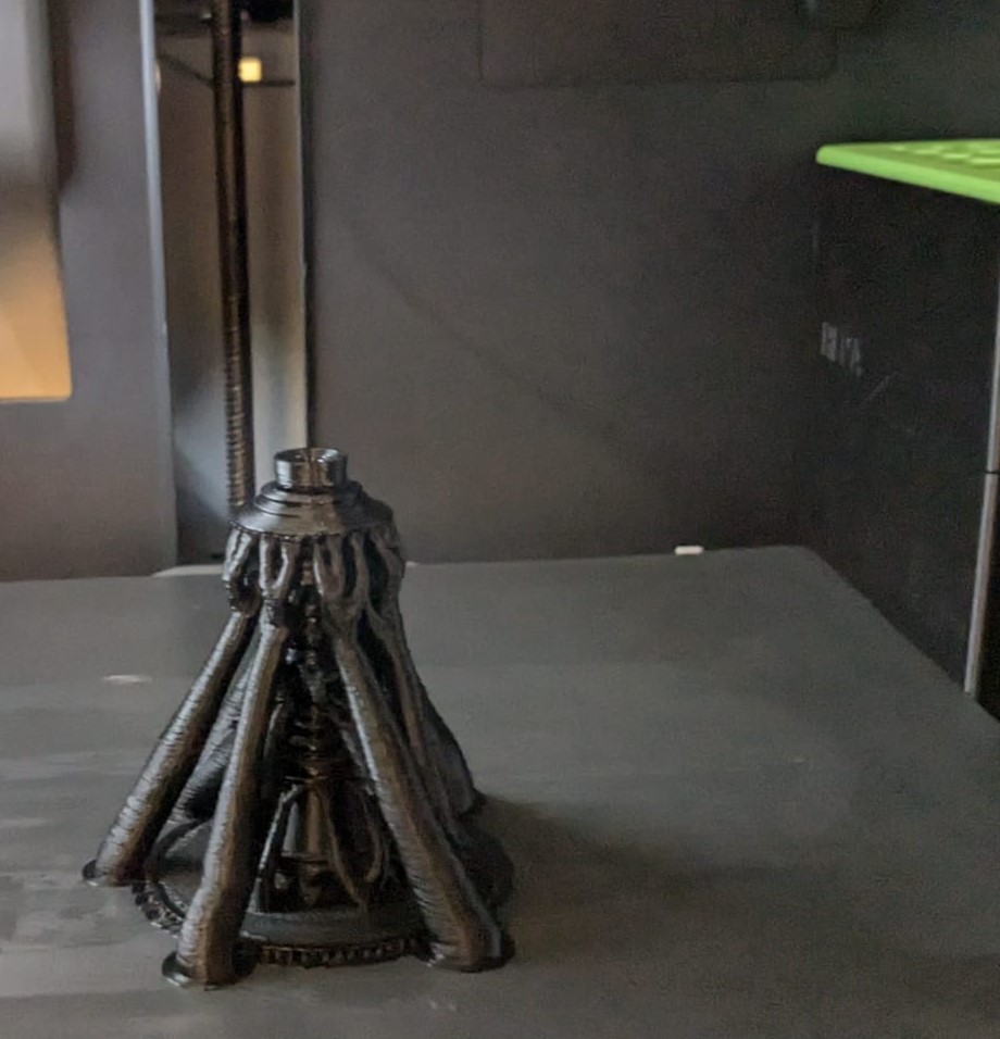
So the tree supports came out nicely as expected in the pre print slice. I honestly thought that this concept of using these supports as part of the artistic expression about the water level of St. Petersburg, Florida was also extremely cool and an interesting take when I thought about it, so I decided to leave the support hands in my final print as part of the composition. To me the supporting hands looked like either something overwhelming the vase like figure (perhaps to be interpreted as the hurricanes affecting / swarming / and attacking St. Pete) or an expression of the people of the world offering their support to the St. Pete area.
Object 2
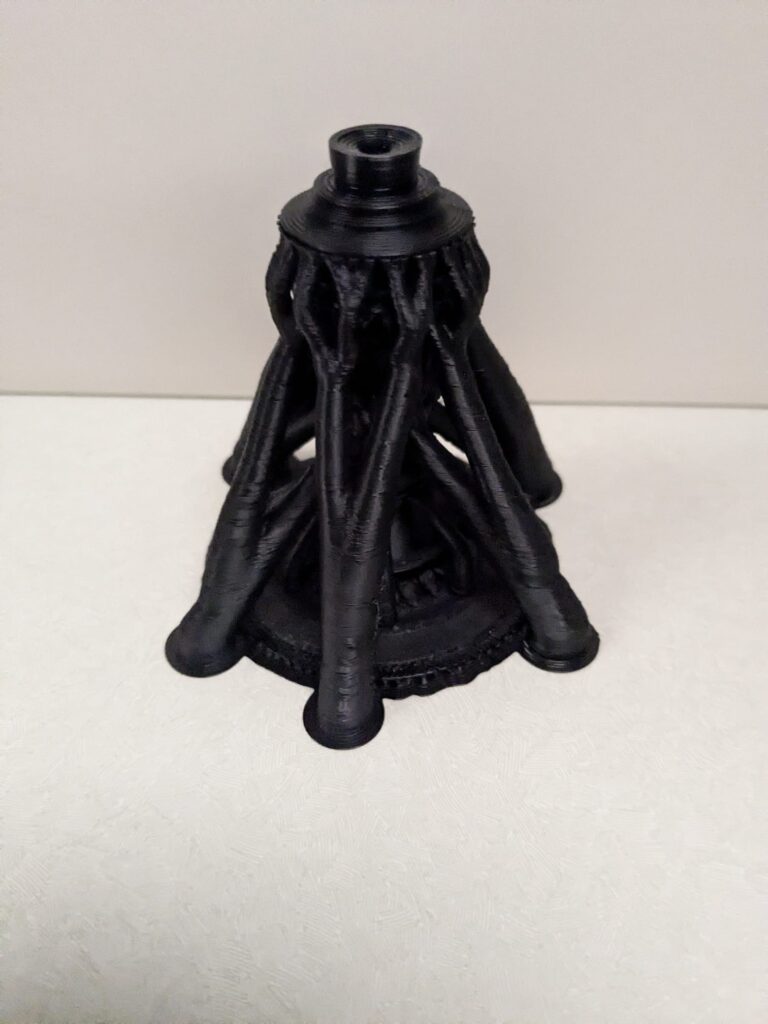
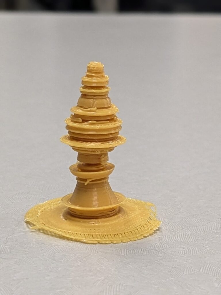
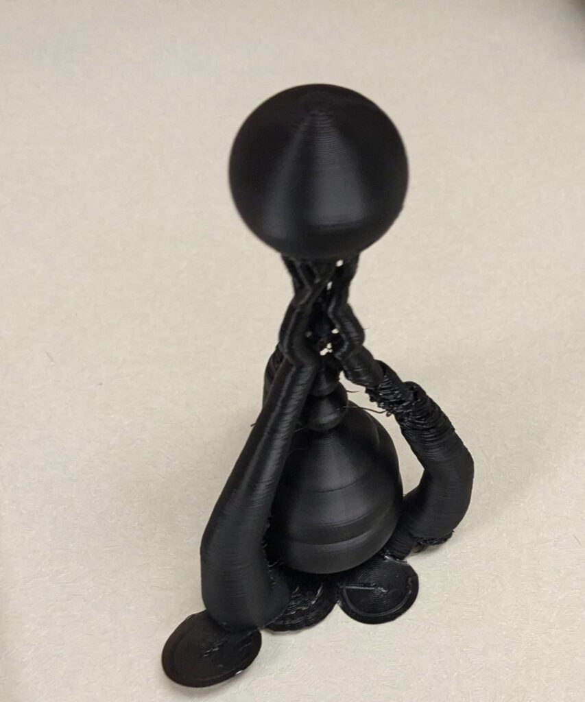
For this object, I wanted to follow pretty much the same structure as the previous one, only in this model, I was hoping to be able to print it and be able to take off the supporting hands / support tree structure. To accomplish this, I played with various parameters I implemented in both my grasshopper python code and the slicer to increase the radius of the neck of the data which apparently had contained floating regions earlier which needed the tree. After playing with these parameters for a while , I was successfully able to have a working print and remove the tree without affecting the print too much.
Object 3
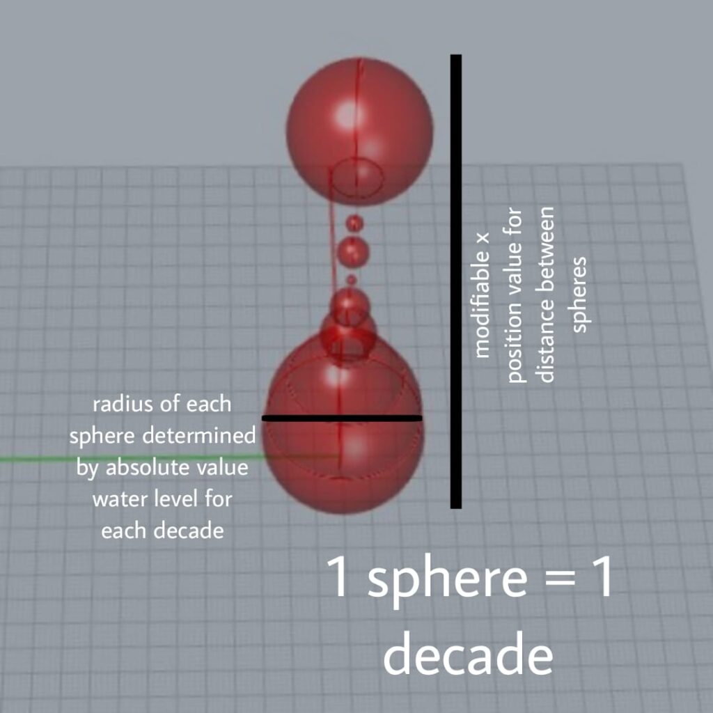
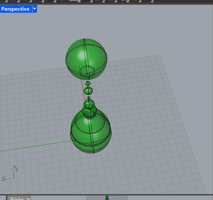
For this object I wanted to make a significant shape for every average and combine them but this took way too much computing power, however I was able to generate a quick render of the brainstorming process in grasshopper .
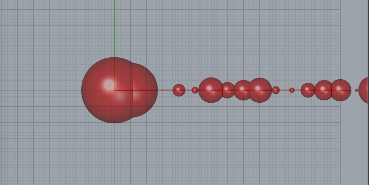
In this idea, the radius of each sphere is determined by the absolute values of the annual water level data. Since this was too much for my computer to handle, I decided to let the radius of the spheres be determined by the averages of every 10 years. Additionally, I thought it would be cool to print up in the y direction which ended up looking super cool as a render.
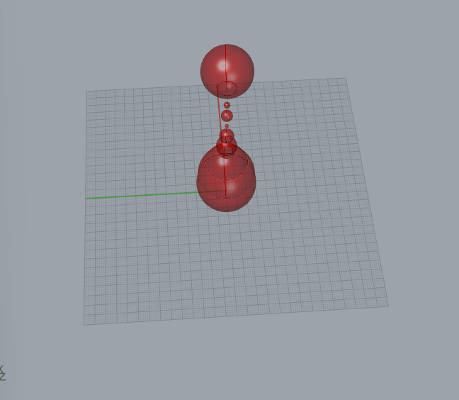
I then knew obviously this would be impossible to print since there are floating portions but I thought with supports it might look super cool like before.
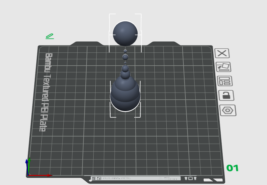
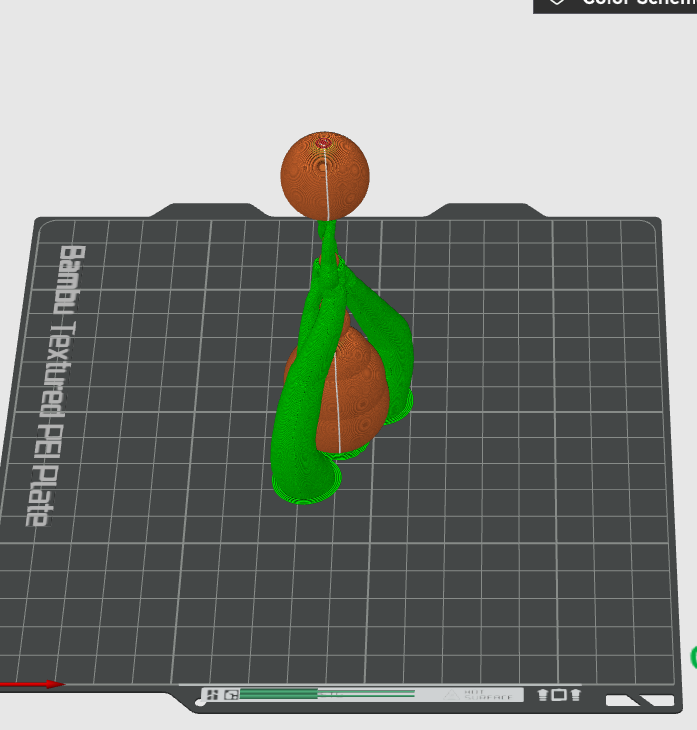
Here is the print with supports, I thought it looked super cool , so I decided to go with it for my final print. I’m really fascinated with how the print slicer does supports and computes them.
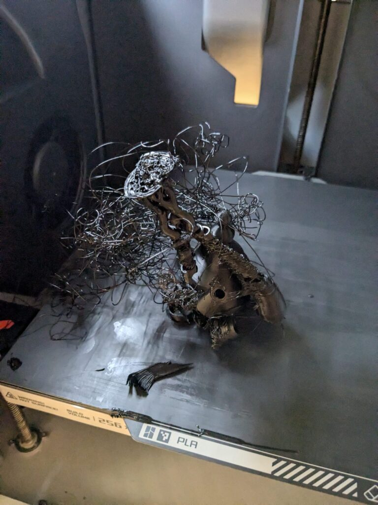
Well, disappointingly and unfortunately, this initial print I made for this one did not go well at all. I am confident this was an issue with the particular printer I was using likely due to either overheating or a slight jam. This was very frustrating because according to the slicer everything was to print fine and I had to wait several hours for this print. Currently , I am re trying the print, but for now , thankfully I was able to extract and preserve the lower half of this print which came out with a pretty fascinating shape. However, this is just the lower half, so I’m hoping when I check again tomorrow , the full figure will have been printed successfully.
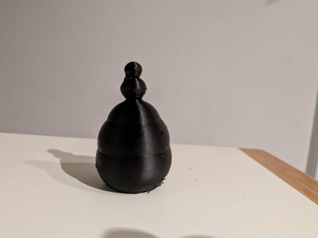
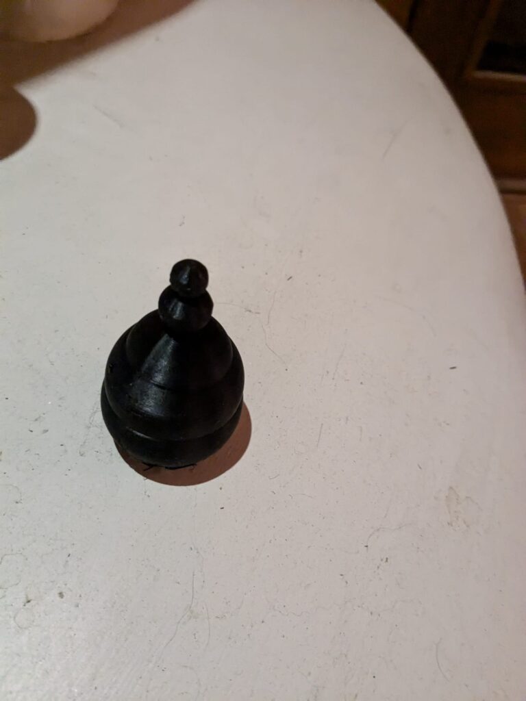
2nd Print:
Reflection on Designing with Data
I really found this project to be awesome to see the data I worked hard to clean out of and extract from the raw NOAA Florida coastline water levels, and then focus the data specifically for St. Petersburg , Florida for where my summer internship was located. I think that physicalizing data in this fashion especially really brings the data to life even more so than a normal 2 dimensional graph because it can be rotated, and when 3d printed, felt and seen in a 3 dimensional form as we see everything around us. Unfortunately due to lots of printer issues at home and even issues on the ones on campus, it was a pretty stressful process for me to get my prints to complete properly and cleanly especially in a timely manner, so I am hoping to re try some of these models I created, compiled, and successfully sliced when there is a printer I can use without underlying hardware issues that are beyond my understanding to address. During this process of making these prints, I also became very fascinated in how the support trees work in the various slicer software. I think it is really cool to make prints that intentionally have floating components, add supports, and then see how the slicer decides to create support structures (particularly in the tree style). I think some really cool, unique , and organic looking art can be made using this process. In particular one print that I find especially meaningful to me personally, is my first print where I intentionally included the tree supports, supporting the 3d graph vase. I really think it looks like hands supporting the data of St. Petersburg , Florida which I think shows in a way how St. Petersburg is in need of a lot of help right now due to the hurricanes and its almost like showing how people have their attention on it and are supporting the city.
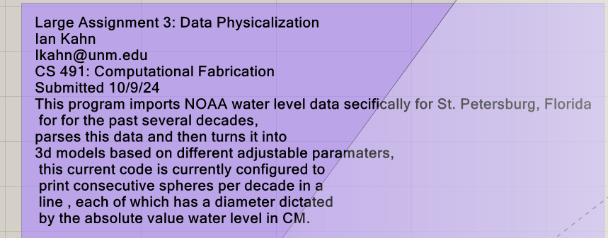
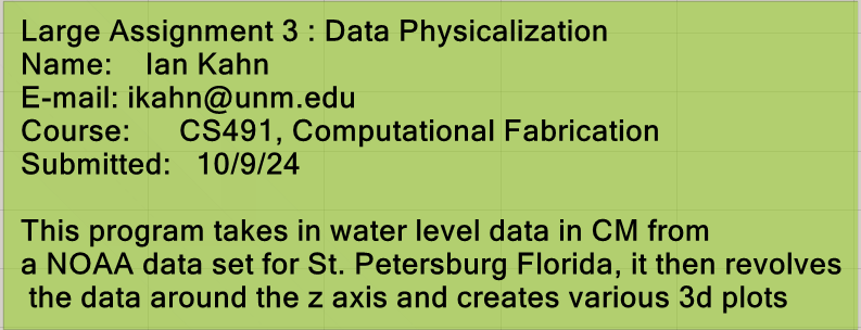
Grasshopper Code:
Alright Ian,
First off, I envy you for having access to some NOAA data. I couldn’t get anything from their databases that I was trying to access during the hurricane.
I agree with your symbolic reasoning for leaving the supports connected in the first model. The tree supports help emphasize the abnormality of the water level at that point in time. However, you did note in your second object that you wanted to follow the same idea as the first object but you were going to remove the supports? The picture of the final print seems to show that the support structure is still connected.
I would also love to hear about your reflection on creating forms with data overall! Do you think it adds significance to the forms?
Hey Nathan,
Yeah I ended up included the model without the support structures, I think the photo had not uploaded by the time you saw the response. As far as the NOAA data , the data I had access to and utilized was going up until 2022, so there wasn’t any pertaining to the exact timeframe of the two most hurricanes, but my research over the summer focused on vacuolizing this data set on the southeast coast (in this case St. Petersburg, Florida) the last several decades, and the importance of improving coastal resilience , so it was very actualizing to see the increase in water level trends and risk coming to life in the very place I conducted the research, immediately after I left after the summer as well.
Sorry, I think my comment on you having NOAA data was misinterpreted (badly worded on my part). Their database was down during the hurricane last week, so I envied that you had data from them in the first place.
Hey Ian, I think the NOAA dataset is a great choice! I know that you have been working with that data over the summer so I think it’s really cool that you had the opportunity to integrate it into this project that you were working on. Would you be able to elaborate a little bit further about what parameters you did change between the first and second object? I think the third object look really cool in the rendering so maybe if you get the chance you could try to reprint it. I haven’t seen a design like that before where the spheres that represent the data are all disconnected. Maybe with some minor modifications you could connect them in grasshopper and Rhino and get a result that’s easier to print. I like your Reflections on the design process and how some things don’t always turn out as we expect. Looking forward to your future work!
Hey thanks Wayne I appreciate the comment! I really liked your project as well. I essentially just created a simple slider parameter that enabled the print to be slightly rescaled horizontally so that way I could remove the supports. I was pretty disappointed however how brittle that one came out , but perhaps with some additional changes in the print wall thickness , I can improve it.
Thanks man, I like that one too. yeah I am wondering about a good way to change that one as well, as of now I am utilizing the tree support structure because I thought it looked really cool and compiled well in the slicer, but now that I think about it , perhaps using some type of rod structure in the center might be a good idea as well.
Ian,
Really cool print! I really liked that you used that water level data and made it look cool at the same time. I saw a lot of people did Carbon Emission prints. Curious is we put them next to each other around the same dates if we see a correlation. I haven’t really read a lot on the change in water level but its very interesting. I will definitely have to start researching it then come back to your post and see if I understand the data more. Again, great post man those prints came out awesome.
Justin
Hey Justin ,
Thanks so much for the comment, I really, really loved your project so much as well! Also that is a really good and interesting point regarding the correlation with Carbon emissions and I totally agree that would be such a good idea to compare the two. I think that creating a 3d figure or figures that combines both of these data sets would be really cool and insightful.