My Data
The data I ended up using is the % change in music industry revenue from the year before. This data is given for a number of different music formats (paid subscription streaming, album downloads, CD, LP, etc.). I got my data from www.RIAA.com:
- https://www.riaa.com/wp-content/uploads/2015/09/2013-2014_RIAA_YearEndShipmentData.pdf
- https://www.riaa.com/wp-content/uploads/2016/03/RIAA-2015-Year-End-shipments-memo.pdf
- https://www.riaa.com/wp-content/uploads/2017/03/RIAA-2016-Year-End-News-Notes.pdf
- https://www.riaa.com/wp-content/uploads/2018/03/RIAA-Year-End-2017-News-and-Notes.pdf
- https://www.riaa.com/wp-content/uploads/2019/02/RIAA-2018-Year-End-Music-Industry-Revenue-Report.pdf
- https://www.riaa.com/wp-content/uploads/2020/02/RIAA-2019-Year-End-Music-Industry-Revenue-Report.pdf
- https://www.riaa.com/wp-content/uploads/2021/02/2020-Year-End-Music-Industry-Revenue-Report.pdf
- https://www.riaa.com/wp-content/uploads/2022/03/2021-Year-End-Music-Industry-Revenue-Report.pdf
- https://www.riaa.com/wp-content/uploads/2023/03/2022-Year-End-Music-Industry-Revenue-Report.pdf
- https://www.riaa.com/wp-content/uploads/2024/03/2023-Year-End-Revenue-Statistics.pdf
I had to create my own dataset using the information from the tables in these articles. Here is my dataset:
My Design Process
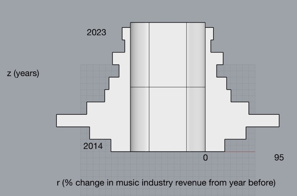
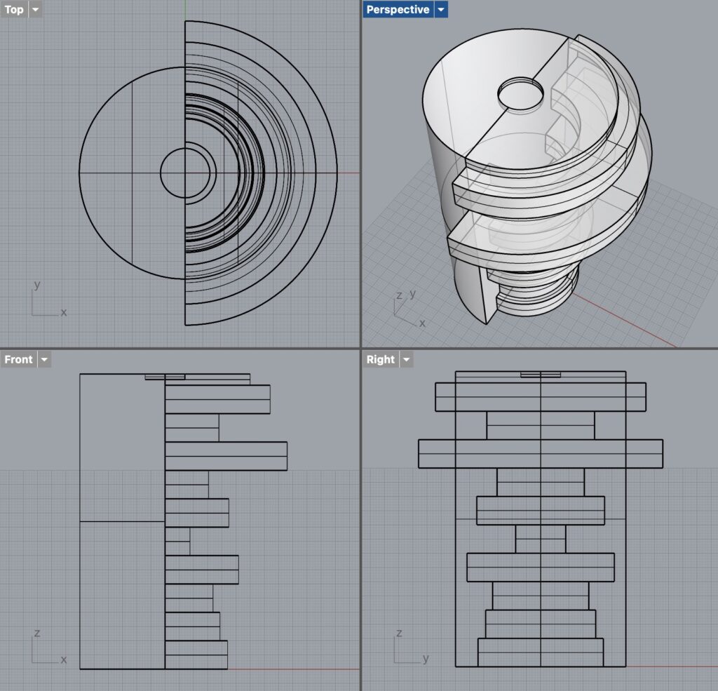
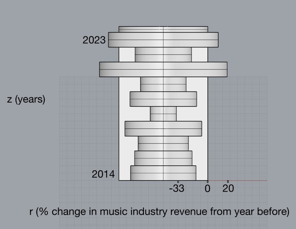
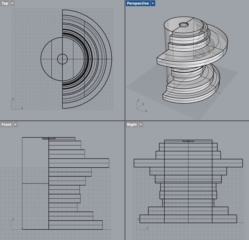
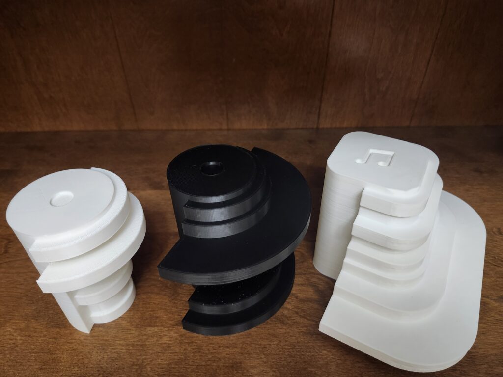
Because I only used data for 10 years, I wanted a simple bar graph (using an interp curve made it took hard to tell where each year was on the curve). For each year, I showed the % change in music industry revenue from the year before. Each of the shapes I made represent a different music format. I wanted to revolve the graph around a rail that was some shape relevant to the data (a circle for the CD and LP, and arrow shape for music downloads, and an app icon shape for the streaming). But I wanted to be able to see where 0% is, so on each revolved shape, I had half of the shape be flat along the 0 line. I ended up designing my shapes parametrically, as in our last assignment, so I had designs for 7 different shapes, but I chose to print the ones for Paid Subscription Streaming, CDs, and LPs. Each ring on the right side of the model represents the % change in revenue from the year before, for that music format. The bottom ring is 2014, and the top ring is 2023. If the ring has a larger diameter than the left side of the shape, it is greater than 0. Otherwise, it is less than 0. The scales are shown below.
Paid Subscription Streaming

CDs
LPs
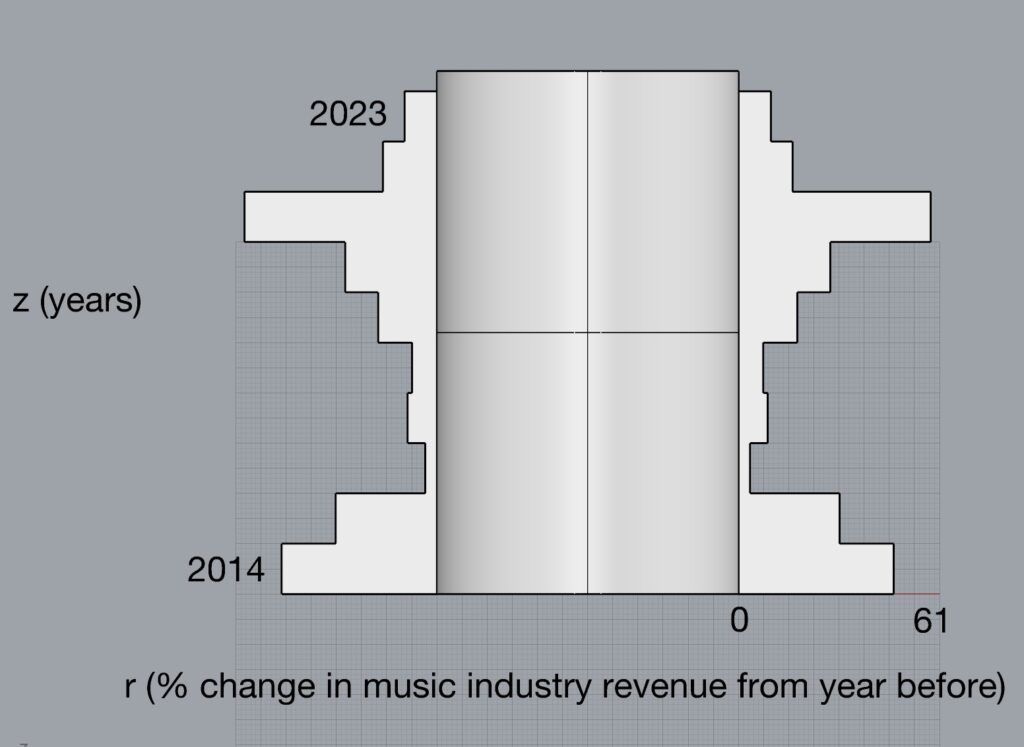
Album Download (I sadly didn’t get to print this one)

Photos
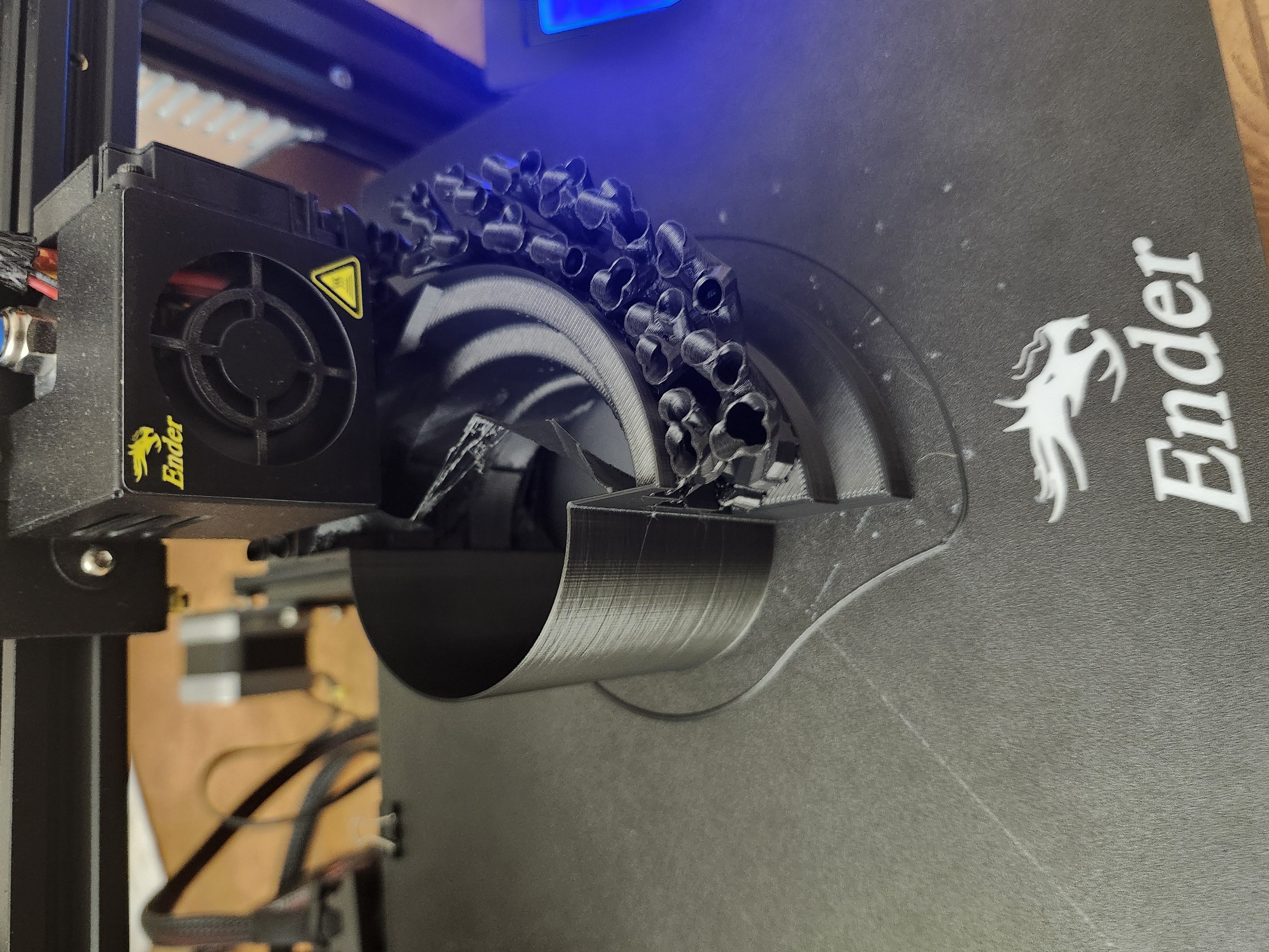
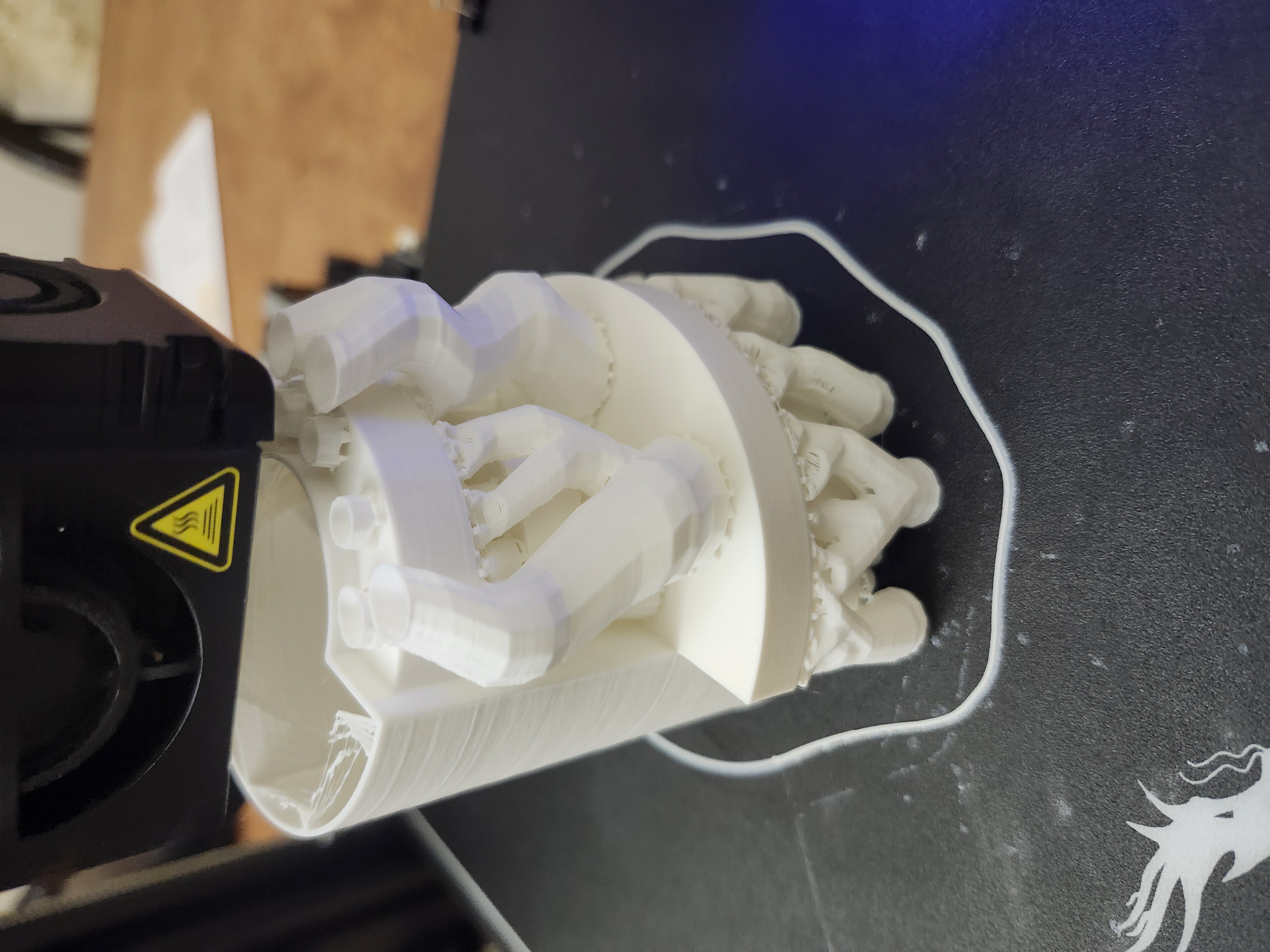

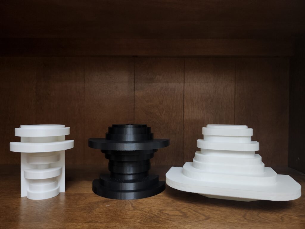

Reflection
Out of the projects I’ve done thus far, this is the one I’m least satisfied with, because I feel there was potential for some more interesting ideas to be explored, but I had so much trouble picking a dataset that I eventually just had to get working! I found that with data that goes both above and below zero, a 3D shape can help see it in a way that may be more intuitive to some. Also, sometimes seeing size in more than 2 dimensions gives it a sense of seemingly greater significance.
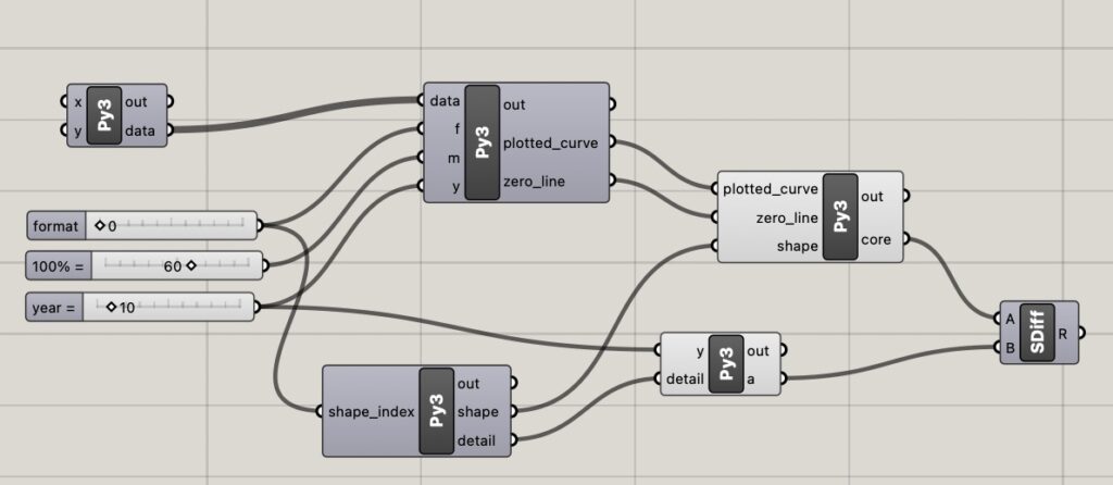
Grasshopper Code
Here is my grasshopper code. For some reason, there are errors when it first opens up. If you change the “format” parameter right after selecting the data file, the errors will disappear.
Hello Nathaniel! It looks like you put in a lot of work to get a dataset you could work with, and seems like it paid off. I like your artistic touch of creating the shape to match the music format. I see that you had to use some supports in your print, did you have any issues with that? I am sorry to hear that you were not very satisfied with this project but I do think your final prints look great.
I had to use a lot of supports! My objects were larger than any I’ve printed thus far, and they needed lots of support, so they took a while to print (the paid subscription streaming one took 18 hours), but I used lightning fill, and that kept it from being completely unreasonable!
Hi, using parametric design for this project was a really good idea! It makes using the same visualization method for multiple different datasets very easy and simple. I really like the idea for the dataset, it is very unique and shows a lot about the change in the music industry over the last few years. Really cool project!
I’m glad you liked it! I’ve enjoyed parametric design enough, that it’s hard for me to imagine doing a project without it now! Even though I mentioned not being absolutely satisfied with the final product, I agree with you that the data about the music industry is really interesting! LPs still don’t earn anywhere near as much as streaming, but they’ve made a bit of a comeback!