Dataset
I picked a dataset that has the number of parking violations that were issued in August 2024 in the District of Columbia, from this link: https://catalog.data.gov/dataset/parking-violations-issued-in-august-2024. I mainly chose this dataset as I wanted data that also included geospatial data so I could create the density map using a similar process to the GeoTiffs and BMPs process we went over in class. For my data it was easy to adapt in a way for me to use, I had to sort the CSV by date to more easily extract the number of violations per day which can be seen in the plot below. This sorting is used for both the Vessel and the 3D plot, while the Density Map did not need any filtering or sorting.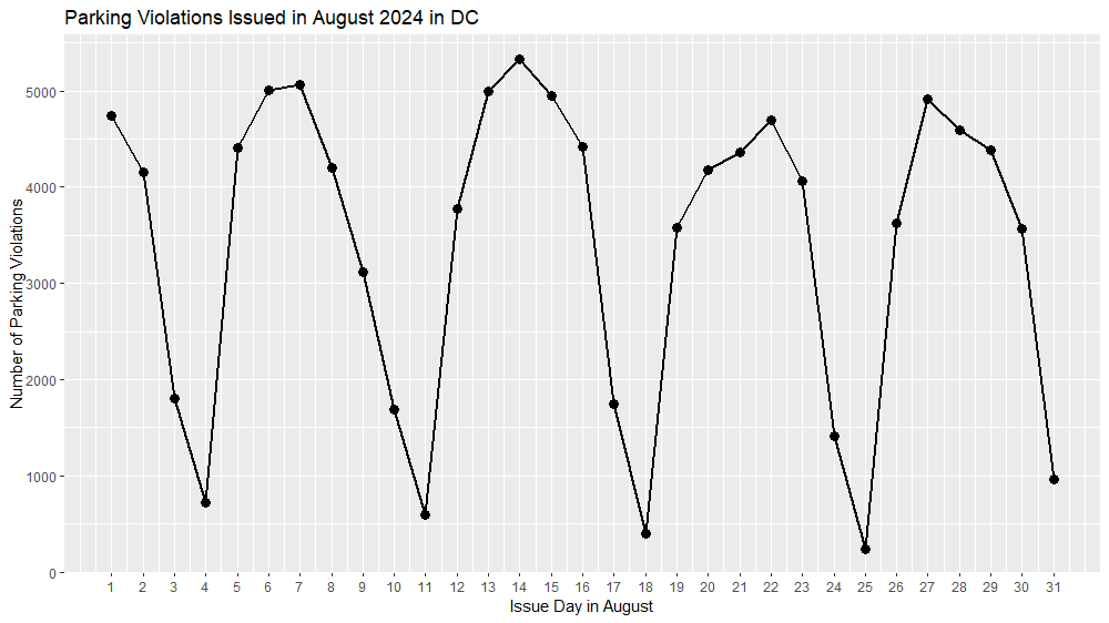
Design Process
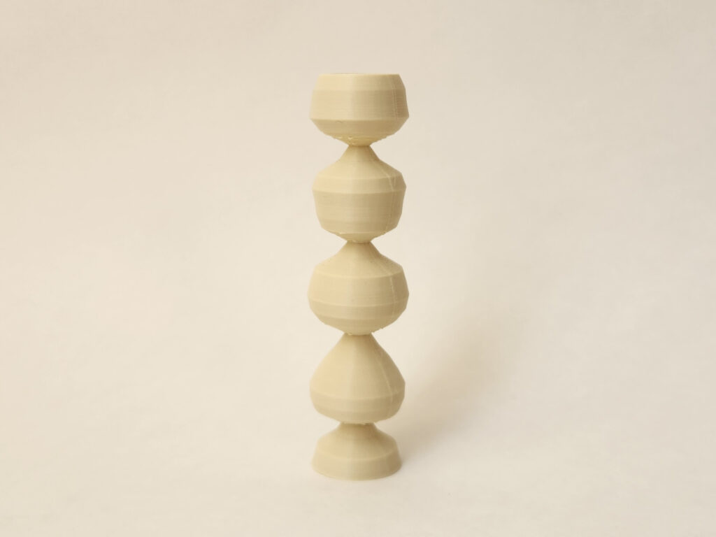
Vessel
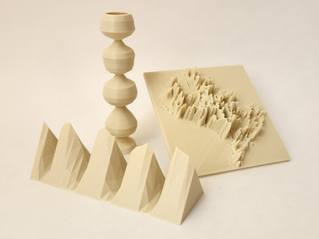
The Vessel was based on the code that we did in class where it follows the radius r representing the number of parking violations and the height z represents the issue day in August from the 1st to the 31st of the month. I modified the parameters until I had a shape that the values could be easily understood and could also print with as few issues as possible.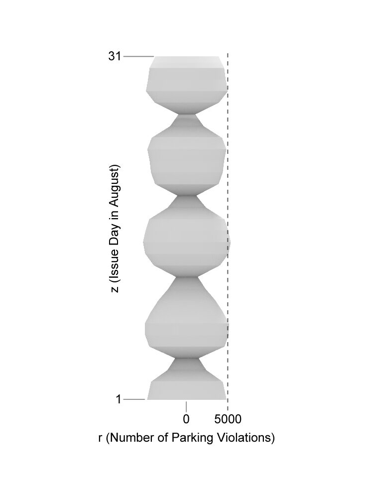
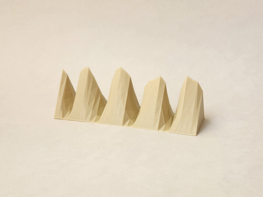
3D Plot
The 3D plot is simply a 3D representation of the plot, I wanted to create a plot that was more interesting than merely extruding the plot shape in one direction to create a solid form. So I created triangles between each data point and lofted them together to create more of a mountain shape to the data. This is by far the clearest representation of the data compared to a standard plot, and the added benefit of being able to be handled makes it just a bit more interesting.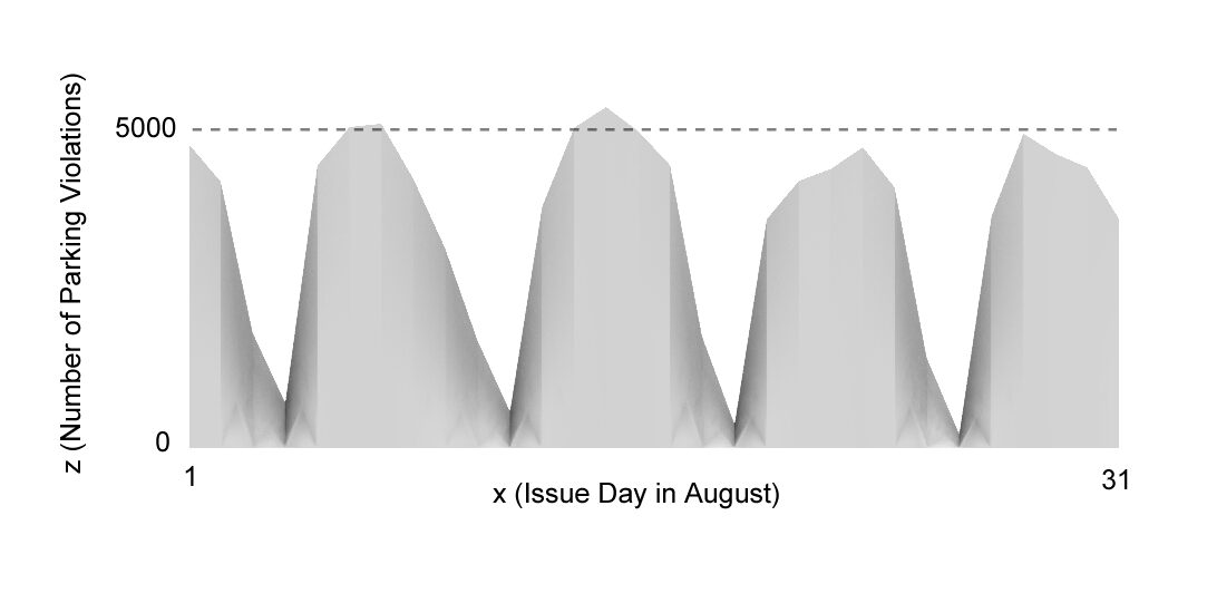
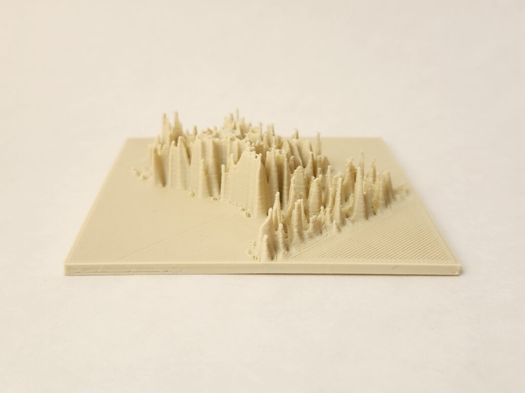
Density Map
The Density Map, unlike the previous two physicalizations, represents all parking violations in the month of August by location given in latitude and longitude. To create this map, I added the CSV as a layer into QGIS and used the given latitude and longitude values to place all of the points, as shown in the image below.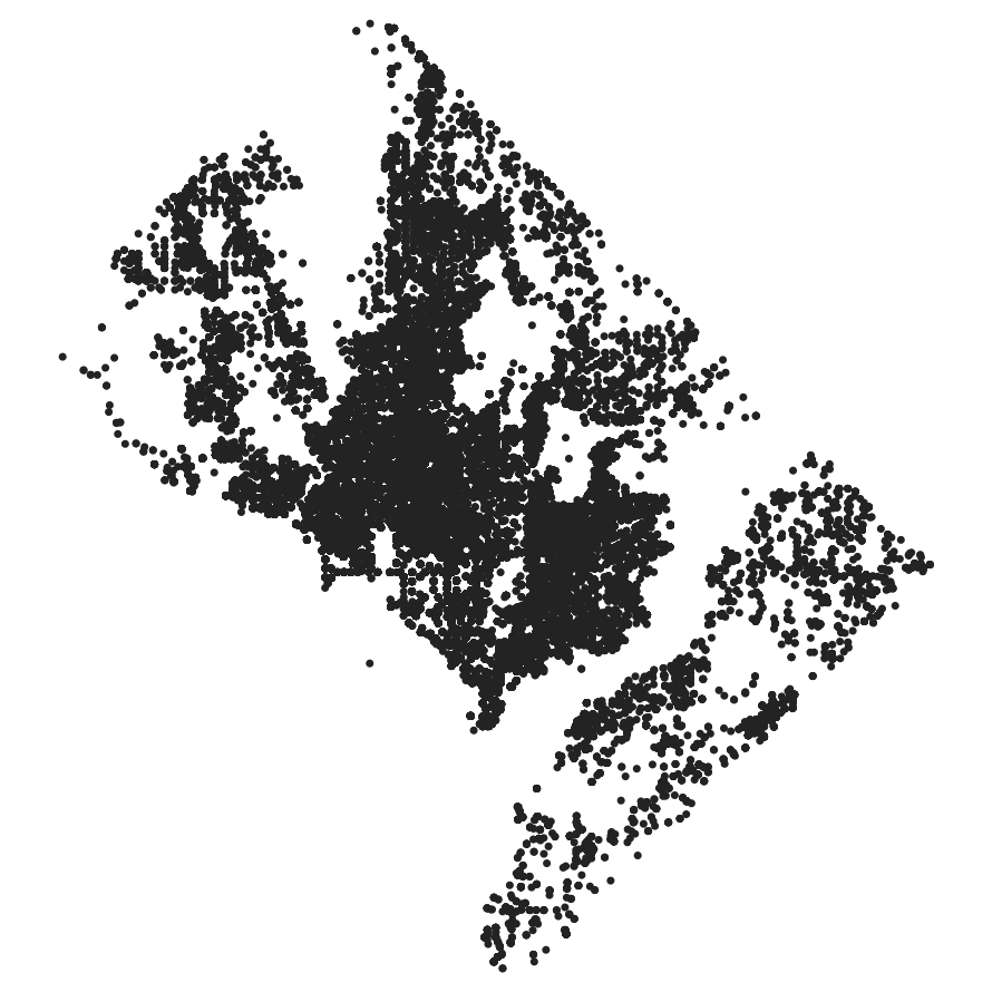
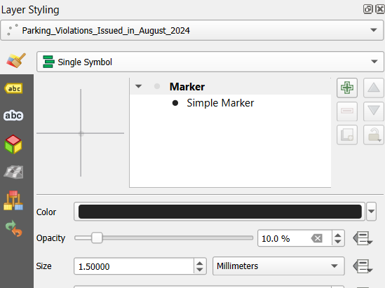
In order to utilize the same process as the GeoTiffs I had to alter the transparency of each point to create differing levels of brightness that could be converted into elevations based on the density of the points. I ended up setting each point to 10% transparency which seemed to have good results when converted into a BMP file and inverting the colors.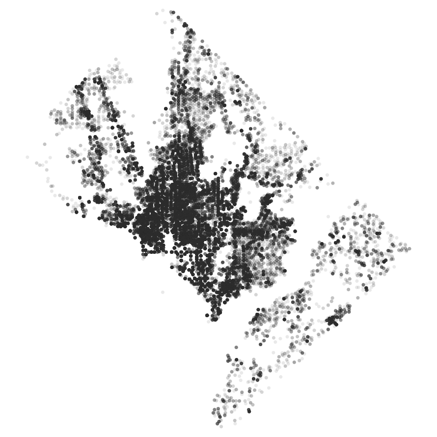
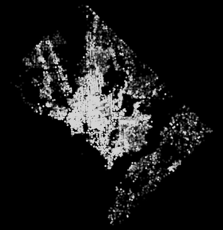
This BMP was loaded into the same code used for the GeoTiff BMPs to create high peaks where the density of parking violations was highest and flat where no violations were recorded. This representation of the data is cool because while the colors on a 2D plane do showcase the density well is it much more interesting being able to see this from different angles.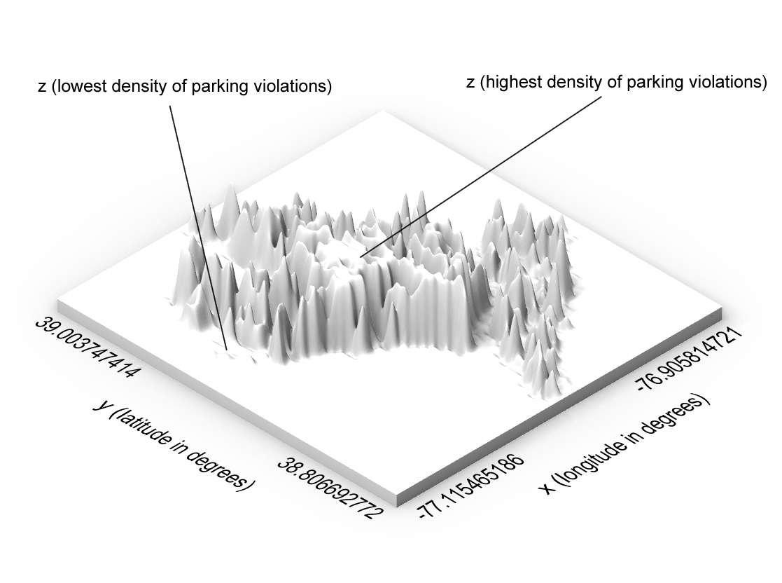
Reflection on Designing With Data
Representing data in a 3 dimensional way can add another level to standard 2D plots, sometimes it is harder to represent certain types of data when there is more than just the x and y-axis. This other dimension can be represented in 2D plots with colors commonly but this does mean that a z-axis can also be used to represent things in this other dimension. In these cases, color can also be added on top of the 3D object, where adding another parameter may be difficult or impossible in 2D. Being able to visualize the same set of data in different ways can also be very helpful to contextualize it around other sets of data where certain visualizations are more useful. Like with the density map being able to see the density from differing angles, and not just how light or dark the points look can be beneficial when trying to analyze the data. You can see the differing levels from the top and the sides which is impossible in a 2D plot even with different colors and transparency values.
Creating objects with data allows for a wider range of possible representations of data, as previously mentioned. There is a reason there are multiple ways to plot data in 2D and that is because some representations fit data better. A bar graph probably would not be the best choice if the distribution of the data in the buckets is important. Some data works well in multiple types of plots, so there is likely a place for 3D objects in an array of existing data where it is beneficial.
While these 3D objects’ clear meaning is a representation of data, there is also room for these to be interesting, artistic, or functional in other ways. The vessel is a clear example of this, where it represents data that could be found in a 2D plot, it is also functional in other ways where it can sit on a shelf decoratively or something can be placed inside of it. There is a wide range of possibilities for creating these kinds of objects that have differing meanings and there is almost no limit to it as long as the data is readable in some capacity.
Images of Prints
Hi Luka! I really like what you came up with. You did a good job of approaching the dataset in different ways to produce different 3D representations. In particular, I like your representation of the density of parking violations. That seems much more understandable to me than that data would have been in a 2D table or graph. I like what you said about 3D objects having the ability to be both an informational representation of data while also being artistic and even functional.
Hi Elektra, thank you! I also really like how the density map came out and I am glad that it is understandable since I worried about the scale in the z-direction not being distinct enough. I don’t think I could make the points any smaller or more transparent without losing some of the data in the final 3D object.
Hi, I like the forms you chose for your data, particularly the 3d plot. Despite being a relatively simple design and concept, I didn’t even consider using something like that during my prints. I also like that your first two models represent the same data in different ways. It gives a new perspective in how the data looks and helps with understandability in my opinion.
Hi Sam, thanks! I wanted to include something very similar to a standard plot just to have something incredibly easy to read and familiar so the 3D plot helped with that. Representing the same data in different ways is also why I didn’t use multiple data sets so they would all be related and I think it makes the data set itself easier to understand too.
Luka,
Great Job! I personally enjoyed your density map the best, this provides an interesting perspective on the data. It would be interesting to see a map of roads and buildings to see if there is a correlation to why there are so may parking violations in certain areas and then comparing that to other cities parking violations datasets.
Best, Andrea 🙂