The dataset I chose for this assignment was from https://www.weather.gov/wrh/timeseries?site=KABQ&hourly=true. I chose to use the wind data from the past 7 days from when I downloaded it on 9/25. This data includes wind speed, gust occurrences and speeds, as well as the wind direction. I thought I could make some interesting models using this data that would fit well together as a group. The data was very clean so I didn’t have to modify it at all. Each data point was taken once an hour totaling exactly 168 hours.
The design process for these models was… an experience. Creating the models for the speeds and gusts was fairly simple. It was just matching up the mph to mm and running up along the z axis. The difficult model was the directions. I had an idea of what I wanted, but quickly realized it was becoming very complicated as I was designing it. It took several iterations and printing attempts until I was able to settle on a design I liked.
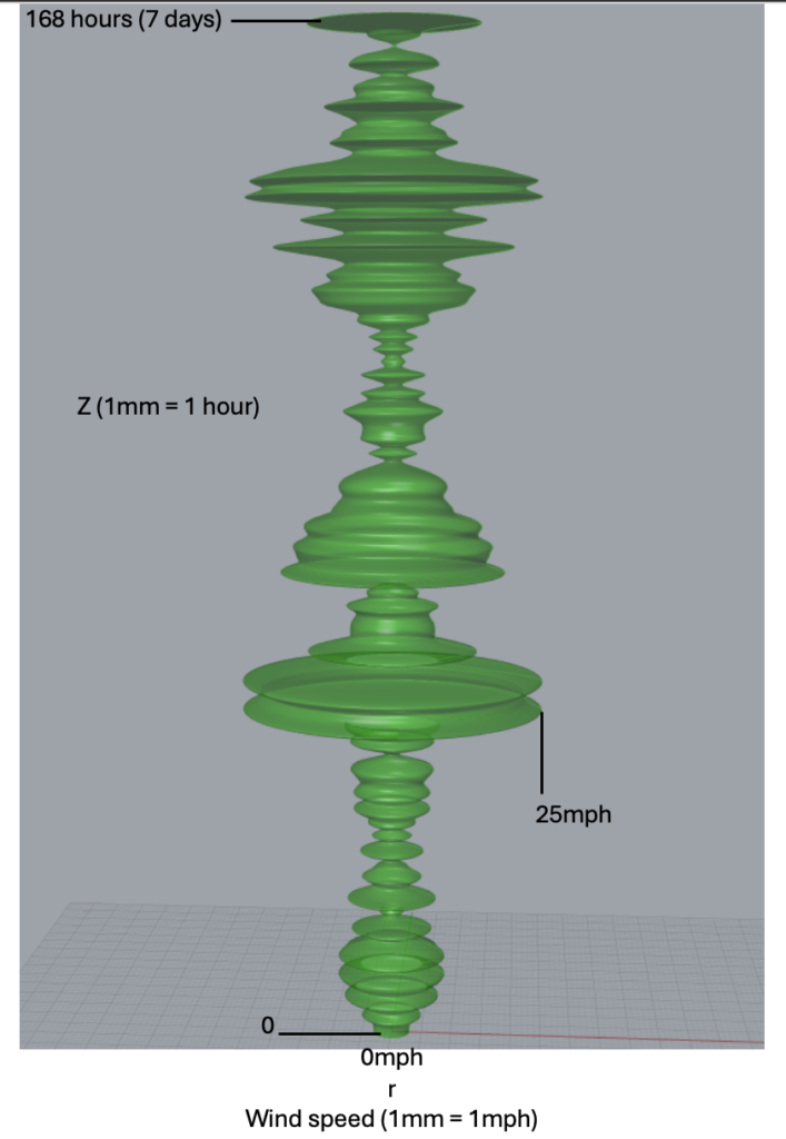
The speed model was designed similarly to the temperature and humidity data we modeled in class. I thought this design of z axis to radius was the best way to display the data in a visually appealing way. Each mm along the z axis represents one hour and each mm along the radius represents on mph. Below is an image of the model:
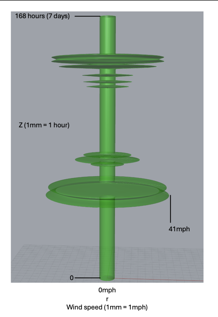
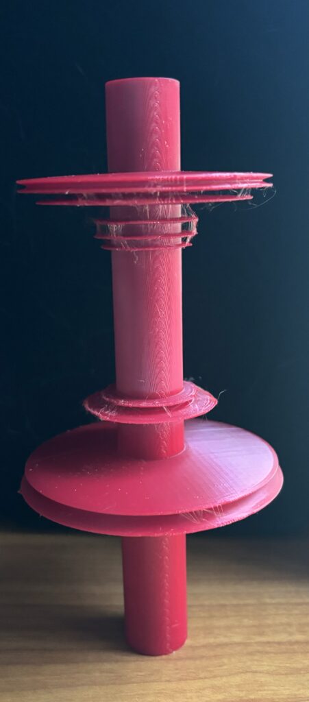
The gusts model was designed similarly to the speeds, but made in a way where the data was not continuous. Each layer of the gust data shows when a gust happened, and how fast the gust speed was. The axis and scale is the same as the speeds where each mm of the z axis represents one hour and each mm of the radius represents on mph. A disk only appears on the model when a gust happens, otherwise, it is just a flat surface along a cylinder. Below is an image of the model:
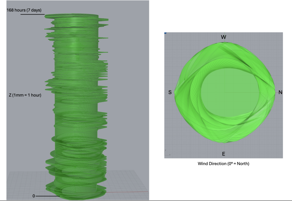
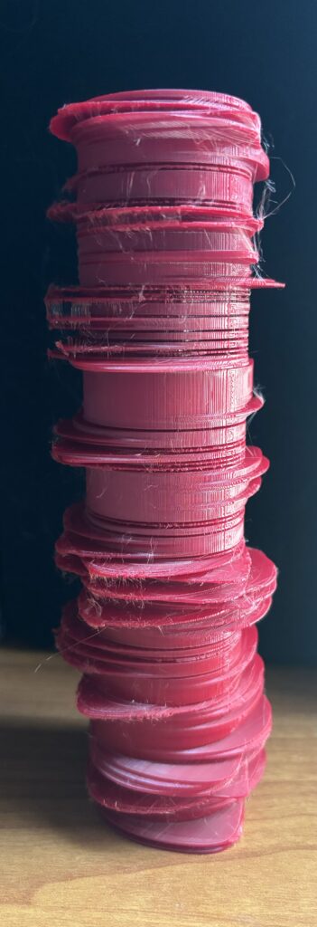
The directions model was designed to show a North/South/East/West scale. The z axis is the same as the other two models where each mm represents on hour, but I did not use the same radius scale. Instead I designed each layer to be a sort of petal shape where the apex of the curve points in the direction the wind was blowing in. The data gave the direction as an angle where 0 degrees represented north, so naturally I used this in my representation as well. Below is an image of the model:
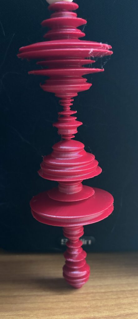
Unfortunately, my final 3d prints did not come out as well as I hoped and had lots “hairy” artifacts and rough edges caused by the supports. However, I think these are the best I will be able to get them due to the excessively long print times they required (directions took 20 hours). Below are the three final printed models:
Overall, I felt that making 3d representations of data allows it to be visualized in a very intuitive way. While traditional 2d graphs and charts will always be an effective way of portraying data, particularly data of the type I chose to represent, the 3d models make viewing the data much more interesting and provide a better sense of scale in my opinion. Being able to see a size difference in the rings or the many changes in directions shows just how much the wind varies. Looking at the same data on a graph doesn’t provide as much of a sense of variation as the 3d models do. Also, I am much more likely to be interested in this data if I am presented with a cool 3d model design rather than a simple graph, which is what I think is the main draw of representing data in this way. People will be much more interested and likely to dive deeper into things that they find exciting. Overall, despite the challenges I faced with model design and the printing process, this was a fun project that showed me yet another useful area of computational fabrication.
Below are the grasshoper and data files:
Hello Samuel! I agree that looking at data in a 3D format is much more interesting than traditional graphs. You said that you had some failed prints with your directions model, do you have pictures of them? I like what you came up with for that design, it ties in to the others well.
I don’t think I can post photos in a comment reply, but for the most part, the failed prints happened because I made the outcrops on the prints too thin. The printer would scrape over them and cause them to get knocked over, pretty much ruining the entire print. I was able to edit everything to get a good final working product though so it worked out.
Hi, Samuel!
Great prints! The scale of your objects make it very easy to understand the data just by looking at it! I had a question about your first print, how long did it take you and what kind of support did you do? And regarding the reflection, I agree that this kind of 3D objects are more interesting than normal graph or a table. I can imagine in the future, the schools could be using 3D prints instead of normal tables to visualize it more better for students to learn. Overall, great job!
For the first print I did it sideways to minimize the supports. This made the prints use way less filament and print much faster. The drawback to this was it was difficult to remove the supports without breaking off any of the outcrops. With some patience though I was able to get them off pretty cleanly, although I still have a lot of markings on my prints from where the supports were removed that I’m not too happy about.
Hi Samuel,
When it came to your reflection, I liked that you discussed the idea of scale. I think in a world full of data, people tend to become sensitive to the scale at which things are recorded, and the numbers all start to blend. I agree with your take on 3D models versus 2D models, 3D models are definitely more interesting and even interactive. By having a physical printout of a dataset you can grasp more of change and the information provided rather than a basic spreadsheet. I wish the photo for your wind direction print showed, the model looks super interesting with each direction having varying values.