Hi everyone! My name is Ricardo Ponce and I’m currently a senior undergraduate in Computer Science while getting a minor in Mathematics. I’m enrolled in the course because I was always interested in 3D printing so I figured this would be a good way to get started. I’m also interested on how we can use code to create designs that can be later be manufactured.
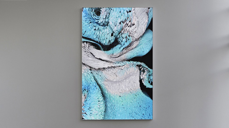
The image I selected is called Wind of Boston by Refik Anadol. Refik uses machine learning and collects data on points of interest to create three-dimensional sculptures and paintings. Doing so creates breath taking and “dynamic perception of space”.
The painting takes a year’s worth of wind pattern data from Boston’s Logan airport. A custom software was developed to analyze the data. The painting itself has different chapters to represent the different data sets. The one I found the most interesting was the Sea Breeze since I find patterns eye catching and breathtaking. Also, what’s catches my interest is how the painting moves, it’s almost like you’re watching a live view of a formation. It’s amazing to see this was created from live data points and were able to create different figures based on specific characteristics on the data. You can find the entire dynamic painting here https://refikanadol.com/works/wind-of-boston-data-paintings/
Hi Ricardo, this is a neat example of combining art and computation. It seems like taking actual data from the airport gives the piece a more organic feel, and because the wind pattern data is specific to Boston, it also ties the piece to its location and space. I wonder what the wind pattern data on the Sandias would look like, or perhaps the Sunport.
Hello Ricardo, visualizing collected data into an art piece is very innovative! It seems like it creates stunning work that has a story to tell behind it, and really shows the versatility of how algorithms (such as the learning algorithm used to visualize the wind pattern data) can be used, making it a great fit for the subject of this course. I am curious about the algorithm that used the data points to visualize smooth curves of varying color (assuming that the color means something other than looking good).