
Dataset
I went into this project without much of a plan given that I wasn’t sure what data I would be able to find. Due to that I started just by looking through a ton of sources for a data set that stood out to me. After considering some potential sets on airplane crash stats, and Halloween candy, I came across a massive NHL data base with game stats. It contained information from 2021 all they way back to 1918 a year after the division was first founded with the original six teams. I don’t really ‘have’ a team or follow the NHL religiously, however I have played ice hockey for most of my life now so using a hockey related database seemed perfect. Due to the size of the data I ended up narrowing it down to the first 100 games of the years 1927, 1947, and 1967. From there the easiest values to use came from goals scored by each team per game.
Design Process
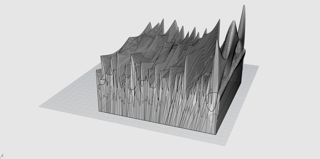
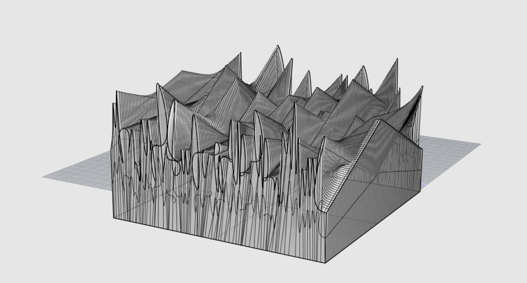
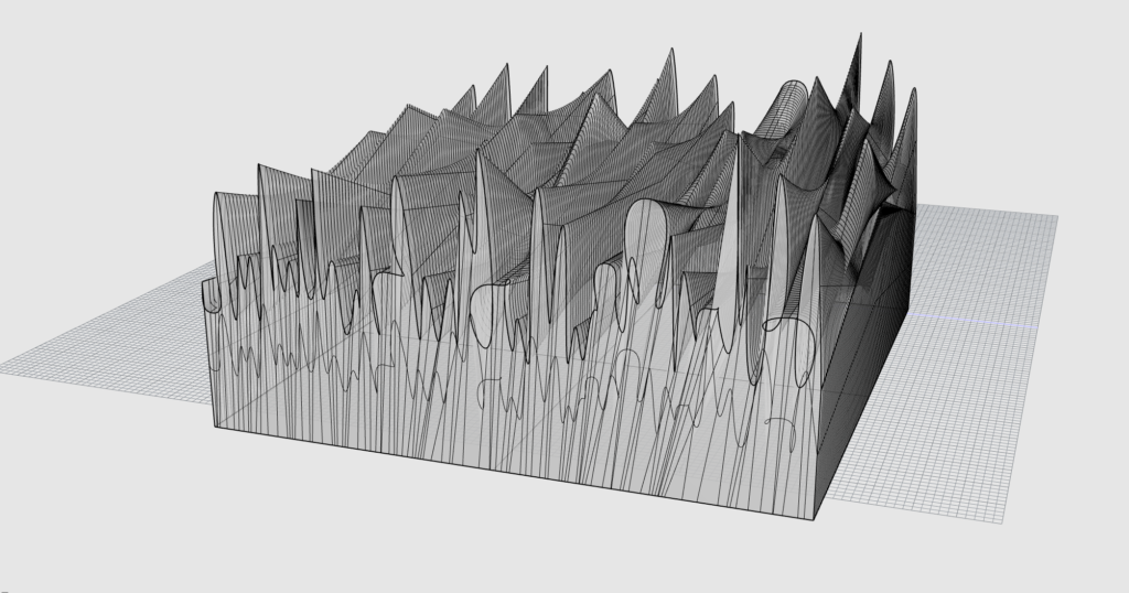
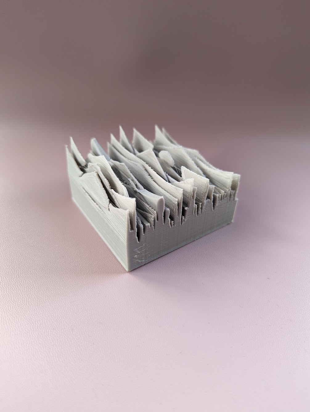
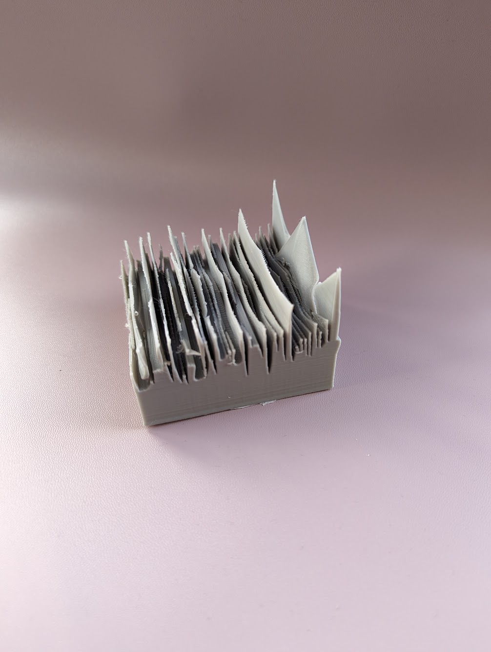
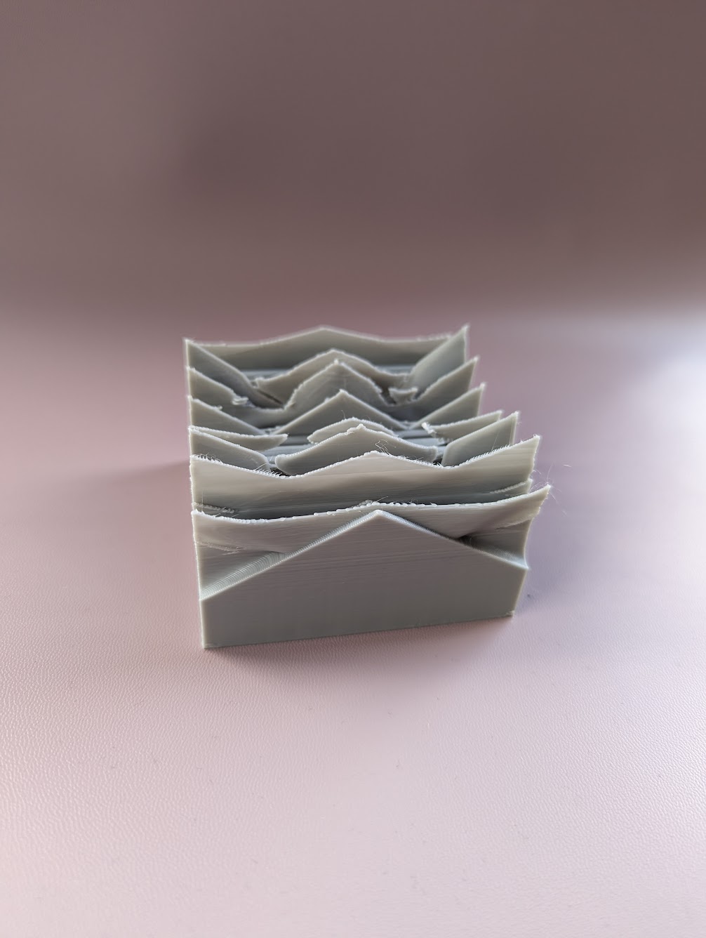
During class I had really liked the topographic maps and had wanted to try and reproduce something similar using the data that I found for the NHL. To do so I created curves based off of the goals scored with number of team-A goals being the number on the outside and the team-B goals being on the inside. I set the z values to gradually increase/decrease between the two value to get canyons or hills depending on which team won. Due to the game outcomes being drastically different this produced an extremely jagged terrain. There were also a couple of places where it got a little weird looking and you can see curves at the peak rather than a sharp point, however I am unsure if this was a result of baking a shape with such dramatic angles or the data itself. Either way, I was happy with how they looked in rhino so I left them.
Reflection
Being able to load in CSV or other types of files for use in creating objects allows them to be made much faster once the base code has been created. For example, rather than adding in all the values for my second large assignment by had I could have just loaded in a CSV file and gotten and extremely similar result. However this would need to be a file tailored to get the result I wanted rather than a meaningful representation. Whereas with actual data you can’t necessarily control what the final result will look like only the form that it’ll take. Despite this drawback the ability to create art from datasets is an important method for creating a meaningful impact. If someone is just looking at a bunch of numbers they very quickly loose all relational meaning and their importance is lost. However by creating visual objects the data becomes visceral.
I will add that I am especially excited to see what I can further create using images.
Hey Lasair,
Love the NHL data choice and the topographic style – it’s such a cool way to visualize game highs and lows! Excited to see what you’ll create with images next.
Best,
Daniel
Hi Daniel,
Thank you! I was trying to figure out the best way to represent that there are two teams for each game, and doing it in that way just happened to work out.
Hello, Lasair:
This is a very cool project. Your way of implementing the 3D curve reminds me how to do a 3D bar graph map in Rhnio. Thank you. I believe if you can make the curves less sharp, you can have a better final result.
Hi Lin,
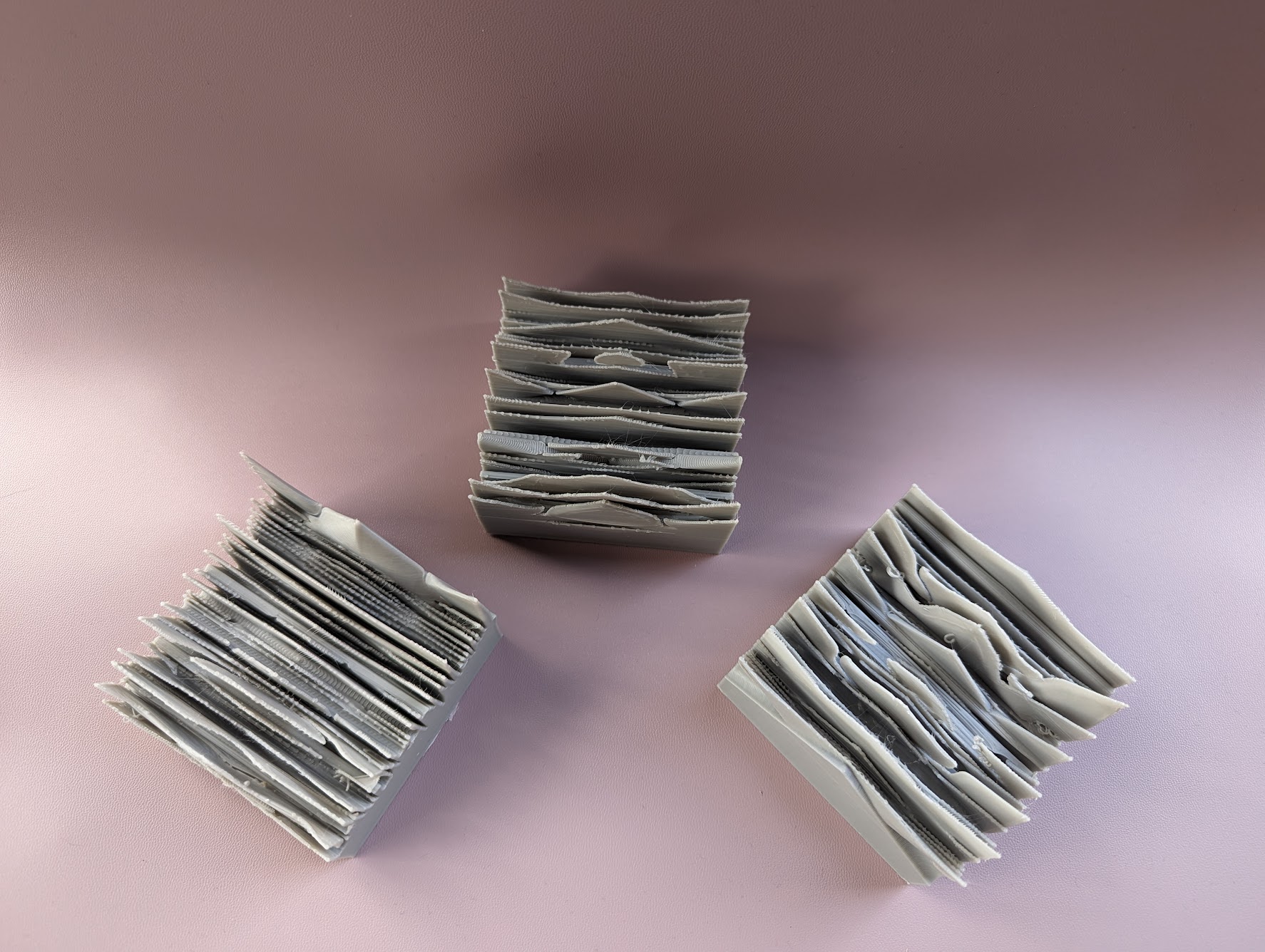
I do have a scale value to increase the difference between the inner and out edges, especially because there were a lot of cases where the goal difference didn’t provide a great curve, so if I changed that value it would probably help with the severity of the curve. Honestly, I am impressed that it printed as well as it did.