Wages in our country are always at the middle of all the debates between everyone across the Americas. To see them in a real life model I feel we could see the wage differences in a new enlightening way. So I picked the salary data from different positions and departments here at UNM by salary. The results are eye opening. This data is open to the public and no names are posted. A link to the data pulled is https://sunshine.unm.edu/salary-book/salary-by-employee-name.html. The data was cleaned up and rearranged to suit certain outcomes as described below.
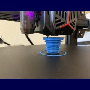
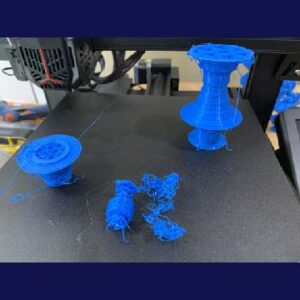
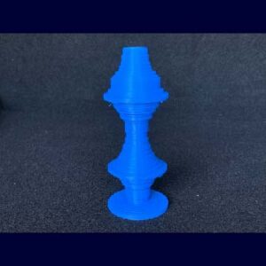
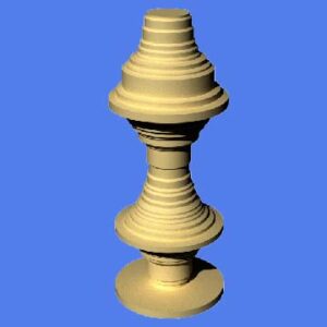
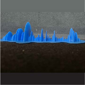
These data show the average and maximum salaries for 190 randomly selected position titles at UNM, as reported by the UNM Sunshine Portal. Everything was scaled to a maximum of 100 to fit on the print bed. The data set was limited to 190 positions because that is the limit of the z-axis on the 3D printer. In order to achieve the desired final look, the data were initially randomly sorted. Then they were subdivided into four equal sections, which were each then sorted in either ascending or descending order, resulting in a “vase” shape with two bulges, representing some of the highest paid positions at UNM.
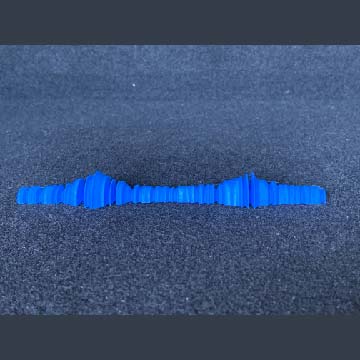
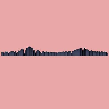
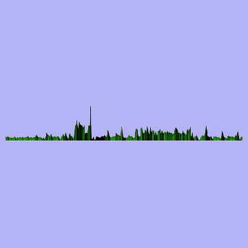
These data also come from the “Salaries by Position” data, with the only difference being that I removed any salaries over $100K. The intent of this was to remove the extreme peaks and “smooth out” the data. I also turned the 3D model 90 degrees and sliced the bottom half off. This gives the appearance of a bar chart when viewed from the side. The data are arranged in the same manner as with the previous object. My third design was based off of salaries by dept and this one I was able to extend the peaks and valleys to there max.
These data show the average, maximum, and minimum salaries for 190 randomly selected departments of UNM, as reported by the UNM Sunshine Portal. For each subset of data (i.e. average, min, max), the values were scaled to a maximum of 100 in order to fit on the print bed. The values were then sorted alphabetically by department name. The data set was limited to 190 departments because that is the limit of the z-axis on the 3D printer.
This is an excellent way of looking at any sort of data as well as feeling it making the data being used more real like and something you can imagine more clearly. Seeing the data in a 3D space as opposed to a flat map brings this data into our world that we can implement into perhaps artwork that helps remind us about certain tasks or maybe as a reminder to workout, do mindful work, save for a trip and the list can go on and on. Below is the Grass Hopper Code.
I loved your piece that is cut in half! And your idea to make art that can help encourage you or remind you of something with data. That form made me want to redo part of the butterfly design I did
Thank you, I stuck it up on the wall on accident and thought how cool it would be to be able to track my hiking and hang it like wall art. I love how we can take all this data and turn it into something real and useful in many different ways. This has opened up my eyes to a whole new world.
Hey Christopher! The data that you found is super interesting to look through, and its made even better by your prints. I really like how your visualizations turned out. the two prints on their side look really cool and its clear to see the data as it changes.
Thank you, like some of my other designs they came from a little mistake and a tweak I had to make because of the mistake. Then I just exploited the mistake into the design I wanted to see. I think it’s awesome how we can turn data into physical things to feel and look at. It makes the world so much more interesting and makes data funner to look at. Thanks for the comment.