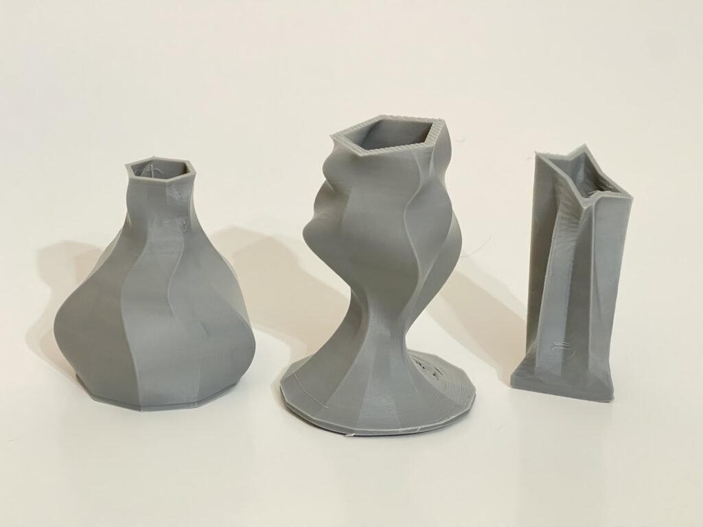
Design Process
The design process began with getting used to the tool while trying to expand its functionality. There was plenty of trying to randomly make something by moving sliders haphazardly, and even more trouble with getting used to Rhino’s syntax and intricacies. After spending some time with the project I eventually made a plan, do what I know how to do first with a simple but respectable first vessel. Build on that with my second vessel, and finish it off with third form that adds yet another layer to the formula. Each of the following vessels will add an additional function to the algorithm to achieve this, elaborated below.
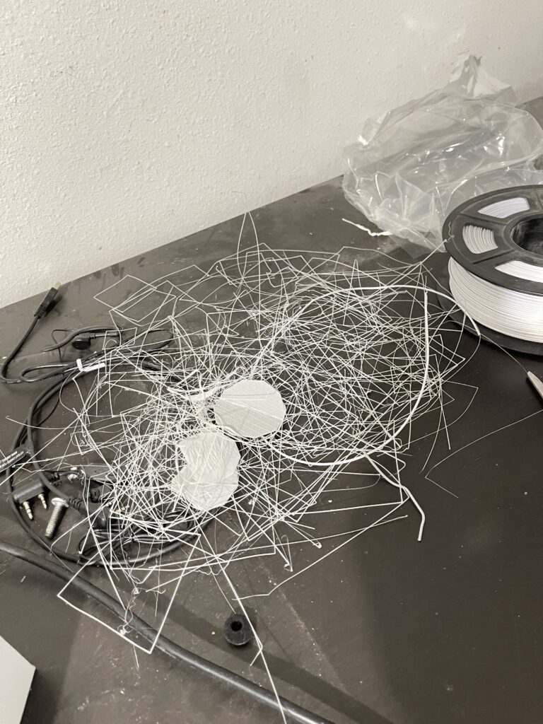
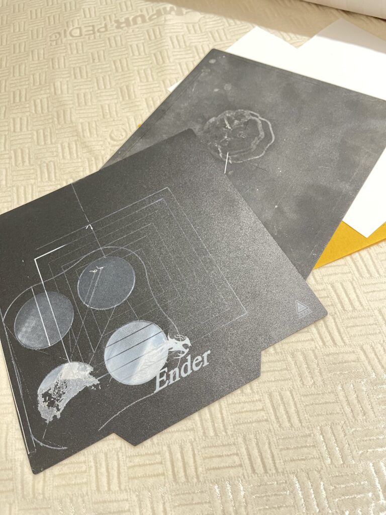
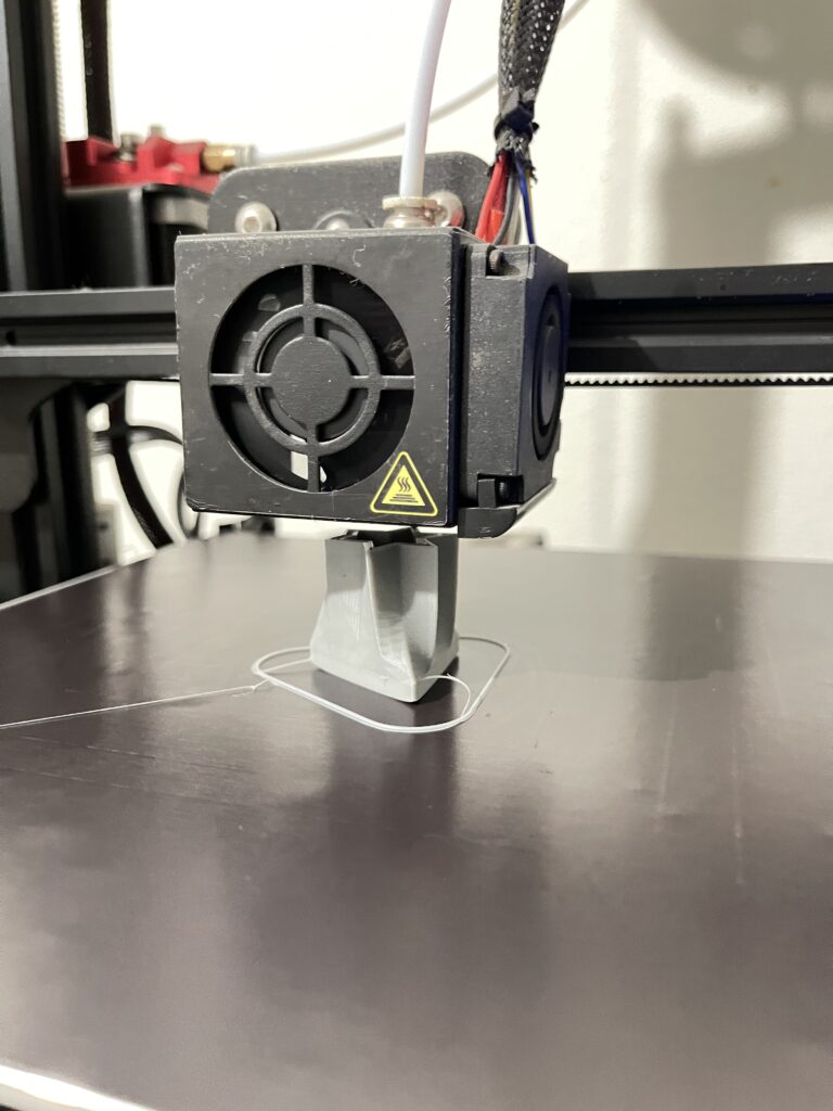
The first struggles began before a vessel was ever printed. My 3D printer is a few years old and wasn’t owned by me previously, so it took some time to familiarize myself with it. This also meant making myself accustomed to the flaws and issues with the printer, of which there were many. The bed was a mess and leveling it felt impossible. Try as I might to follow the tutorial video, I ended up making many different test prints and eyeing out a good print until it worked. There is still an unevenness to the print bed, but once I got things printing mostly okay, I was ready to go with my vessel printing.

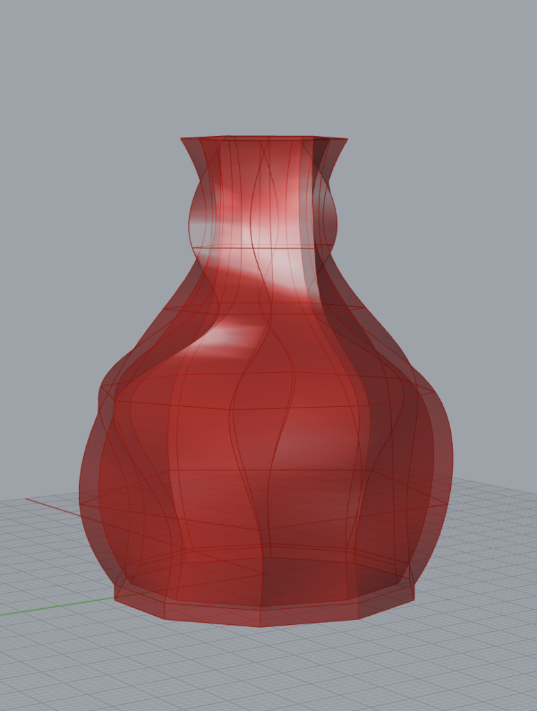
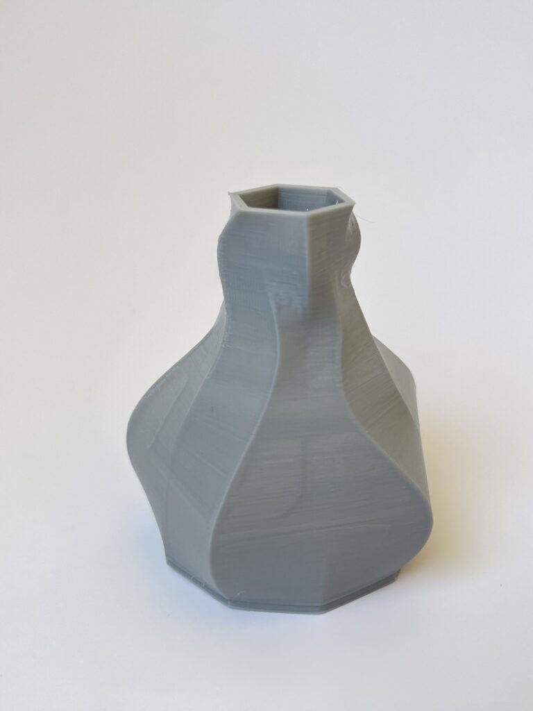
We begin with the first, modeled after a magical potion bottle that you might find in the Legend of Zelda games (or many, many others). Comprised of stacked polygons with only a few rotated around the Z axis to give the shape some extra flow, the potion bottle is very similar to much of what we did in class.
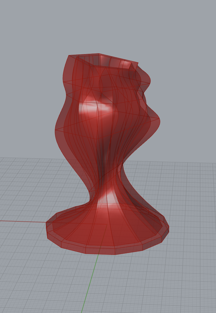
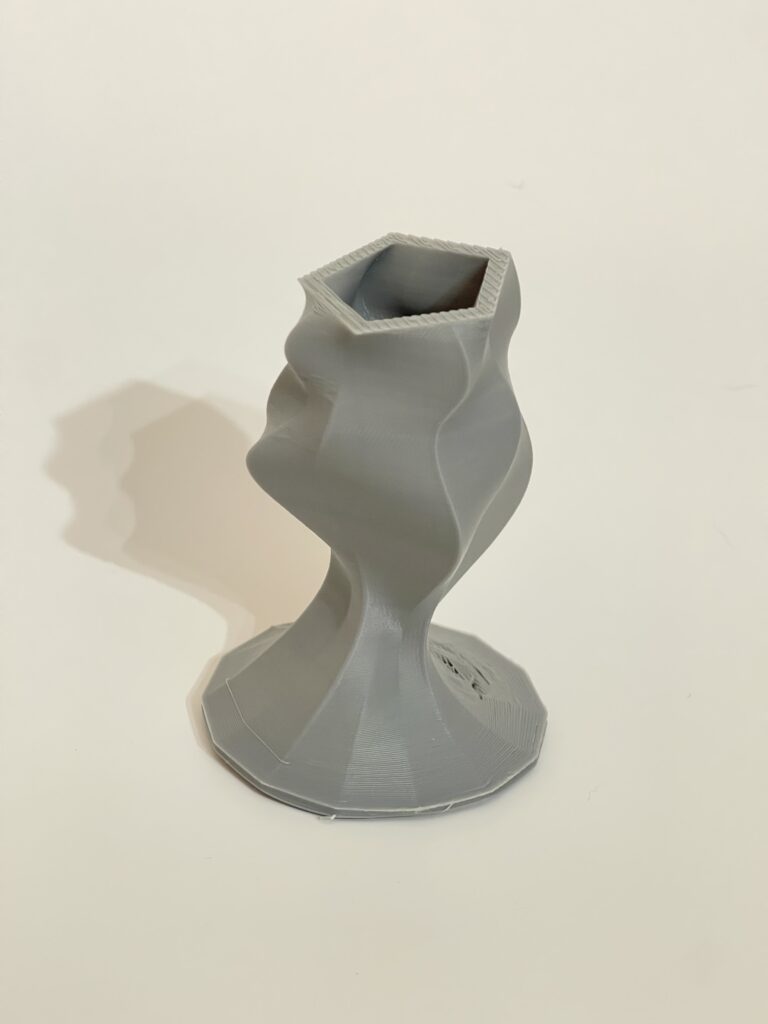
It was at this point that I really wanted to add some extra depth of rotation by altering a polygon’s pitch or roll. This was difficult to pin down but through some documentation scouring, the algorithm now allowed me to add a pitch to any polygon, drastically changing the shape and flow. I was inspired to make a sort of wine glass with this new method, with striking curves that make a beautifully asymmetrical piece. This vessel became my personal favorite with how effortlessly it flows as well as turning out quite well from the printer.
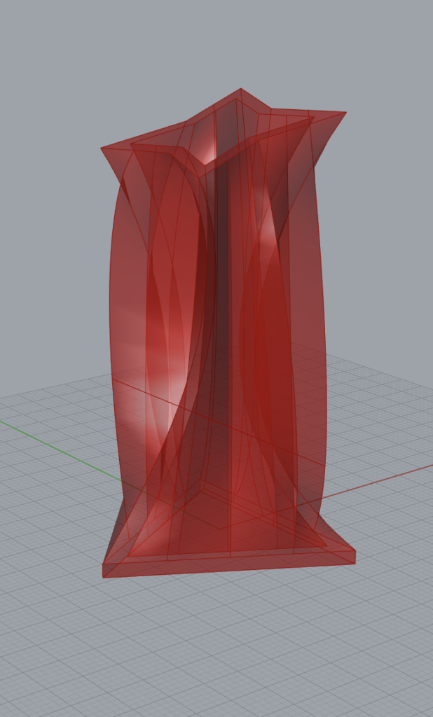
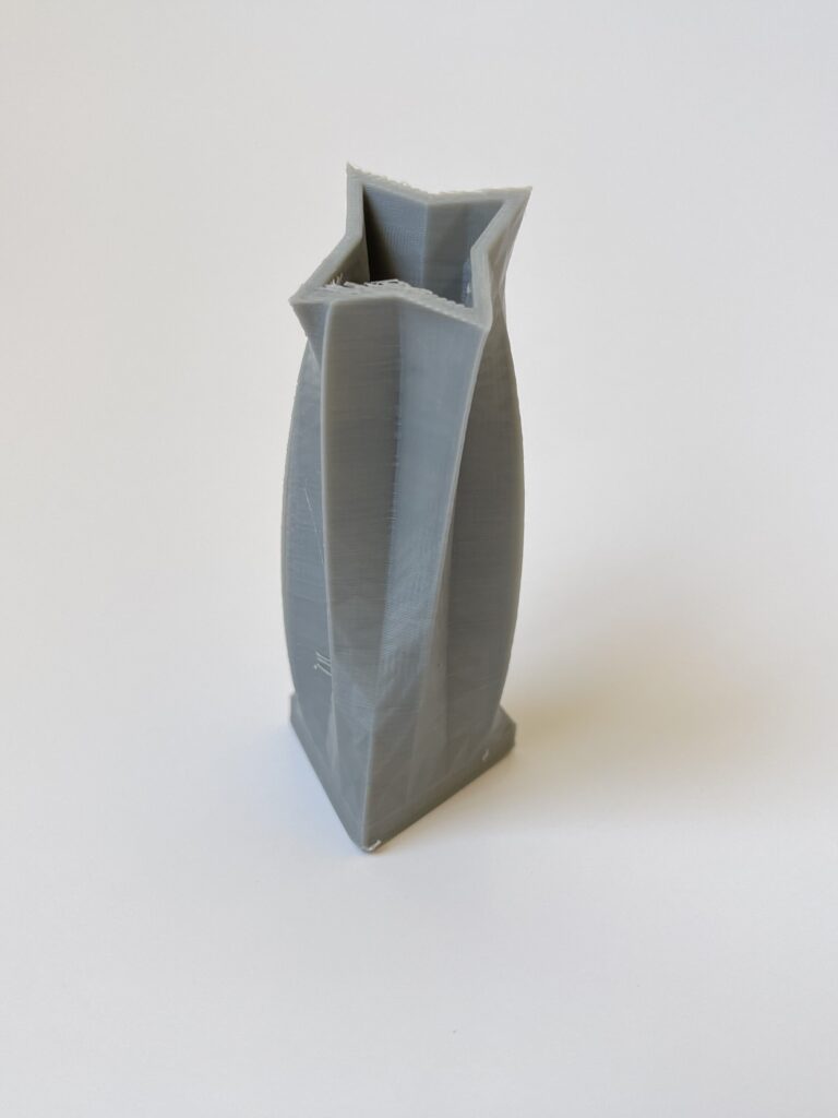
Lastly, I wanted to add something to the polygon generation itself to make those star shaped figures alluded to in class. It took me an embarrassingly long time of attempting complex transformations to finally land on some simple modulo that alters every other points radius. I combined this with the pitch rotation to make a more refined shape, the star trophy, inspired in part by a similar object in the Mario Kart series.
Parametric Design
The advantage of a parametric design for potentially less “creative” individuals such as myself is that it makes room for a huge variety of potential pieces of art. This transforms a little bit of mathematical understanding into a versatile tool that we can choose our design from. Parametric design is by definition restricting, since you literally are stuck within the bounds that your parameters define. So why then does it inspire so much? There’s no possible way I could’ve come up with the forms that I did without it. Through the process of letting me see an outcome from small parameter shifts, I can be inspired by a shape that looks cool, or some curves that make it look interesting. With more traditional methods I simply cannot bring into existence a form that I haven’t already created in my mind, at the very least not in any world as efficiently.
My only qualm with the 3D printing side of the designing is that in order to get a good print, it’s best for you to follow the physical rules of a PLA printer which are quite numerous. Care for the arches, center your mass, account for travel lines or cooling times. I’m not necessarily saying that these things are required for a good print, but they do effectively limit what the otherwise boundless parametric design can do. These restrictions tend to lessen the better your material, machine, or process, so it’s understandable that at our current level we’d feel the burden the most. Regardless of a limited possibility, it’s simply amazing to have the opportunity at all to fabricate real life objects at the size, scale, and ease that 3D printers give.
Creative Agency and Intent
The process of my creative thinking is detailed throughout this post, but in short I think my process took advantage of pure chance as well as deliberate choice. I set up boundaries for myself with my algorithm, and with these boundaries in mind I imagined what could best fit those restrictions. With the potion bottle for instance, since I knew my options were limited outside of height and radius, I thought it would be best to make a more traditional vessel form. I took that and imagined what inspired me that fit that form, and from there used the parameters to spice up the details. With further vessels I used my additions to the algorithm to influence me in the same way.
I do however feel like my sense of “authorship” is diminished in a way, even though I fully believe that this form is of my own work. With being able to see the model in real time as parameters changed, it’s only natural I be influenced by any cool “accident” I may see. In this way, the idea didn’t originate from within me, but from a tool that did. I think this loss of “authorship” as I’ve defined it, is insignificant at best, because whether from math or hand, this art is personally forged by me.
Code
The grasshopper code used to generate these vessels can be found here.
Hello Christopher, I really liked how you were abele to create the star trophy is awesome. I also went in a route to make a trophy for one my vessels. I also agree with as feeling the “authorship” is fading a little when creating our vessels. Overall Great Job.
I appreciate it a lot! The Valorant trophy you were going for is such a cool idea for a design, though to be fair way harder to print than my pretty simple shapes. I think that it might actually be easier to print that one on it’s side! Trophy’s are a really good opportunity for vessels honestly!
Hey Christopher,
I think the star trophy is a great design to base a vessel off of. I think that the rotation and tilt of the star looks really cool. I also love the wavy pattern of the wine glass. Well done!
Hi Christopher,
I like how you were able to replicate the objects you chose. I especially like the little wings at the top of the magic potion bottle it gives the shape a nice flow and makes it more interesting! Nice work!
Thank you for noticing that little flare on the potion bottle! It was a pretty big part of that particular design that I neglected to mention so great catch! Wings is a great work for it too as I couldn’t quite describe what it invoked for me.