Part 1 – Fractal
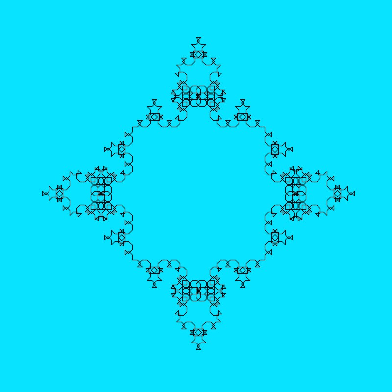
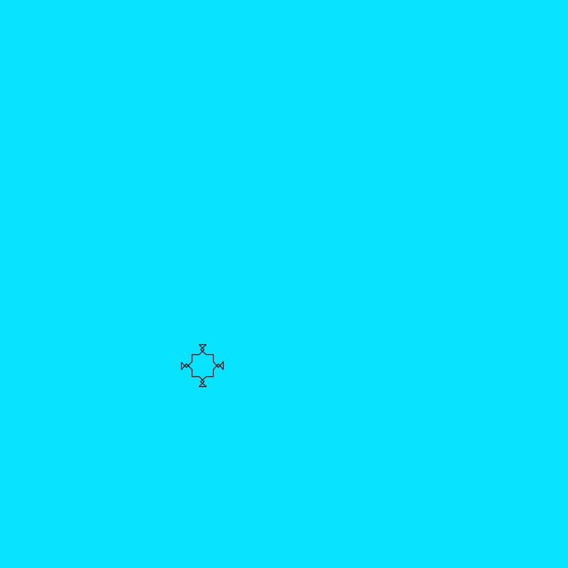
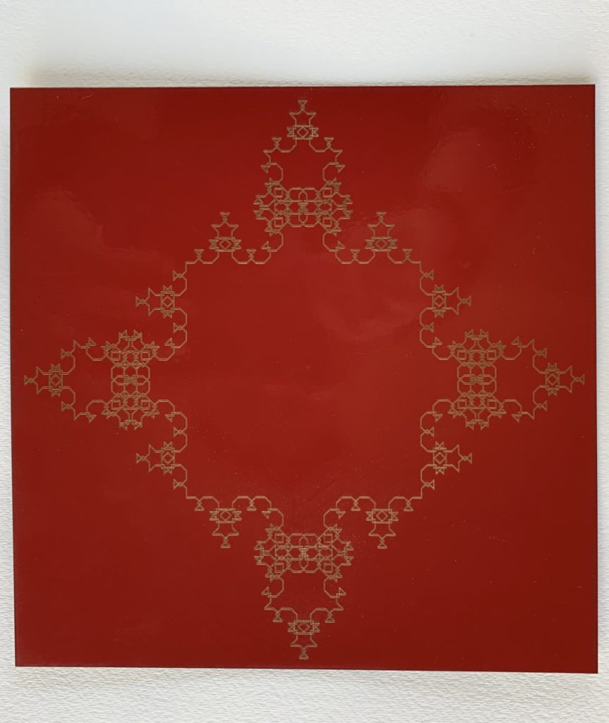
I took a relatively simple approach to this fractal. I started with a square as an axiom, then made each permutation a sort of symmetric “bow” shape using overlapping angled lines. Its designed around 45 degree angles, and each “bow” consists of these lines: 45o left, 90o left, 135o right, 135o right, 90o left, and 45o left.

Part 2 – Tree
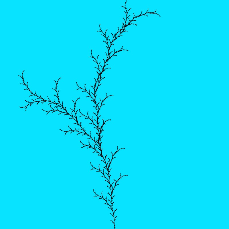
For the “botanical form”, I created this design using the tree code from the lecture/ABOP. It starts with the axiom F and uses the rule F -> FF-[F–F[F–F]]F+F[F++F[F++F]], which is what creates the sparse, arcing design. I also added small triangles to the end of each “F” line, which were originally intended to make each line look like an arrow like some of the designs in the book. I didn’t get the orientation of the triangle quite right on the first try, but I liked the look and stuck with it. It reminds me a little bit of those dry, spiky grasses that you find everywhere around here.
Part 3 – Nonlinear Design
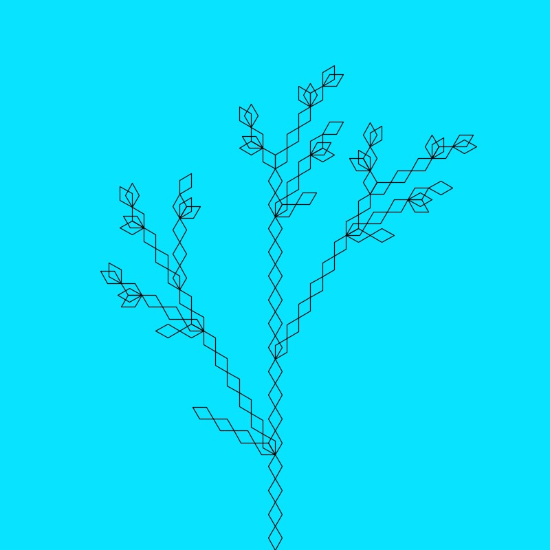
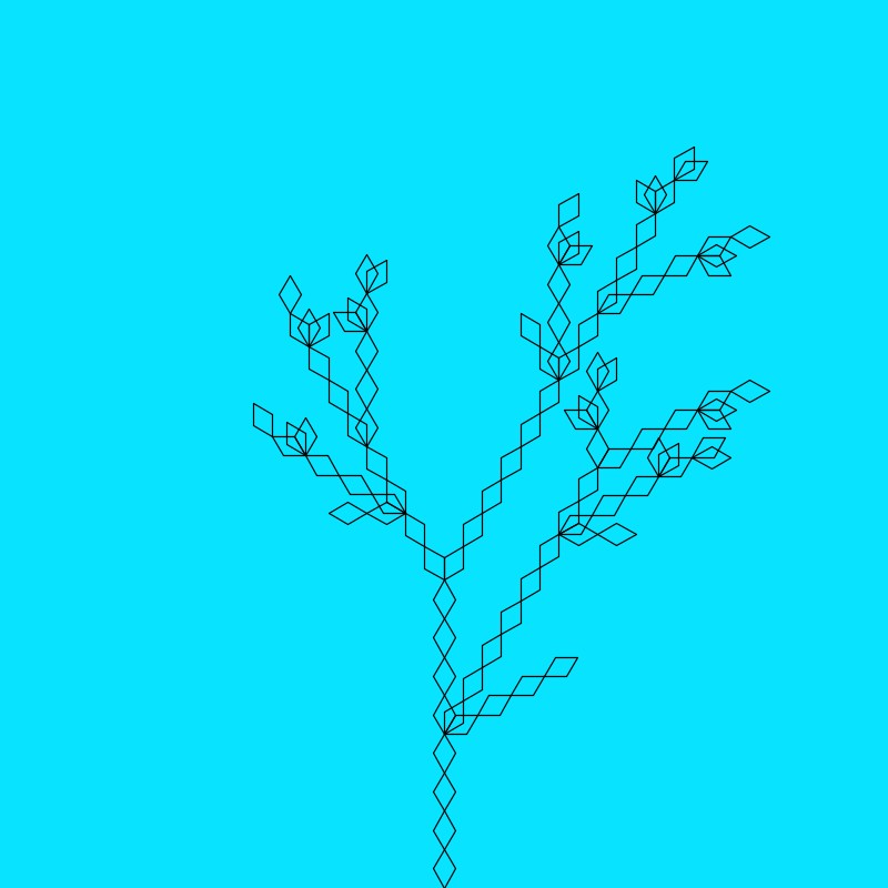
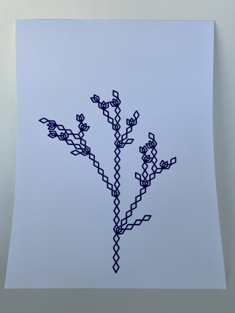
This design uses a tree structure similar to the previous one. However, in this design each “piece” is represented by a diamond shape instead of a line, drawn by the turtle essentially tracing out two equilateral triangles. The design is also randomized each time, where branches are generated by one of three rules.
Part 4 – Rogan Brown-ian
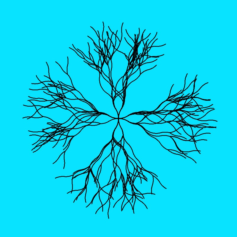
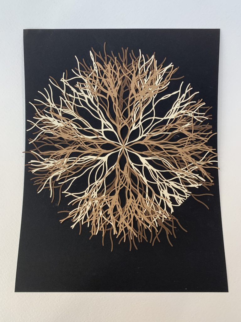
This design actually uses a generation method that’s very similar to the nonlinear tree. At its core, this design is 4 randomly generated trees placed at 90 degree angles away from the center of the screen, repeated 5 times with varying branch lengths. Each branch is then created by drawing arcs with the turtle, with length/2 degree arcs (ie. for branch length of 60, the turtle turns out 30 degrees then in 30 degrees) in a random direction left or right. However, this is technically not the entire design. I originally wanted to create a much denser image, but Processing had a hard time drawing it in a reasonable amount of time (this current one takes a couple seconds to draw) so I kept it like this. In the physical design, I cut out three of these and overlapped them to get to my original design goal.
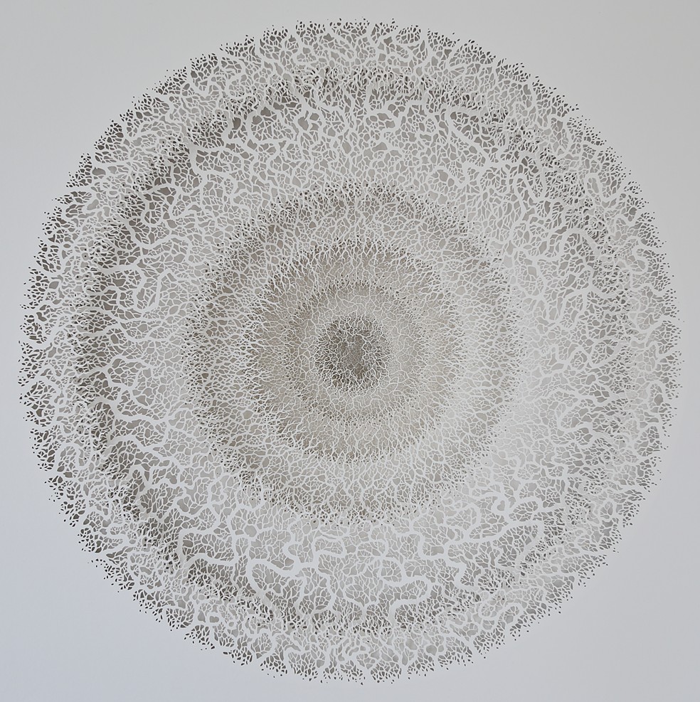
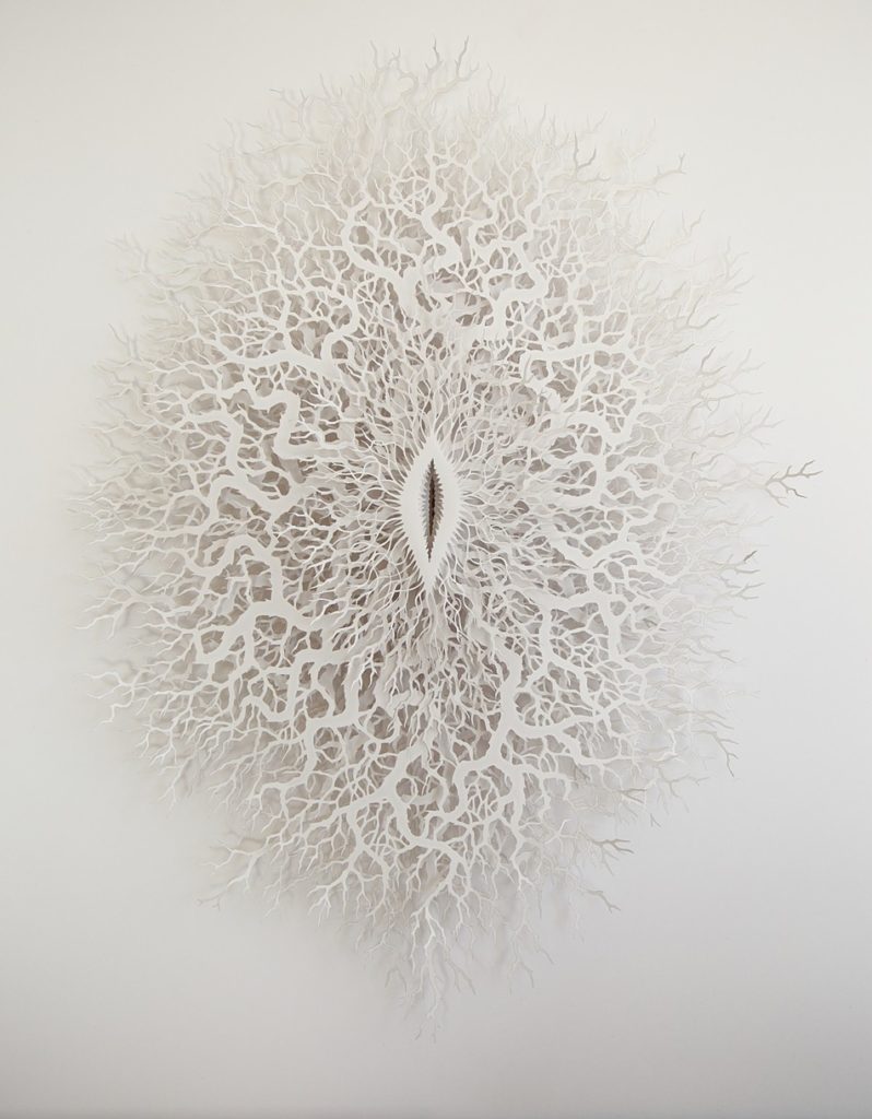
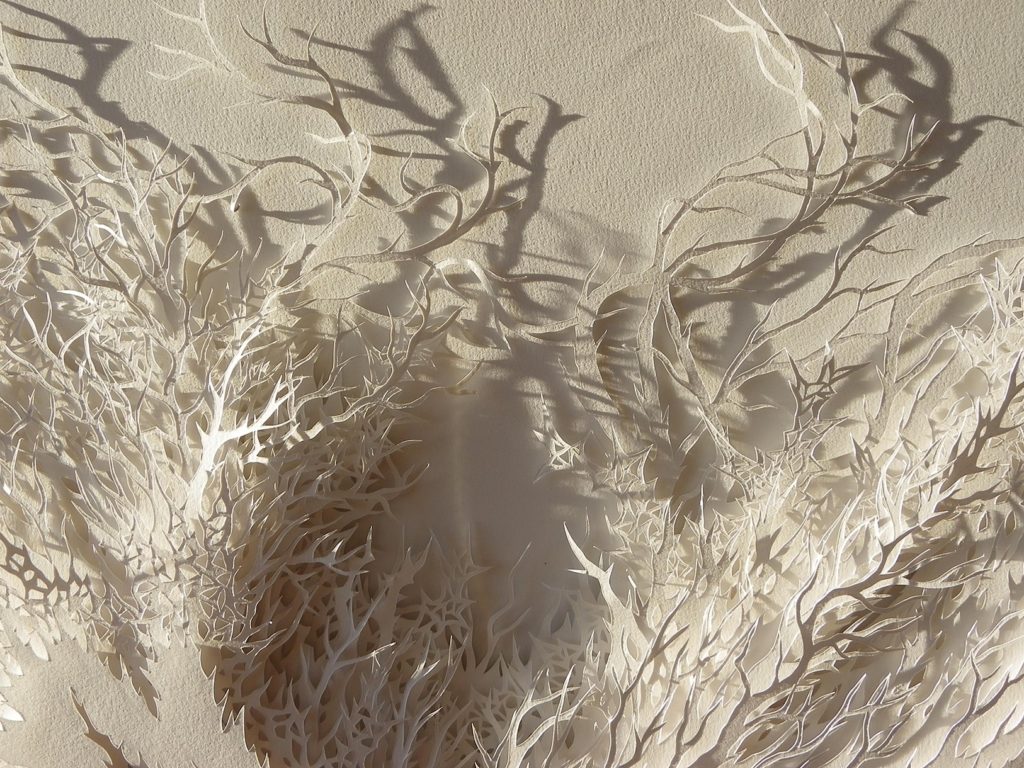
The goal was to mimic the sort of sprawling, tree branch design that Rogan Brown uses in a lot of his works, as shown below. I experimented a bit with making the lines more pointy to match his designs more closely, but I couldn’t find a solution for that that looked good.
Cut-outs and Plots
All three of the pieces below were cut/etched using the laser cutter.
Code
Note: I started working on this project before the lecture on tree generation, so my code uses my own implementation of the turtle stack.
Ben, I love the use of the 3 different color papers on your laser cut. The final result is delicate and lovely.
I am astonished by your fractal design. There is no way I could visualize the final image from the first two iterations of the L-System but its incredible how it ends up. And there is truly something special about taking a natural form and making it more uniform and rigid. The Diamond tree that you made is just stunning and I love the leaf like structures it makes when the diamonds overlap! Great job on your designs.
Hey Ben,
First off, it’s funny that you mention implementing your own turtle stack. Before we went over it in class, I completely forgot the push() and pop() already existed, so I did the same thing but ended up using the cleaner option.
I like what you did with gluing your cutout designs onto paper. It didn’t occur to me until I saw your presentation in class that doing that was an option. The Rogan Brown design looks so cool with the multiple, different-colored layers! That’s a great idea for giving the designs more depth/dimension. Nice work!
Jamini